- Industry
- Productivity
- Site type
- Landing
- Platform
- Custom code
- Tech
- Next.js
- Style
- Minimal, Typographic, Geometric, Diagrammatic, Software Mimicry
- Business model
- AI
- Presence
- Online
- Components
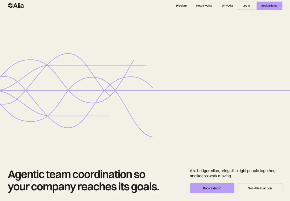
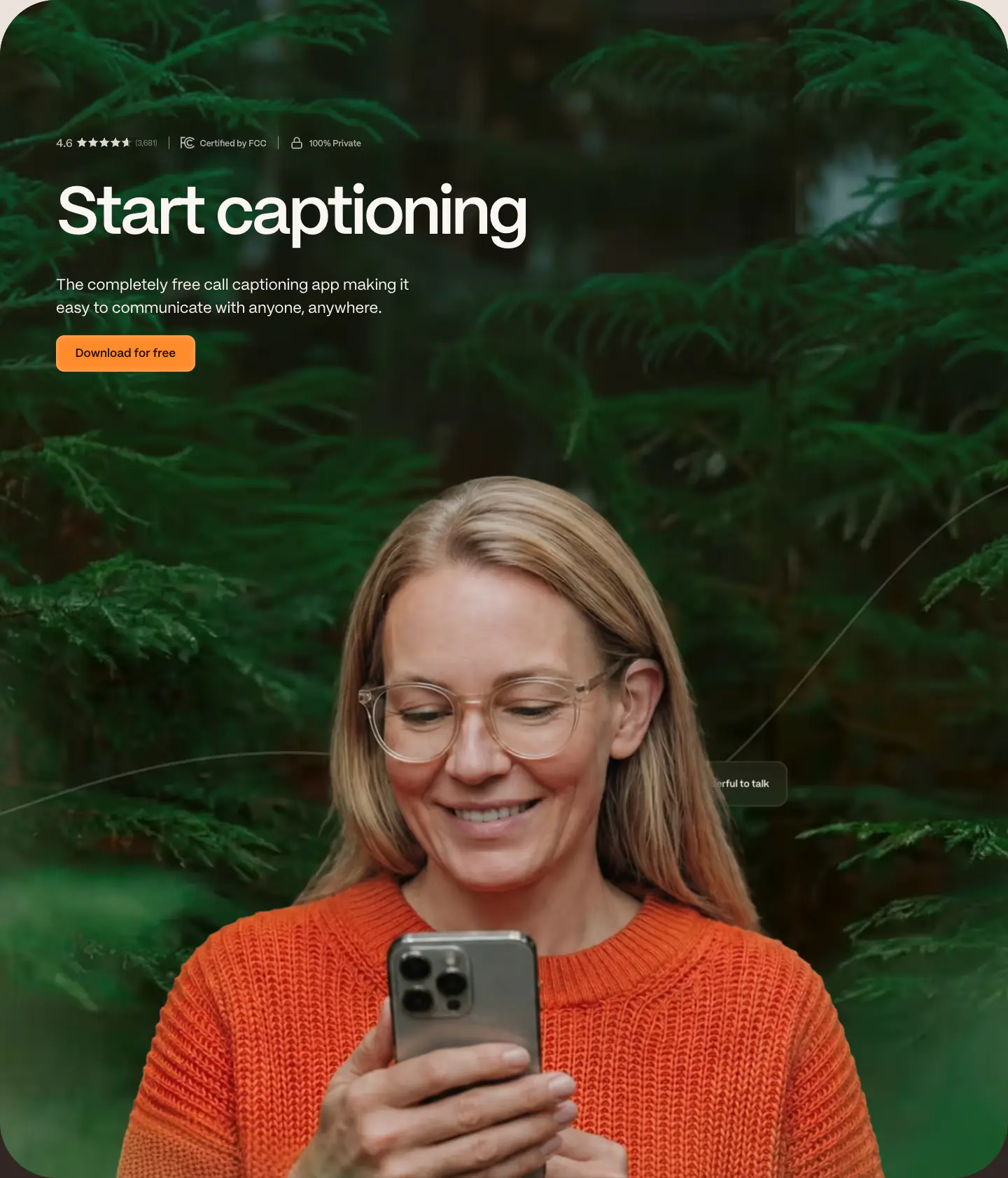
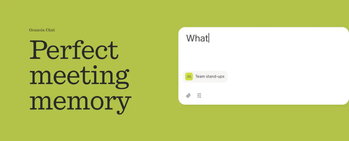
- Navigation Bar, Hero, Floating Product Card, Feature Collection, Footer, Scrolling Line Diagram, Faux UI Stack
- Score
- 56.1/100 · 100% evidence · Review pending
- Typography
- Display — switzer; Heading — switzer; Body — switzer; Mono — geistMono
- Palette
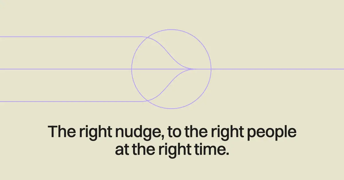
- OG image
Design analysis
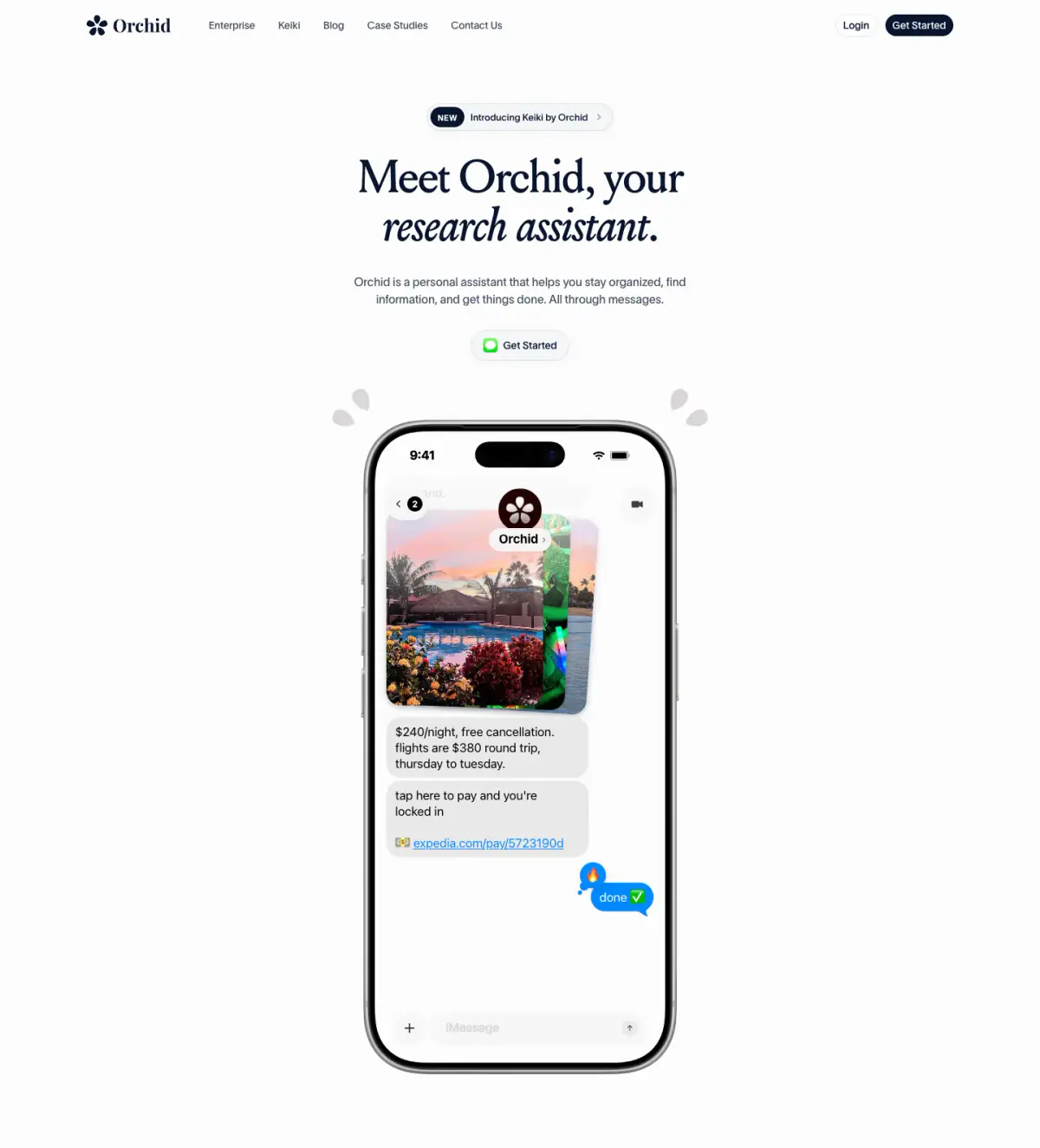
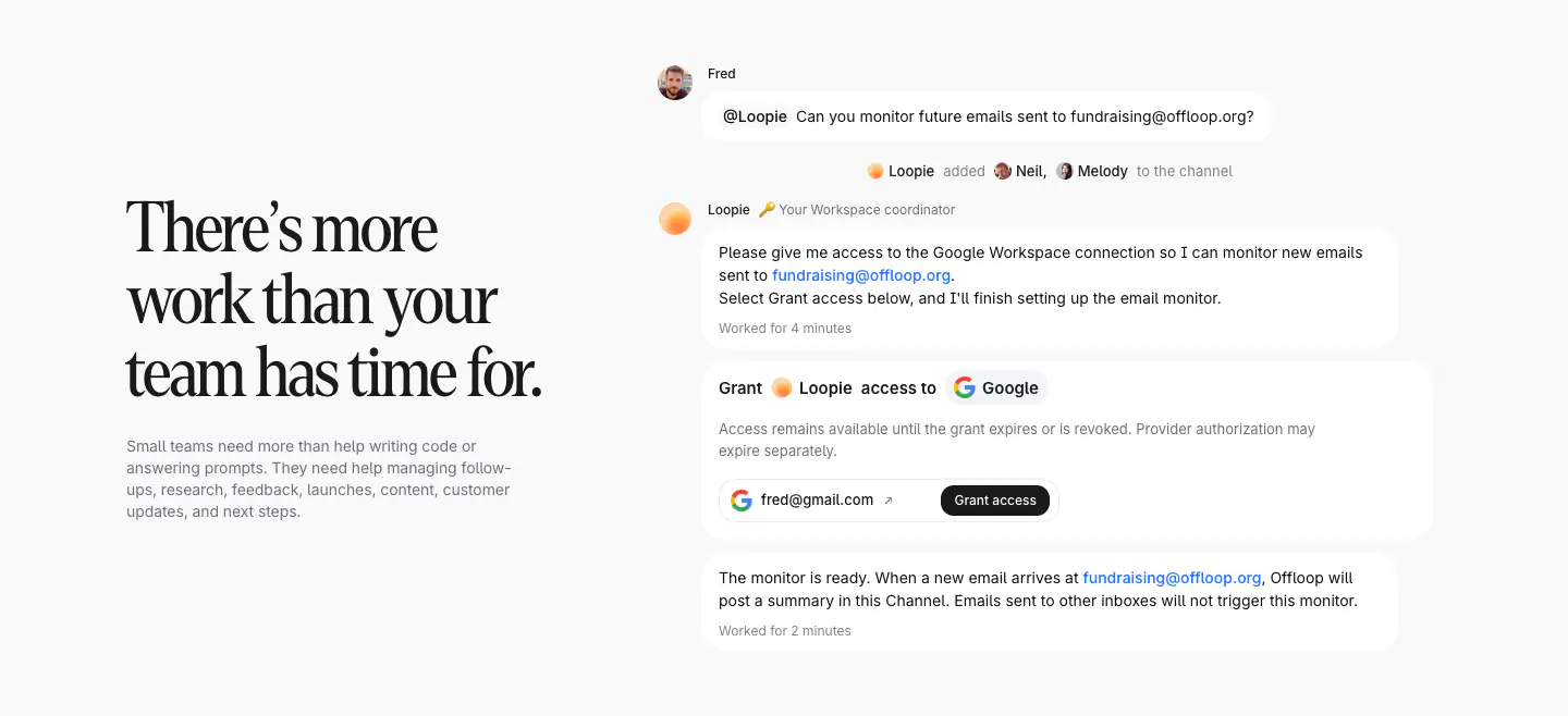
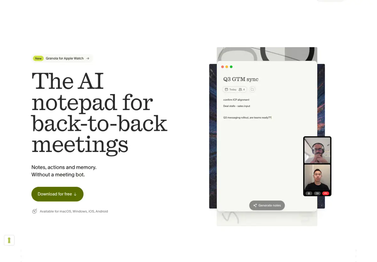
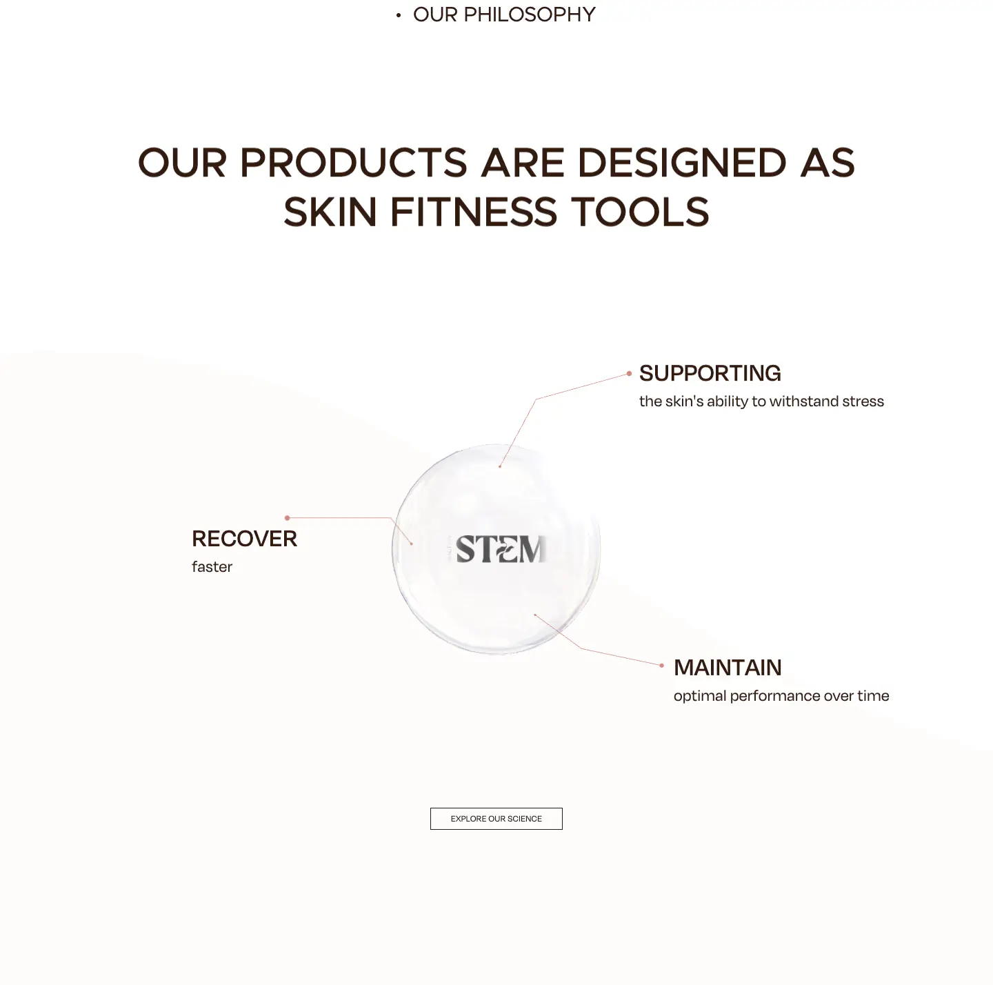
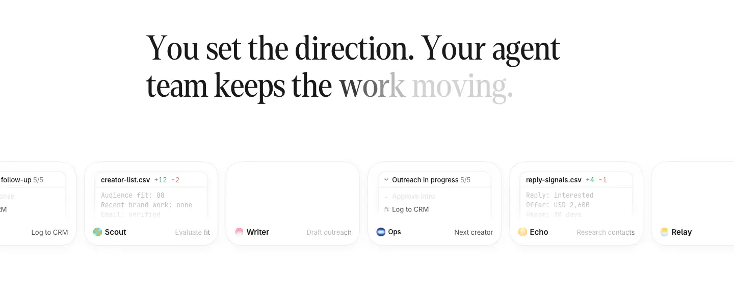
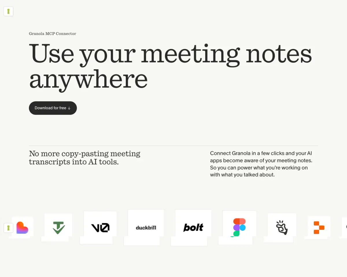
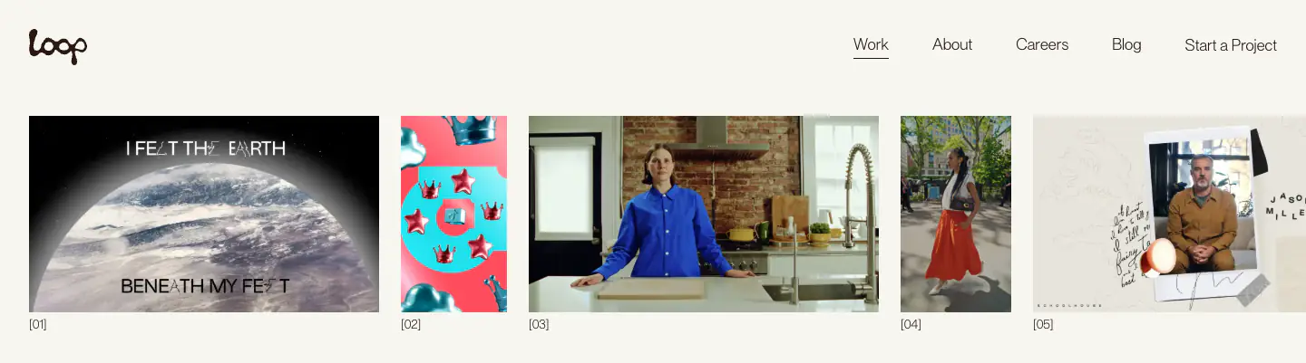
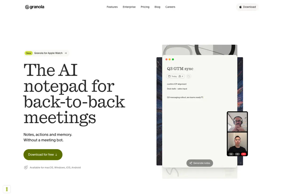
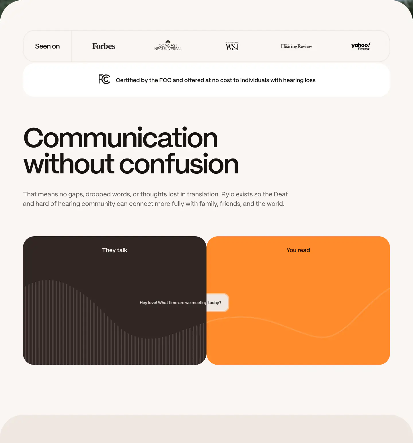
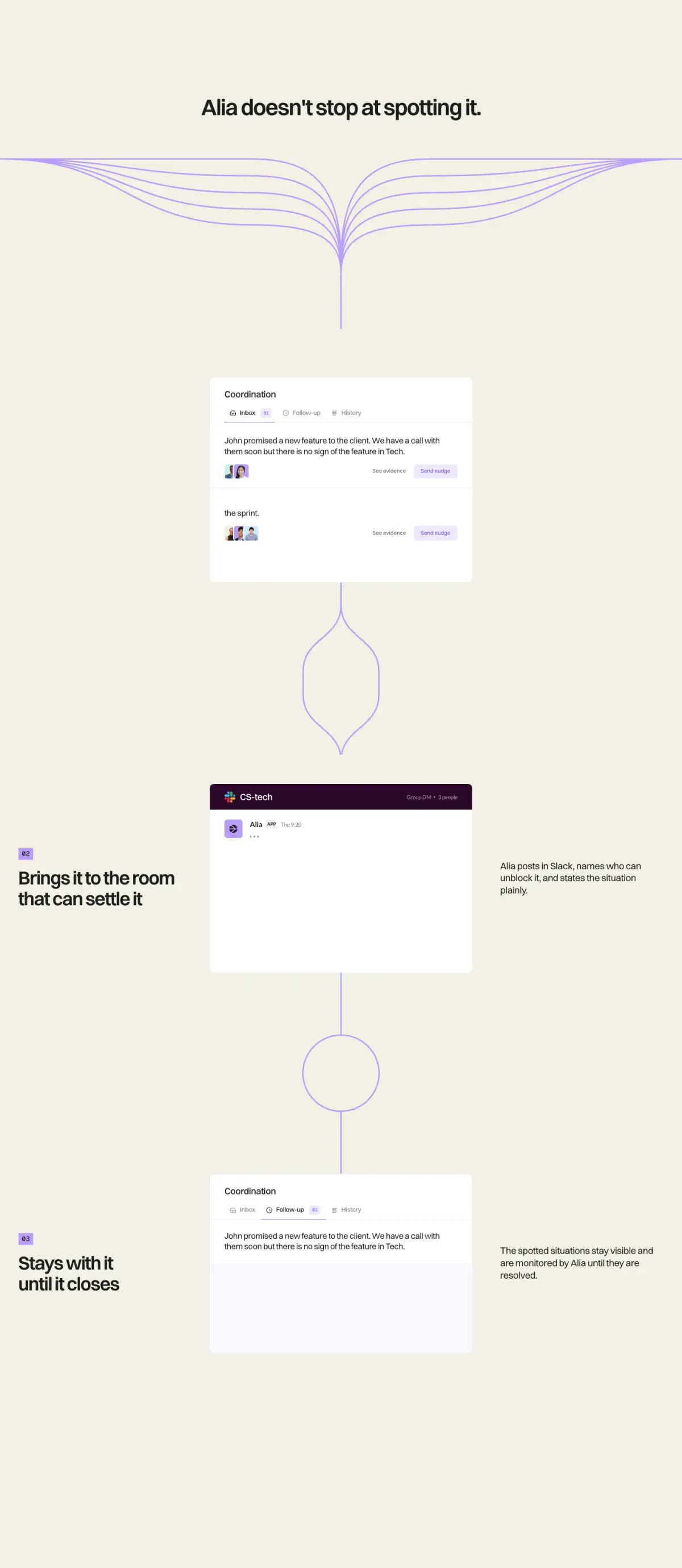
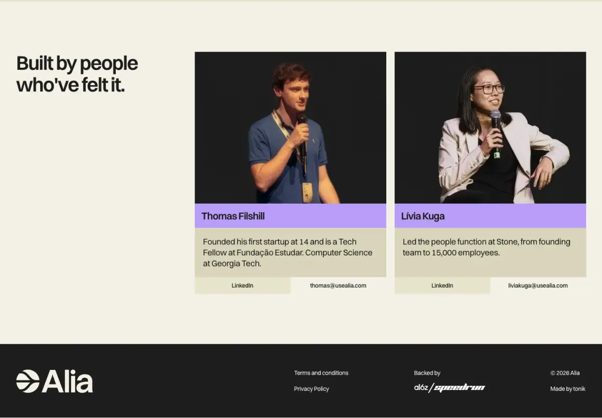
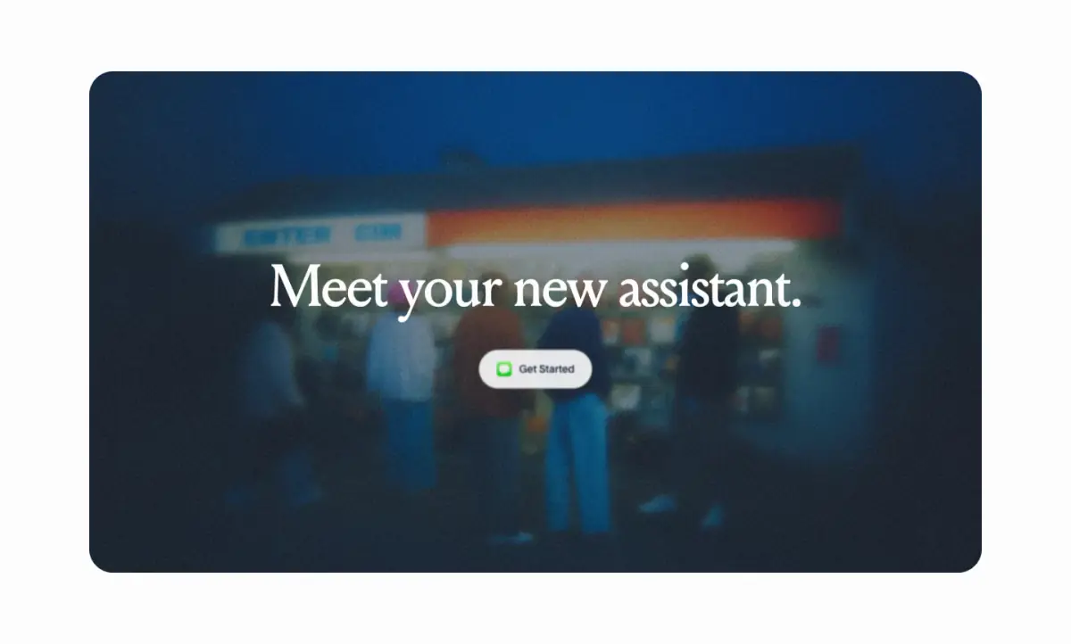
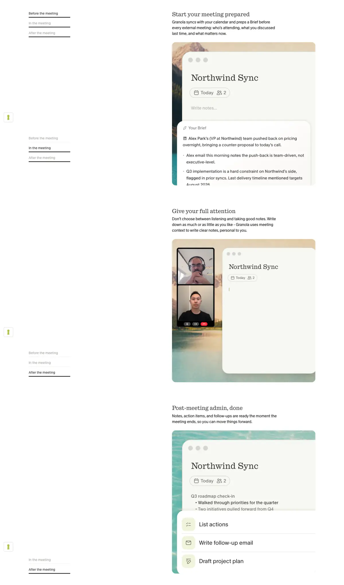
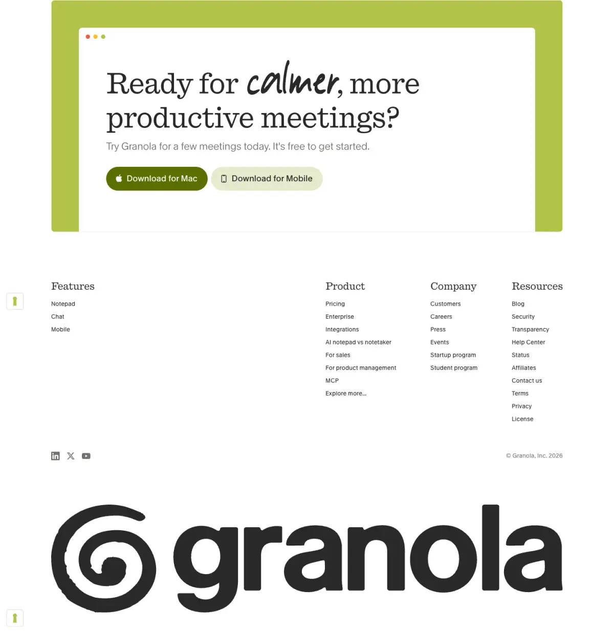
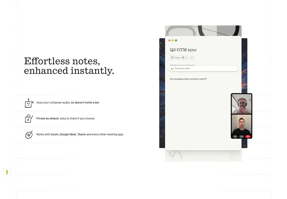
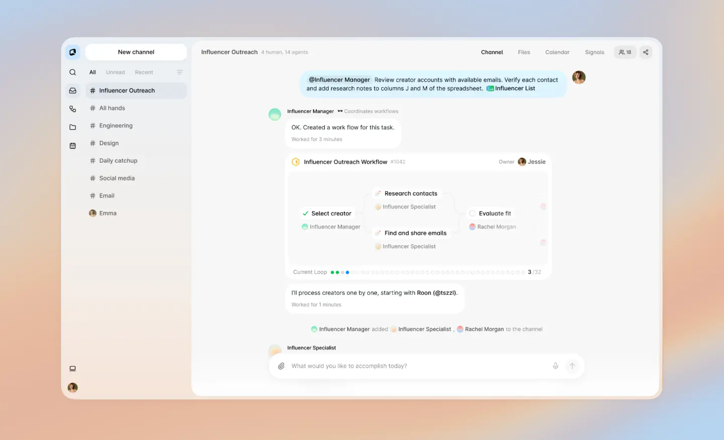
The website employs a highly minimal, typographic, and geometric design language to communicate abstract concepts of workflow and coordination. The visual hierarchy relies on a stark contrast between a warm cream canvas and deep charcoal typography, punctuated by soft violet accents. The design heavily features continuous, branching SVG lines that serve as visual metaphors for data pathways, alongside floating, stylized UI cards that mimic popular software interfaces (like Slack or Jira). The generous use of whitespace and a structured, almost diagrammatic layout give the site a clean, modern, and slightly technical feel.
- Spacing
- Generous vertical spacing between sections, often paced by the flowing line graphics to enforce a slow, deliberate reading rhythm.
- Shape
- Consistent use of rounded corners on UI cards and specific line joins to soften the geometric aesthetic. Small to medium border radii (approx 6-12px) applied to mock UI cards and buttons.
- Borders
- Mostly borderless designs relying on color contrast, with occasional subtle borders (e.g., color-13) on UI cards.
- Buttons
- Flat, unshadowed rectangular buttons with soft color fills or simple borders.
- Width
- Content is frequently centered or offset in a wide, fluid grid, leaving significant margins on desktop viewports.
- Density
- Very low density, prioritizing negative space to focus attention on single ideas or diagrams per viewport.