- Industry
- Productivity
- Site type
- Landing, Blog
- Platform
- Custom code
- Tech
- Next.js
- Style
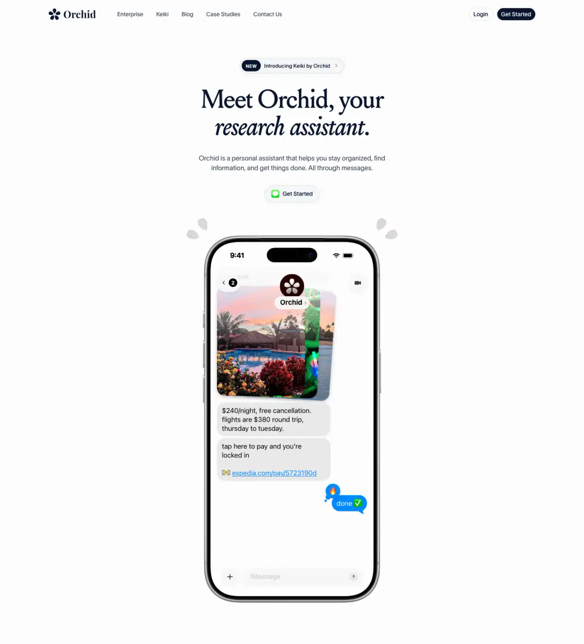
- Minimal, Editorial, Soft, Corporate, App Simulation
- Presence
- Online
- Components
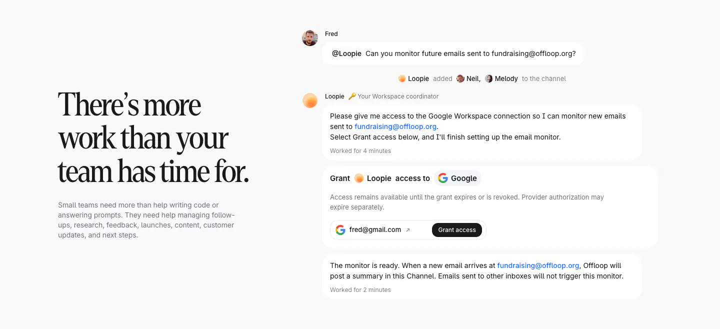
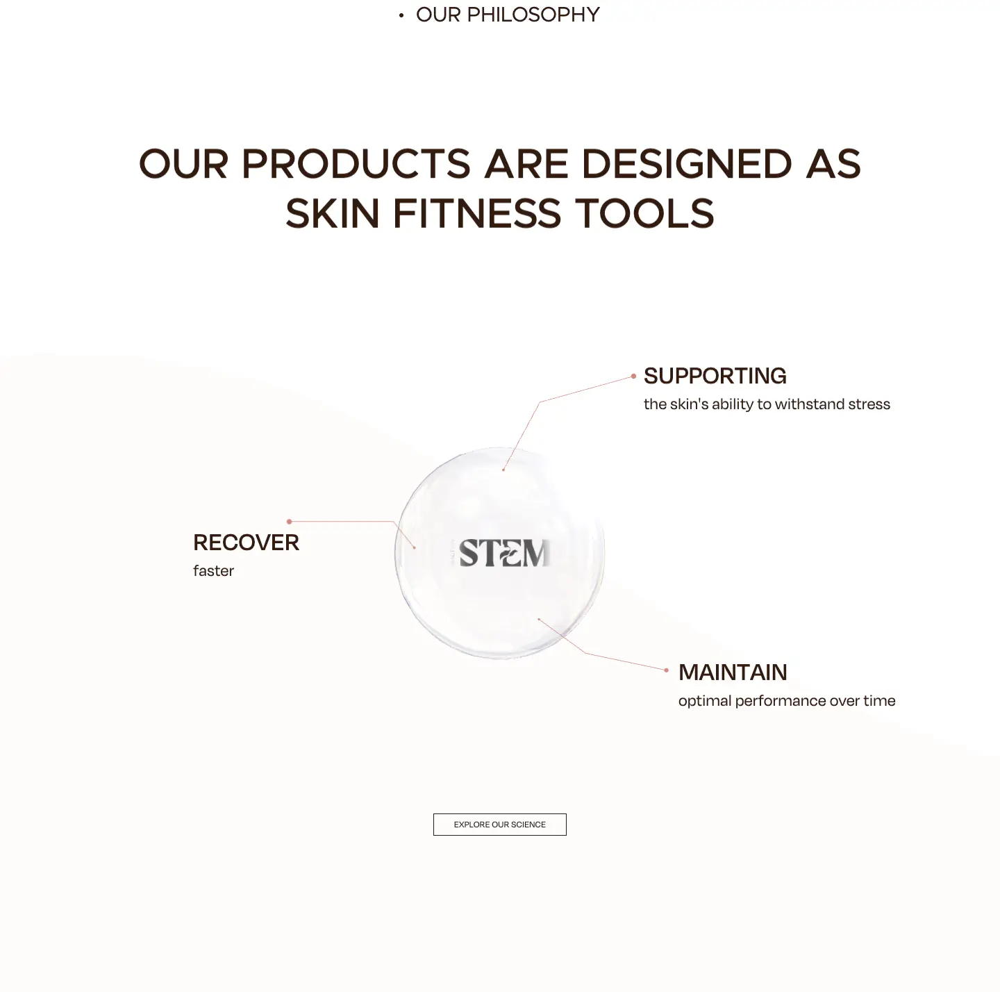
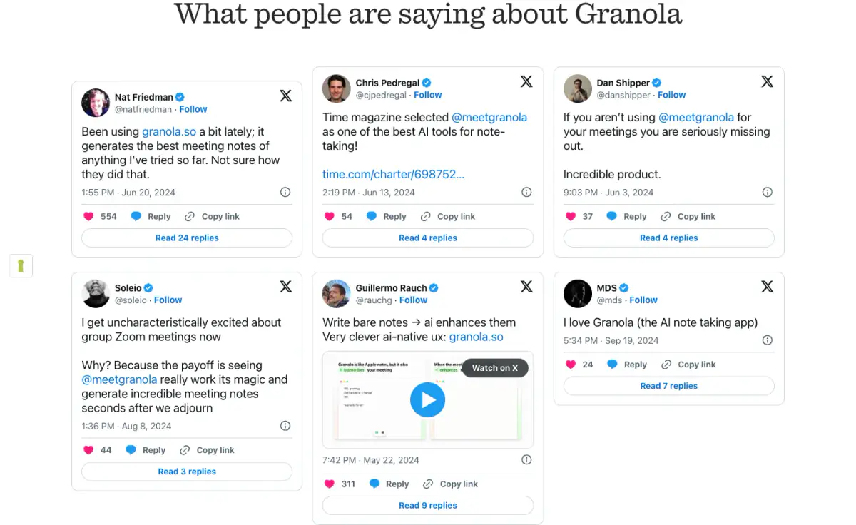
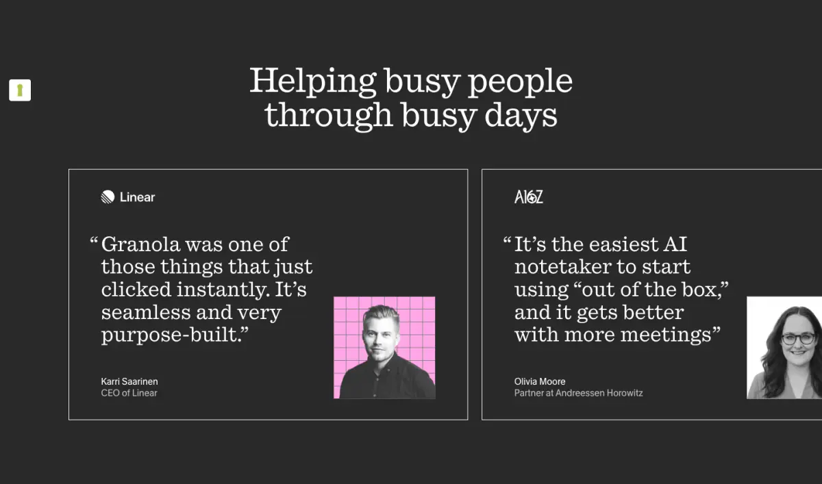
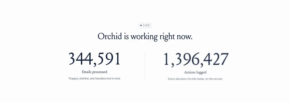
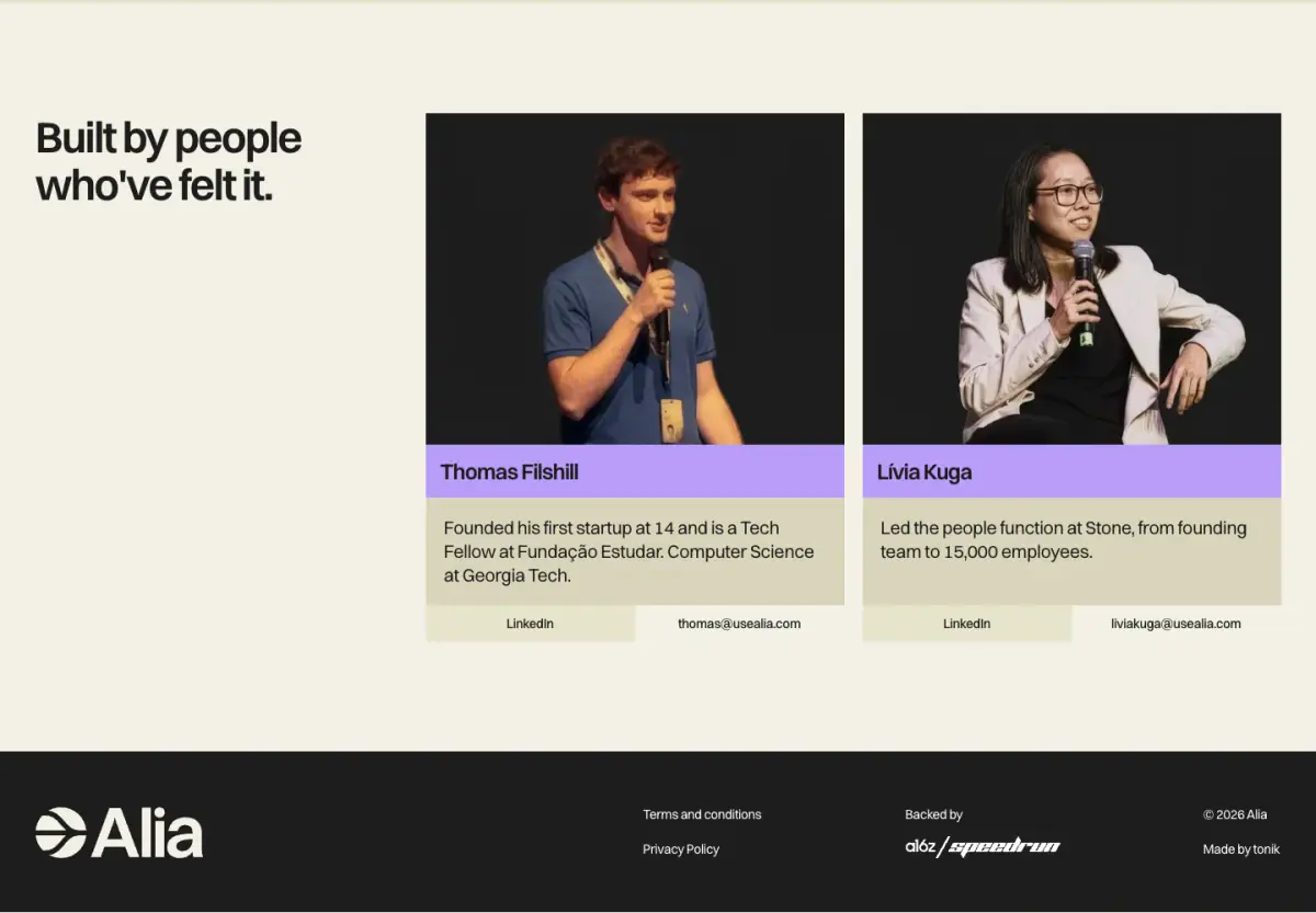
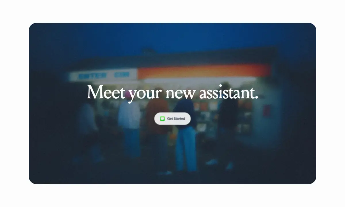
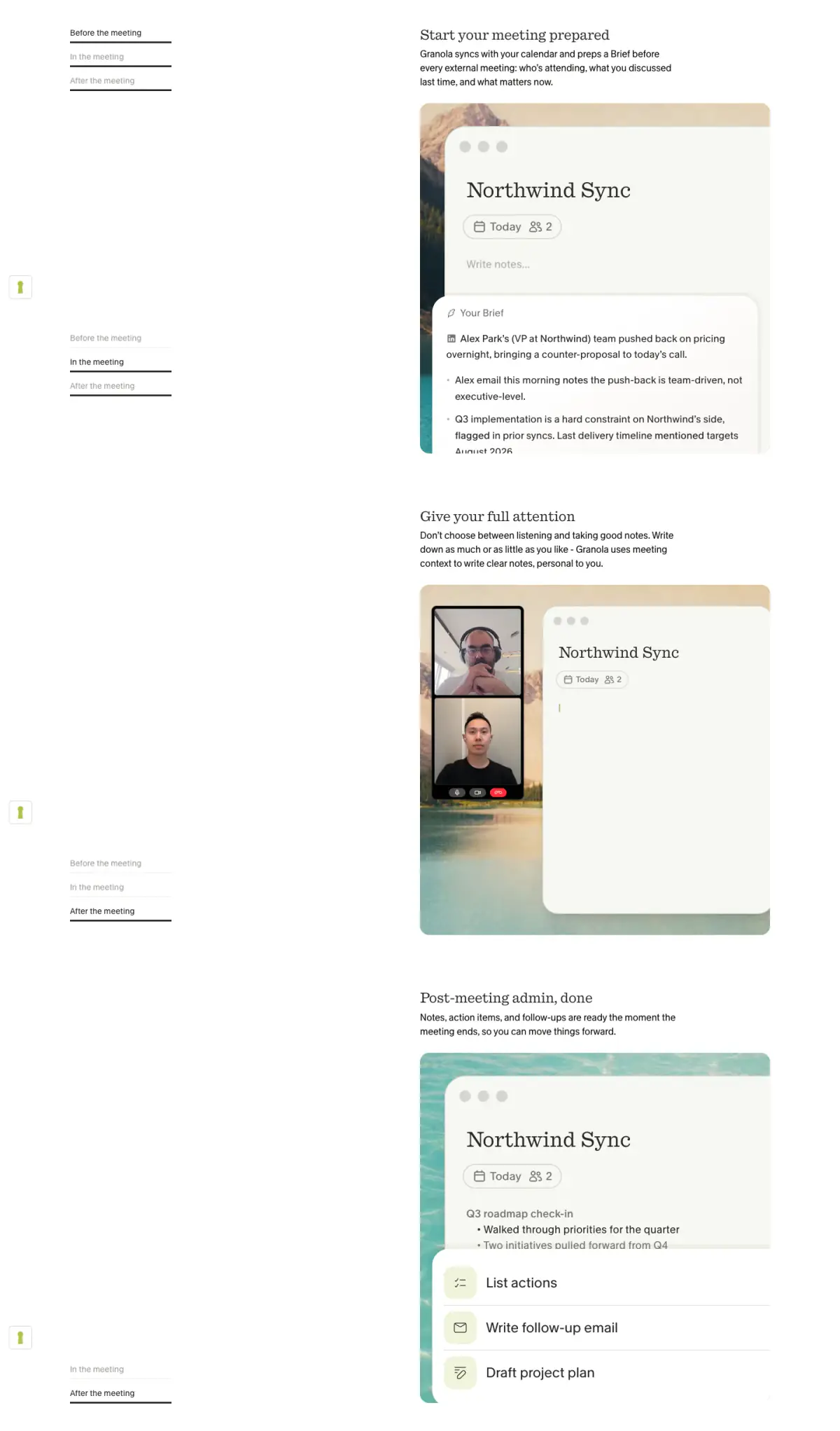
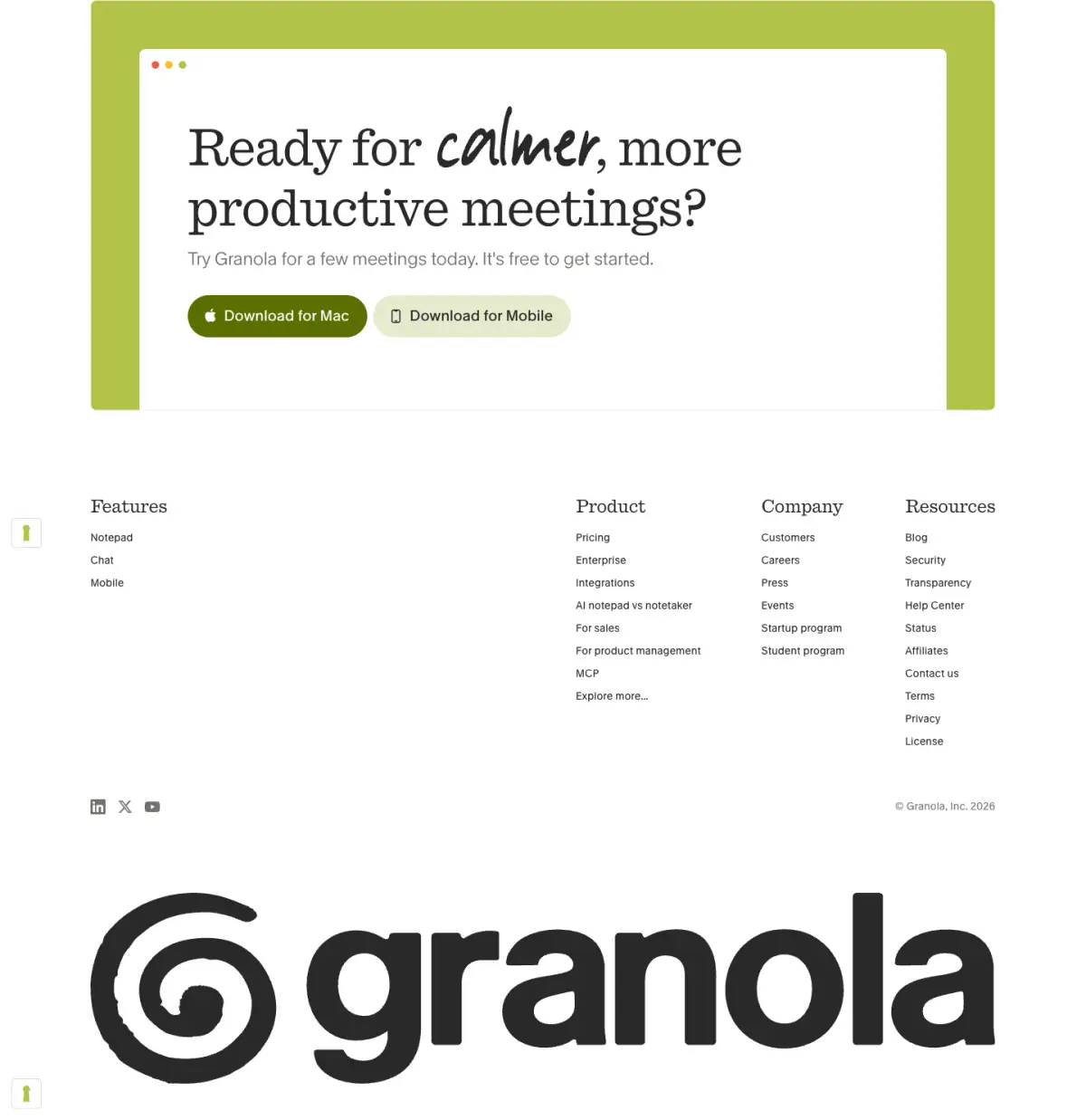
- Navigation Bar, Hero, Badge, Primary Button, Feature Collection, Testimonial Card, Stat Block, Footer, Interactive Feature Graphic, List Based Feature Description
- Score
- 53.25/100 · 100% evidence · Review pending
- Typography
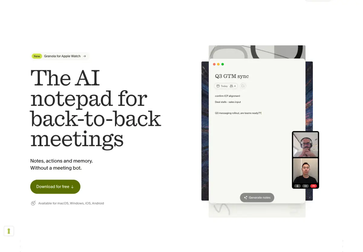
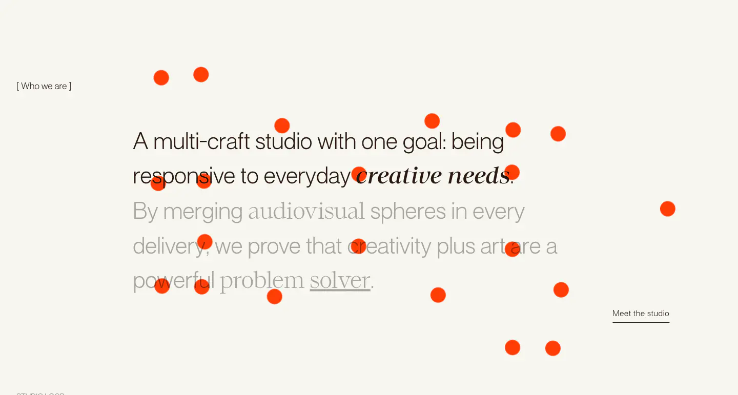
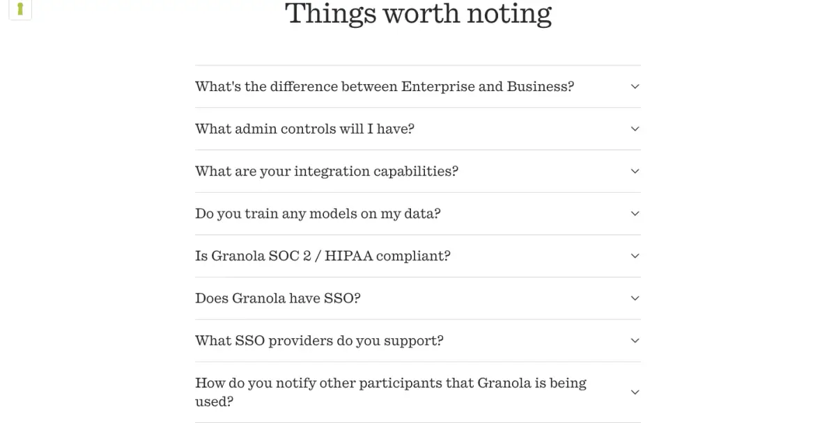
- Display — louize; Heading — louize; Body — lausanne
- Palette
- OG image

Design analysis
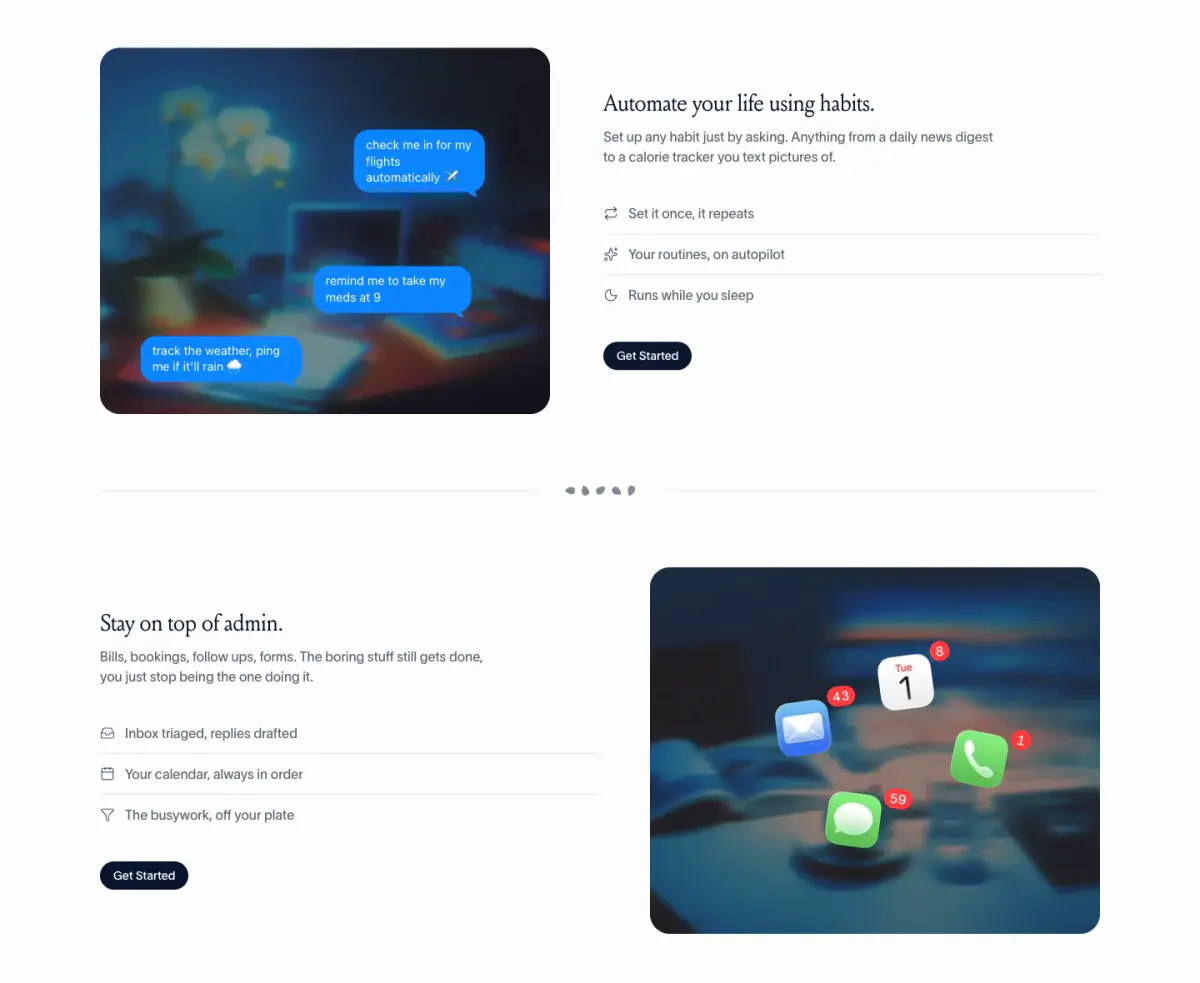
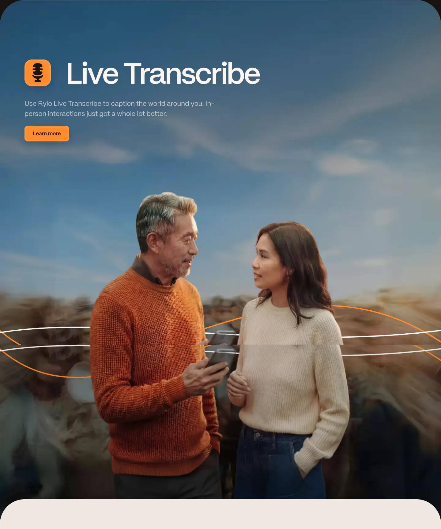
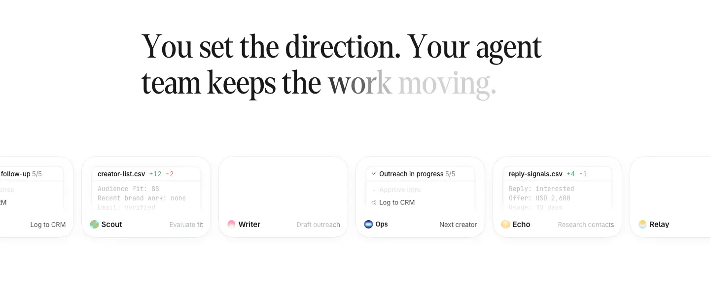
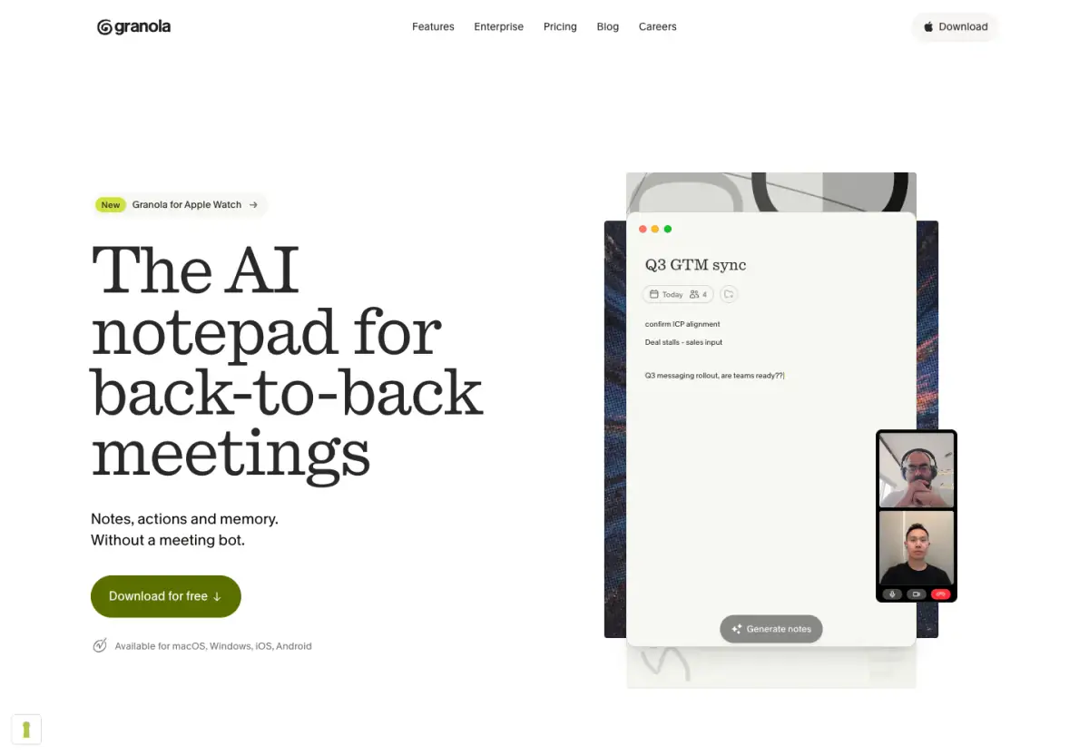
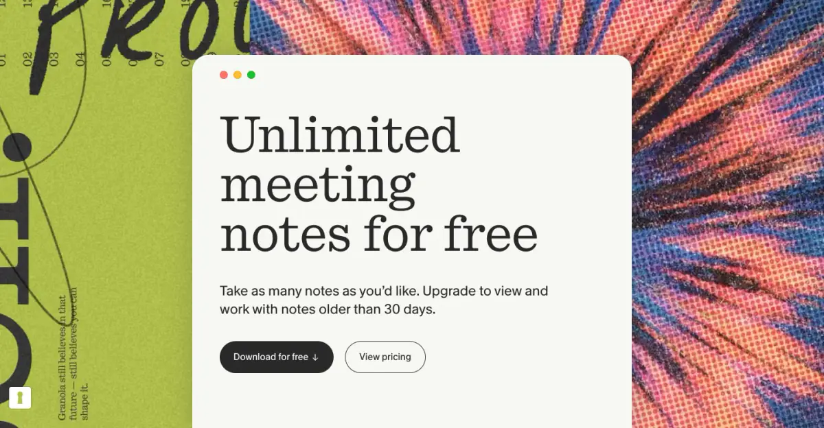
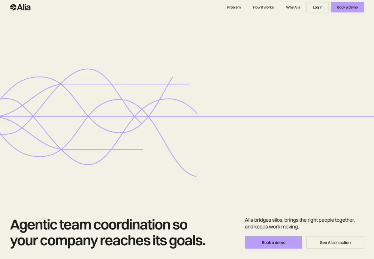
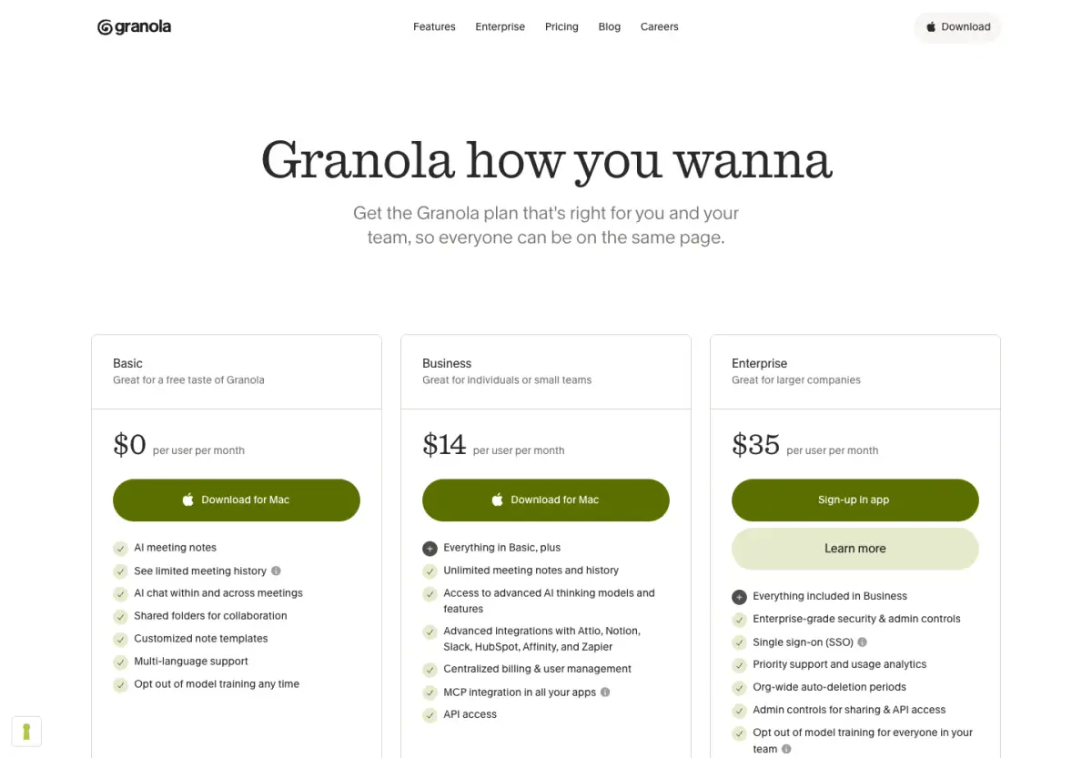
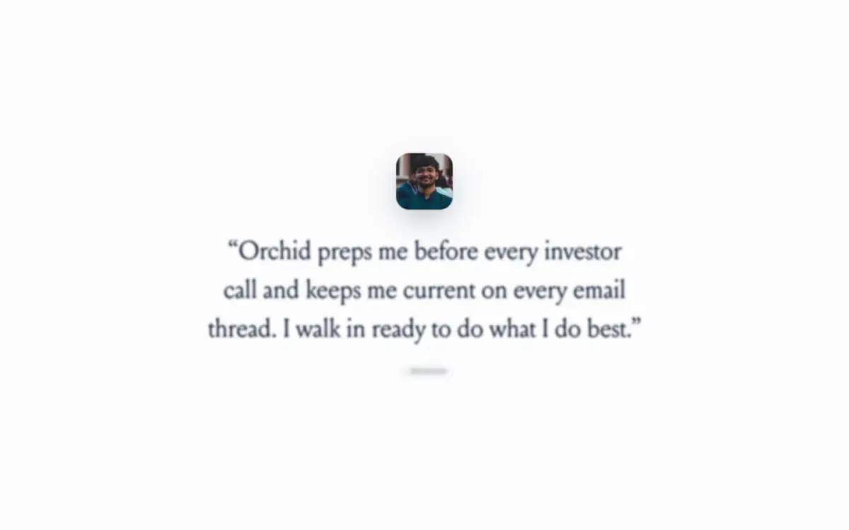
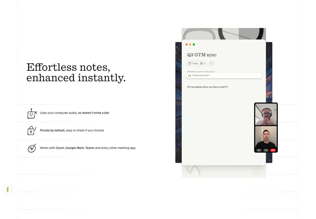
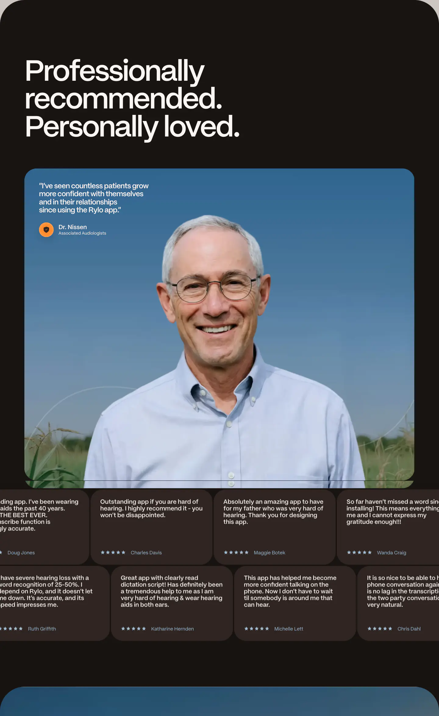
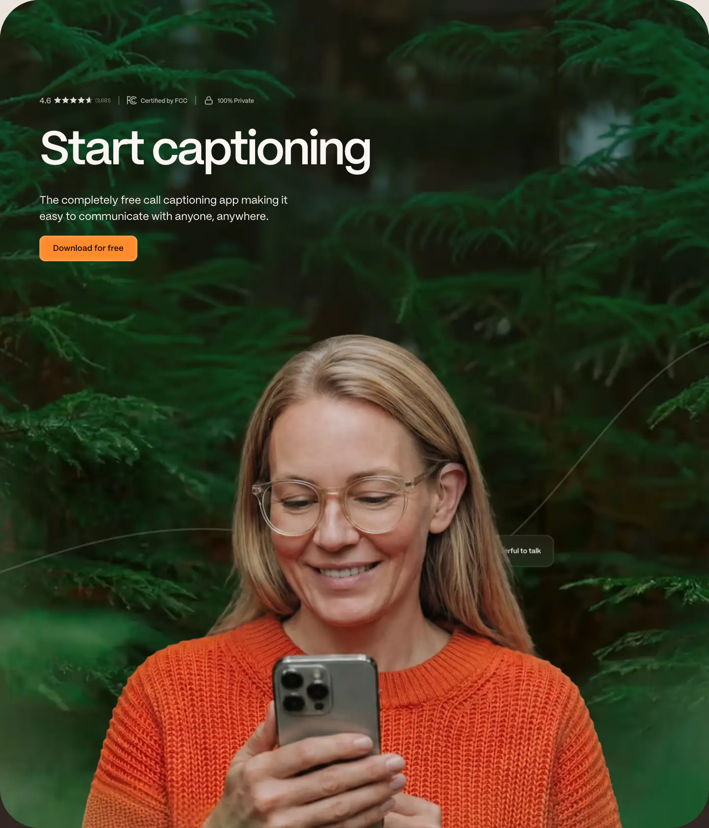
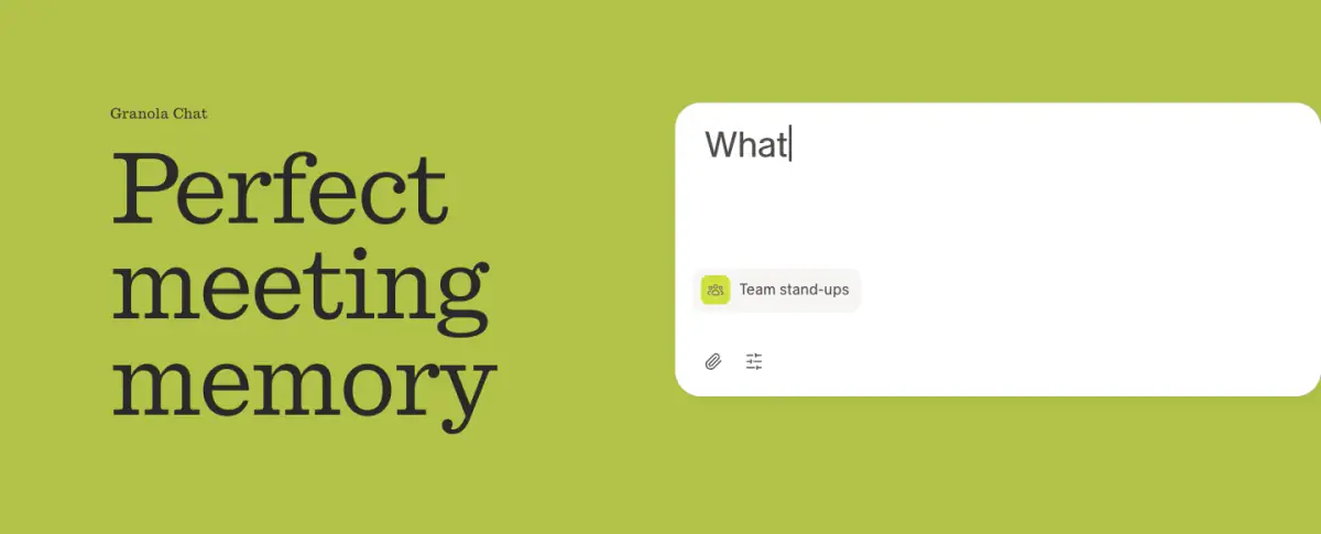
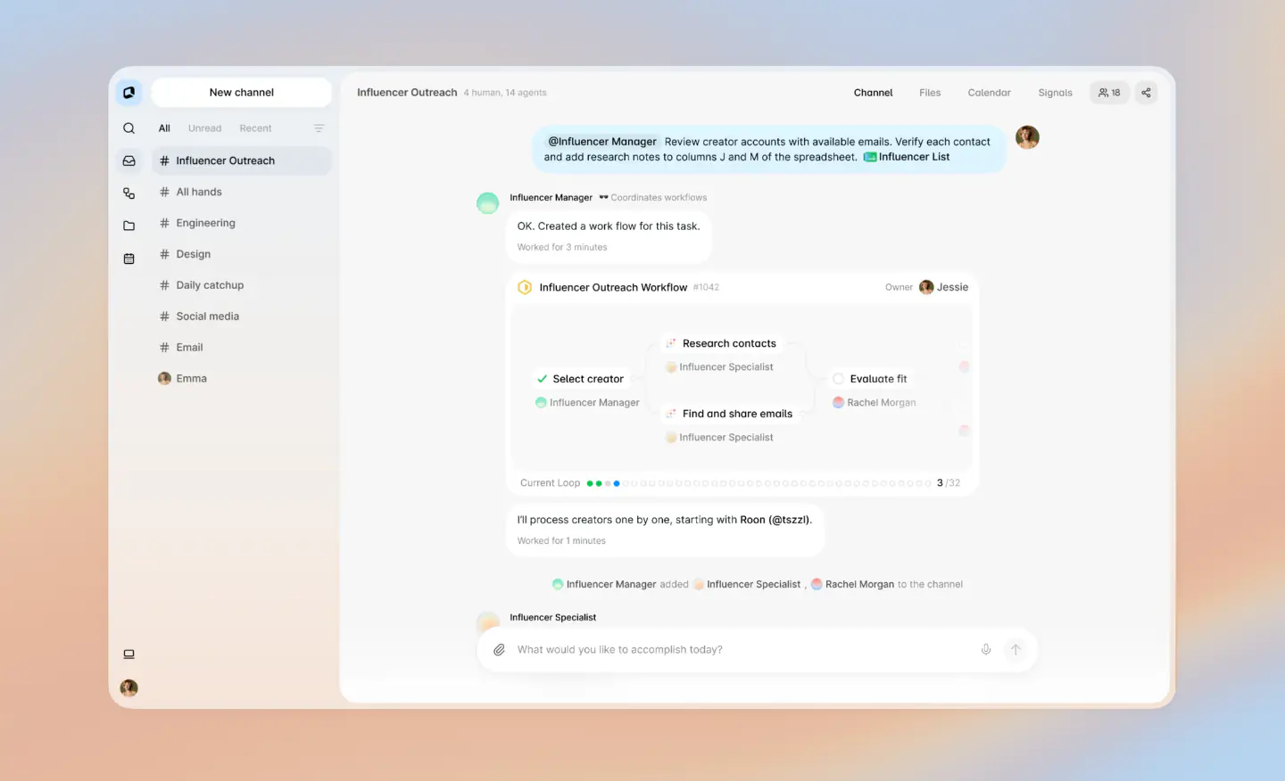
The design presents a clean, sophisticated, and modern SaaS landing page. It relies heavily on editorial typography, featuring a prominent serif typeface for headings paired with a crisp sans-serif for body copy. The layout is spacious with generous whitespace, centered content blocks, and large, soft-rounded feature graphics that simulate mobile UI interactions. The color palette is minimal, mostly monochromatic dark blue on off-white, with subtle blue and green accents.
- Spacing
- Generous vertical spacing between sections, maintaining a relaxed, breathable rhythm.
- Shape
- Fully rounded (pill-shaped) buttons and badges, with large soft radii on feature image containers. Maximum border-radius for interactive elements; estimated 16px-24px for large feature cards.
- Borders
- Minimal borders, occasionally using very faint structural lines between list items.
- Buttons
- Solid dark background with white text, pill-shaped without visible borders or heavy shadows.
- Width
- Centered single-column layout for text, expanding slightly for split-feature blocks.
- Density
- Low density, favoring large typography and ample whitespace over tightly packed information.