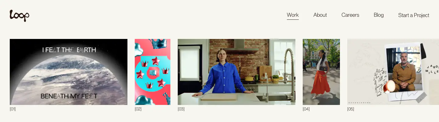
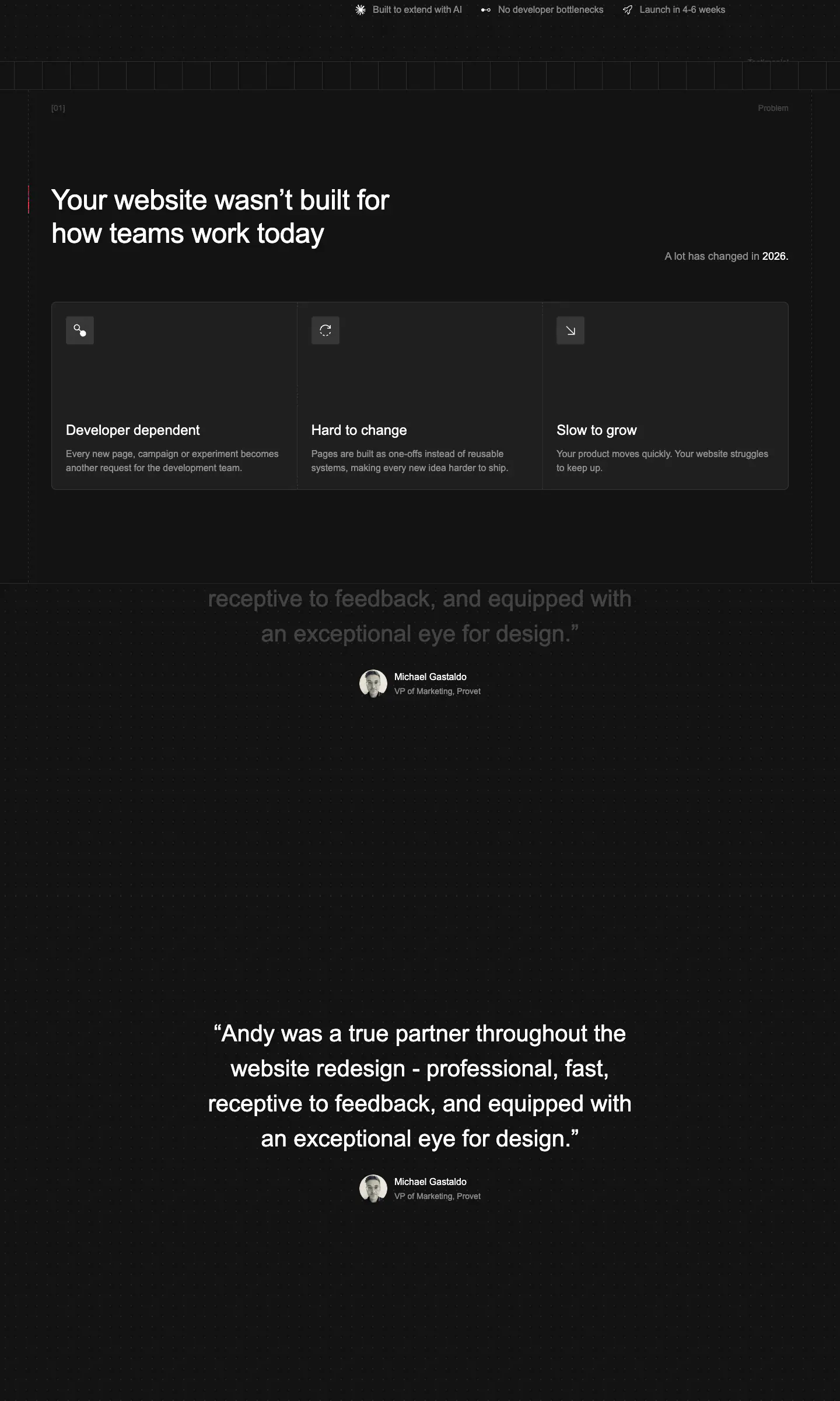
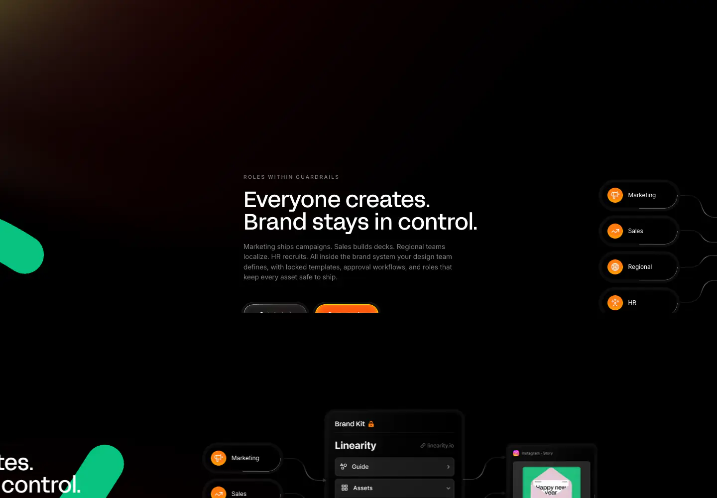
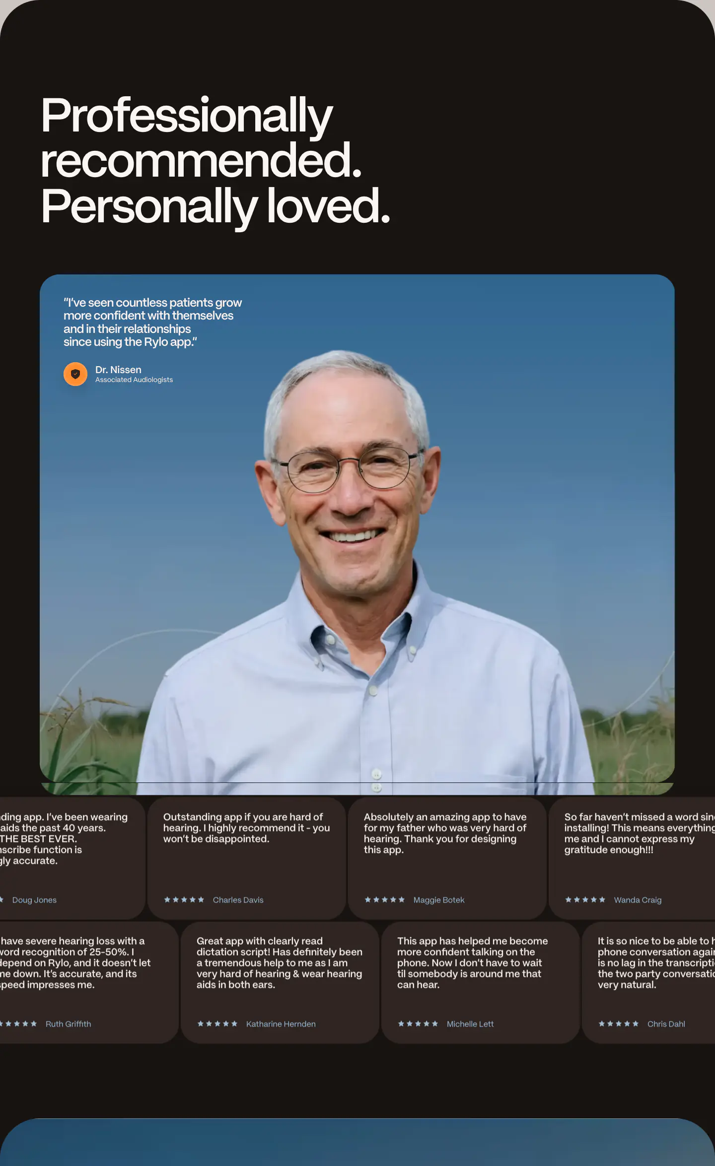
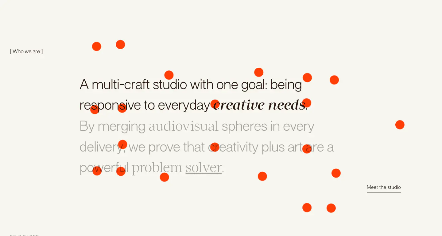
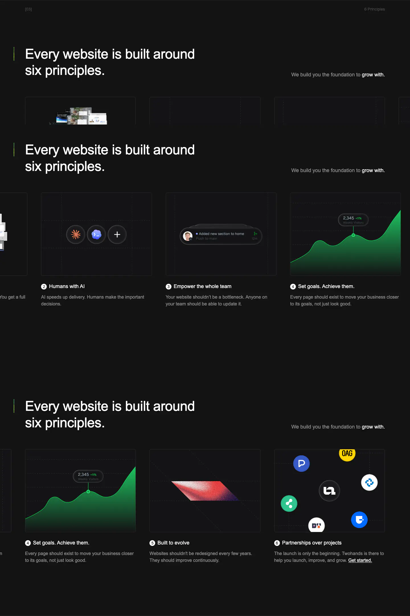
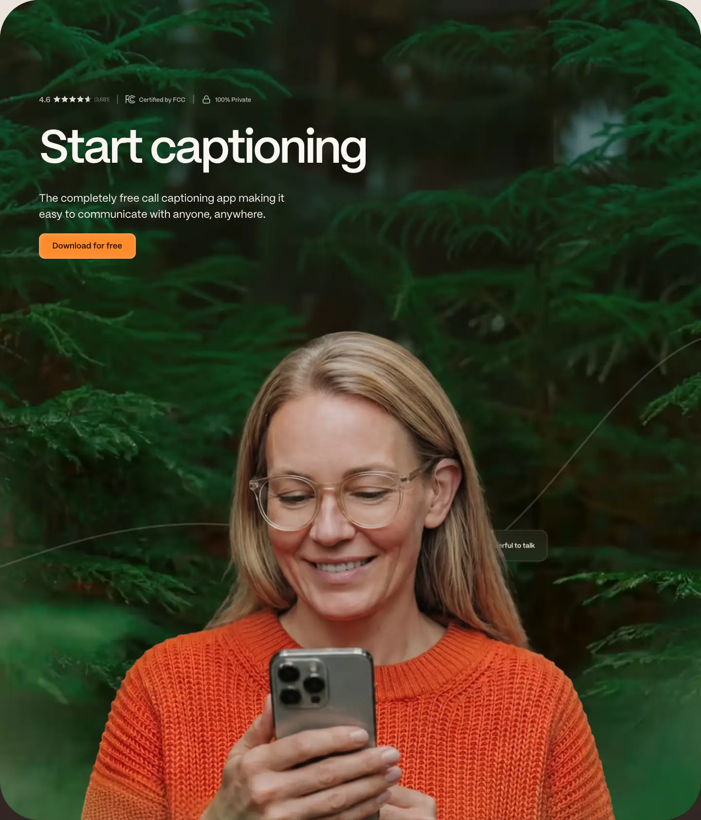
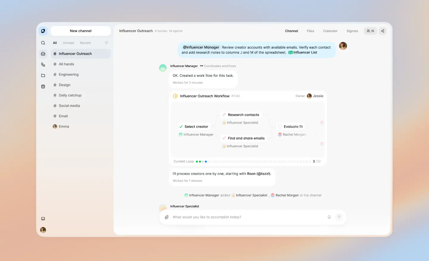
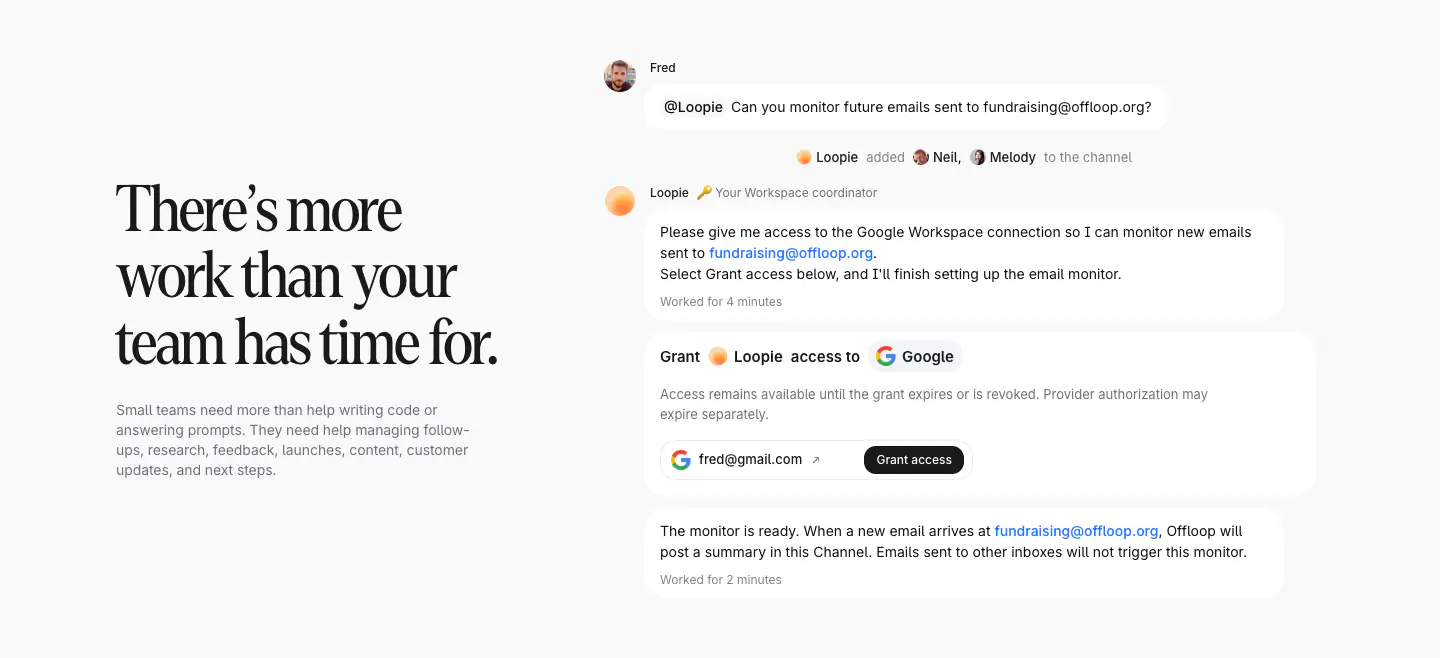
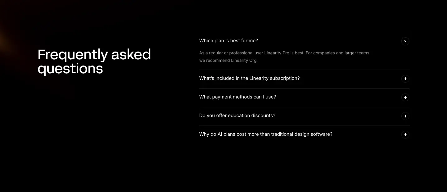
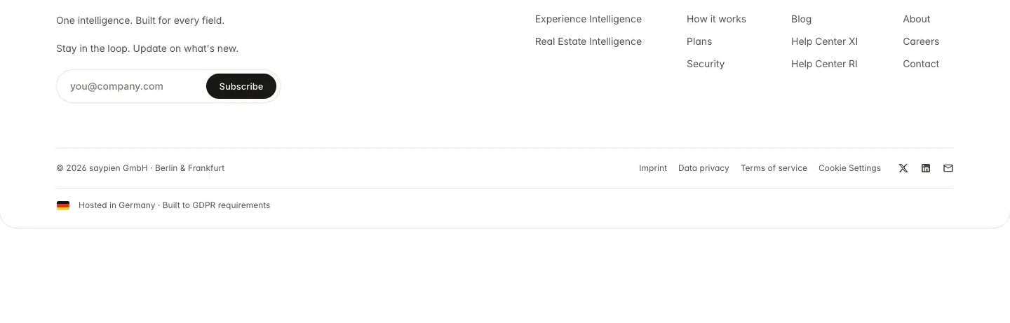
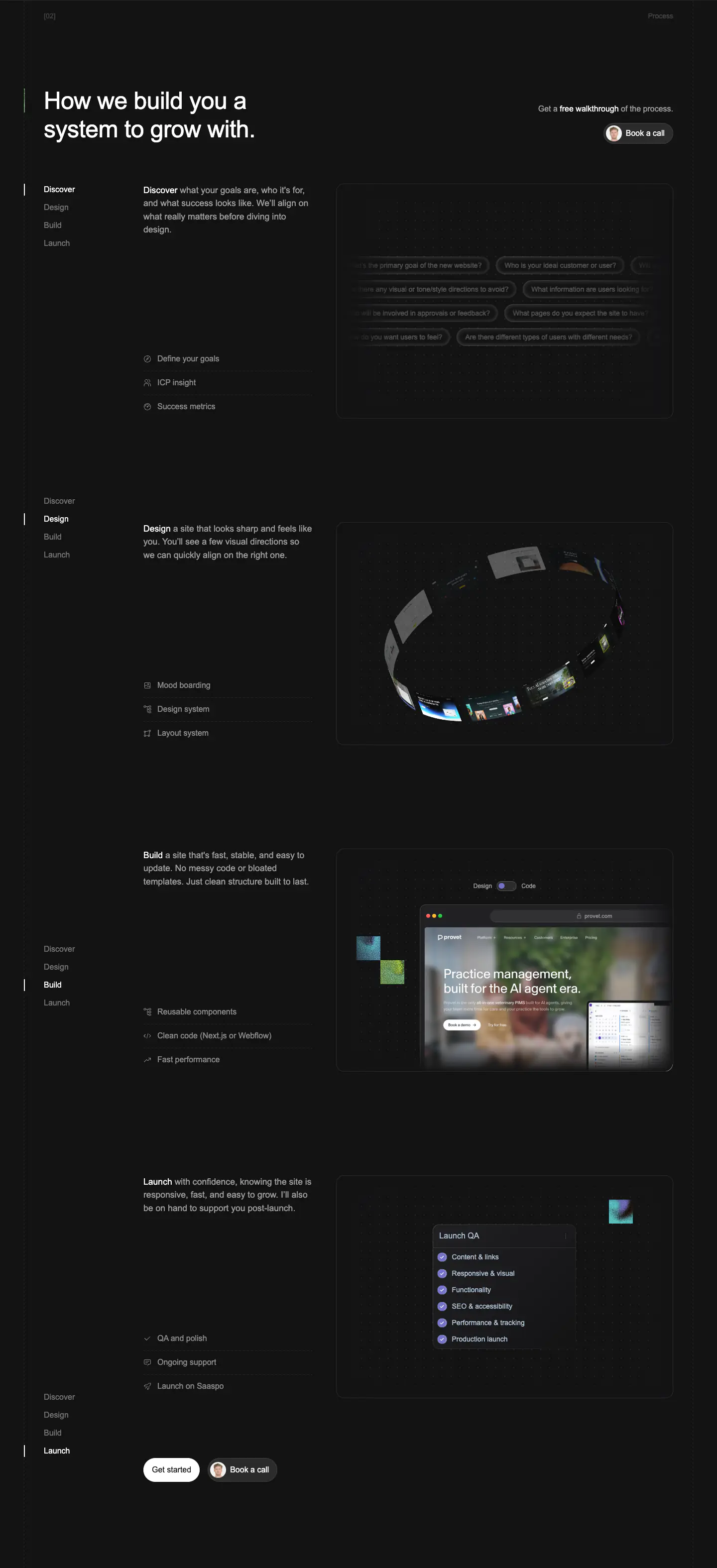
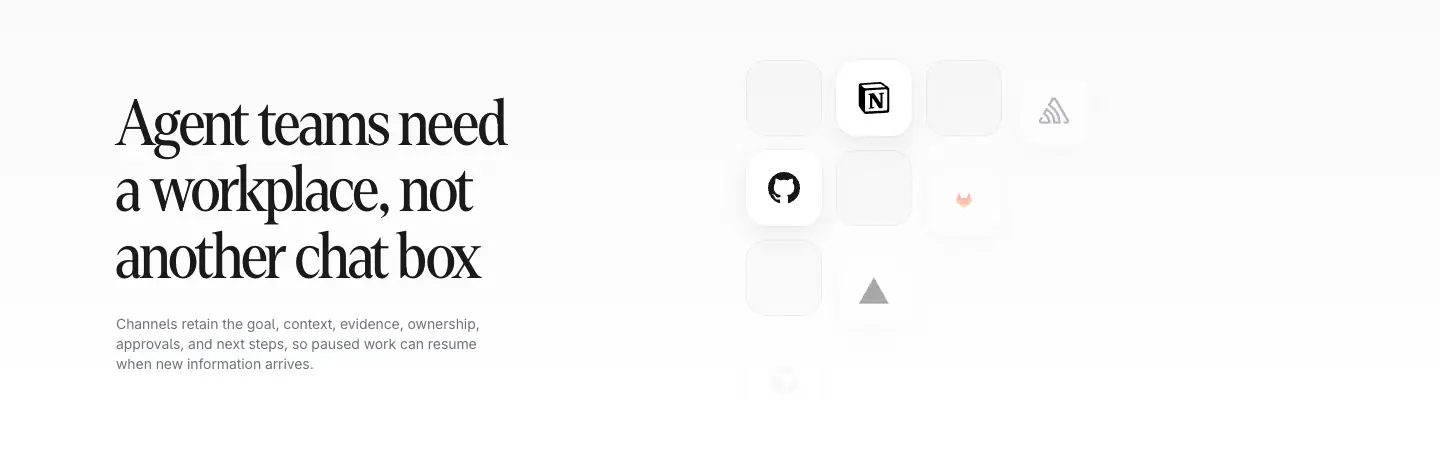
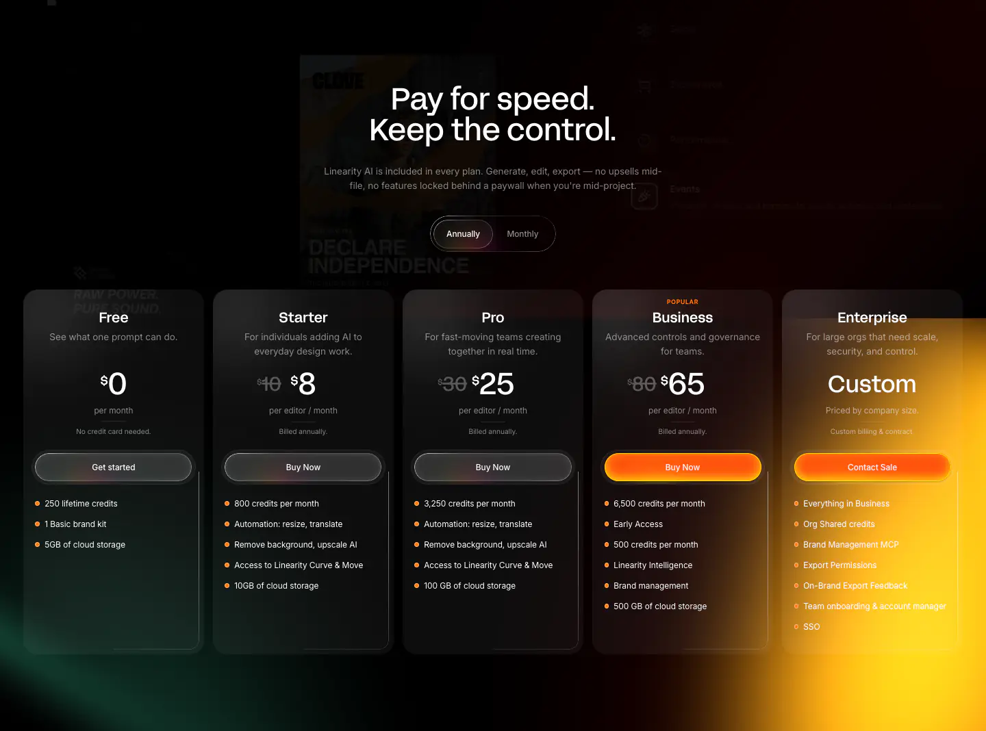
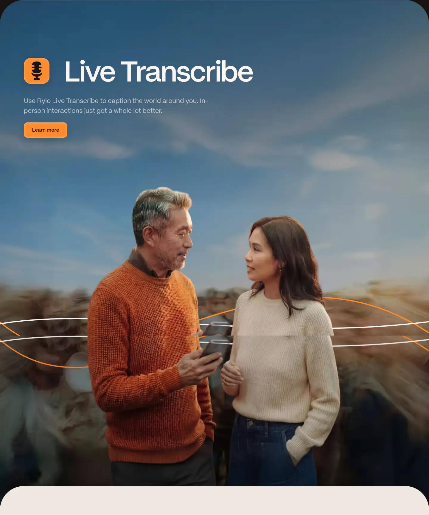
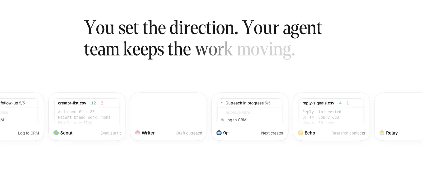
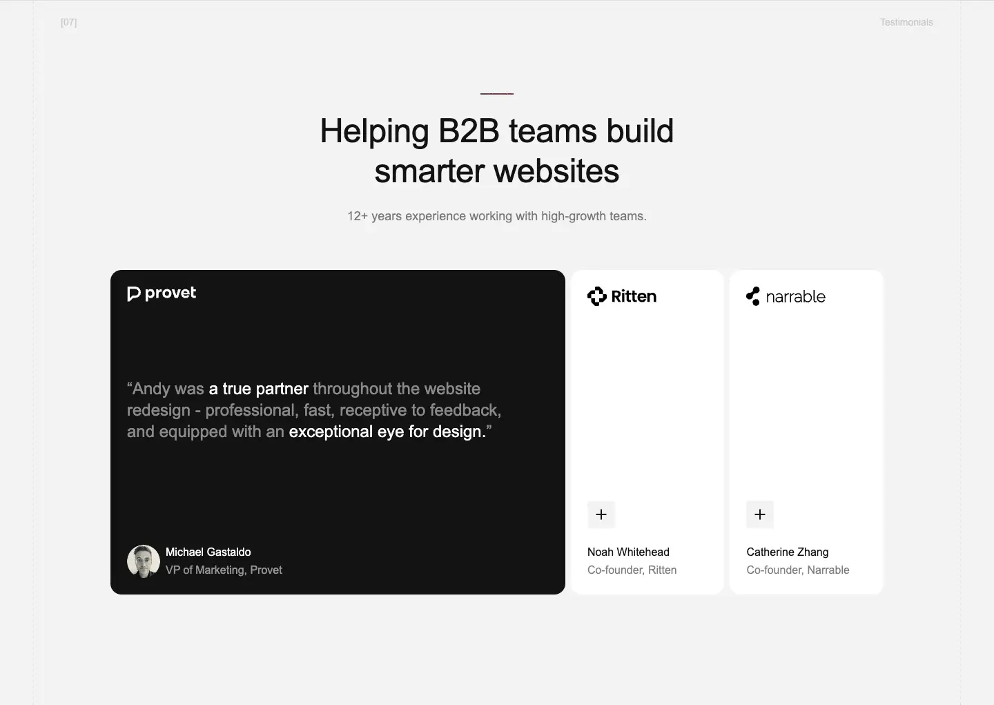
Studio Loop presents a highly creative and editorial design system. The visual language blends rich, grounded colors (warm browns, deep oranges) with off-white canvases (color-1, color-15) and playful, hand-drawn graphical elements. Typography relies heavily on neoFormaSans and neoFormaSerif, mixing clean geometric headings with italicized serif accents. The layout incorporates unconventional overlapping objects and dynamic horizontal scrolling to emphasize storytelling and 'looping' narratives.
- Spacing
- Sections are spaced widely with generous vertical padding, allowing large typography and images to breathe. Horizontal spacing is tight in the scrolling gallery.
- Shape
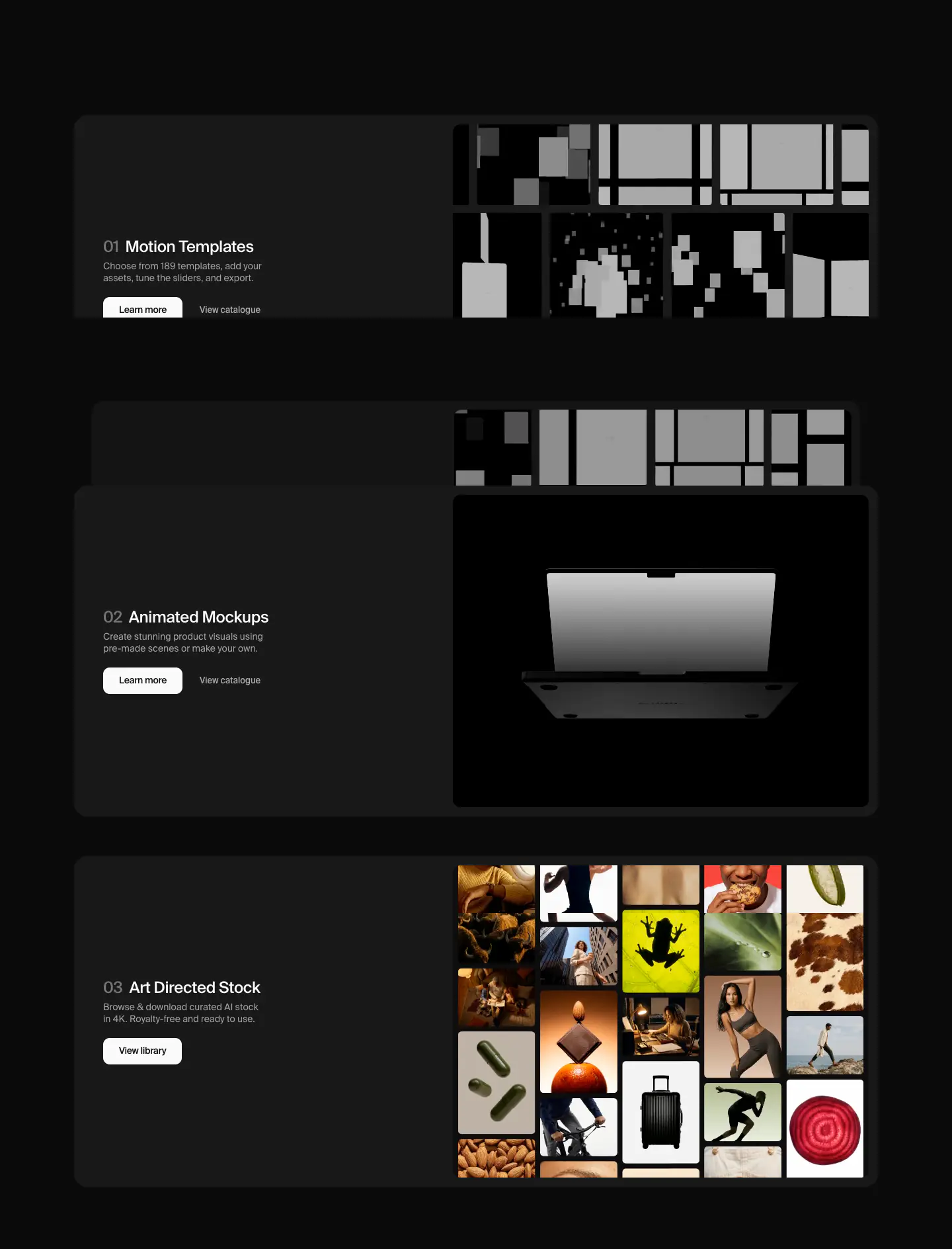
- Cards and video frames feature subtly rounded corners (visible on video placeholders and email input block). Border radii appear small-to-medium on the video frames and the newsletter form container.
- Borders
- Thin, subtle borders are used as dividers (e.g., separating the hero from the list, or underlining the email input).
- Buttons
- Buttons and interactive elements often lack traditional bounding boxes, relying on text style or subtle underlines, except for explicit forms.
- Width
- Content stretches across a wide grid, often extending near the edges of the 1440px viewport.
- Density
- The design feels open and airy in typography sections, but becomes dense and layered in the hero composition and horizontal scroll areas.