- Industry
- Technology
- Site type
- Landing
- Platform
- Custom code
- Tech
- React, Astro, GSAP
- Style
- Soft, Editorial, Minimal, Warm Toned
- Business model
- AI
- Presence
- Online
- Components
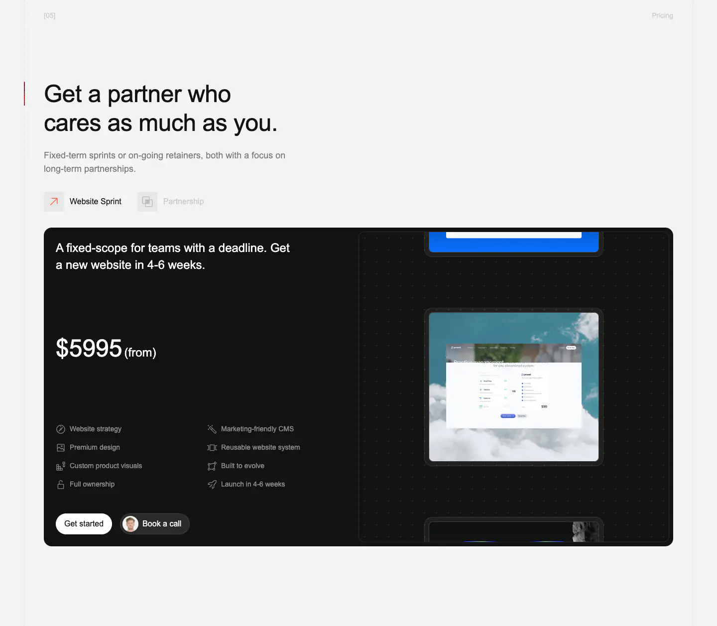
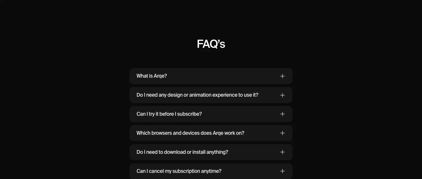
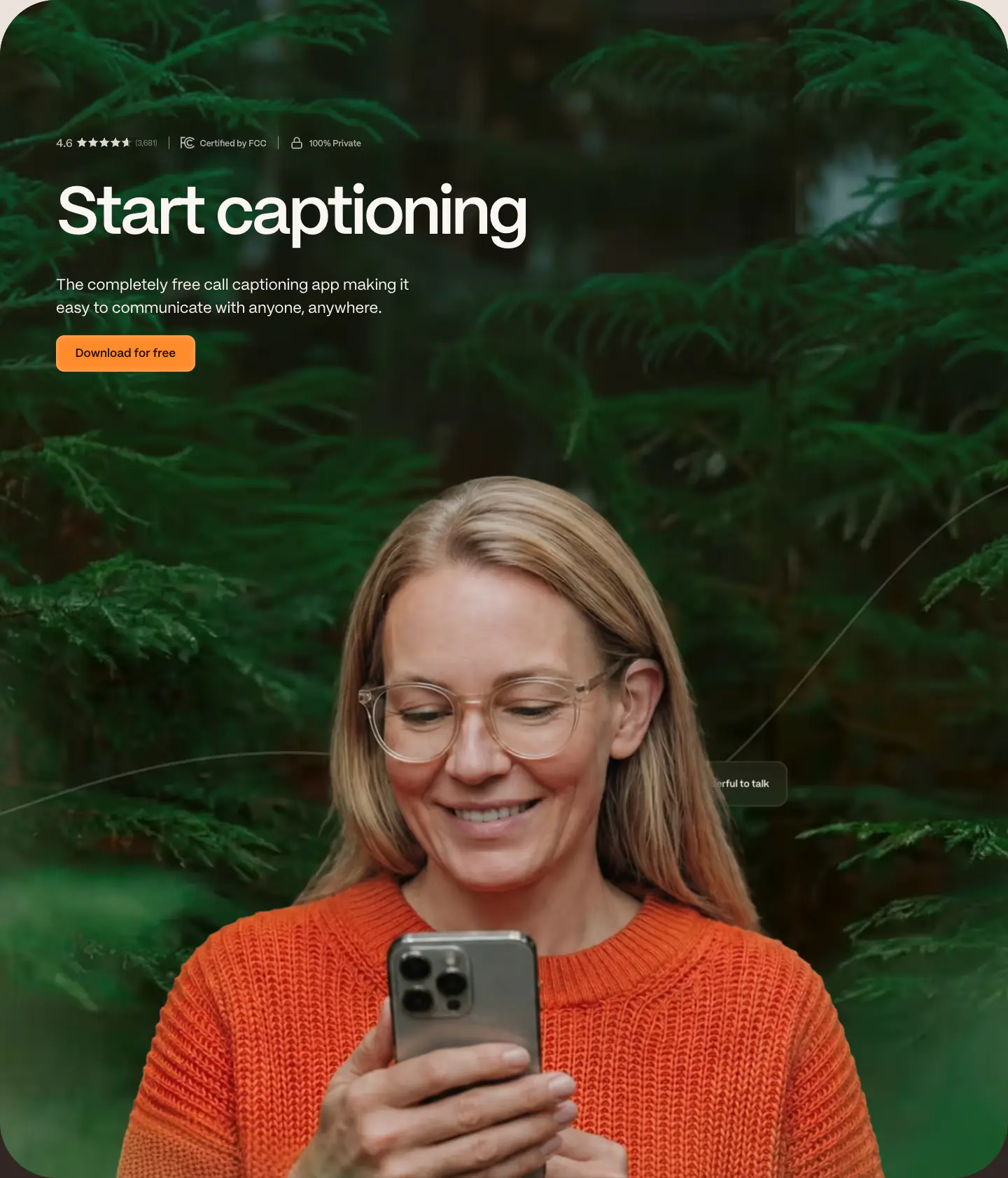
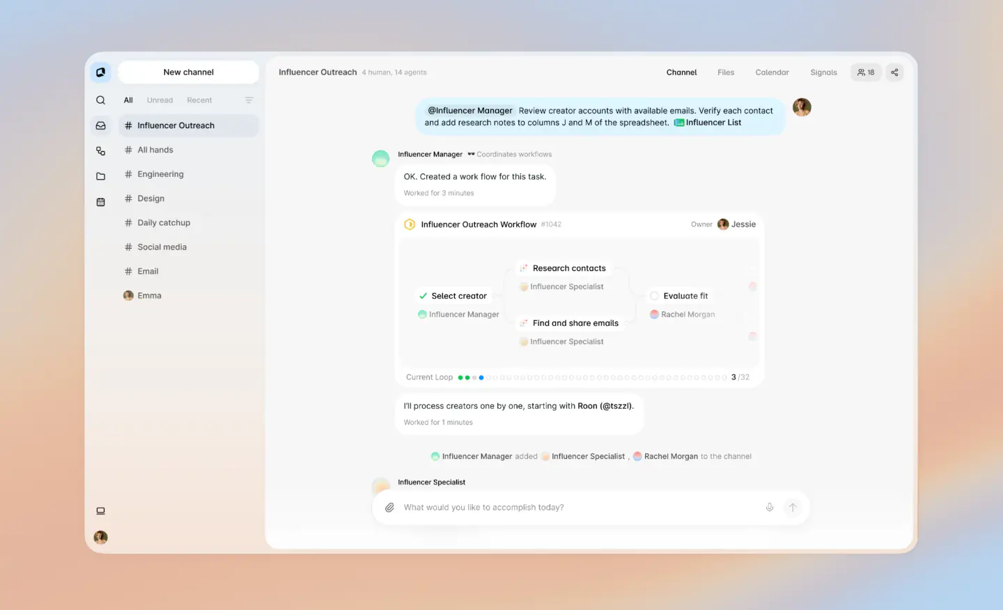
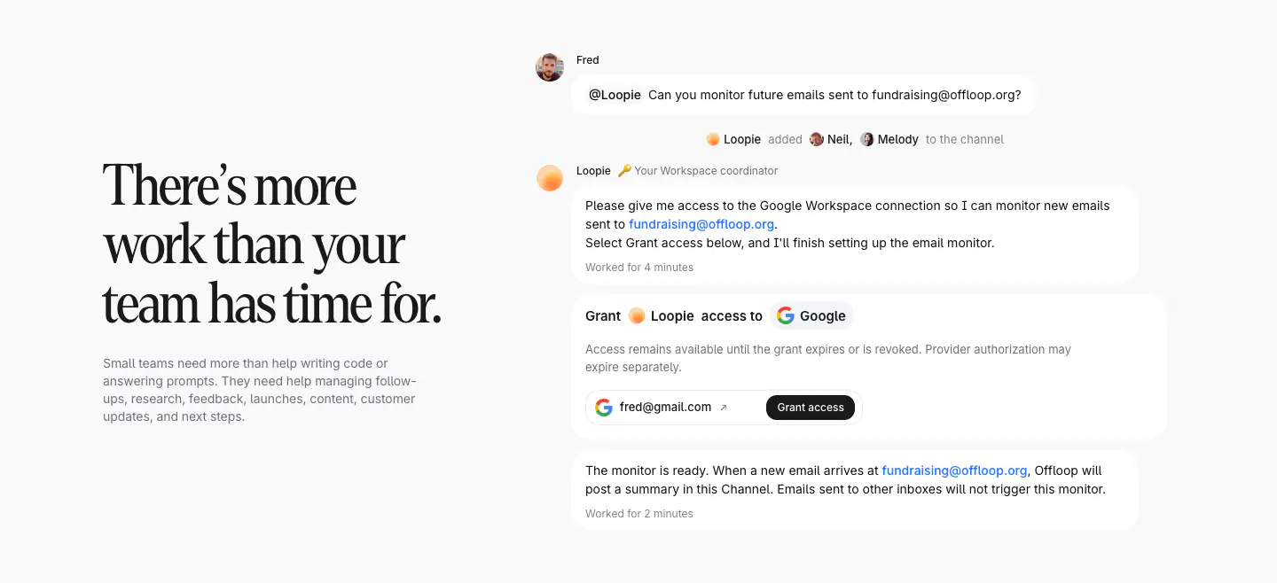
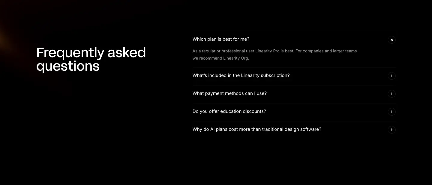
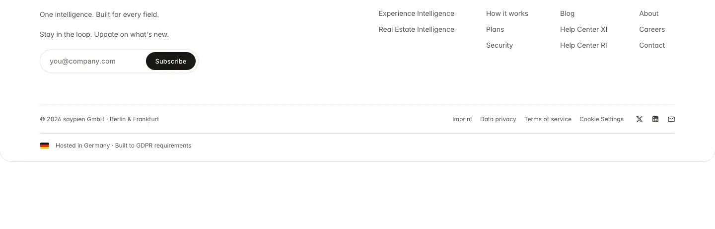
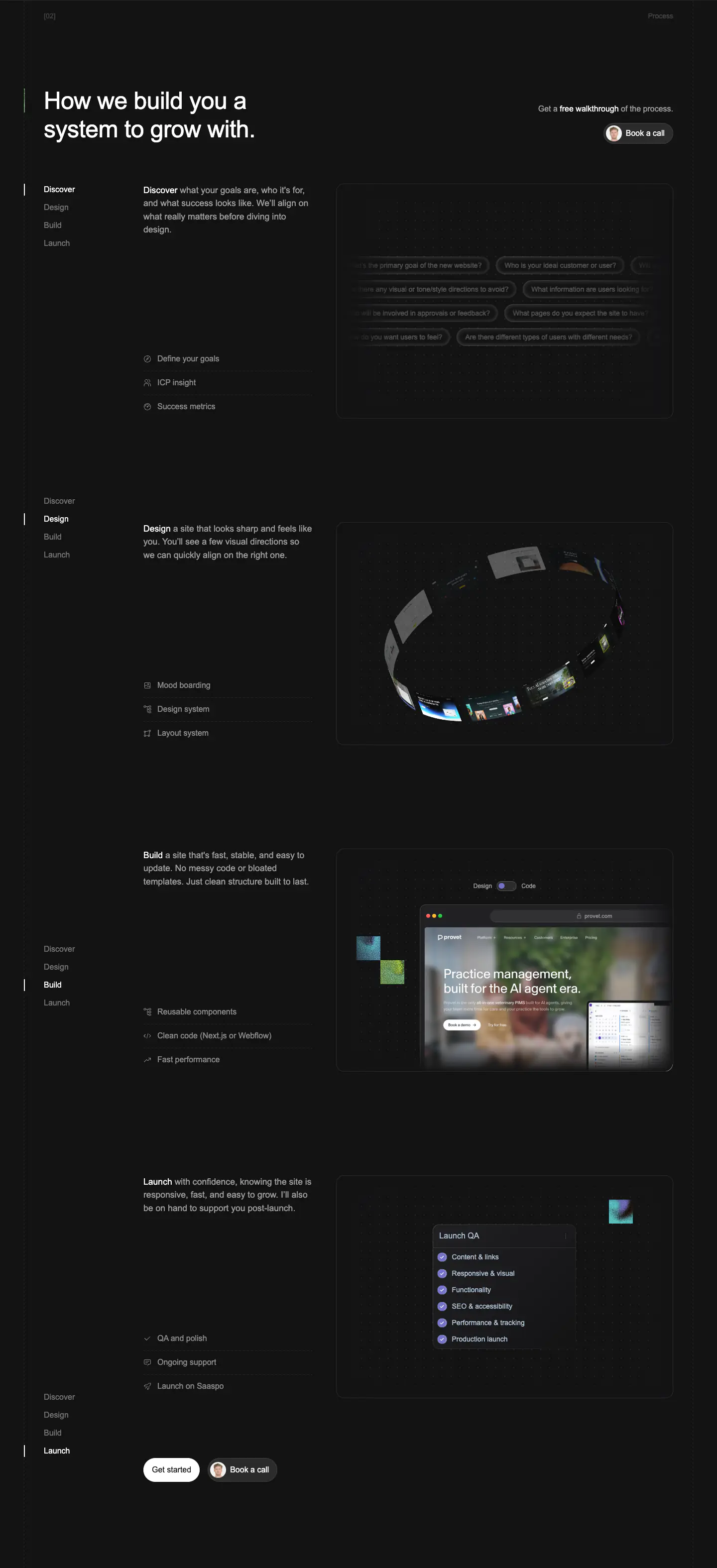
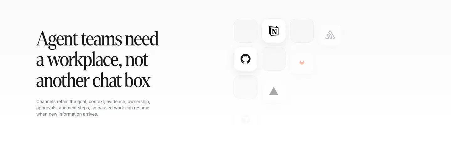
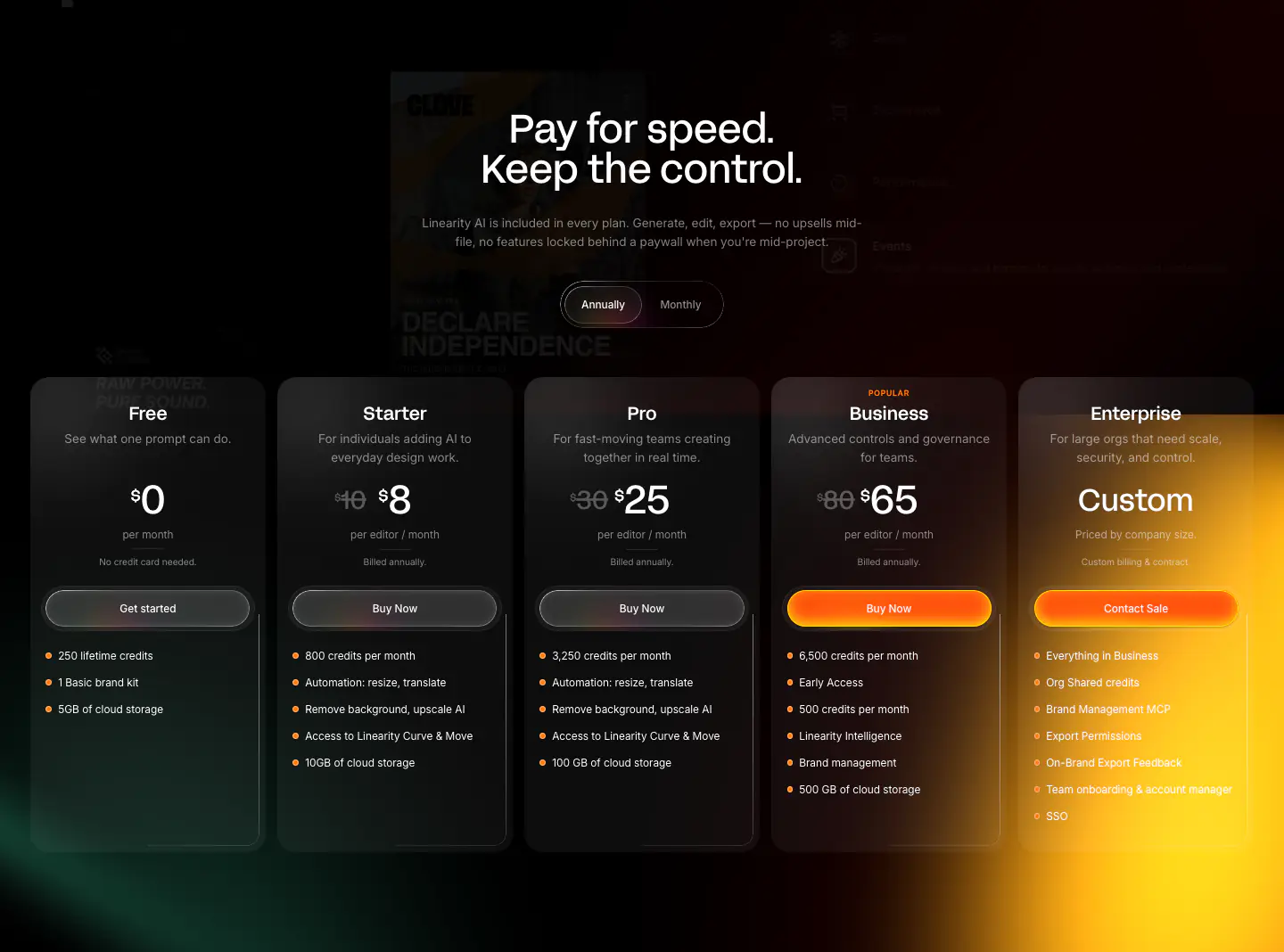
- Navigation Bar, Hero With Background Imagery, Logo Strip, Feature Card, Testimonial Card, Primary Button, FAQ Accordion, Footer, Feature Mockup Container
- Score
- 48.5/100 · 100% evidence · Review pending
- Typography
- Display — PP Mori; Heading — PP Mori; Body — PP Mori
- Palette
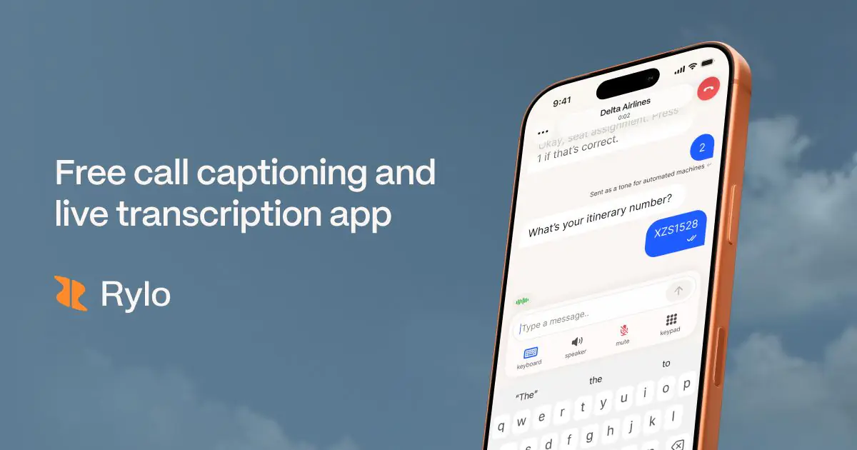
- OG image
Design analysis
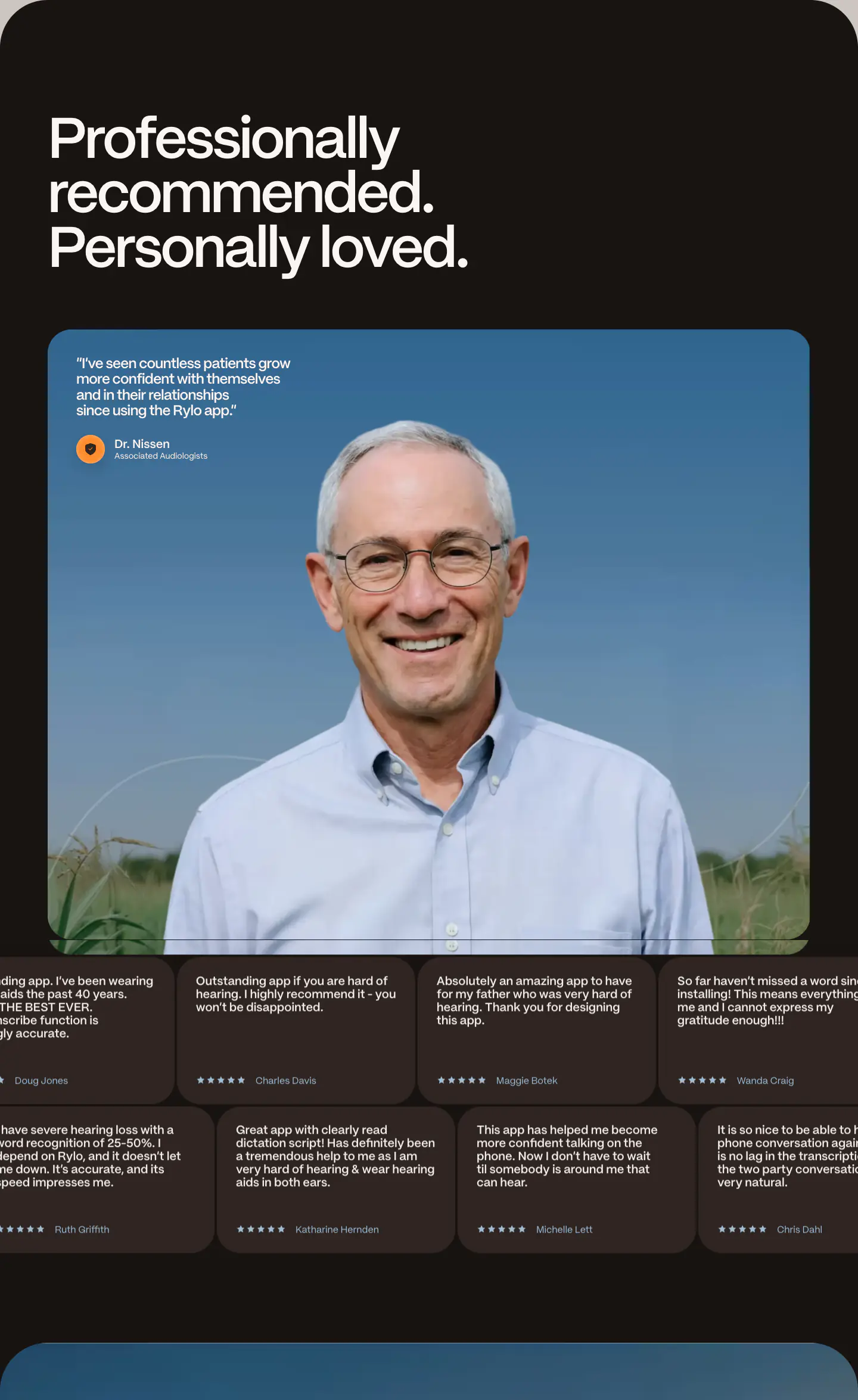
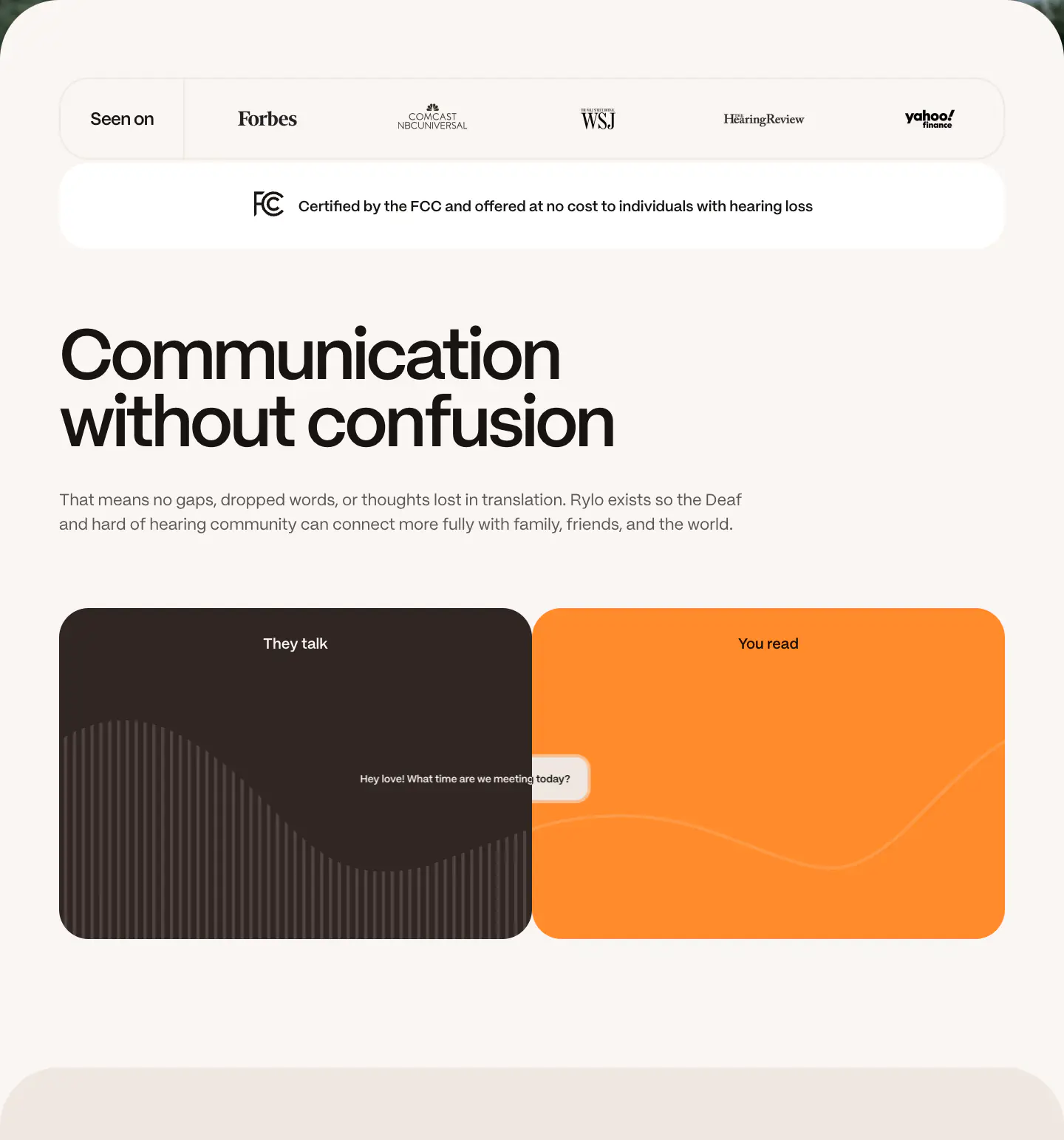
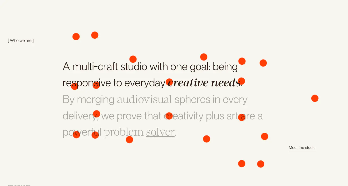
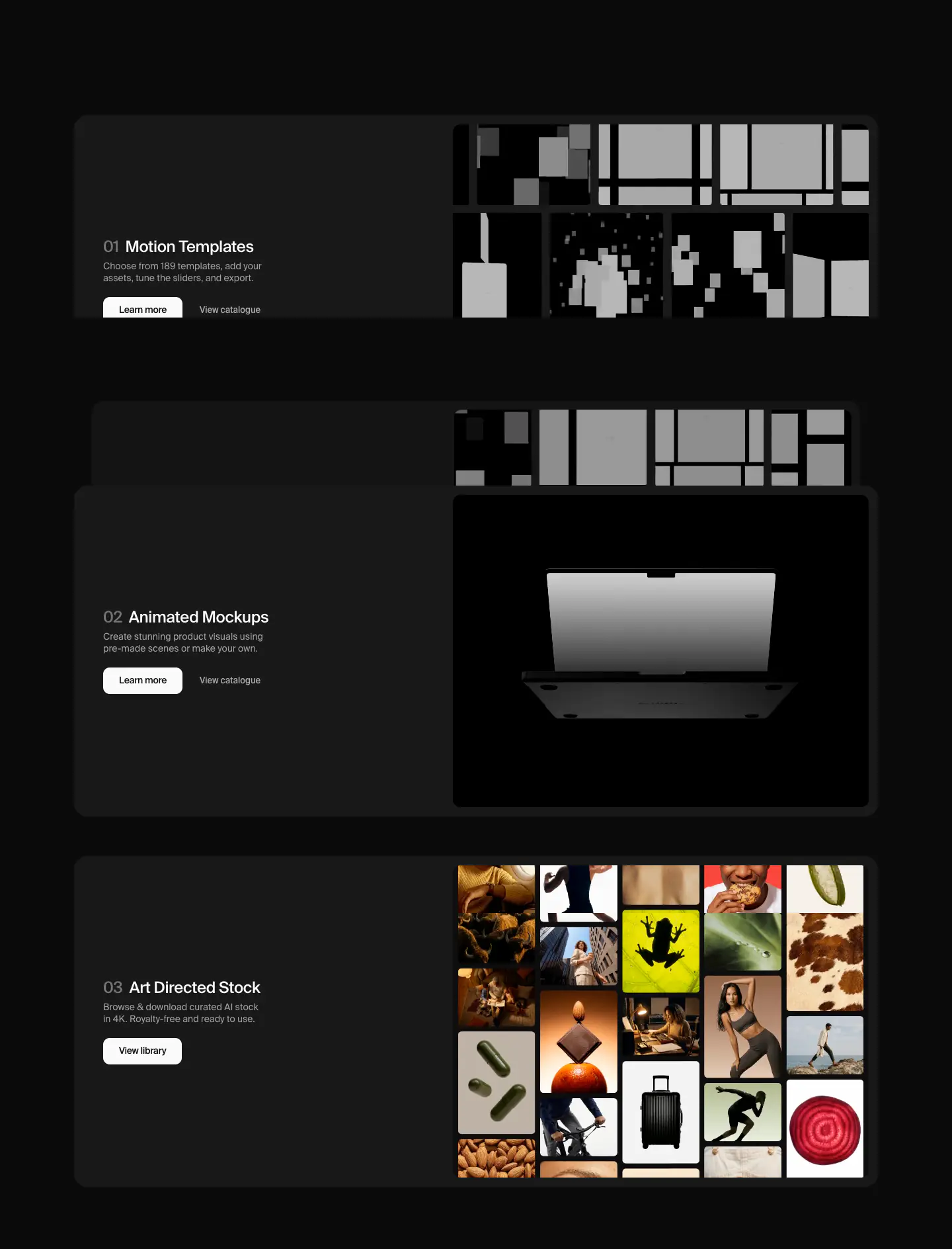
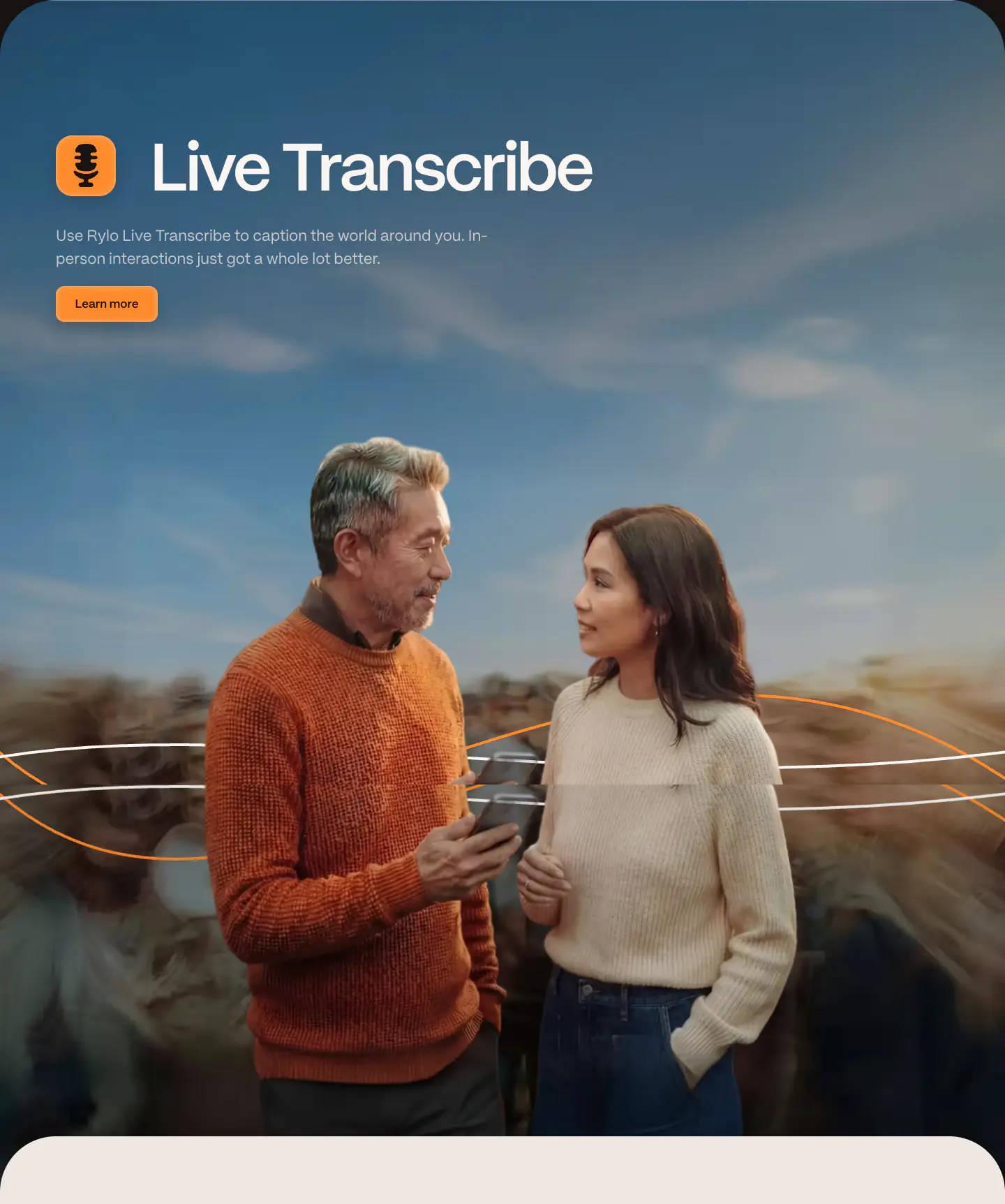
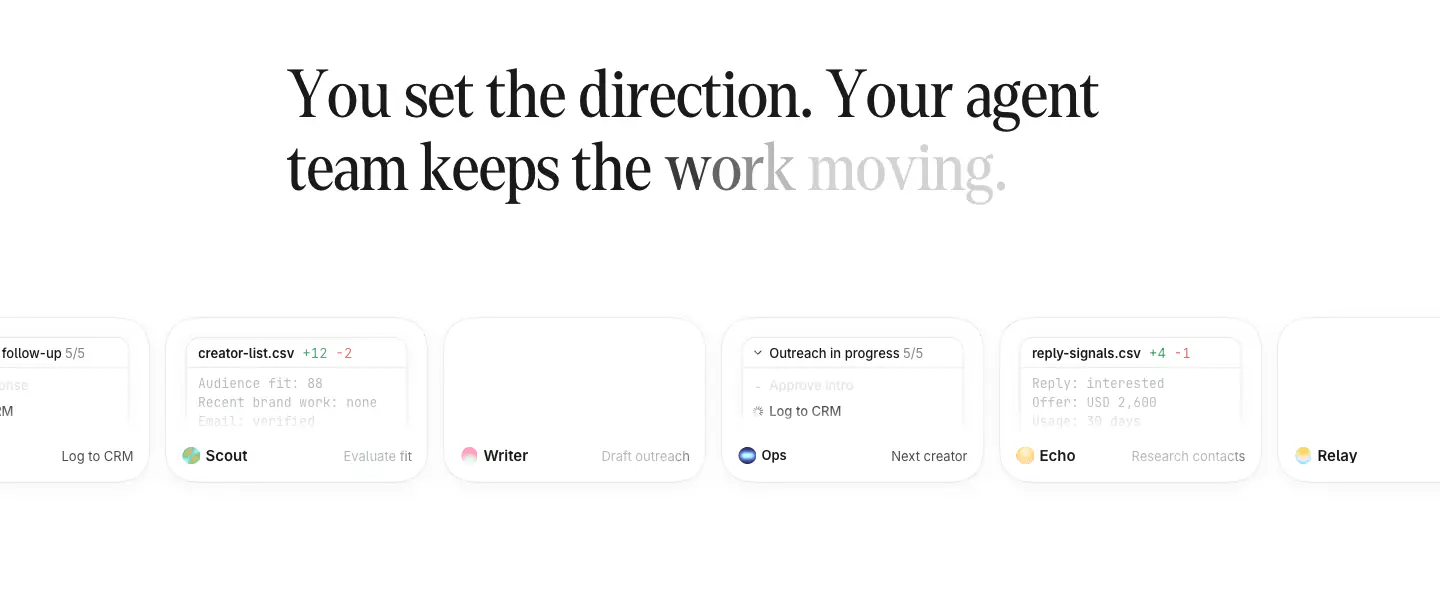
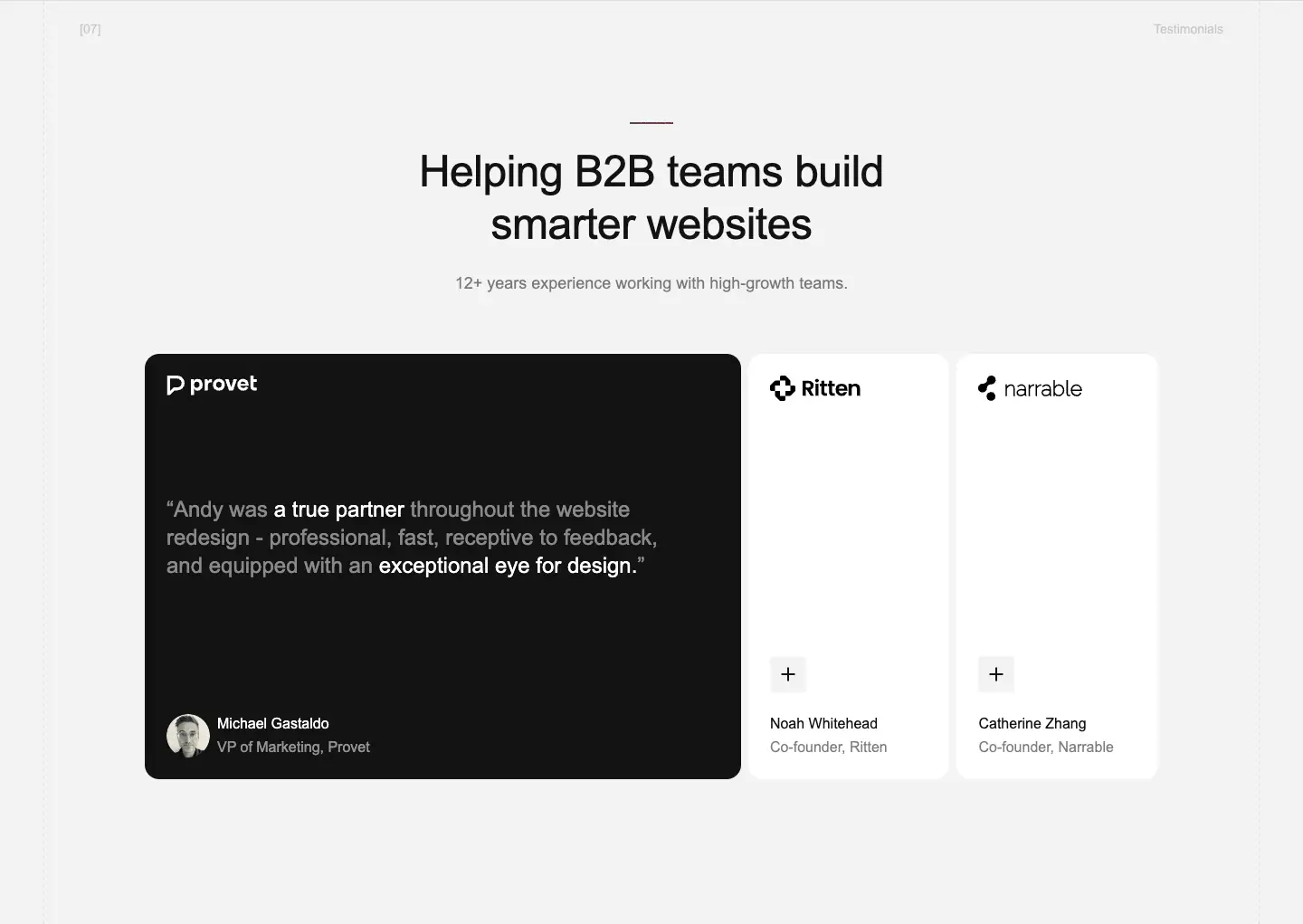
The Rylo website employs a soft, editorial style with a muted, warm colour palette featuring creams, soft browns, and a vibrant orange accent. Typography relies heavily on 'PP Mori', a sans-serif used in varying weights and sizes, contributing to a modern, approachable feel. Design tokens are characterised by large, rounded corners on containers, generous spacing, and a clean, spacious layout. Visual components include prominent hero sections with imagery, feature cards with subtle icons, and a dark-themed footer that contrasts with the primary light canvas.
- Spacing
- Generous vertical spacing between sections, often utilizing wide margins and padding to separate distinct content blocks.
- Shape
- Highly rounded corners on almost all structural elements, including buttons, cards, and major layout containers. Large border radii, evident in the main content blocks and feature cards.
- Borders
- Generally borderless, relying on background colour contrast to define shapes.
- Buttons
- Solid fill with rounded corners, primarily utilizing the brand orange for primary actions.
- Width
- Contained within a central column for text readability, but background containers and images often stretch full-width or break out of strict grid bounds.
- Density
- Low density, breathable layout with substantial whitespace.