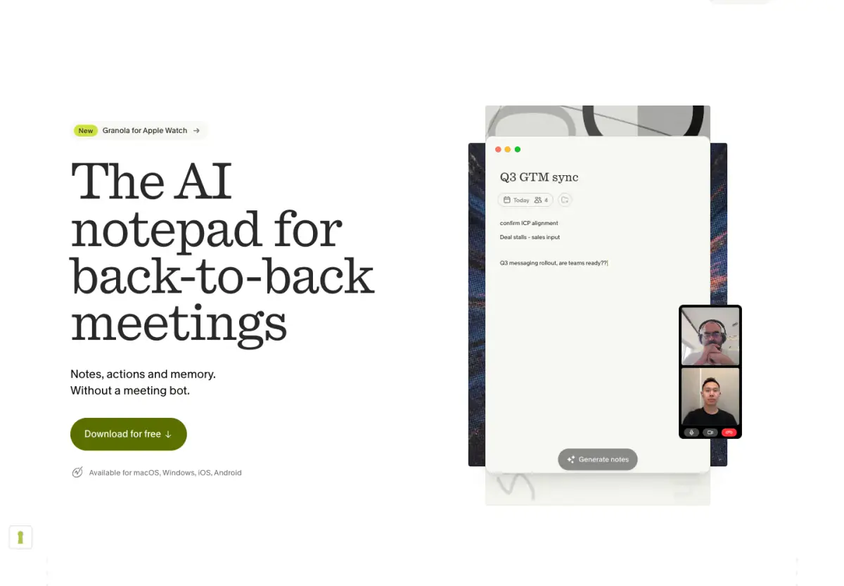
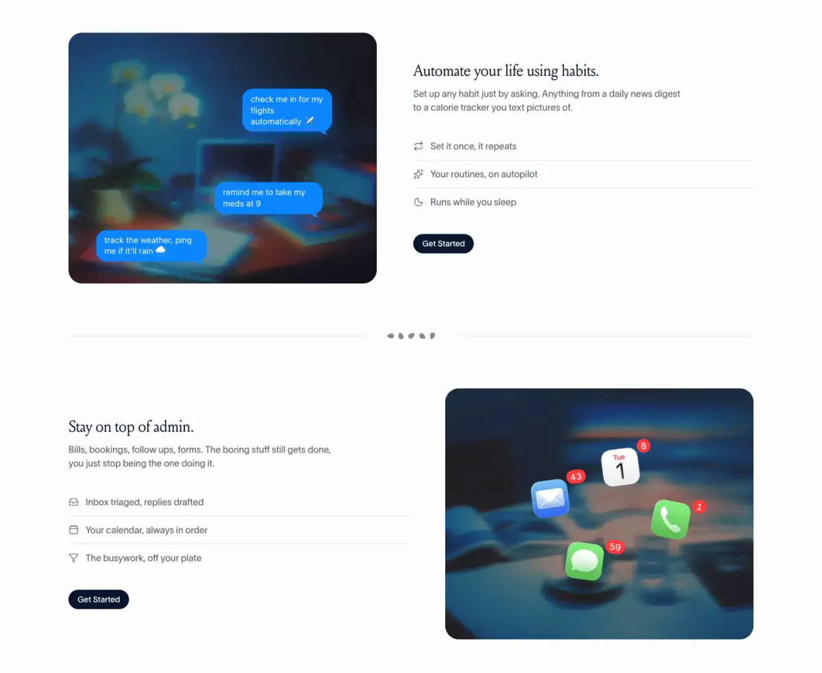
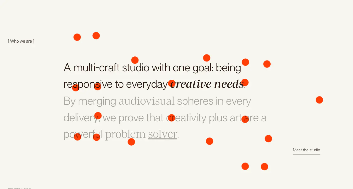
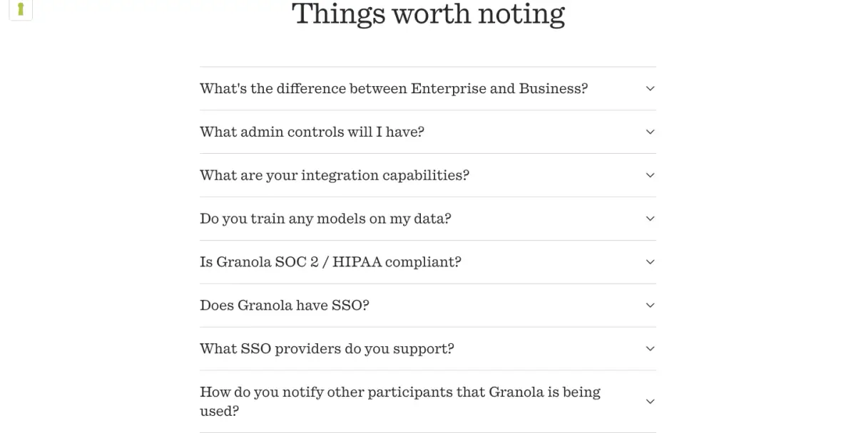
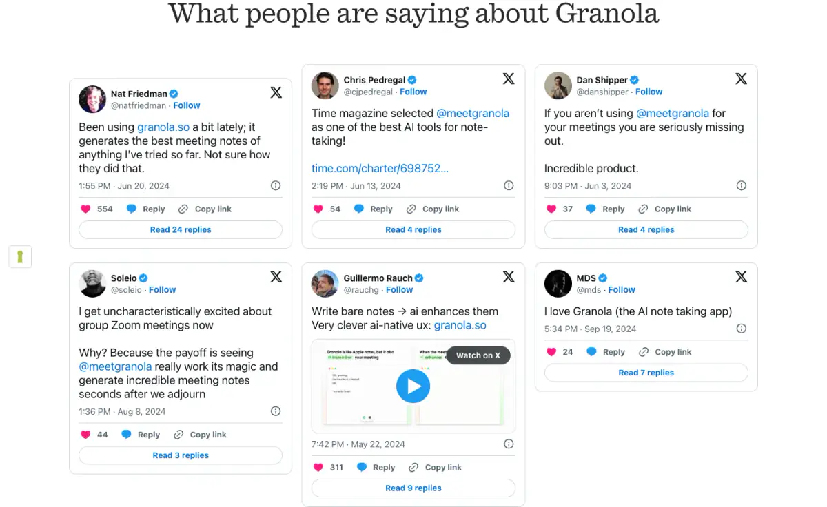
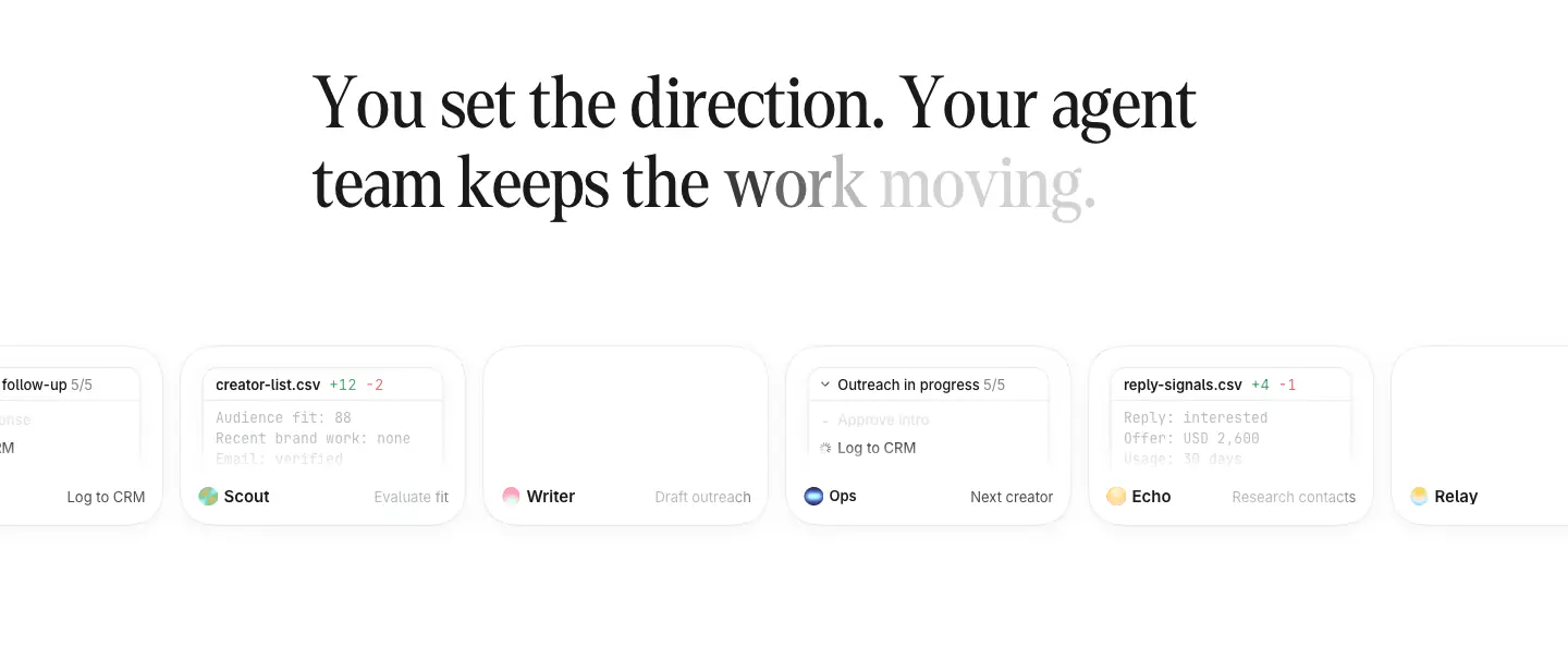
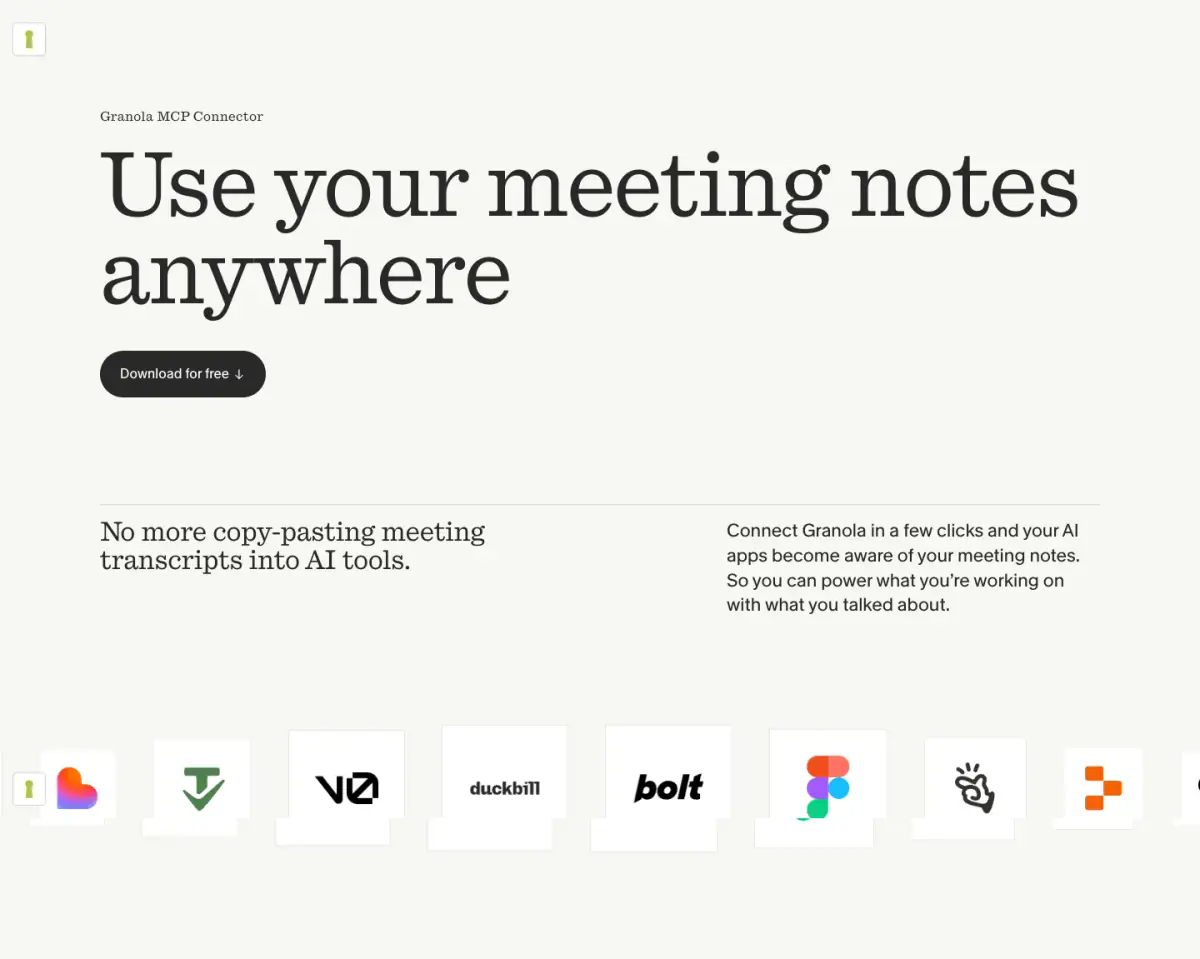
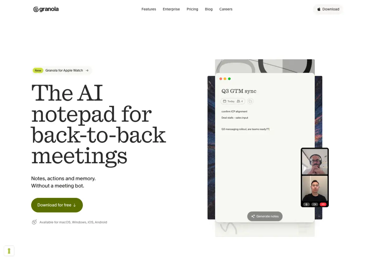
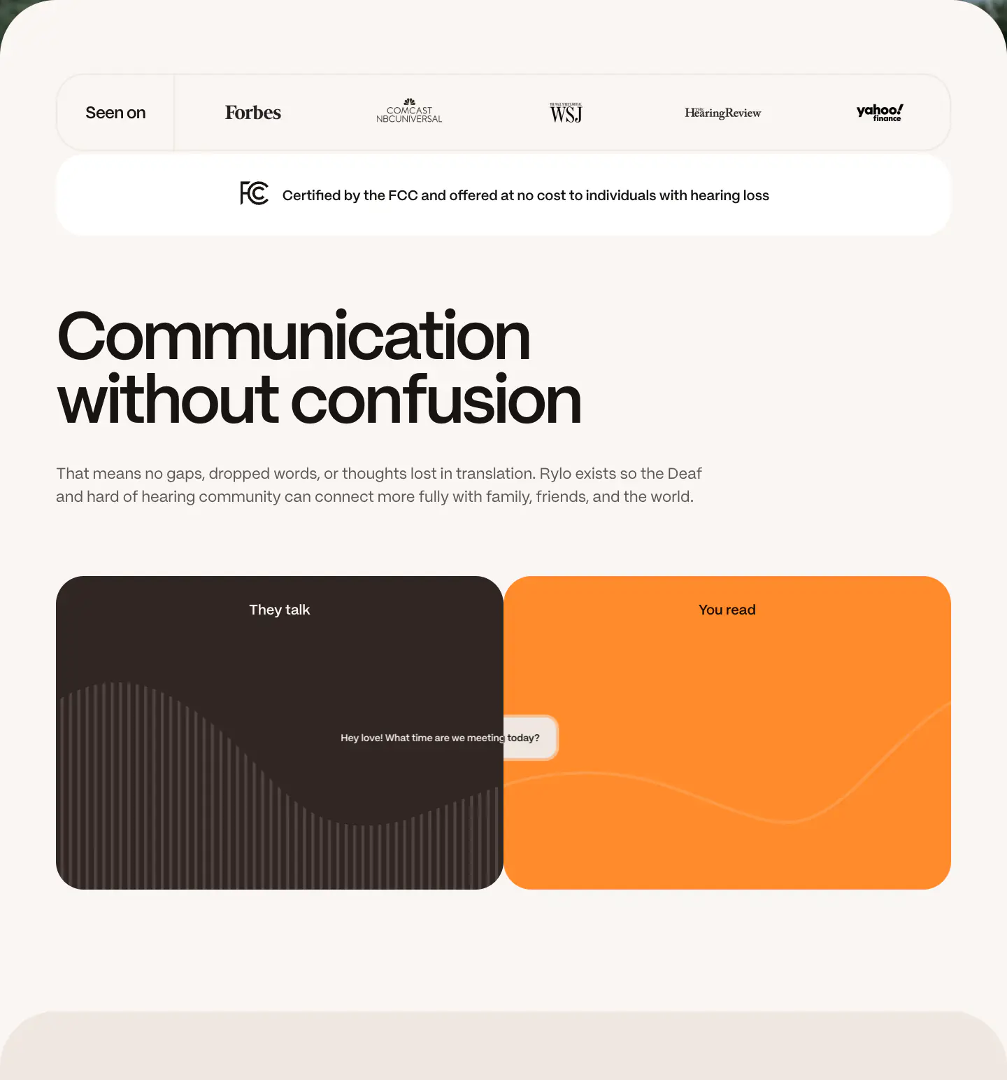
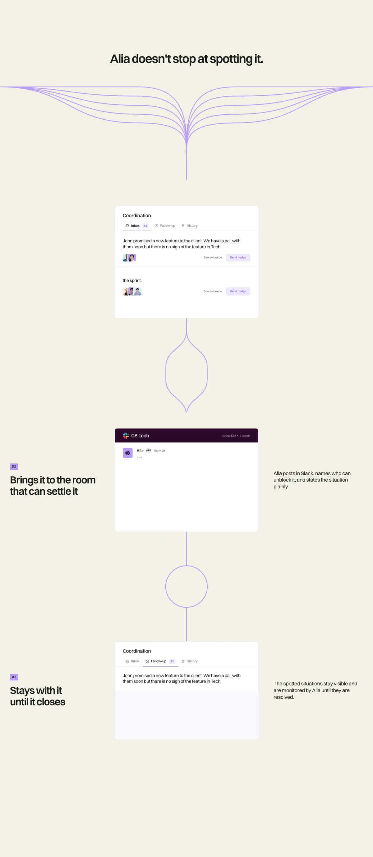
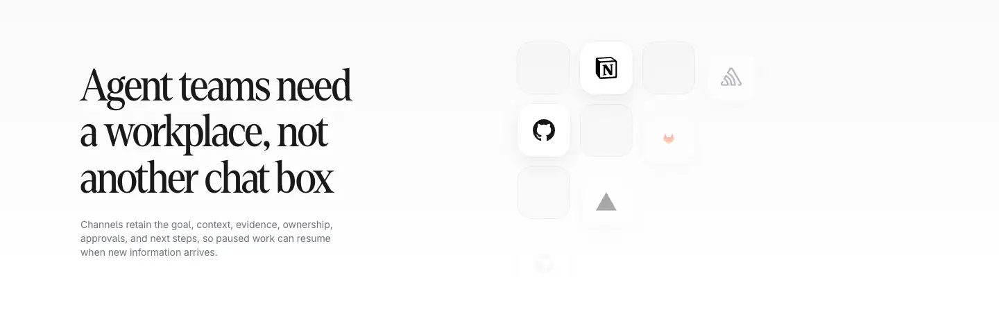
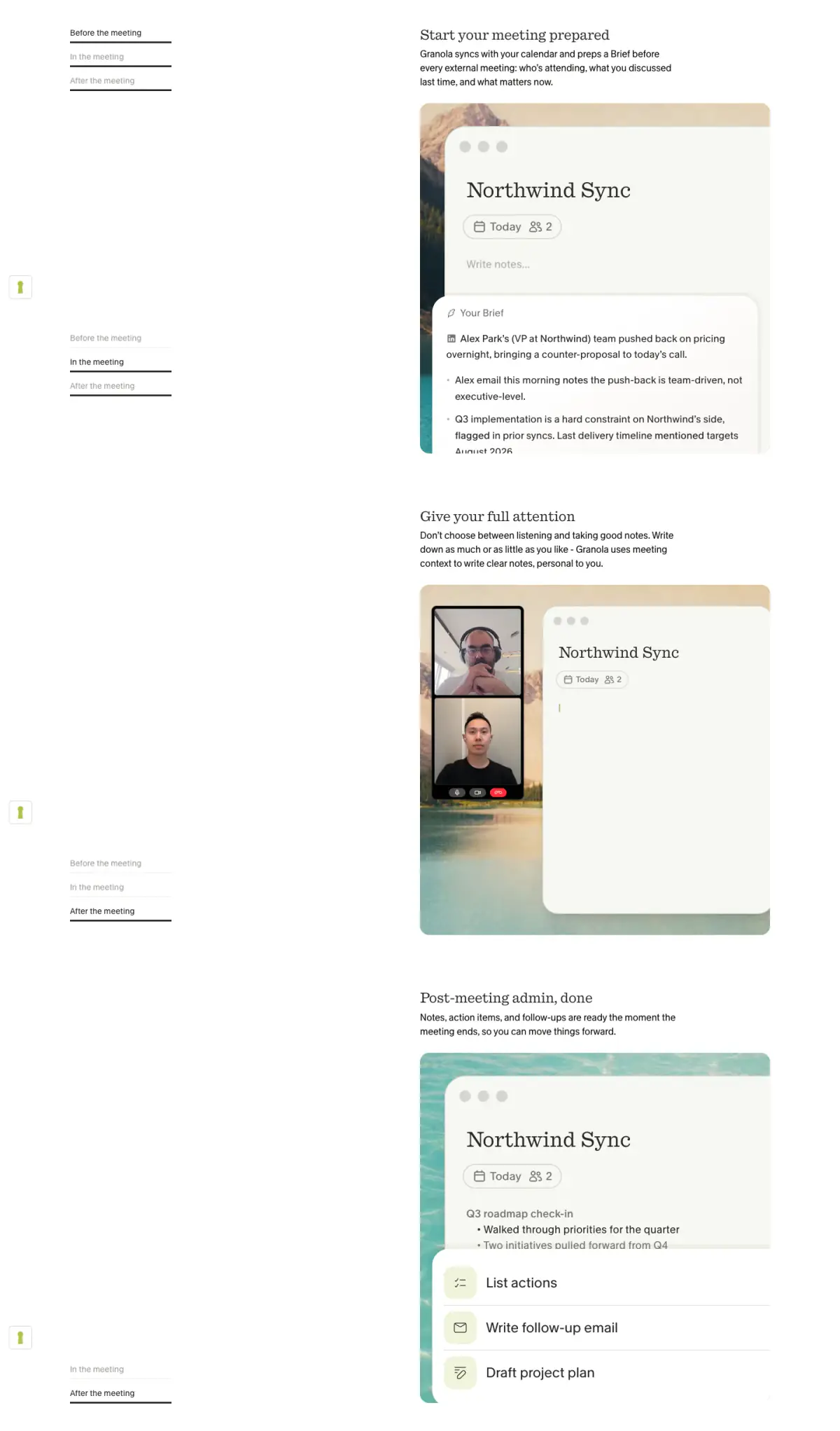
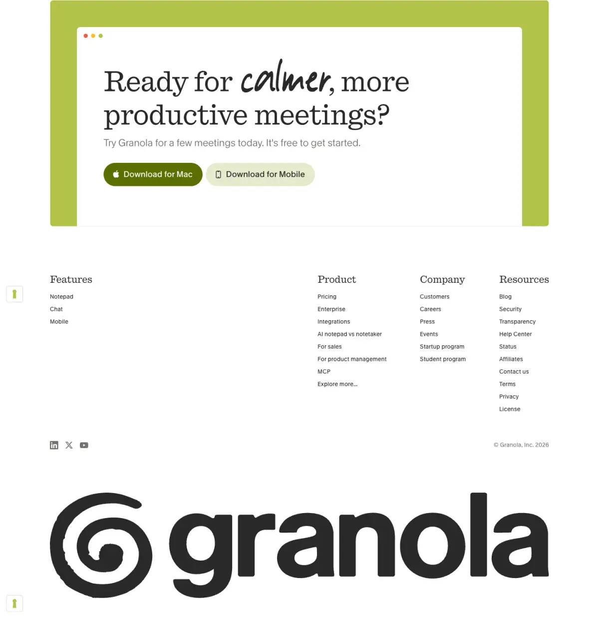
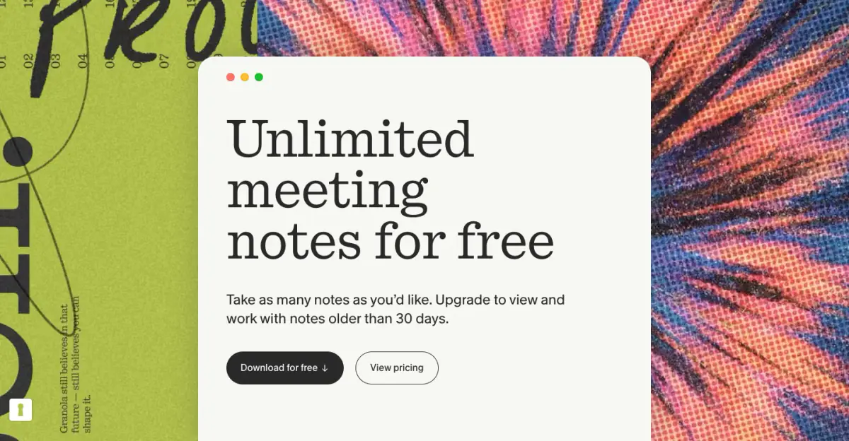
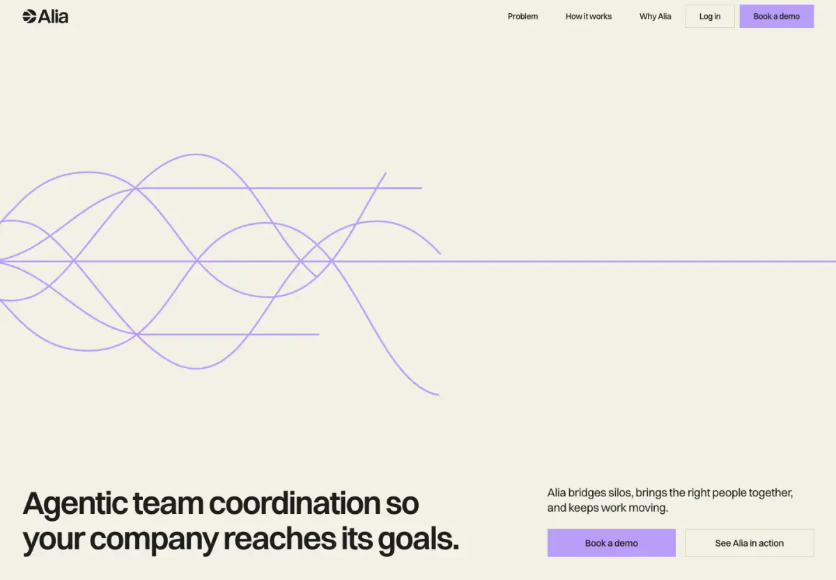
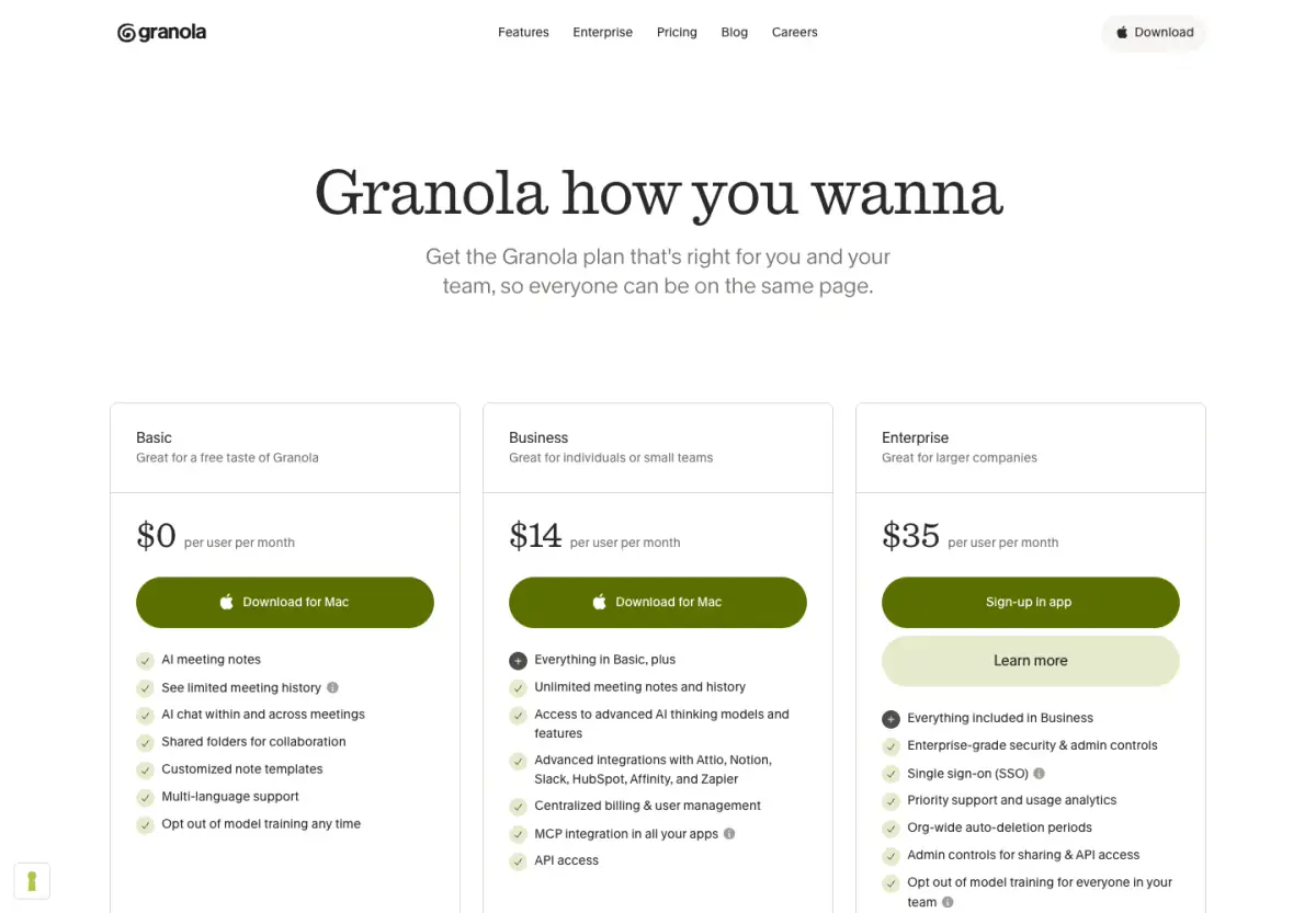
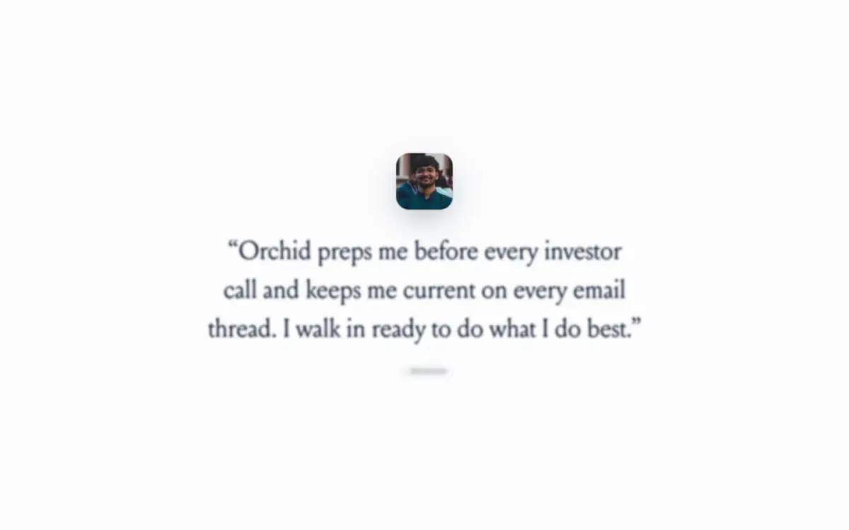
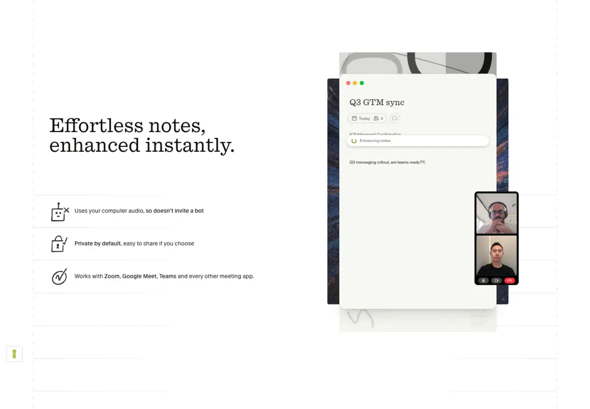
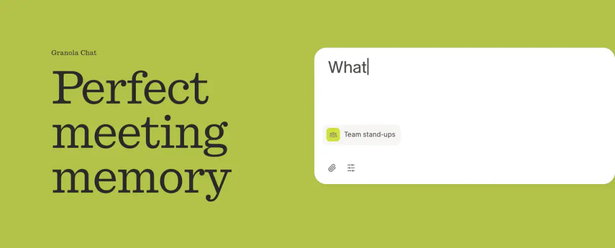
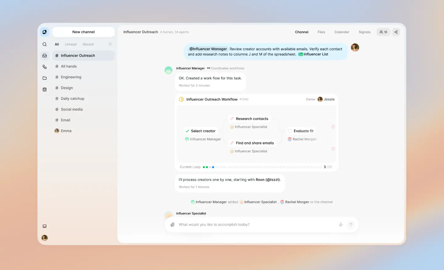
Granola's desktop website features a clean, slightly editorial design emphasizing legibility and straightforward utility. The color palette relies heavily on stark contrasts—dark charcoal text on an off-white canvas, interspersed with vivid lime green accents—to establish a modern, pragmatic identity. Typography plays a central role, utilizing a distinctive serif font ('quadrant') for large headings and a clean sans-serif ('melange') for body copy, contributing to an elegant yet highly legible interface. Reusable components include varied product feature demonstrations enclosed in soft-cornered containers, large textual testimonials on dark backgrounds, and a consistent sticky navigation bar
- Spacing
- The layout employs a generous, blocky rhythm. Sections are clearly separated by significant vertical whitespace, and components within sections (like the feature text and UI cards) are often arranged in a loose, asymmetric grid.
- Shape
- Cards and UI elements predominantly feature soft, rounded corners, contrasting with the stark typography. Button radii appear fully rounded (pill-shaped). Product UI mockups have consistent, moderate border radii.
- Borders
- Borders are generally subtle (e.g., color-12, color-13), used to define UI cards against similar backgrounds, or absent entirely in favor of background color blocking.
- Buttons
- Primary buttons are solid, pill-shaped, and use contrasting colors (dark green on light backgrounds, dark grey on dark backgrounds).
- Width
- Content is constrained to a central max-width, with backgrounds occasionally bleeding to the full viewport width.
- Density
- The overall density is low. The design favors large typography and ample whitespace over tightly packed information.