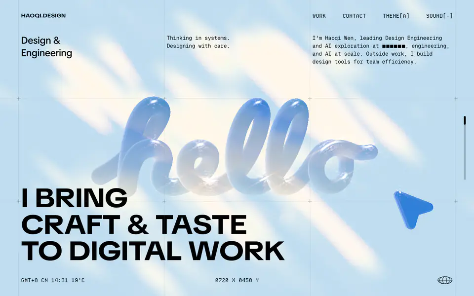
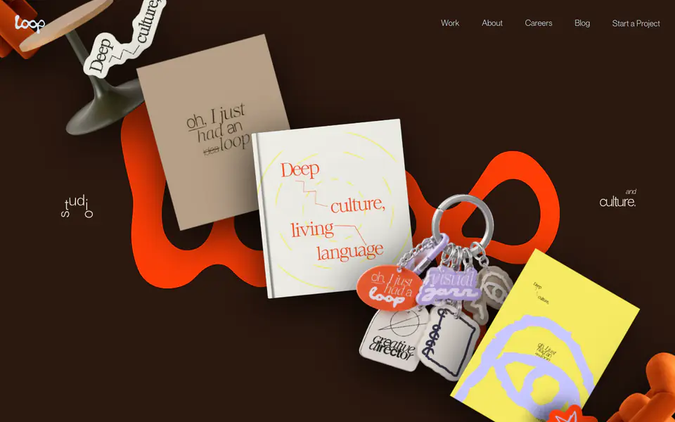
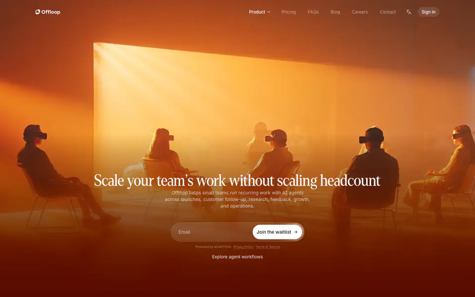
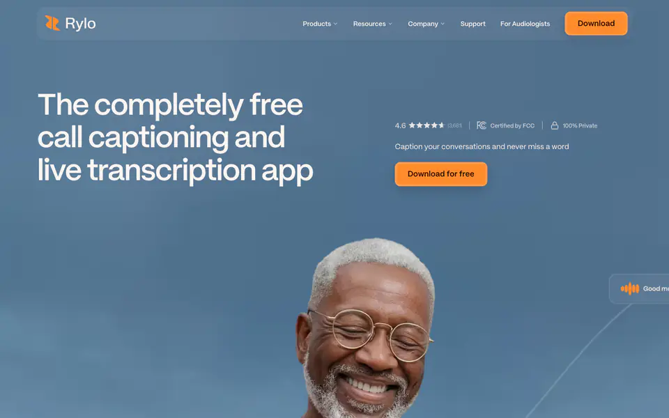
The website features a modern, tech-forward aesthetic that blends minimalist typography with striking 3D visual elements. The design employs a highly structured layout marked by thin grid lines (reminiscent of architectural or engineering blueprints), reinforcing the "Design & Engineering" theme. A limited but high-contrast palette centers on black text against an off-white/light blue canvas, punctuated by neon accents like #C0FE04 (lime green). Typography mixes a primary sans-serif for headings (tiktok) with a prominent monospaced font (tronica-mono) for secondary details and meta-information, creating an editorial yet technical feel. The integration of 3D, balloon-like typography and float
- Spacing
- The spacing is highly structured and governed by the visible background grid, suggesting a rigid, mathematical spacing system rather than fluid, content-driven margins.
- Shape
- Elements predominantly feature sharp, square corners, aligning with the brutalist/technical aesthetic, though some 3D elements have organic curves. Zero radius (sharp corners) on most structural elements and grid lines. The 'Inspire Mono' card features a pill-shaped graphic, and the 3D elements are fully rounded.
- Borders
- Borders are expressed primarily through the structural background grid (thin, 1px lines, likely #000000 with low opacity or similar subtle color).
- Buttons
- Explicit standard buttons are not clearly visible; interaction appears driven by text links and entire cards.
- Width
- Full-width canvas utilization, with content structured along the visible grid lines extending to the viewport edges.
- Density
- The layout balances high structural density (the grid) with high spatial density (large amounts of negative space around core typographic elements).