- Industry
- Technology
- Site type
- Waitlist, Landing
- Platform
- Webflow
- Tech
- GSAP
- Style
- Typographic, Editorial, Minimal, Soft, High Contrast
- Business model
- AI, Software
- Presence
- Online
- Components
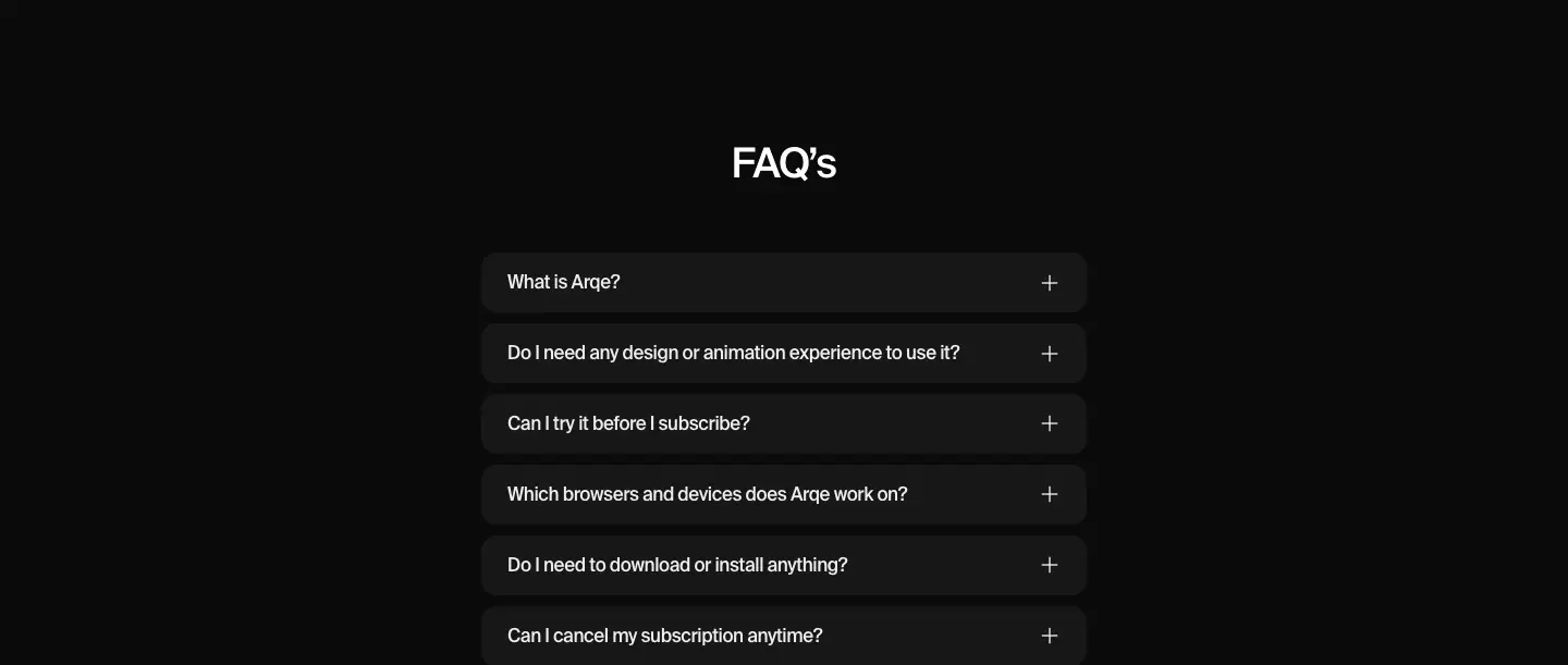
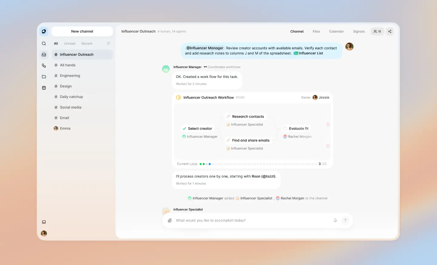
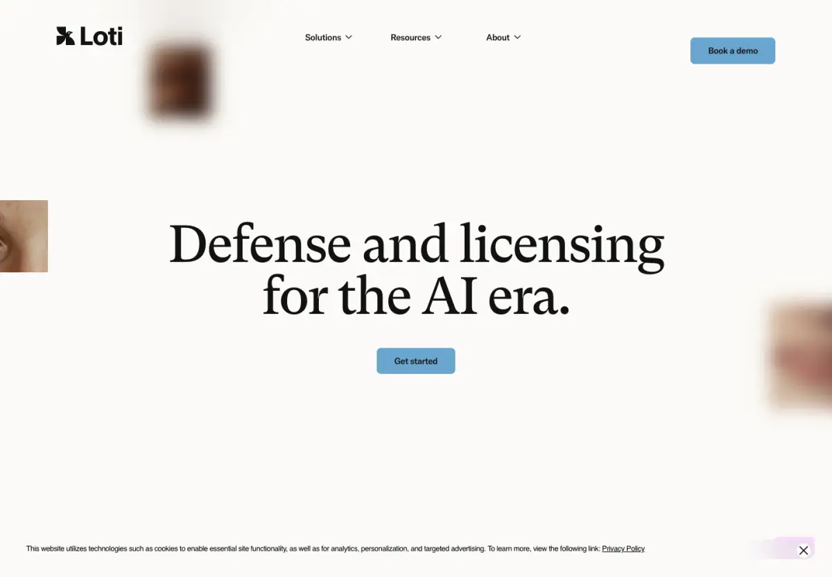
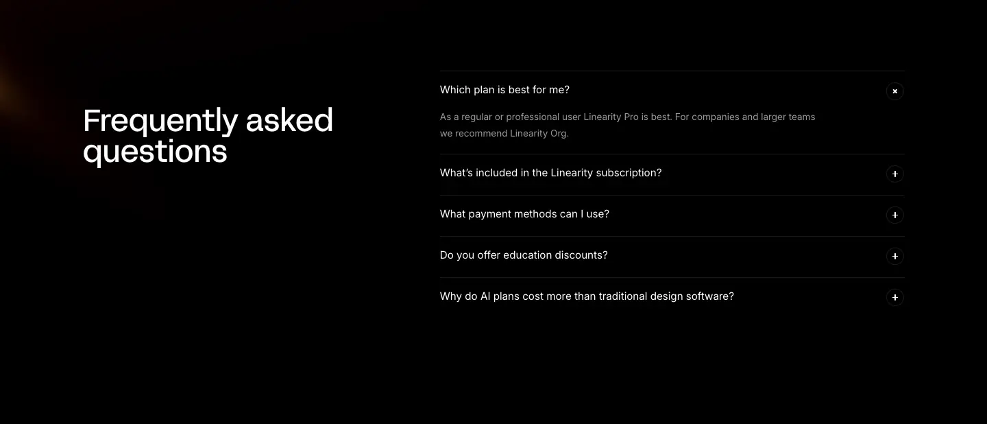
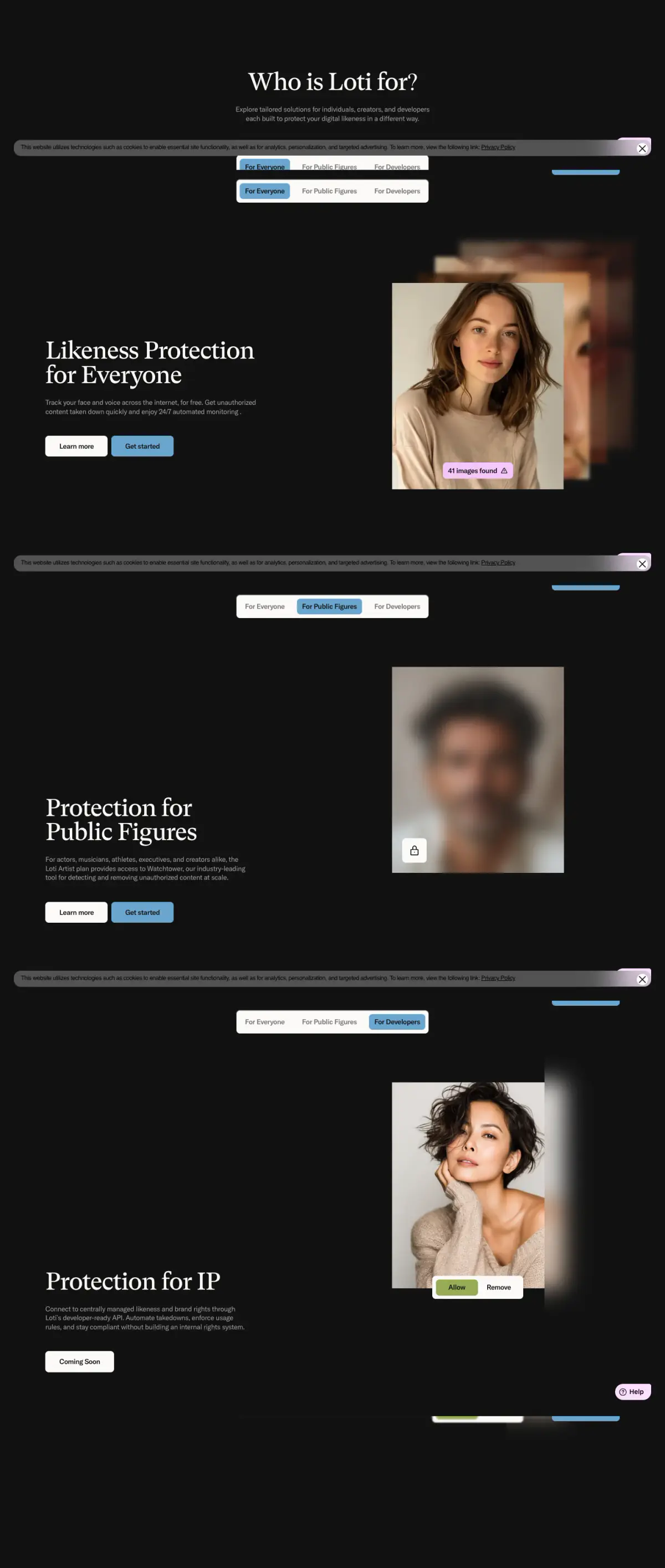
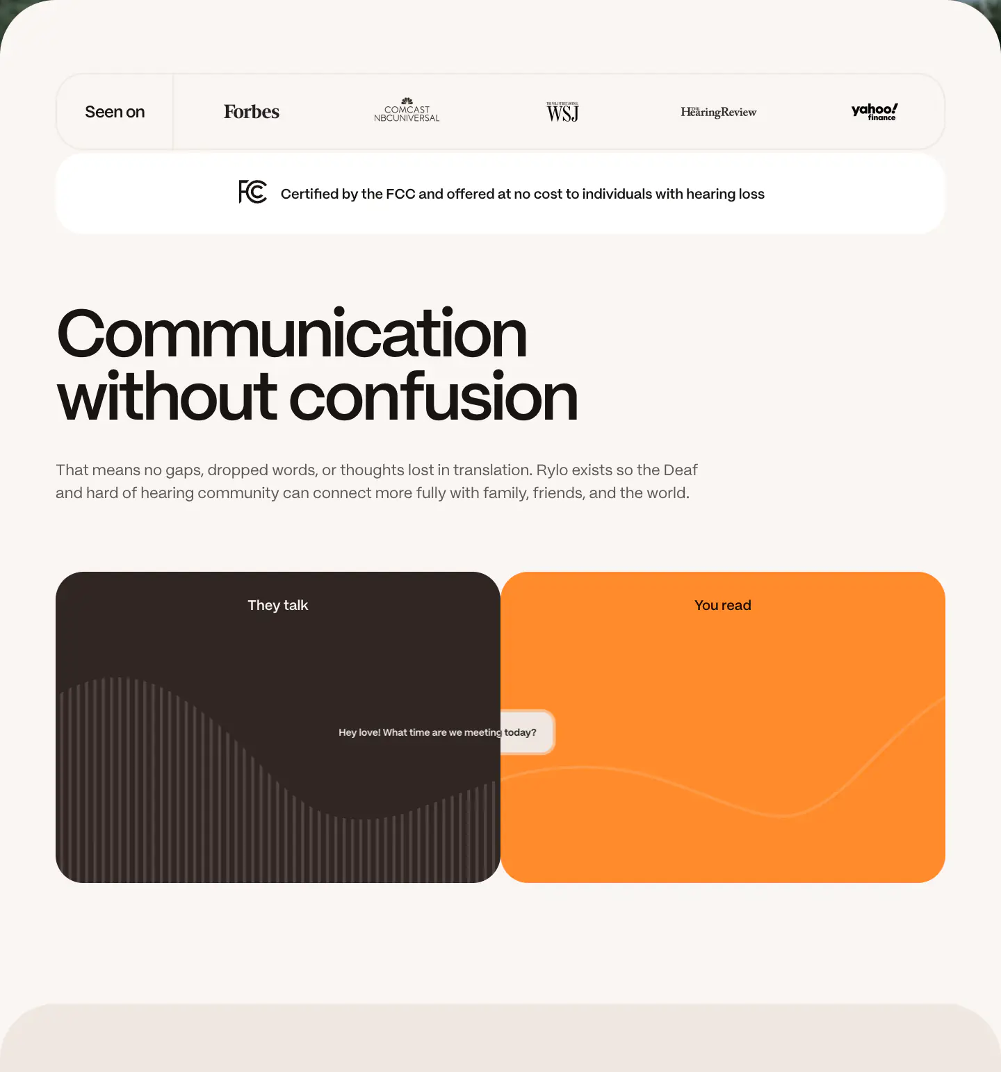
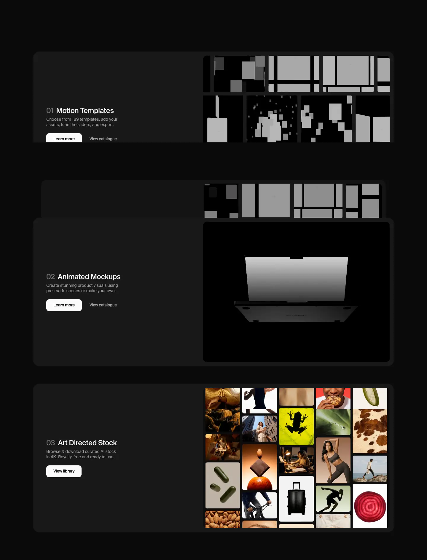
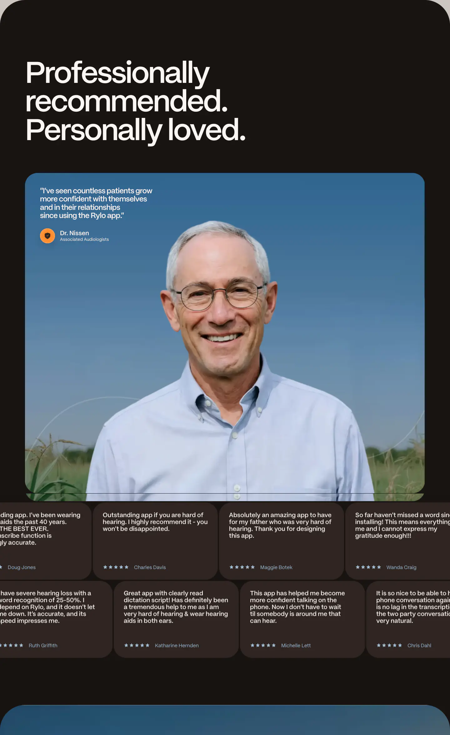
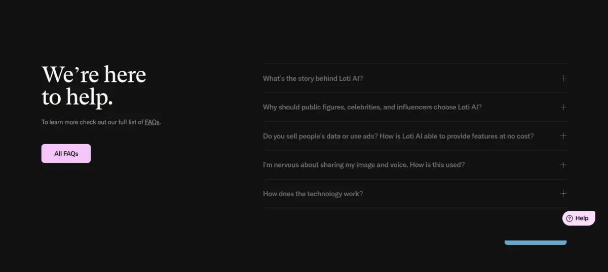
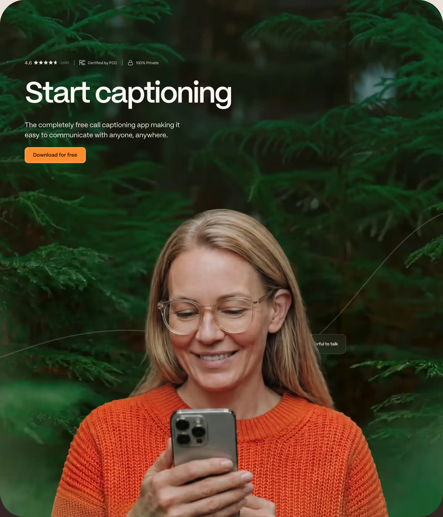
- Navigation Bar, Hero With Background Imagery, Primary Button, Product UI, Editorial Card, Logo Strip, Tabs, FAQ Accordion, Footer, Blurred Background Accents
- Score
- 55.4/100 · 100% evidence · Review pending
- Typography
- Display — Gt Super Text; Heading — Gt Super Text; Body — Gt America Standard; Mono — Gt America Standard
- Palette
- OG image
Design analysis
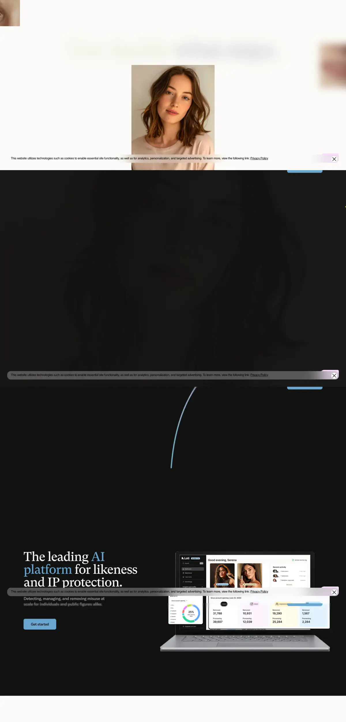
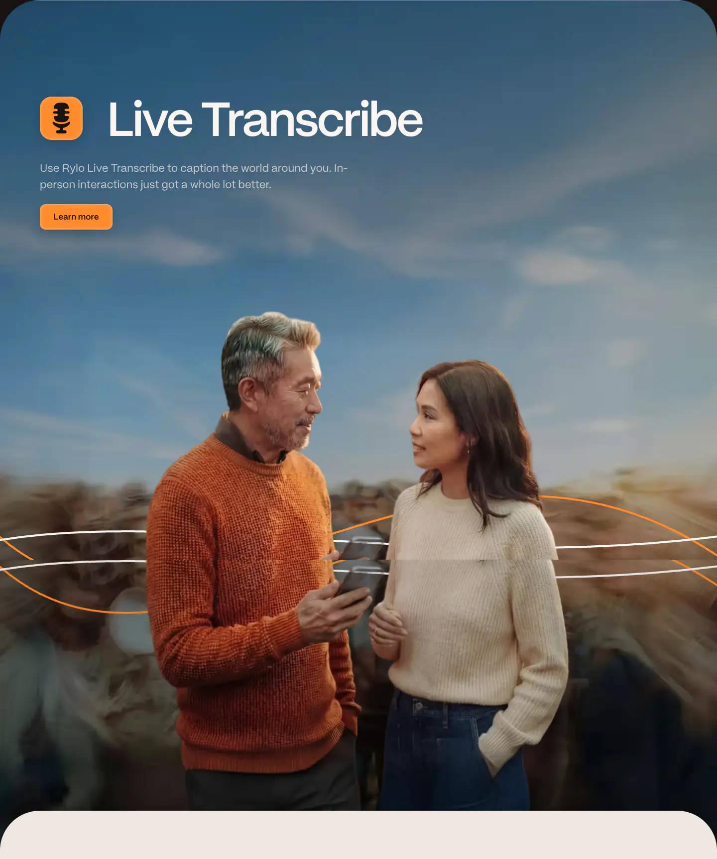
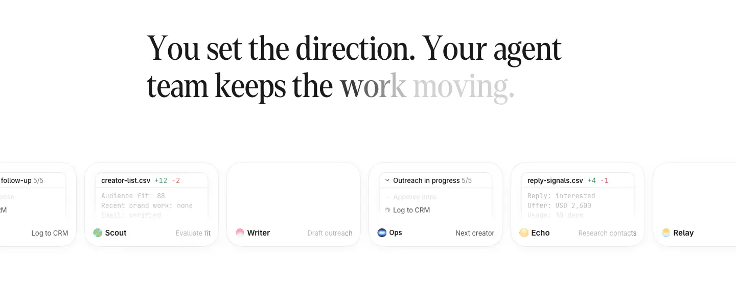
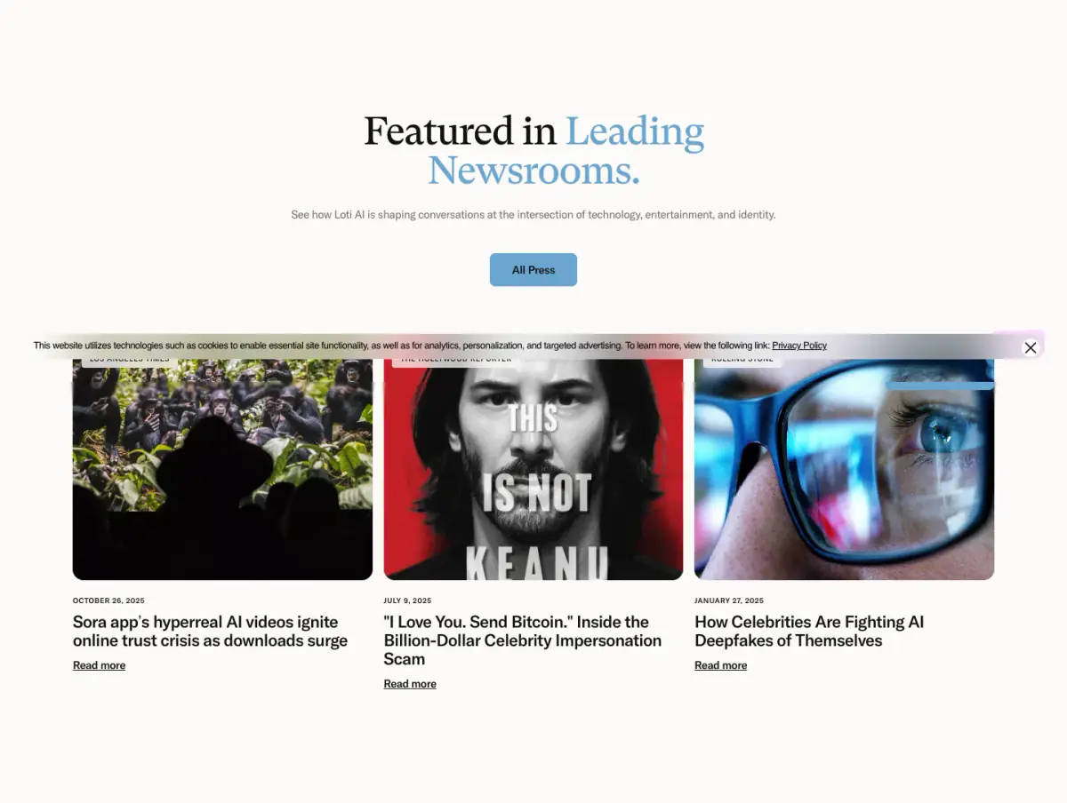
The website presents a highly polished, editorial-style layout with a strong emphasis on large, elegant serif typography contrasting with a clean sans-serif for secondary text. The design alternates between light and dark high-contrast sections to delineate content areas. Large, softly blurred imagery is used as a background element to create a sense of depth and focus without distracting from the primary messaging. UI mockups and rounded interactive elements provide a modern, approachable feel.
- Spacing
- Generous vertical spacing between sections, maintaining a relaxed, breathable rhythm.
- Shape
- Consistent use of rounded corners on interactive elements (buttons, tabs) and media (images, UI mockups). Small to medium radii for buttons (approx. 4-8px) and slightly larger radii for image cards.
- Borders
- Mostly borderless design, relying on background color contrasts for separation. Subtle 1px borders used in the FAQ accordion.
- Buttons
- Solid color fills (primarily blue) with rounded corners and medium-weight sans-serif text.
- Width
- Content is generally constrained to a centered max-width container, typical of modern desktop layouts.
- Density
- Low density, utilizing significant white space to draw attention to large typography and key visual elements.