- Industry
- Technology
- Site type
- Landing, Blog
- Platform
- Custom code
- Tech
- Tailwind CSS, Three.js
- Style
- Gradient, Typographic, Bold, Colourful, Dark Mode, Glassmorphism
- Business model
- E-commerce, AI, Software
- Presence
- Online
- Components
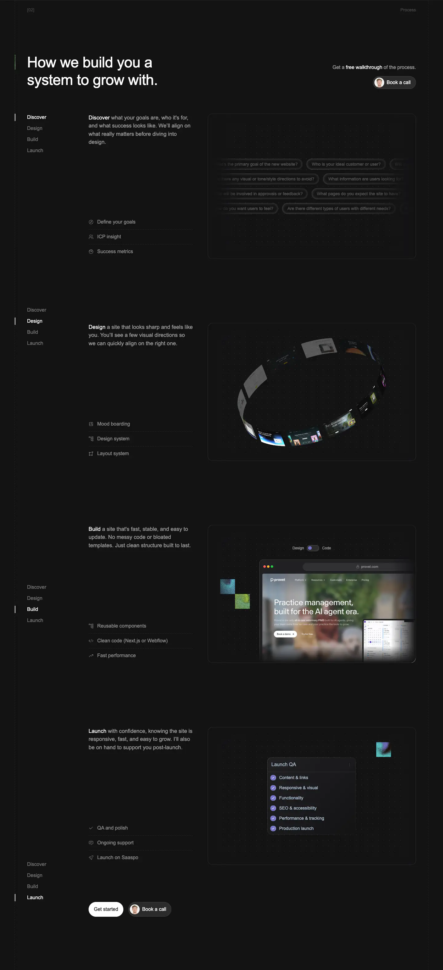
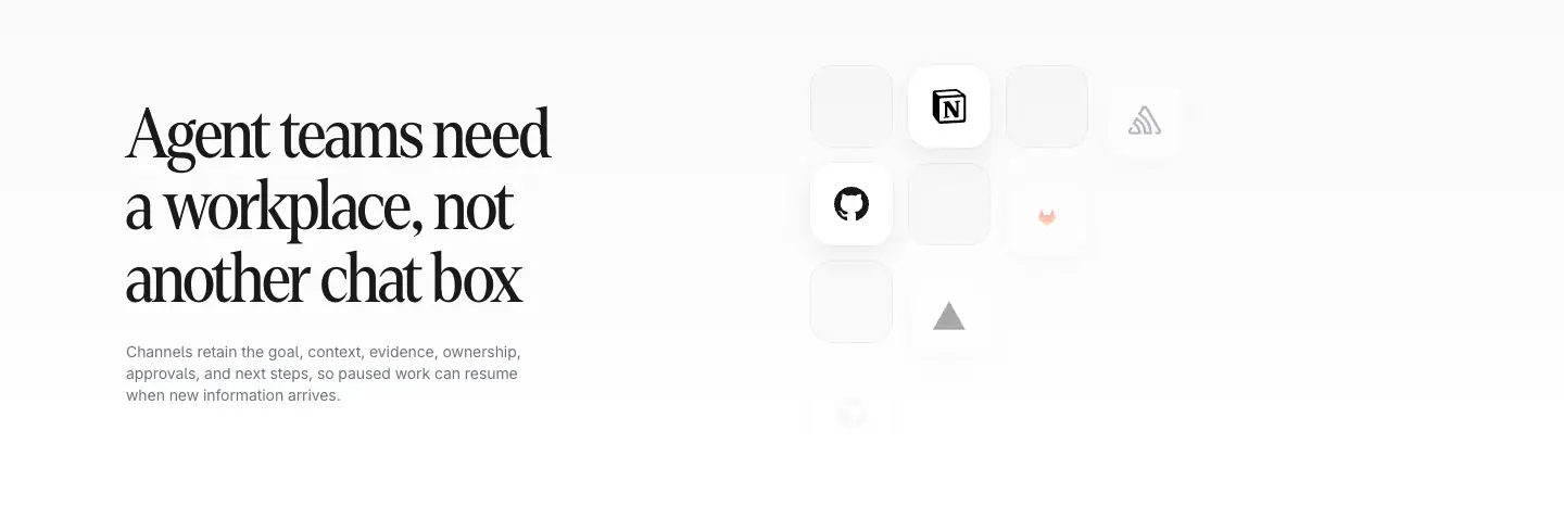
- Navigation Bar, Hero, Product UI, Feature Card, Gallery, Primary Button, Outline Button, Footer, Bento Grid Mockups, Interactive Tag List
- Score
- 57.7/100 · 100% evidence · Review pending
- Typography
- Display — AcidGrotesk; Heading — AcidGrotesk; Body — Inter; Mono — Inter
- Palette
- OG image
Design analysis
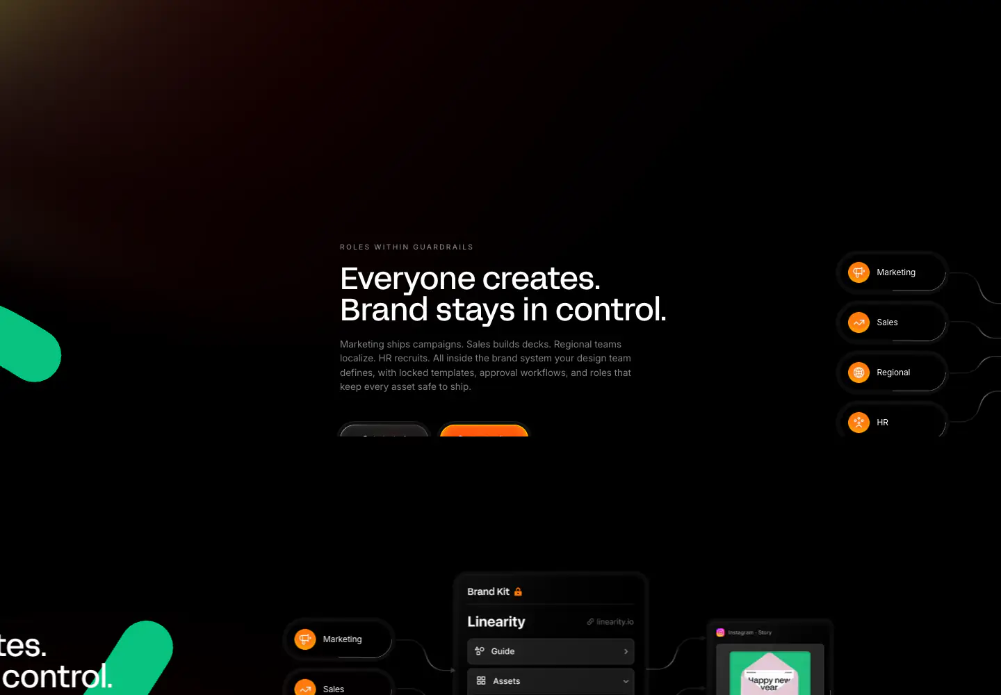
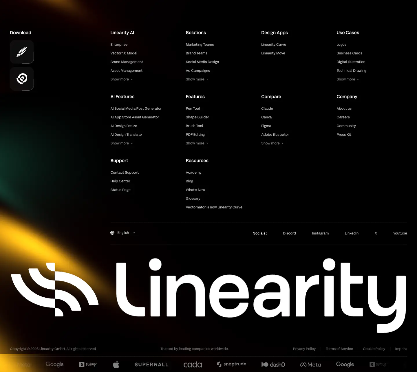
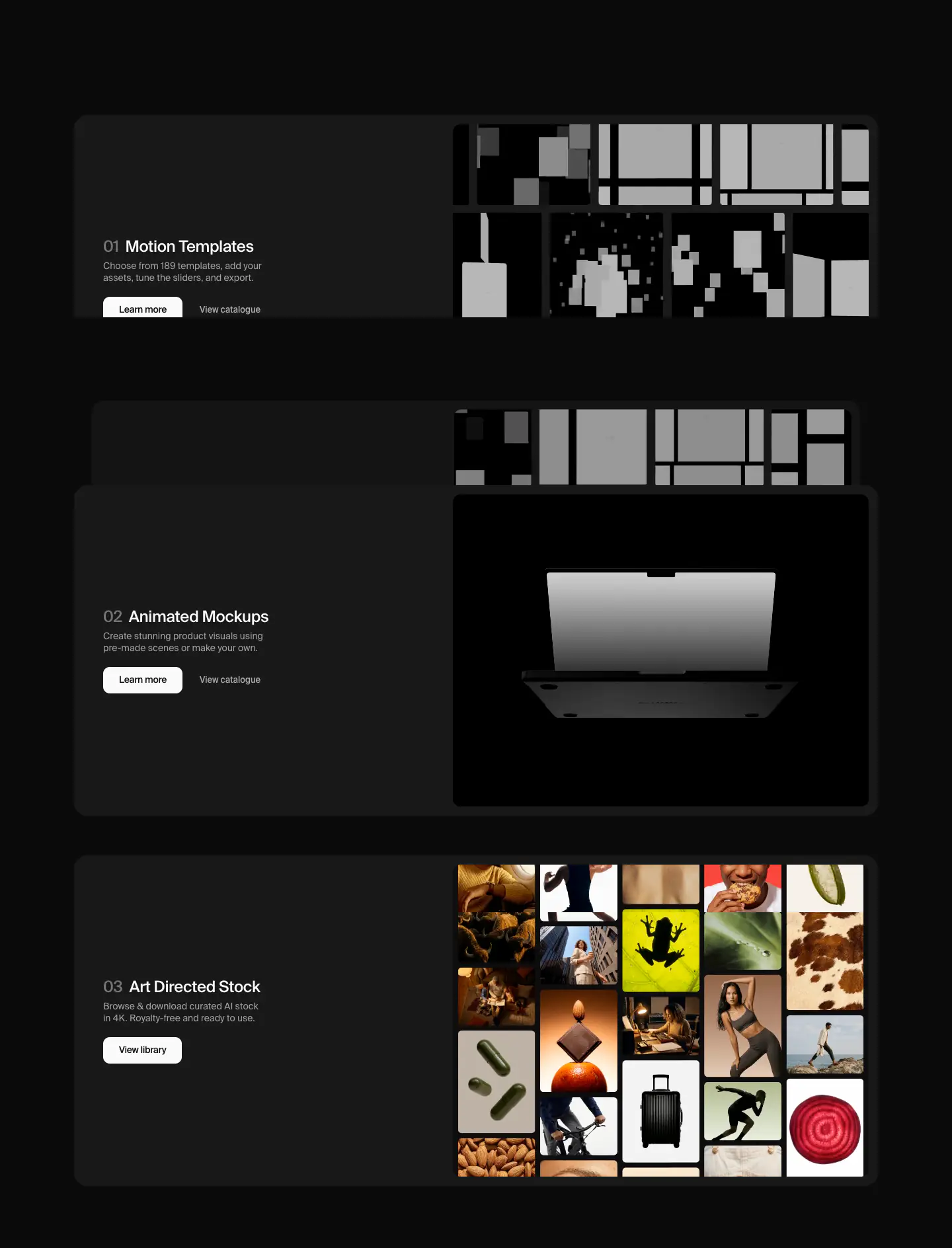
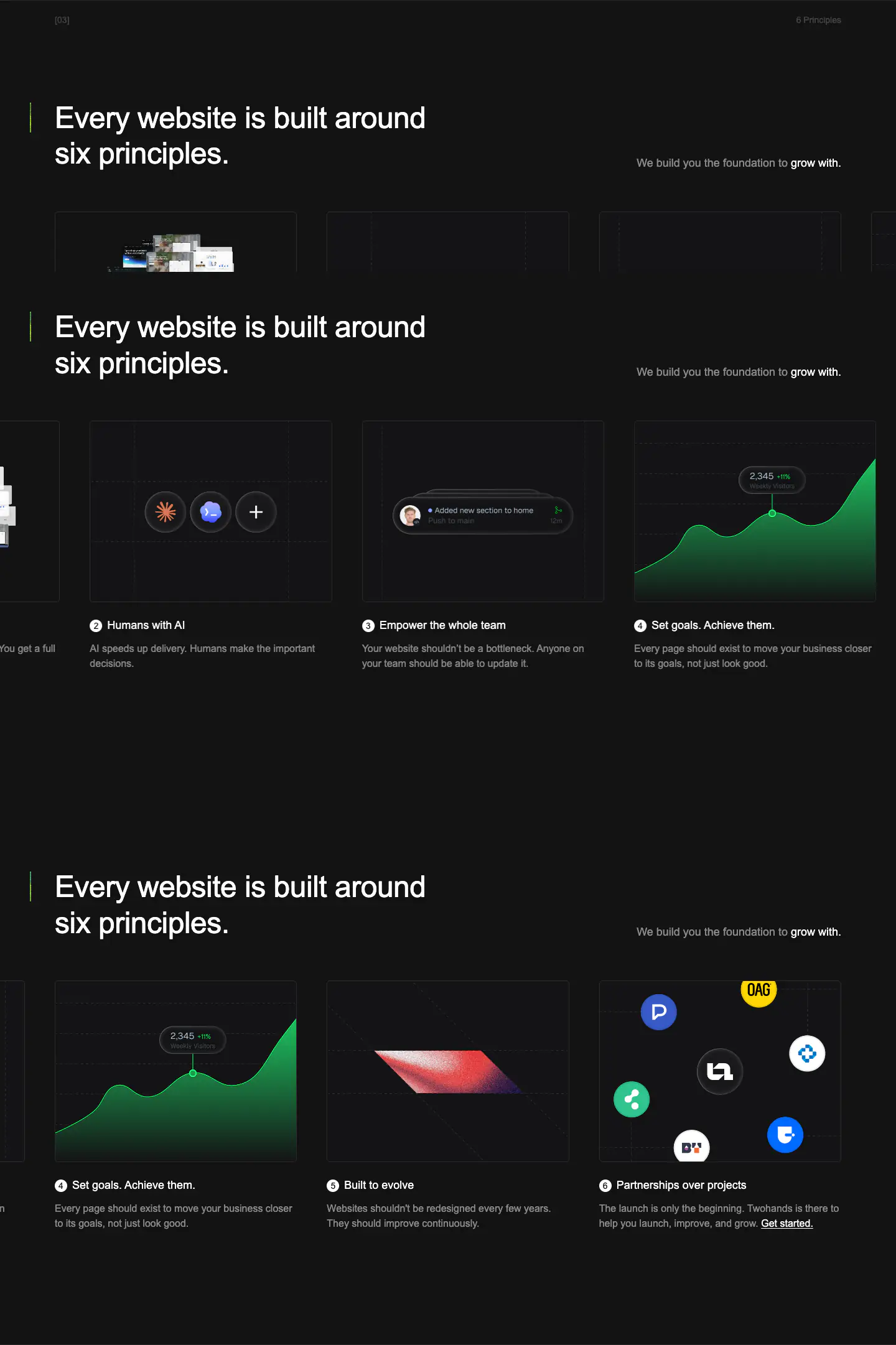
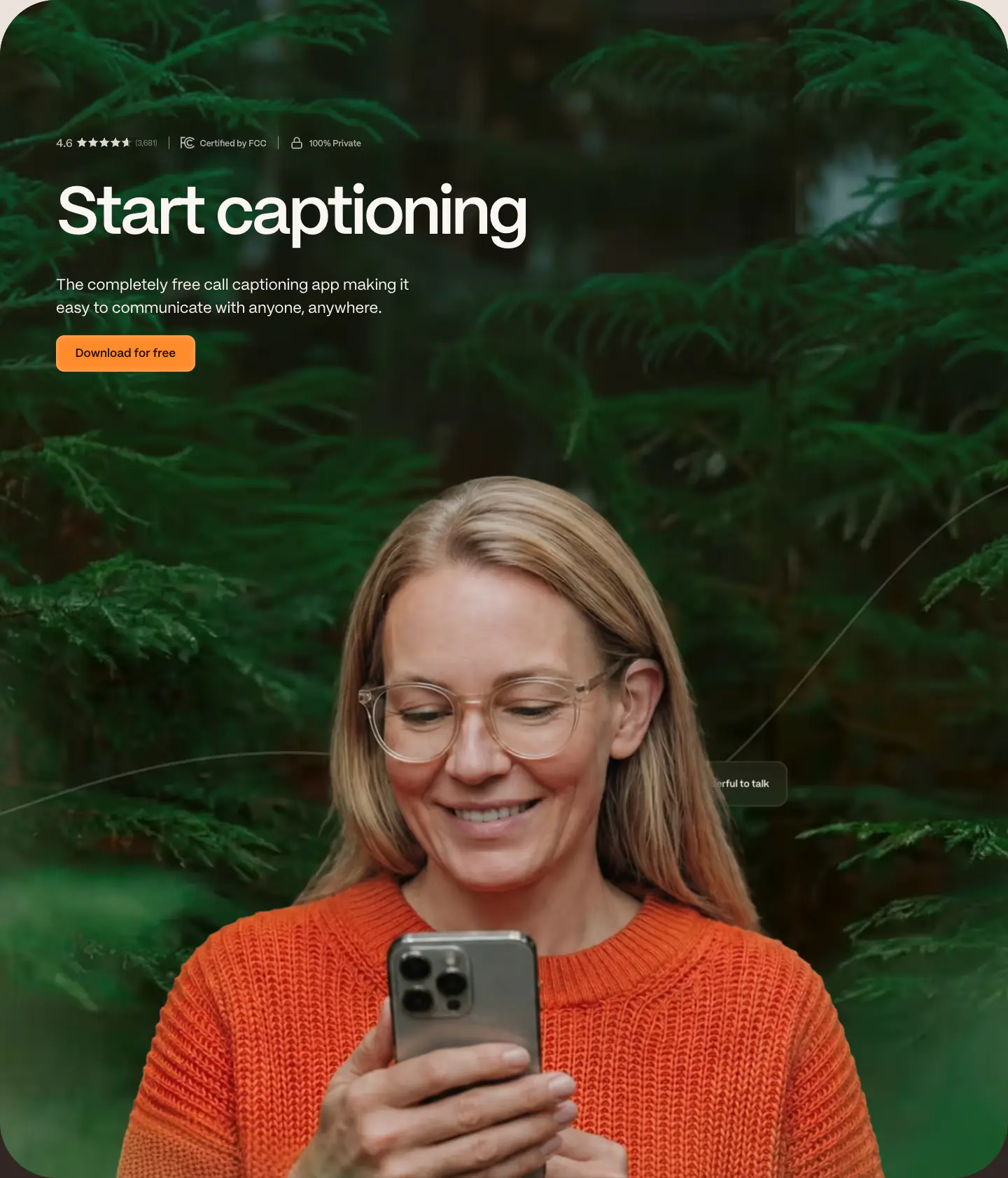
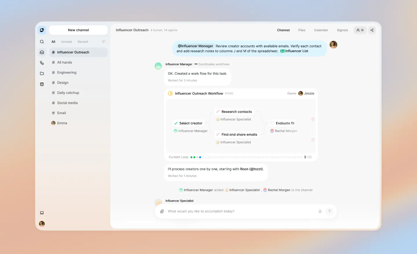
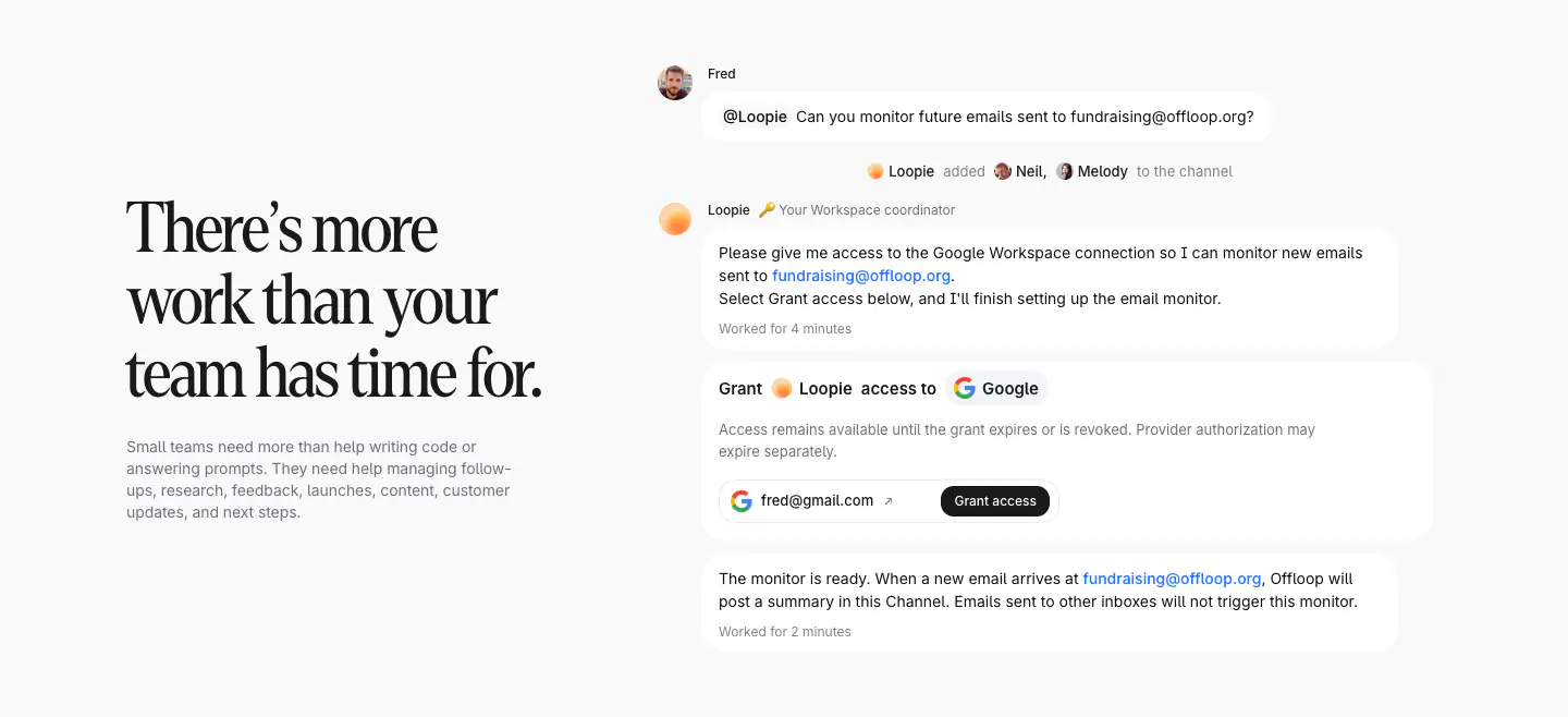
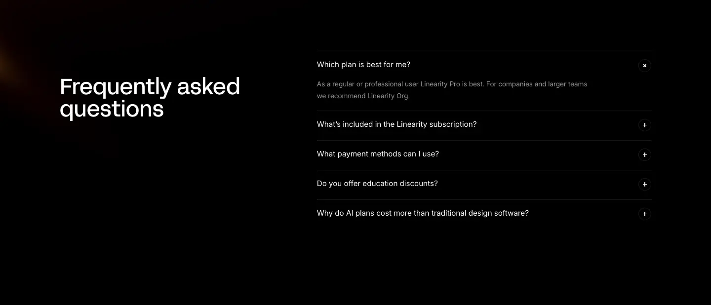
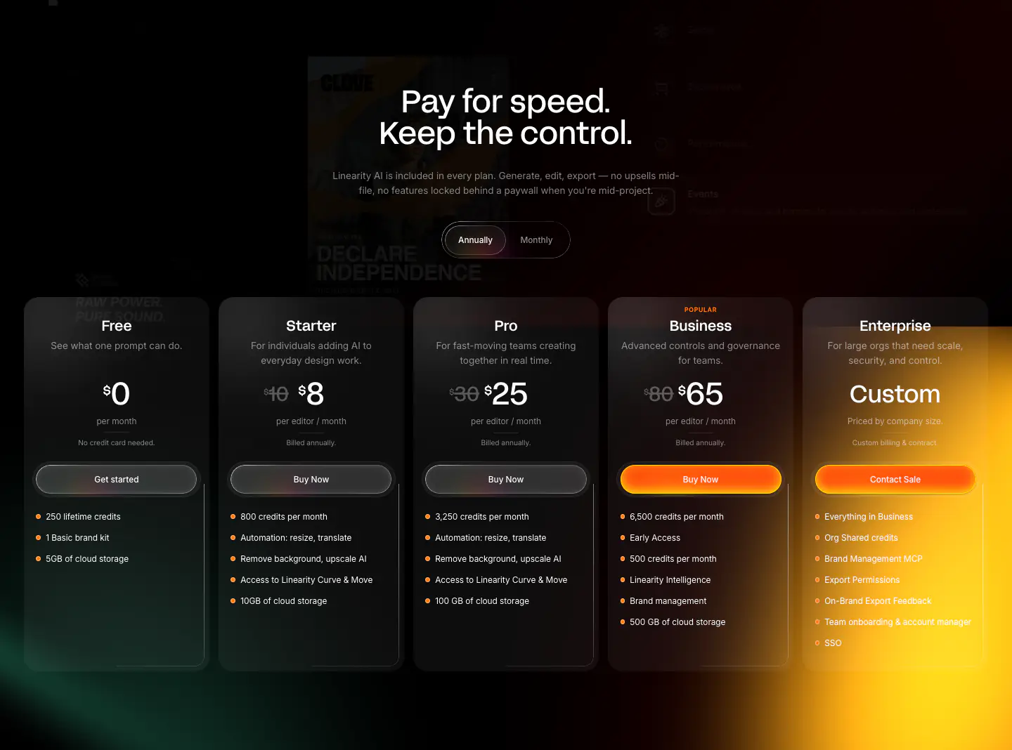
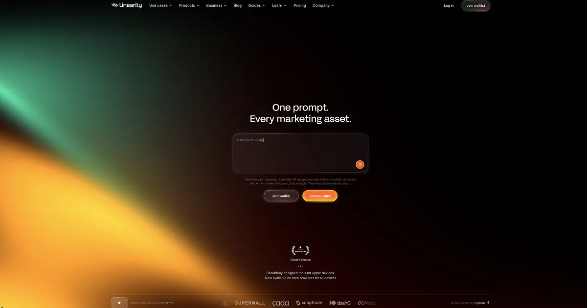
The Linearity website features a distinctly modern, dark-mode visual identity characterized by deep black canvases illuminated by vibrant, glowing gradients in green, orange, and purple hues. The layout is highly structured yet visually dynamic, relying heavily on interactive product UI mockups and parallax image grids to showcase the software's capabilities. Typography is bold and functional, using AcidGrotesk for tight, impactful headings and Inter for legible body copy. Key UI elements such as buttons and interactive tags uniformly employ pill-shaped (fully rounded) geometries, often styled with translucent 'glassmorphic' backgrounds and subtle borders, contrasting against solid, vivid or
- Spacing
- Generous vertical rhythm with large gaps between sections to allow background gradients to show. Content blocks are padded with ample negative space.
- Shape
- Distinctively dual-natured: fully rounded (pill-shaped) for interactive elements like buttons and tags, and heavily rounded rectangles (e.g., 16-24px) for cards and UI mockups. Buttons and badges use max radius (border-radius: 9999px equivalents), while product UI mockups use consistent, large, smooth radii.
- Borders
- Hairline (1px), translucent white borders on dark elements to create depth without solid lines.
- Buttons
- Pill-shaped, either solid high-contrast (orange) or glassmorphic (dark translucent with white text/border).
- Width
- Content is typically centered in a max-width container, though background effects and parallax grids bleed to the edges.
- Density
- Loose and airy, prioritizing visual impact and large typography over high information density.