Inside the Giga website design
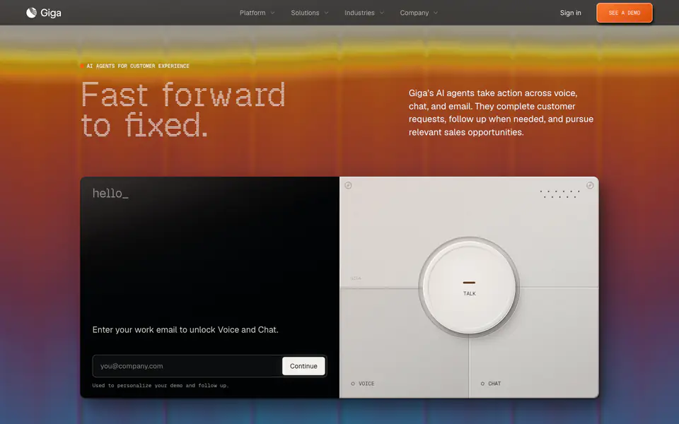
Giga is an AI website built with custom code and Next.js. Its pages are built from hero, features, forms, footer, process, and testimonial card sections, shown here in full-page captures and a scroll recording. Typography: Inter. Palette: #202000, #808060, #604020.
Giga builds enterprise AI agents for customer support that resolve complex conversations across chat, voice, and email — deployed in weeks, human-like at scale. Its visual style is typographic, minimal, and geometric, with navigation bar, hero, and primary button among its components.
Why we picked it
A gradient banner fades into a near black page, and a mono chat prompt next to a physical dial styled control room give the agent a tangible face. Repeating two panel blocks down the long scroll keep the same rhythm, so each new capability reads as a fresh step rather than more text.
What to look for
- Hero: a specific headline instead of a generic slogan
- Features: benefits framed around what the user gets, not internal capability names
- Forms: only essential fields
- Footer: grouped navigation with clear column headings
Questions designers ask
What fonts does Giga use?
Giga uses Inter, read from the fonts loaded on the captured page.
What is the Giga website built with?
The Giga website is built with custom code and Next.js, detected when the page was captured.
What colours does the Giga website use?
The captured palette includes #202000, #808060, and #604020.
What sections does the Giga website have?
The Giga website includes hero, features, forms, footer, process, and testimonial card sections. Each one opens on its own page, so you can compare it with the same section on other websites.
Can I use Giga's design for my own project?
Use it as a reference for structure, hierarchy, and style rather than something to copy. The DESIGN.md download summarises Giga's typography, colours, and components for your team or an AI tool.