- Industry
- Technology
- Site type
- Blog, Portfolio
- Platform
- Framer
- Tech
- Not detected yet
- Style
- Minimal, Corporate, Photographic, Bold, Soft Ui
- Business model
- AI, Software, Portfolio
- Presence
- Online
- Components
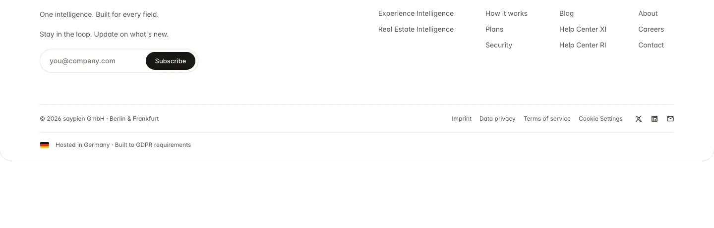
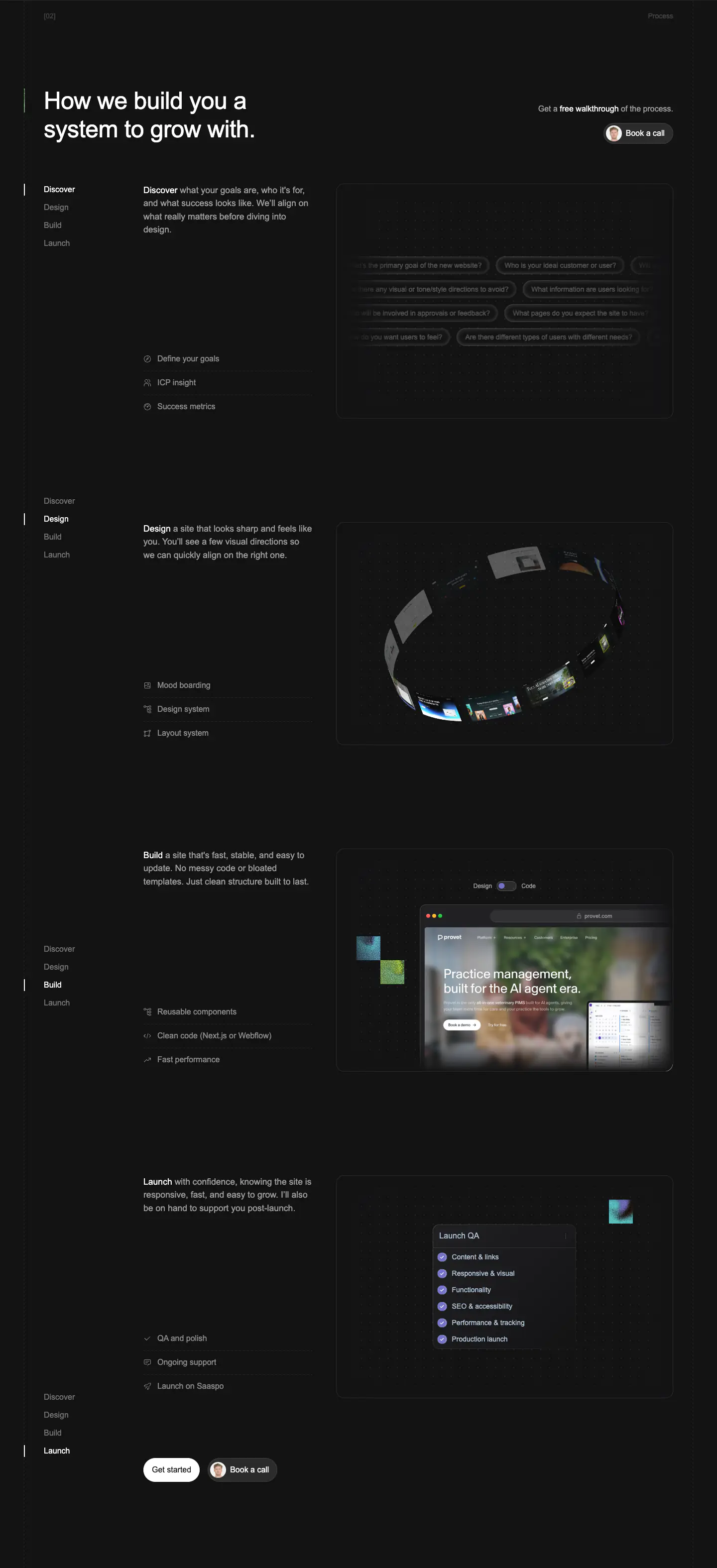
- Navigation Bar, Hero With Background Imagery, Logo Strip, Feature Card, Carousel, Primary Button, Newsletter Form, Footer, Interactive Feature Tabs, Bento Grid Layout
- Score
- 56/100 · 100% evidence · Review pending
- Typography
- Display — Stack Sans Headline; Heading — Stack Sans Headline; Body — Inter
- Palette
- OG image

Design analysis
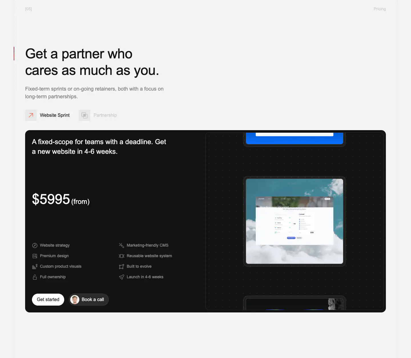
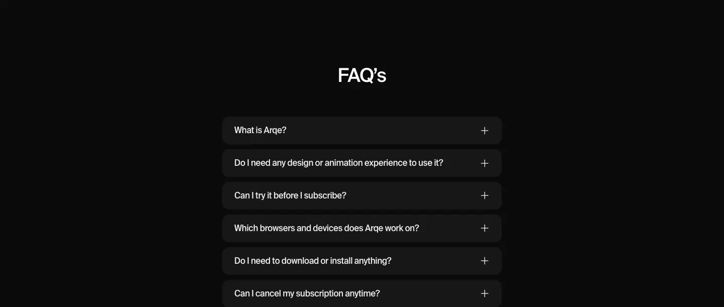
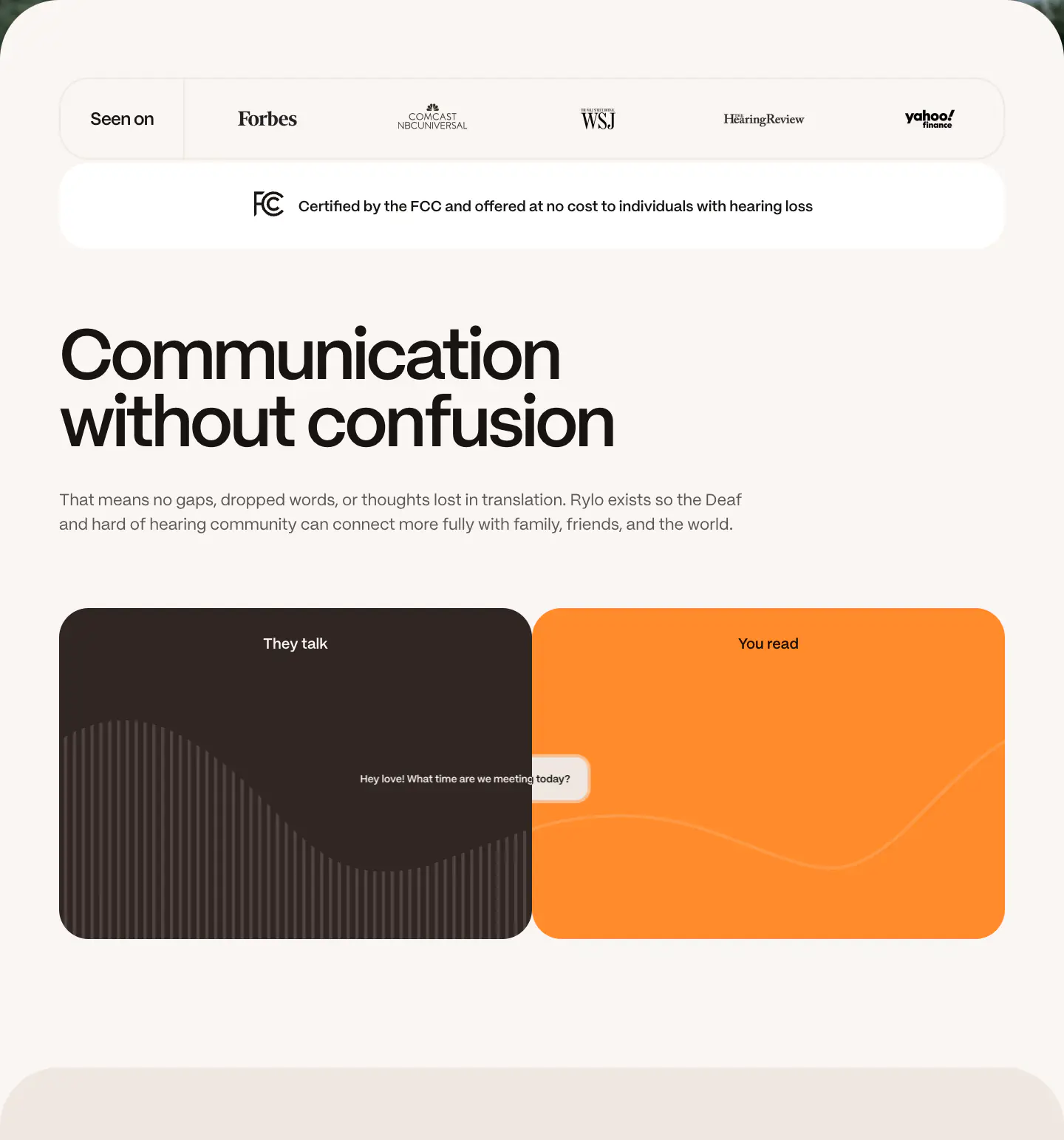
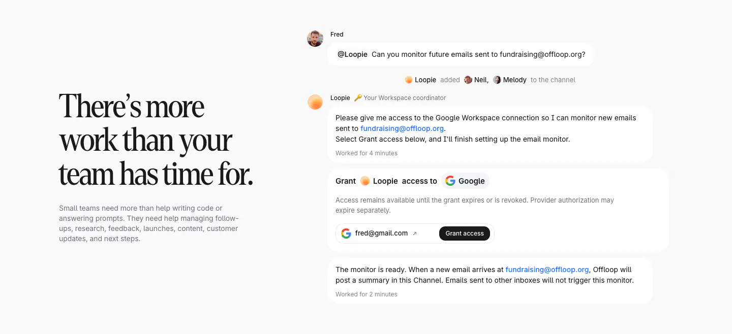
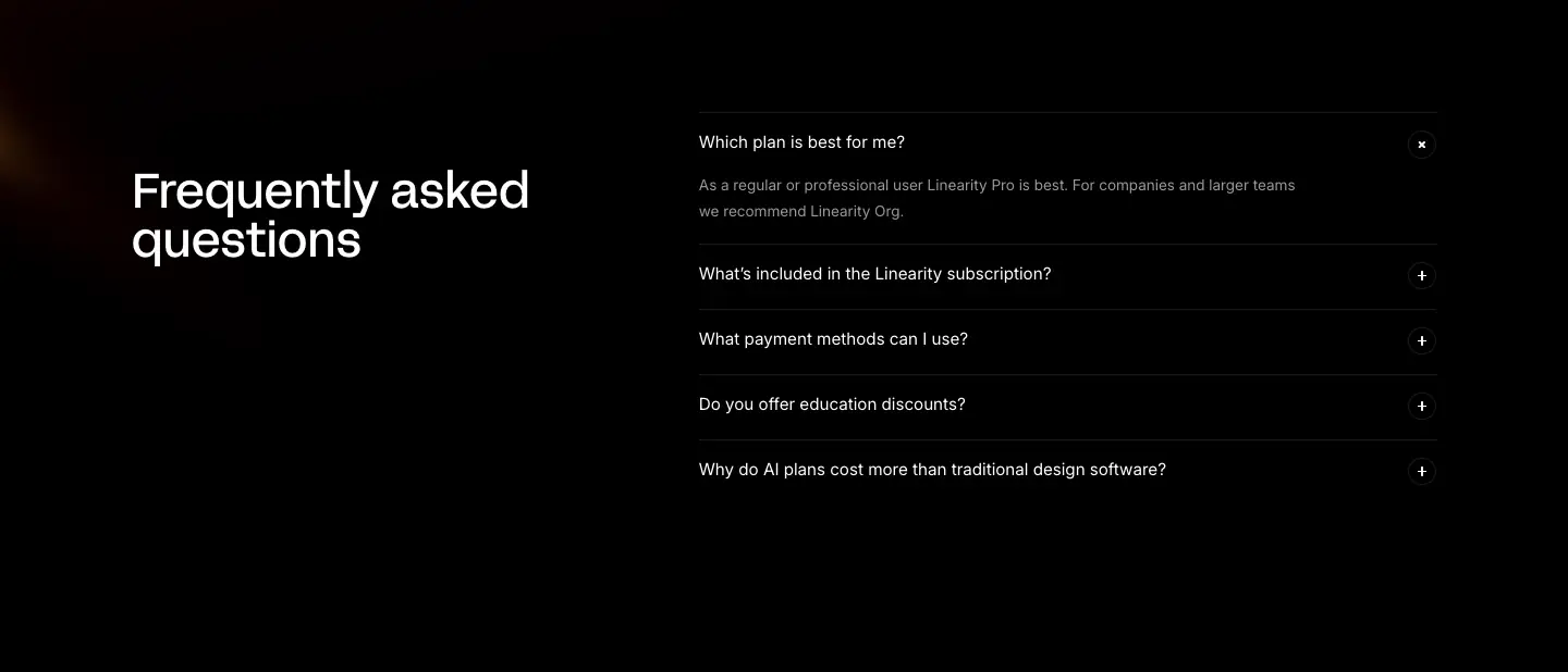
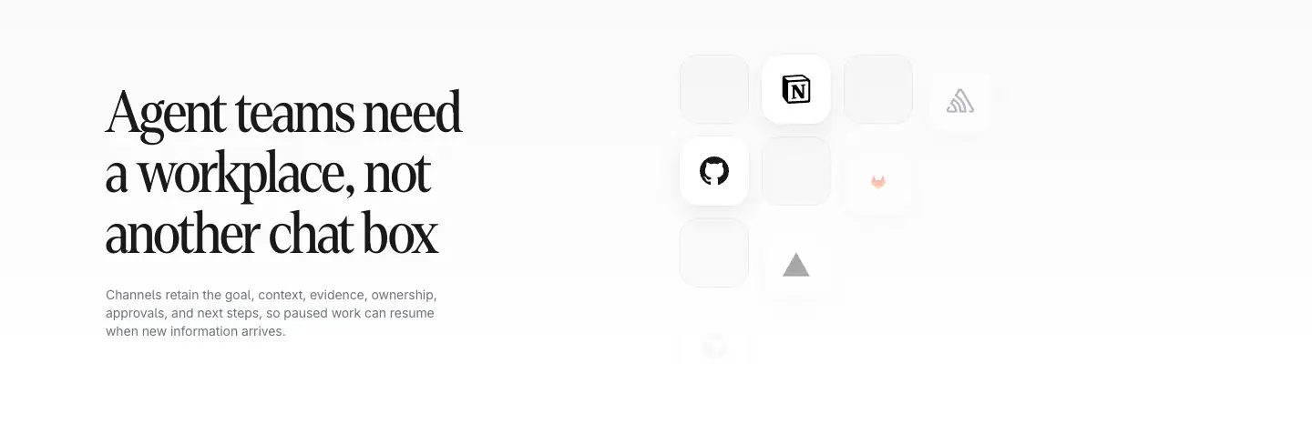
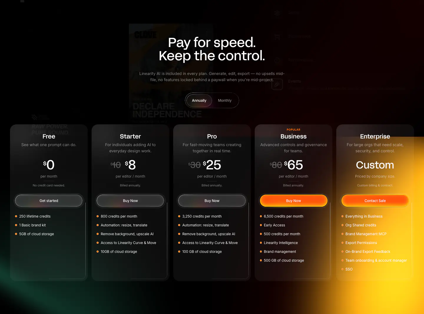
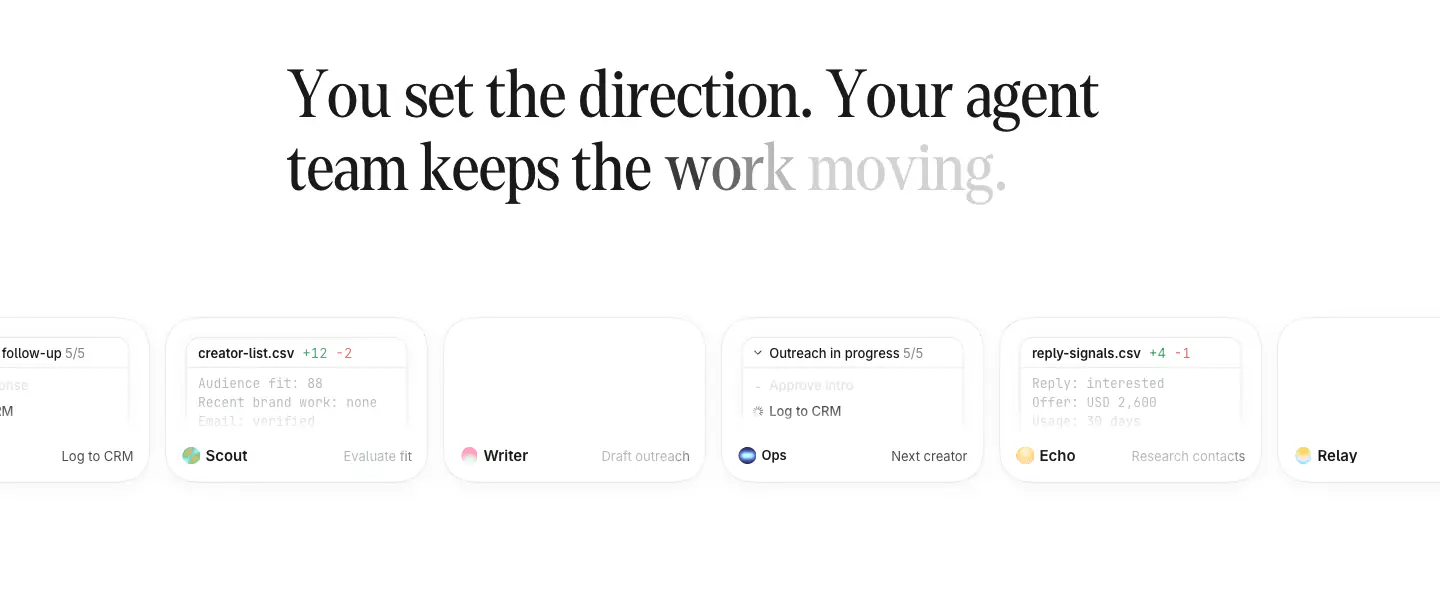
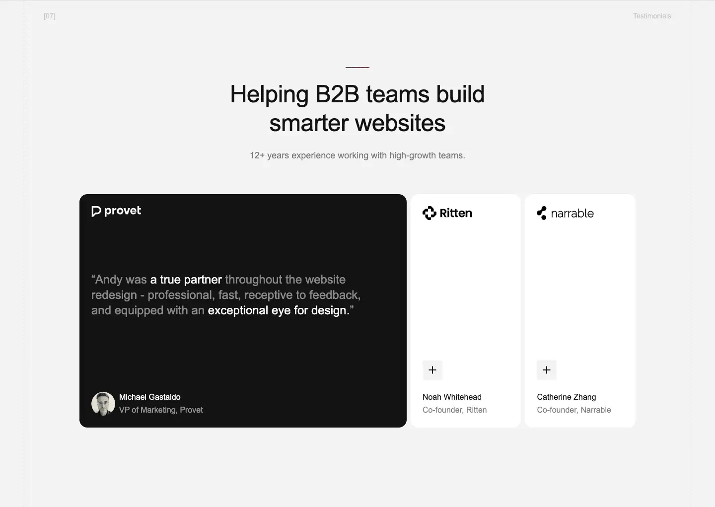
Primefold features a clean, modern, and highly polished corporate SaaS aesthetic. The design emphasizes large, clear typography using 'Stack Sans' and 'Inter', generous whitespace, and heavily rounded corners on cards and buttons. It mixes light and dark themed sections, utilizing full-bleed photographic backgrounds in the hero and within feature cards to add depth and context.
- Spacing
- Generous and structured, with large vertical padding between sections to allow content to breathe.
- Shape
- Fully rounded (pill-shaped) buttons and heavily rounded corners on cards and image containers. Consistent use of large border-radius across cards, interactive elements, and layout boundaries.
- Borders
- Mostly borderless design relying on background color differences or shadows, with occasional subtle transparent borders.
- Buttons
- Pill-shaped, appearing in both solid contrasting colors (white on dark, black on light) and semi-transparent treatments.
- Width
- Centered content with a constrained maximum width to ensure readability on large displays.
- Density
- Low density, utilizing significant negative space to draw focus to typography and imagery.