- Industry
- Technology
- Site type
- Landing, Blog
- Platform
- Webflow
- Tech
- Not detected yet
- Style
- Minimal, Editorial, Corporate
- Business model
- AI, Agency, Software
- Presence
- Online
- Components
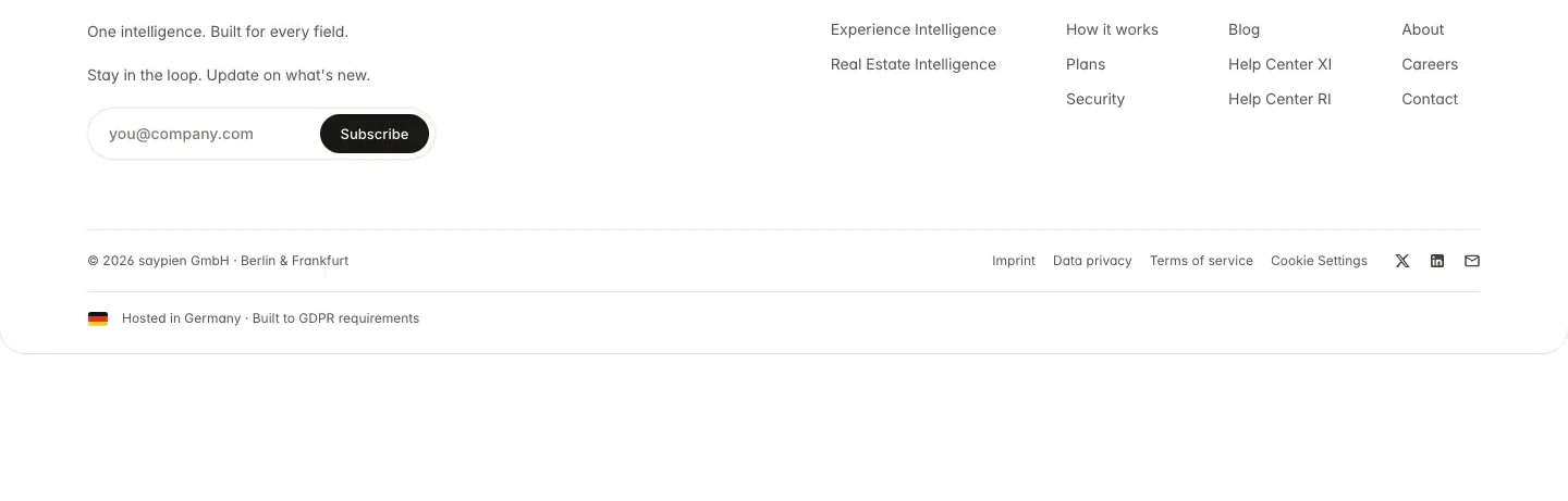
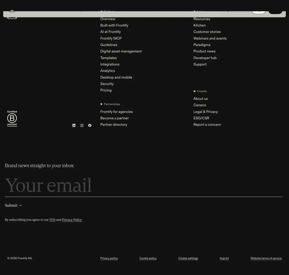
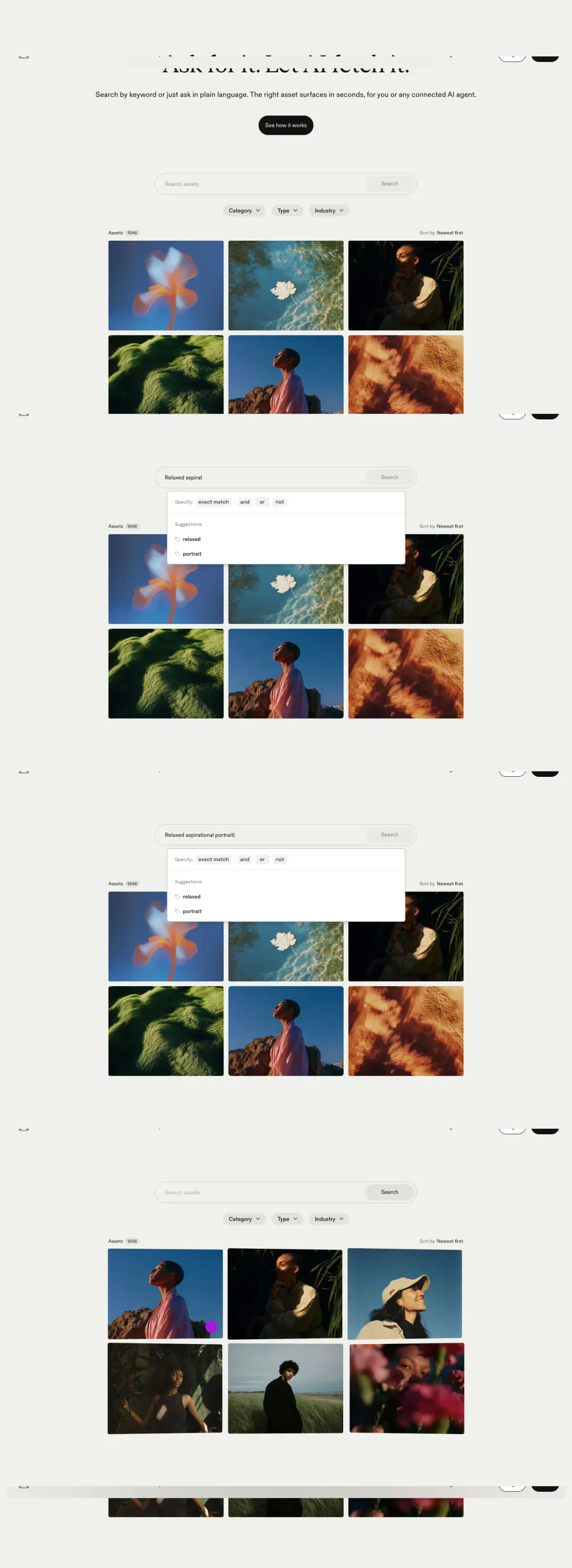
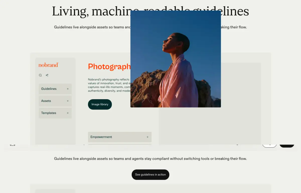
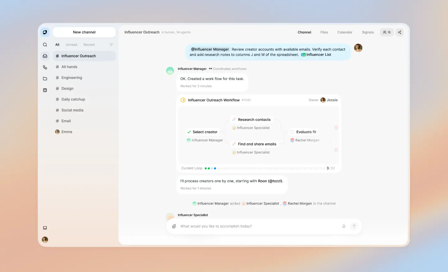
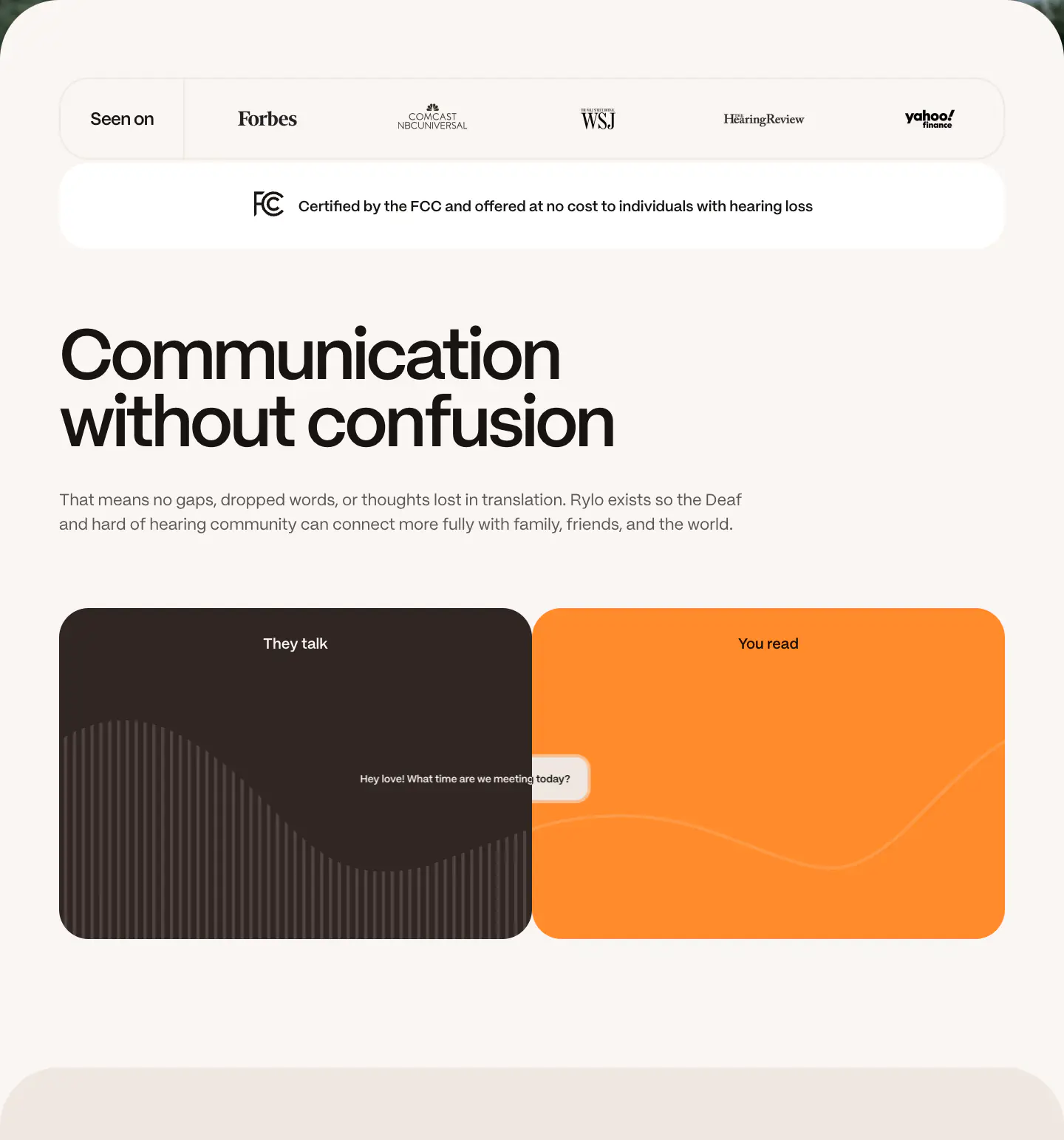
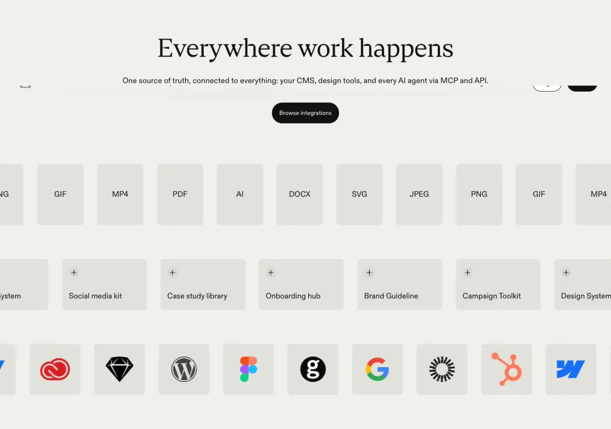
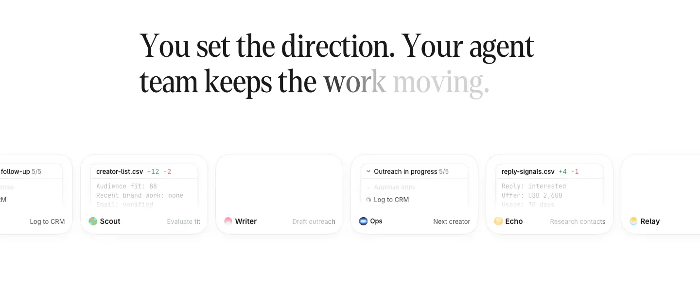
- Navigation Bar, Hero, Logo Strip, Product UI, Primary Button, Outline Button, Footer, Newsletter Form
- Score
- 58.1/100 · 100% evidence · Review pending
- Typography
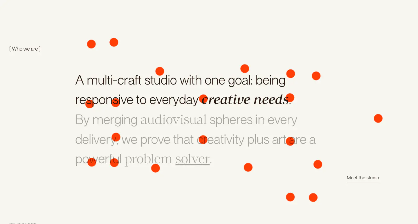
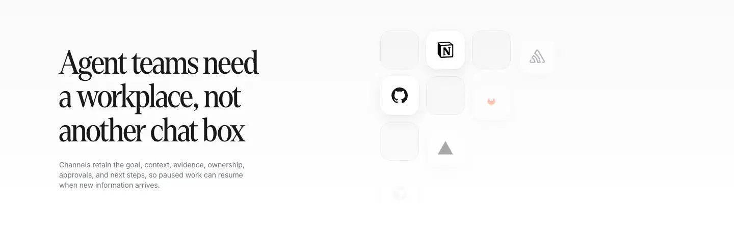
- Display — Cranny; Heading — Cranny; Body — ABC Diatype
- Palette
- OG image
Design analysis
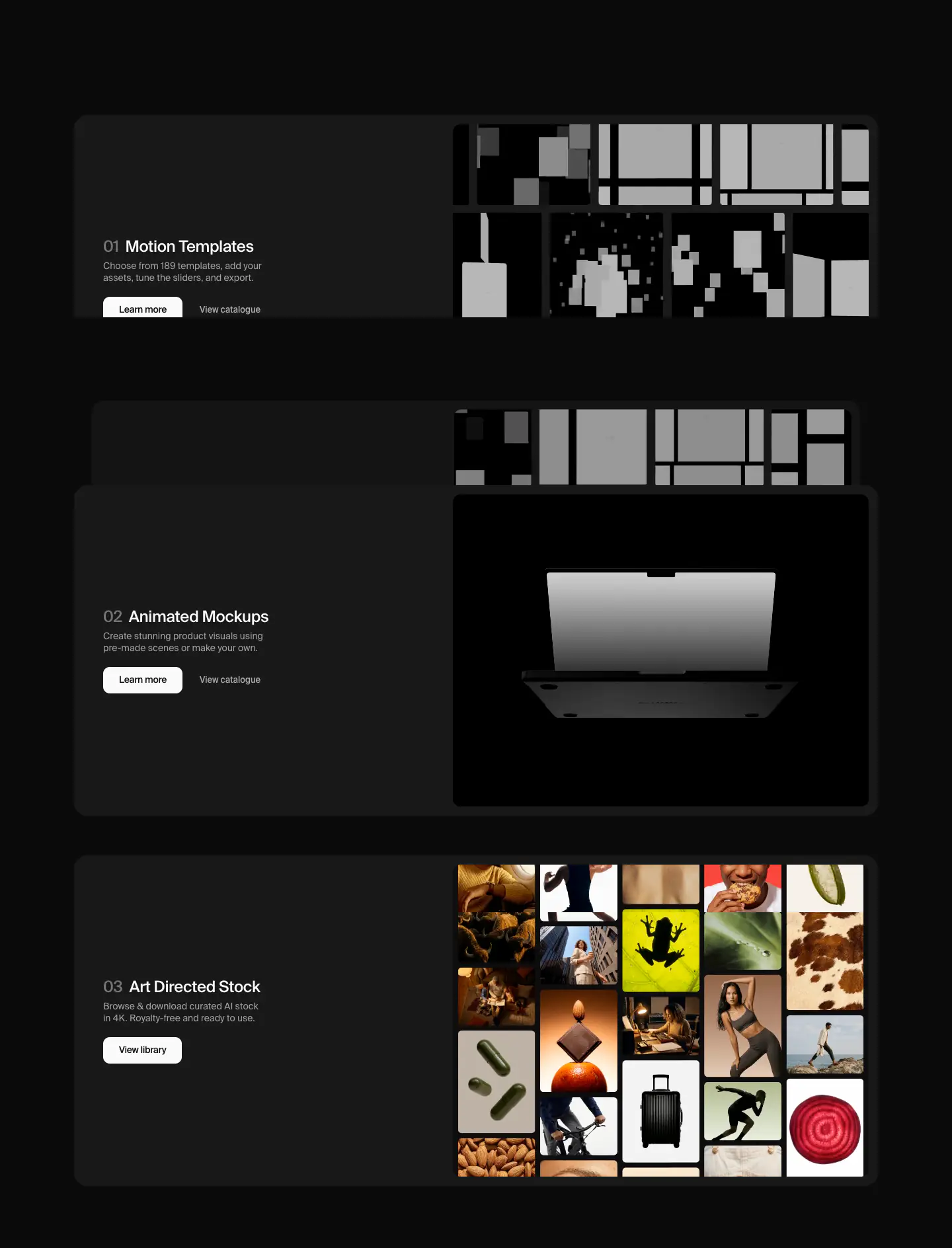
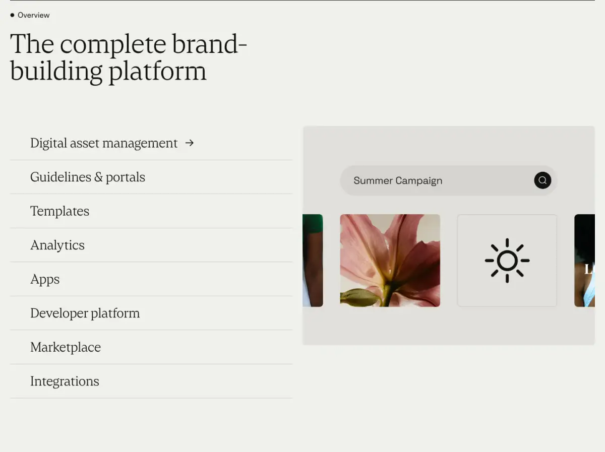
The page is a modern SaaS marketing site featuring a minimal and editorial design. It utilizes a warm, off-white canvas with dark, high-contrast text. Typography is a key element, pairing a distinctive serif for headings with a clean sans-serif for body copy and interface elements. Components include pill-shaped buttons, product UI mockups, and structured feature sections, enhanced by subtle, sparse accent colors like purple and orange. The layout relies on generous whitespace and a clear visual hierarchy.
- Spacing
- Generous vertical rhythm with large padding between distinct sections and relaxed line heights in body text.
- Shape
- Mix of fully rounded pill shapes for buttons/inputs and moderate border radii for product cards/images. Buttons appear to use full capsule/pill radii; product UI mockups use ~8px to ~16px border radii.
- Borders
- Mostly borderless design relying on subtle background color shifts. Thin 1px solid borders are used sparingly on specific form elements.
- Buttons
- Pill-shaped, mostly solid dark fills for primary actions, or transparent with thin borders for secondary actions.
- Width
- Centered content with a constrained maximum width to maintain readability, especially for text blocks.
- Density
- Low density, utilizing significant negative space to draw focus to central interactive elements and typography.