- Industry
- Finance
- Site type
- Landing
- Platform
- Custom code
- Tech
- Next.js
- Style
- Minimal, Corporate, Ui Centric
- Business model
- Software
- Presence
- Online
- Components
- Navigation Bar, Hero, Primary Button, Ghost Button, Feature Card, Carousel, Tabs, Input Field, Animated Product Mockup, Tooltip Feature Callouts
- Score
- 45.7/100 · 100% evidence · Review pending
- Typography
- Display — seasonsSans; Heading — seasonsSans; Body — seasonsSans; Mono — Geist
- Palette
- OG image
Design analysis
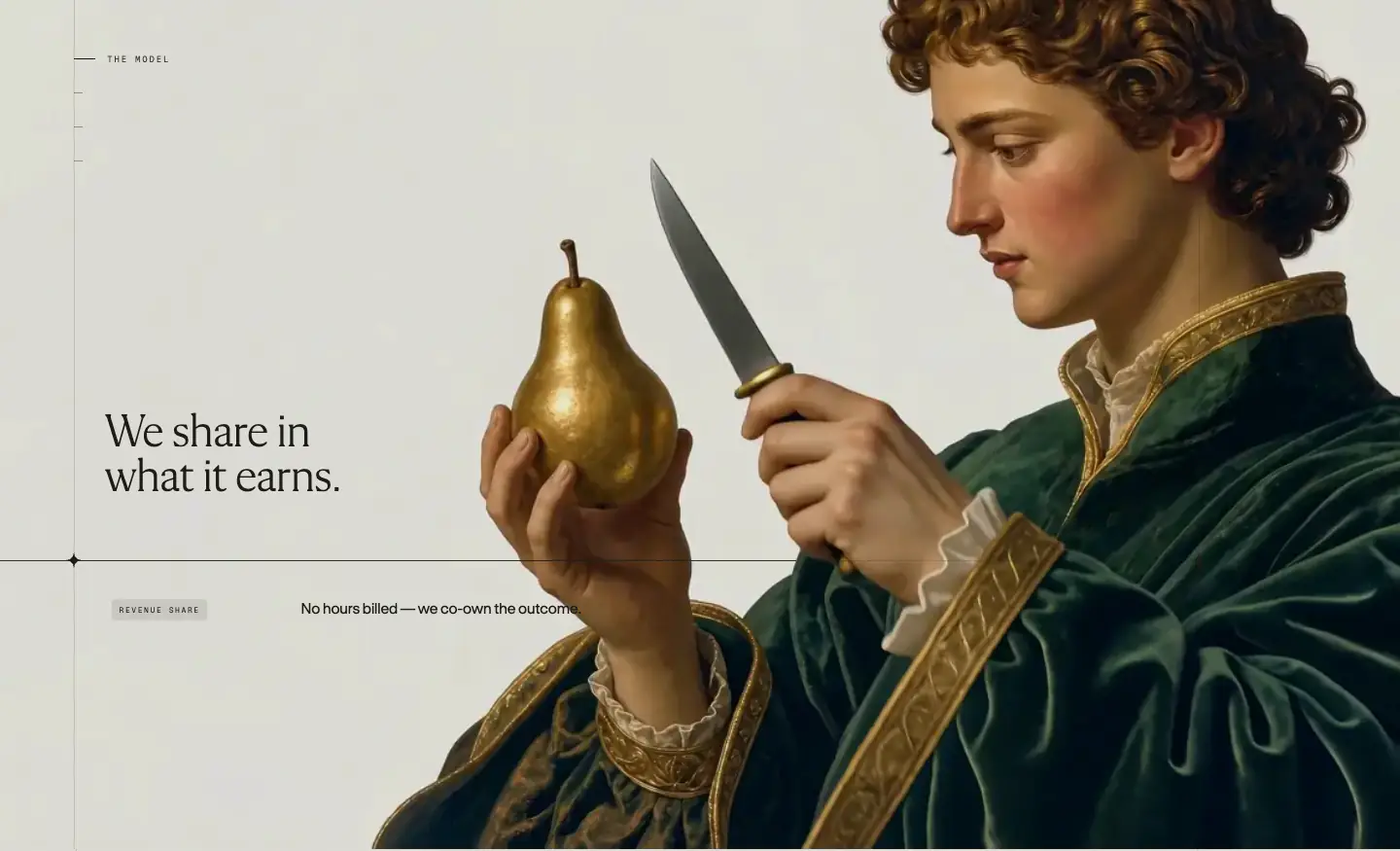
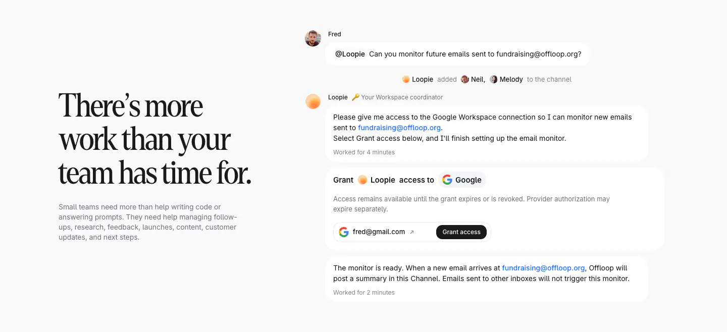
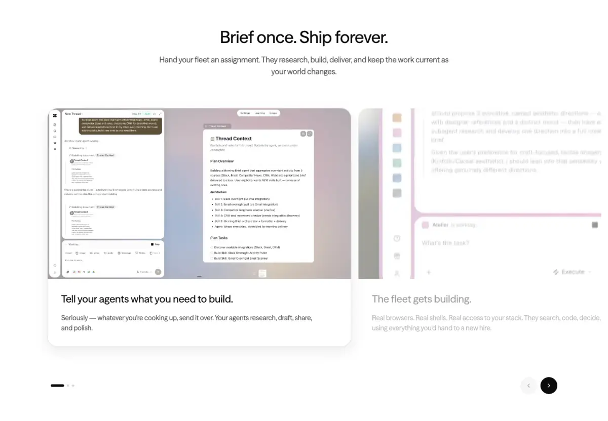
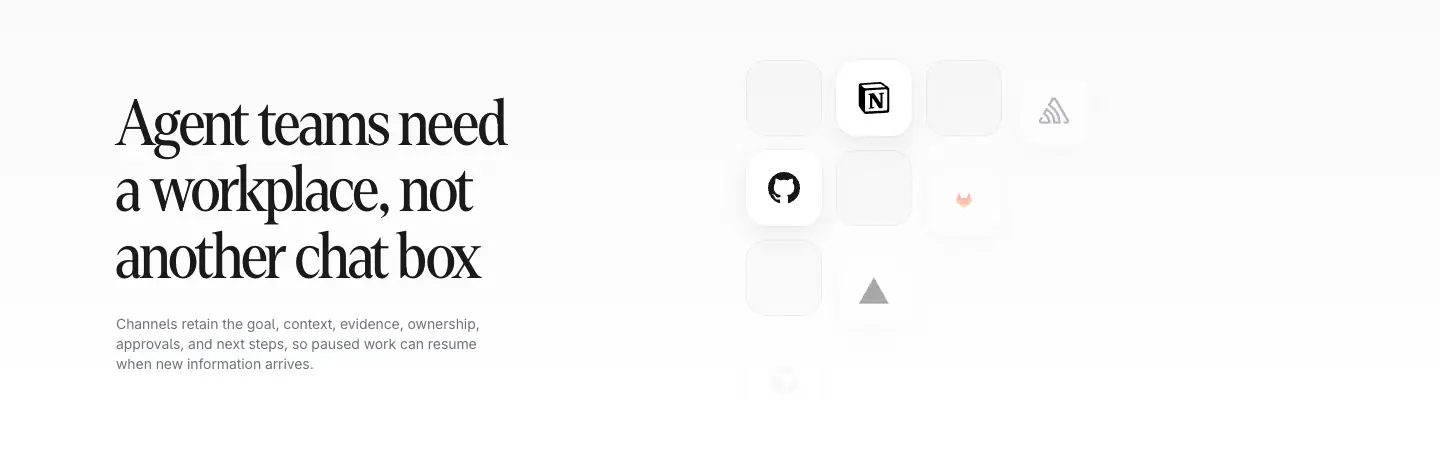
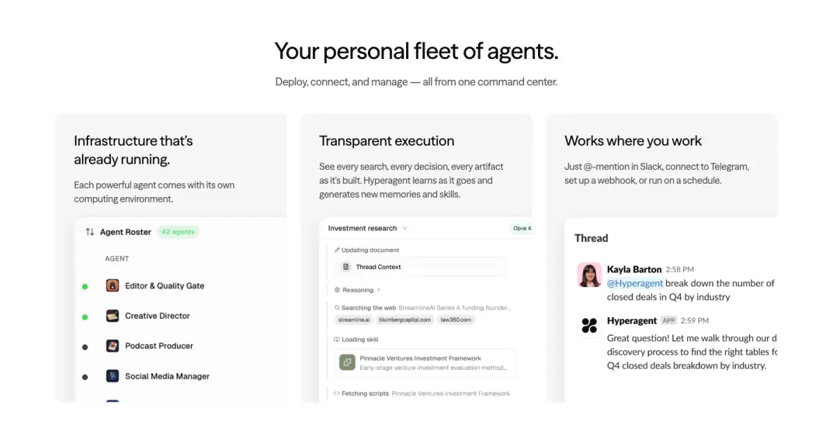
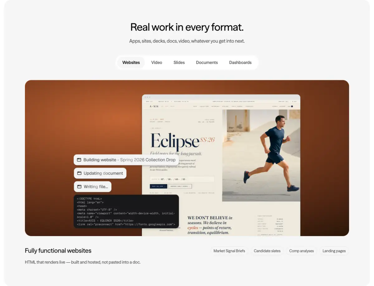
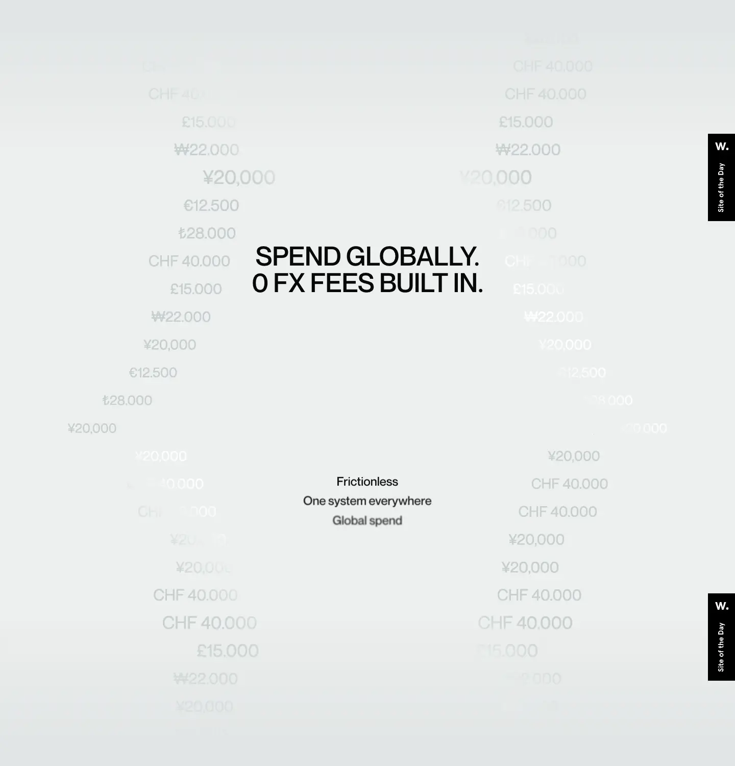
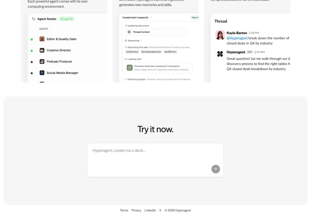
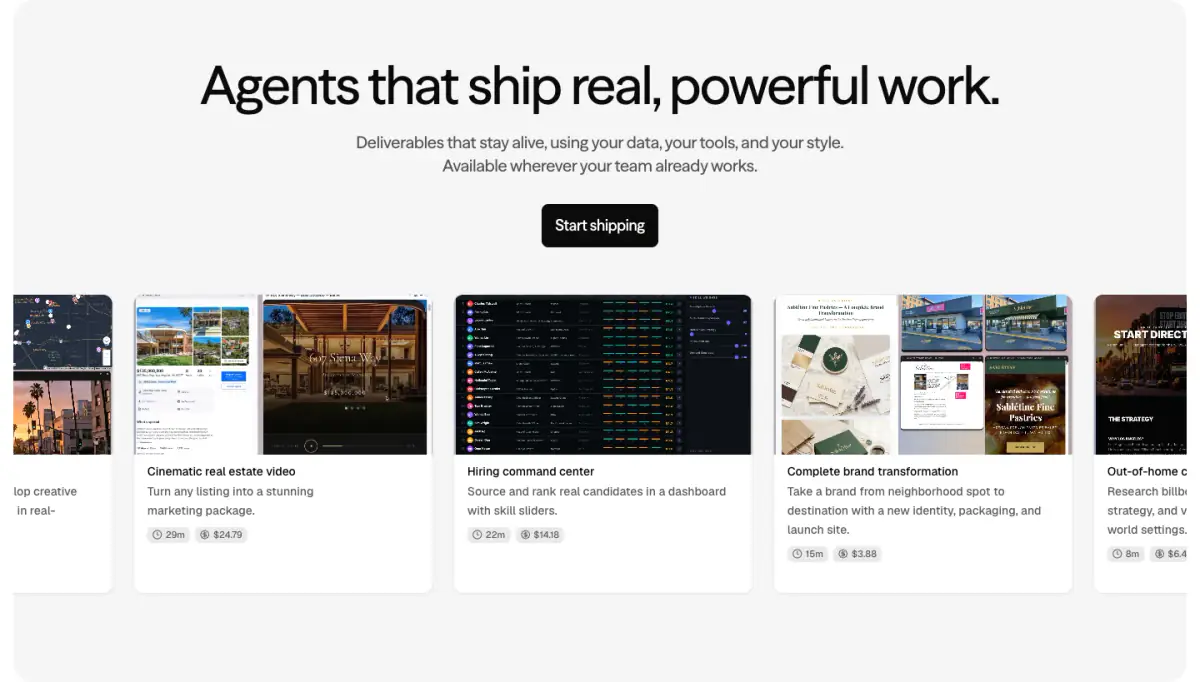
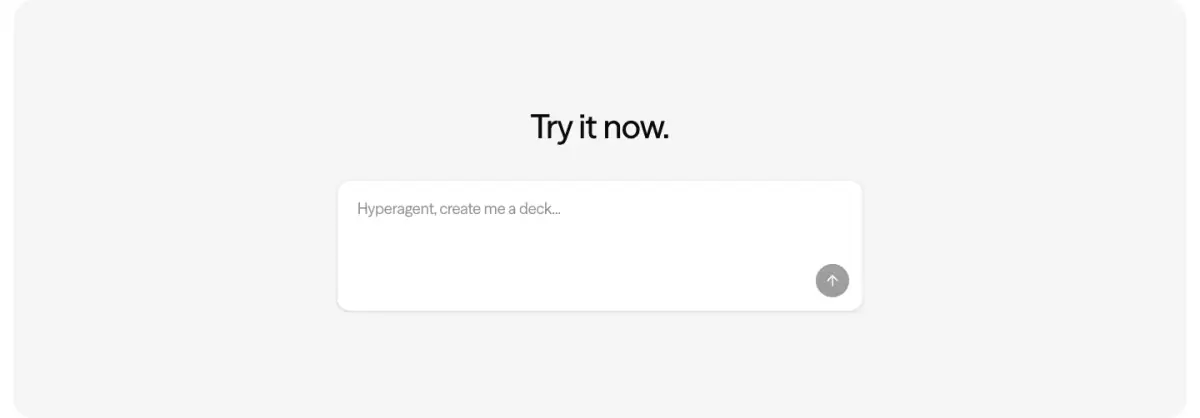
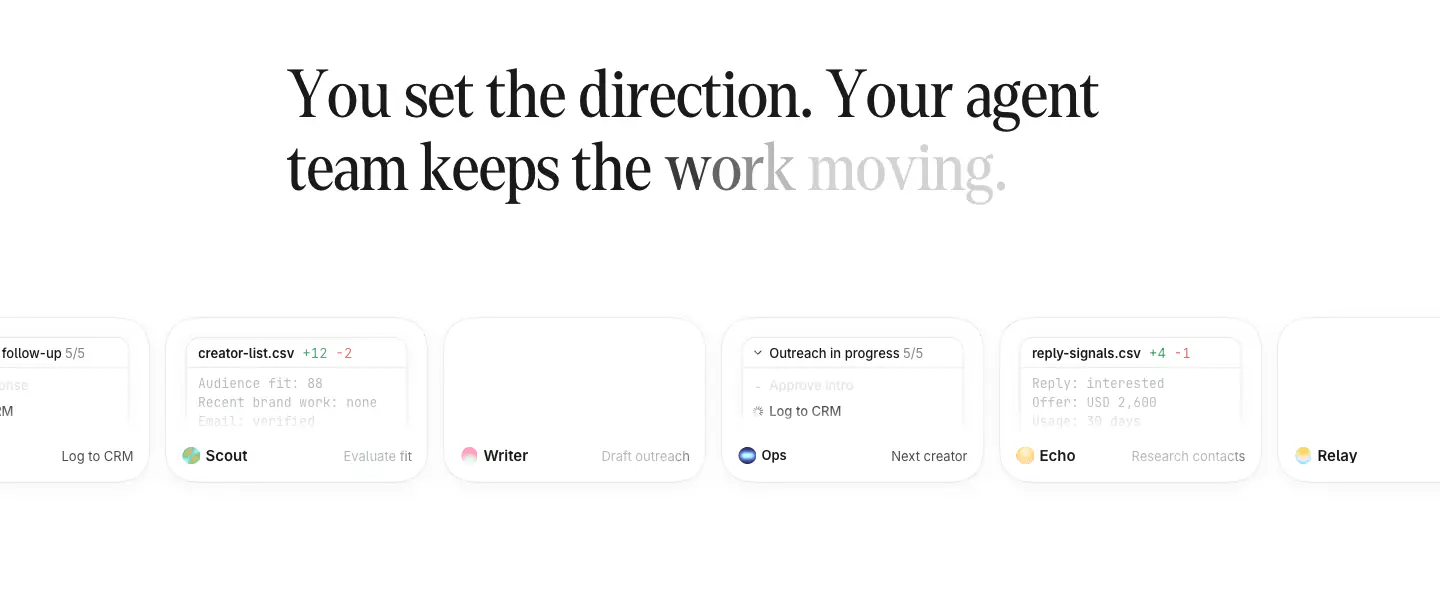
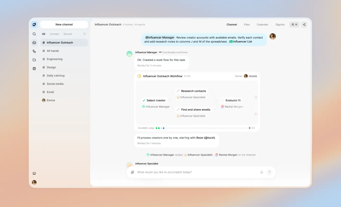
The website for Hyperagent features a clean, minimal, and slightly corporate design with a focus on product UI mockups. The color palette is mostly monochromatic (white, black, and various shades of grey) with subtle use of color in the UI graphics. The typography relies on 'seasonsSans' for headings and body text, with 'Geist' used for smaller UI details. The layout is structured around large, rounded-corner cards and sections that showcase different aspects of the product's capabilities. A marquee, tabbed content, and simulated typing add dynamic elements to the presentation.
- Spacing
- Generous use of whitespace between main sections, with tighter padding inside cards and UI mockups.
- Shape
- Prominent use of rounded corners (border-radius) on almost all elements, including main content sections, feature cards, buttons, and UI mockups. Large radii on main section containers (e.g., the grey background sections) and feature cards. Smaller radii on buttons and input fields.
- Borders
- Subtle 1px solid borders (color-11) used to define cards and UI elements against the background.
- Buttons
- Primary buttons are solid (black background, white text) with rounded corners. Secondary/utility buttons in the UI mockups are outlined or ghost.
- Width
- Centered content with a maximum width, leaving margins on larger screens.
- Density
- Overall sparse density, focusing on distinct, well-separated content blocks. Higher density within the specific UI mockups to simulate complex interfaces.