- Industry
- Finance
- Site type
- Landing
- Platform
- Custom code
- Tech
- Not detected yet
- Style
- Editorial, Illustrative, Minimal, Cinematic Scroll, Technical Overlay
- Business model
- E-commerce, Software, Agency
- Presence
- Online
- Components
- Hero With Background Imagery, Navigation Bar, Primary Button, Badge, Crosshair Grid System, Floating Narrative Text
- Score
- 71.1/100 · 100% evidence · Review pending
- Typography
- Display — Flecha M; Heading — Flecha S; Body — GT Standard L; Mono — GT Standard Mono
- Palette
- OG image

Design analysis
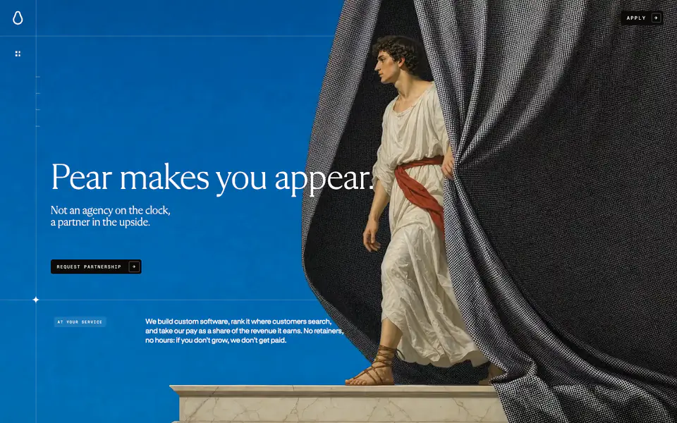
The Pear website features a highly editorial and cinematic design, heavily reliant on a continuous scroll-driven narrative sequence. The aesthetic combines classical, Renaissance-style painted imagery with modernist, technical UI elements like thin grid lines, crosshairs, and small monospace typography. Large serif typography is used for statements, creating a striking contrast against the full-bleed background media. Interactive elements are minimal, featuring sharp corners and high contrast.
- Spacing
- Sparse rhythm relying on viewport heights; text blocks are positioned openly against expansive backgrounds rather than in tight containers.
- Shape
- Strictly sharp, 0px corners on buttons, inputs, and layout boundaries. No visible border radius used in the primary UI elements.
- Borders
- Thin, 1px translucent or solid white lines used to draw a technical grid over the organic imagery.
- Buttons
- Solid color fills with high contrast text, sharp corners, and monospace uppercase typography. Often paired with a subtle arrow icon.
- Width
- Full bleed edge-to-edge for media, while text floats within invisible inset grid columns.
- Density
- Extremely low density; the design prioritizes large-scale imagery and negative space over information density.