- Industry
- Retail
- Site type
- Portfolio
- Platform
- Custom code
- Tech
- Not detected yet
- Style
- Minimal, Editorial, Photographic, Luxury
- Business model
- Shopping, Agency
- Presence
- Online
- Components
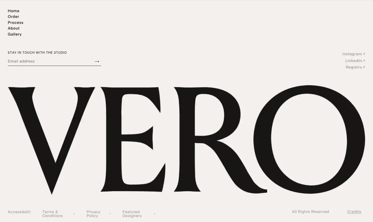
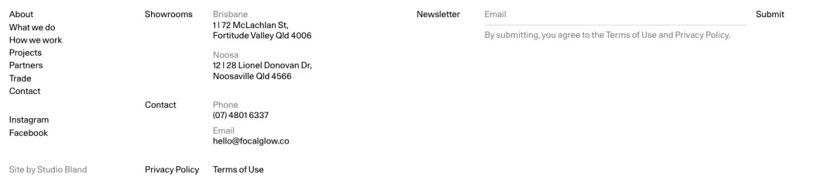
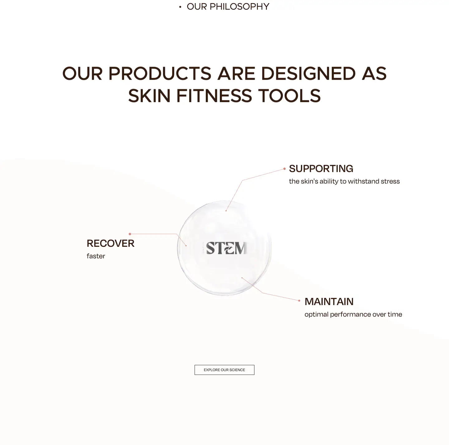
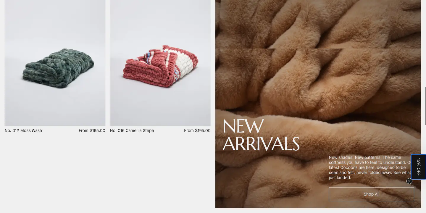
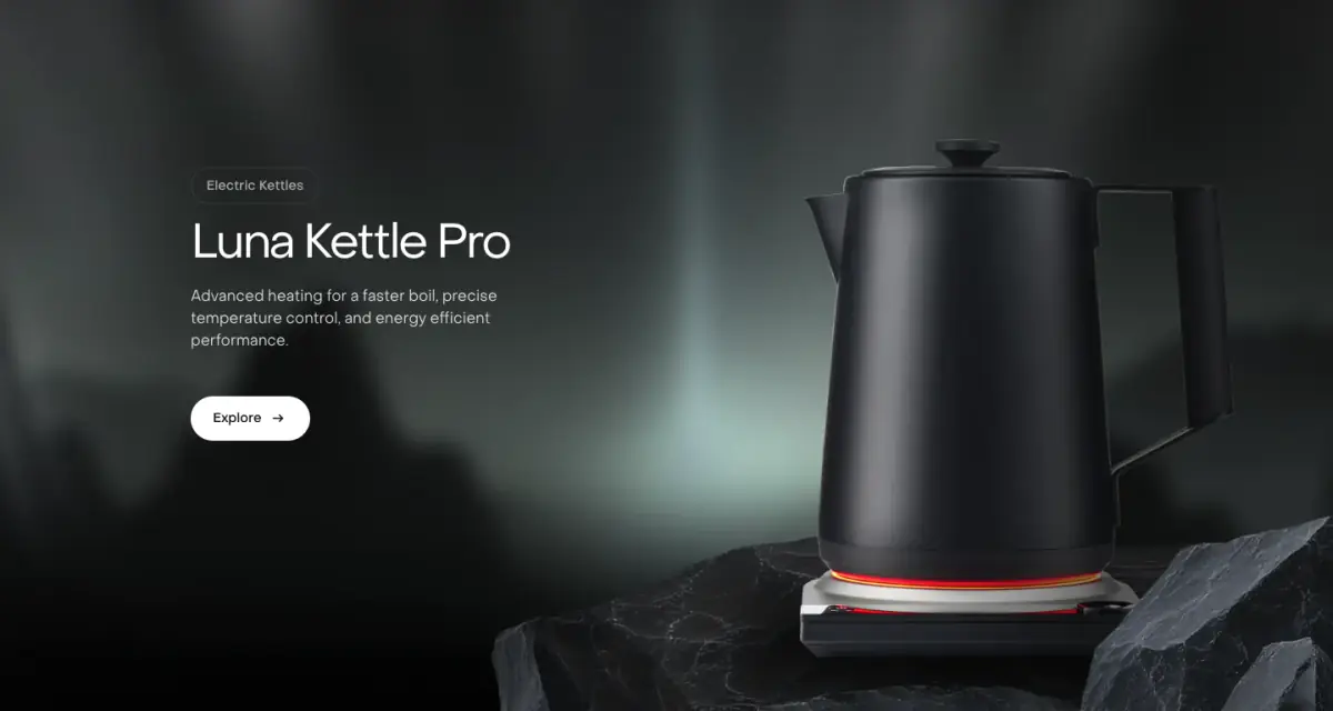
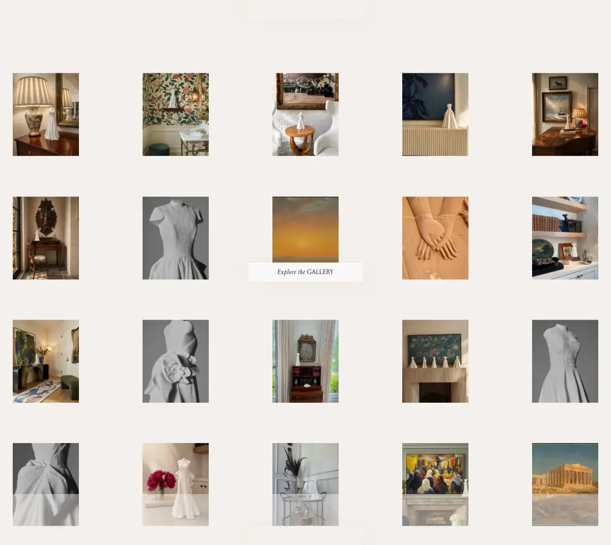
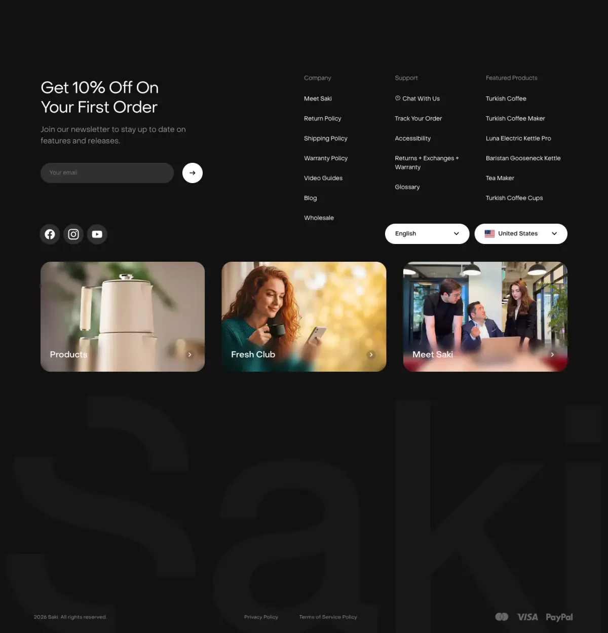
- Navigation Bar, Hero With Background Imagery, Gallery, Newsletter Form, Footer, Sticky Section With Cross Fading Content, Video Synced Progress List
- Score
- 62.5/100 · 100% evidence · Review pending
- Typography
- Display — Bradford LL; Heading — Bradford LL; Body — Unica 77 LL
- Palette
- OG image

Design analysis
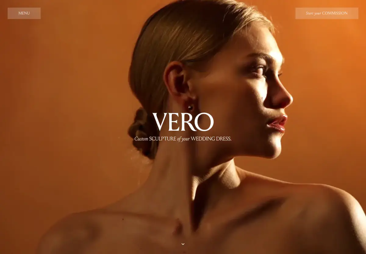
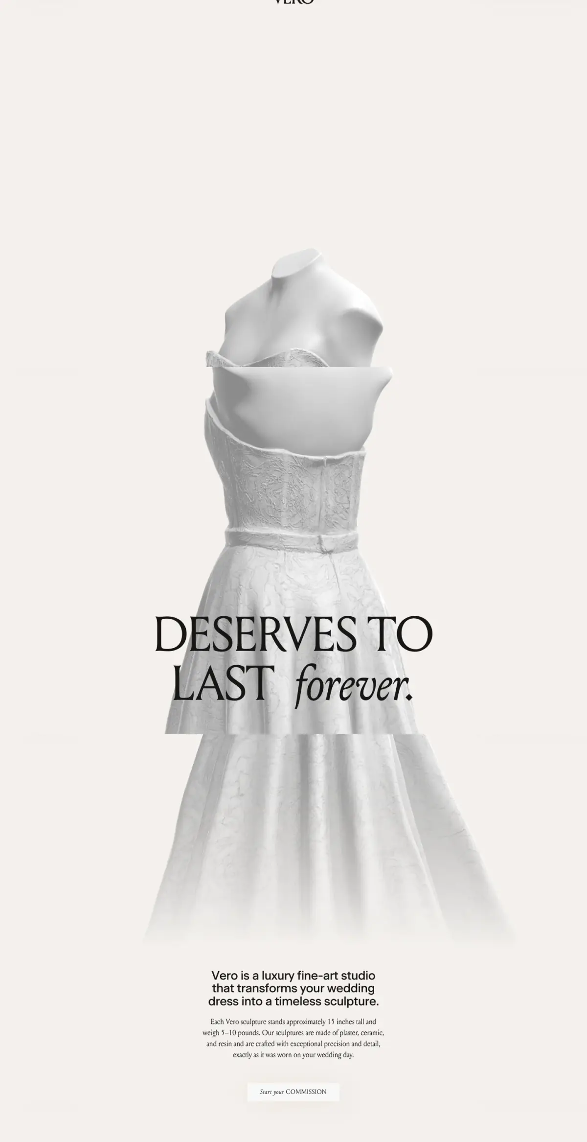
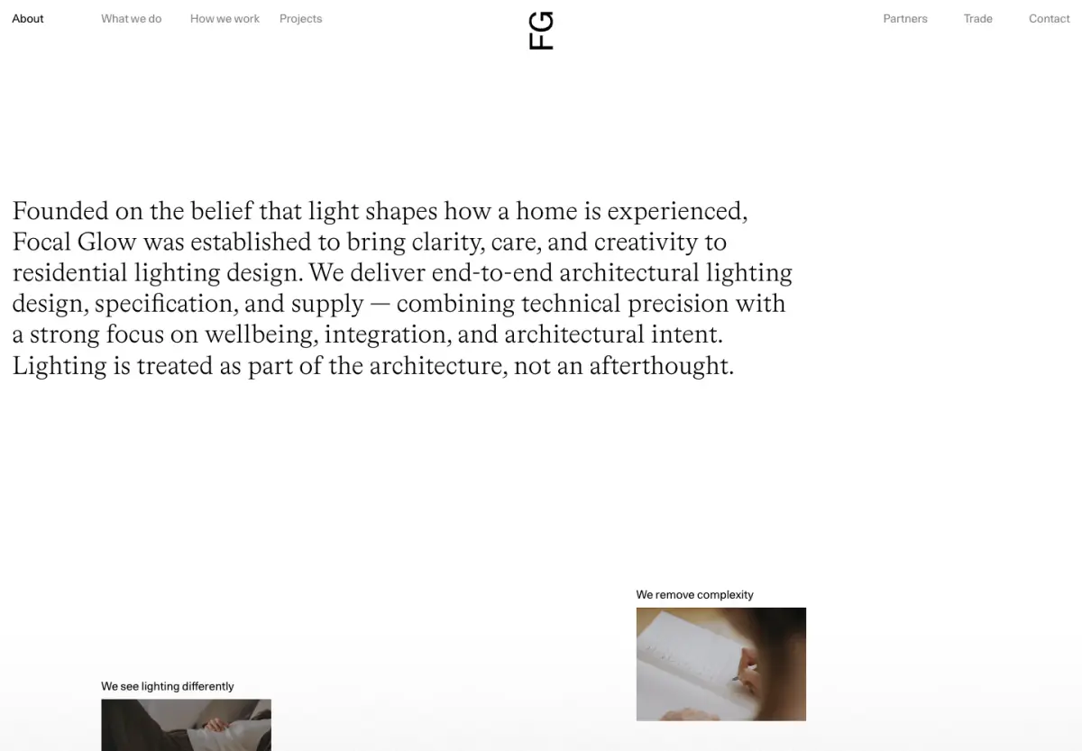
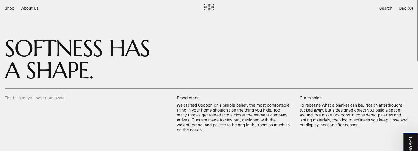
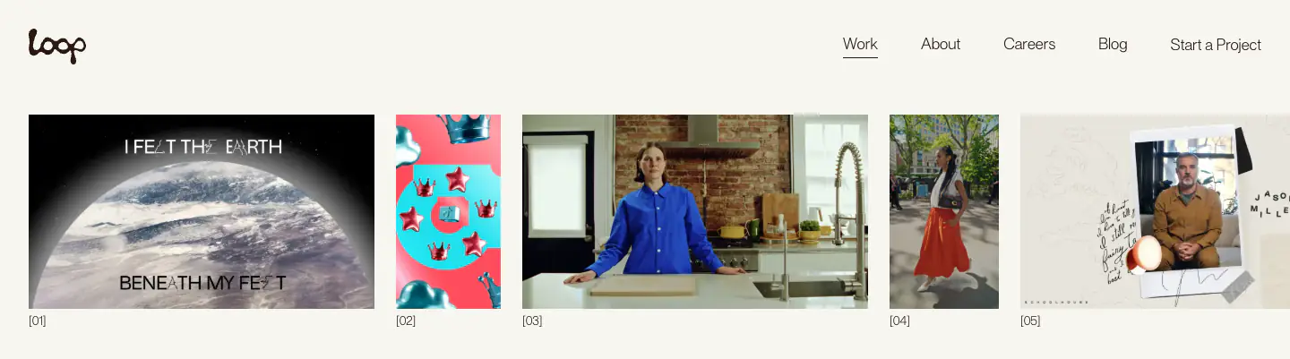
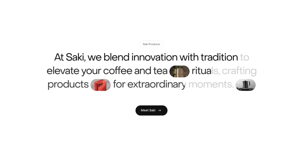
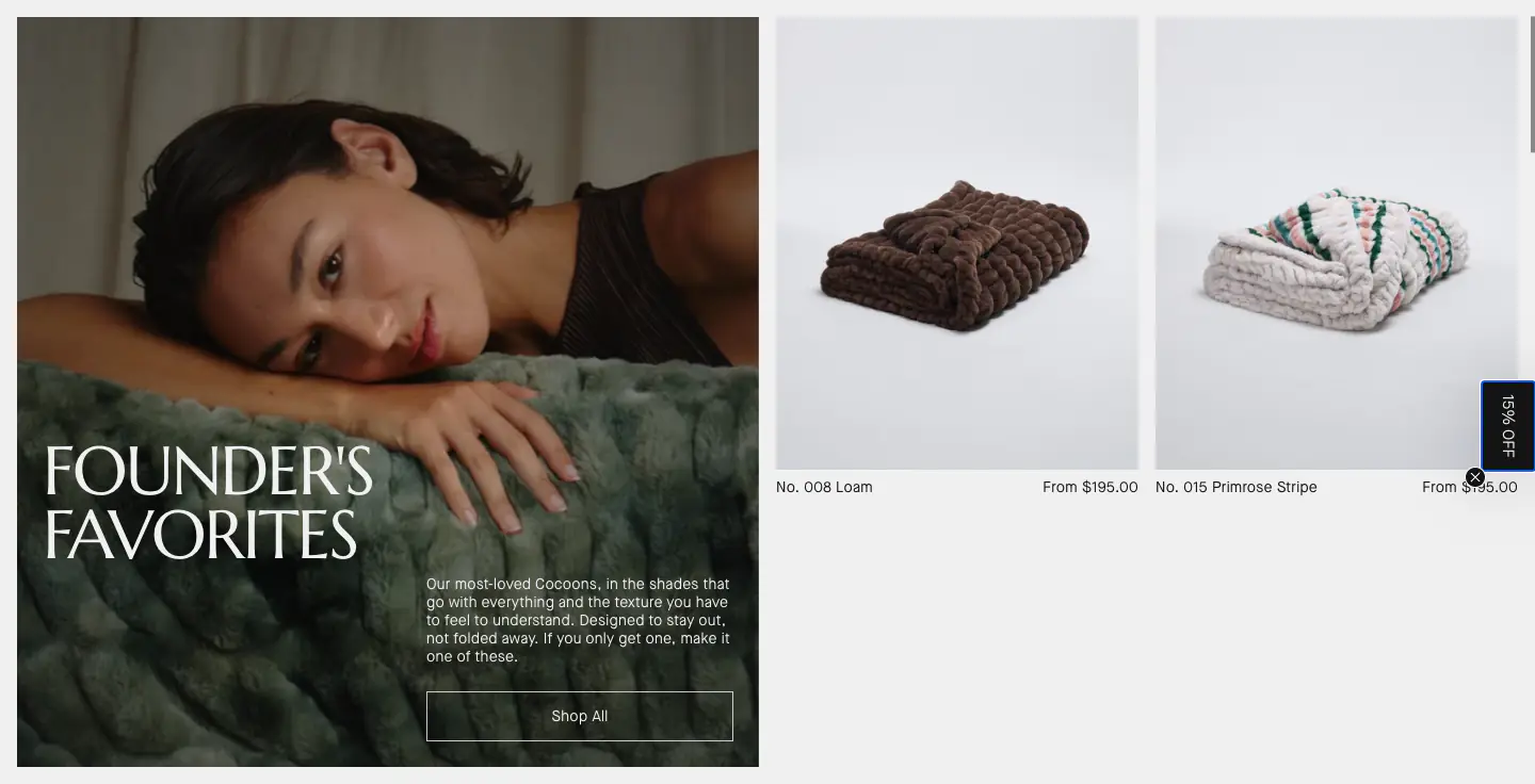
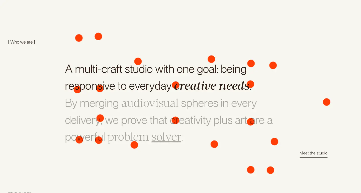
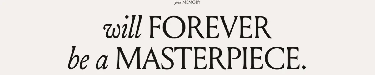
The website employs a highly minimal, editorial, and photographic design language tailored for a high-end architectural or design consultancy. It relies on a stark black and white palette, allowing large, high-quality imagery and video content to serve as the primary visual focus. Typography is elegant and restrained, pairing a modern sans-serif (Unica 77 LL) for navigation and UI elements with a refined serif (Bradford LL) for impactful statements, creating a magazine-like reading experience. The layout is characterized by generous white space, sharp corners, and a low information density, contributing to a sense of luxury and calm.
- Spacing
- Generous and airy. Sections are separated by large vertical margins, and elements within layouts (like the footer columns or project grids) have significant padding, avoiding any sense of clutter.
- Shape
- Sharp and precise. Images, input fields, and layout boundaries uniformly utilize 90-degree angles. 0px. No visible border radius is applied to major structural or media elements.
- Borders
- Extremely minimal. Only visible as 1px solid lines in specific UI contexts like the newsletter input field or subtle separators, using 'color-6'.
- Buttons
- Understated. Primary actions (like 'Submit' or project links) are often just styled text or text accompanied by a simple, thin circular icon outline, avoiding solid filled shapes.
- Width
- Variable. The hero and some media elements break out to full viewport width, while text content and standard grids are contained within generous side margins.
- Density
- Very low. The layout prioritizes negative space and isolated focal points (either text or imagery) over packing in information.