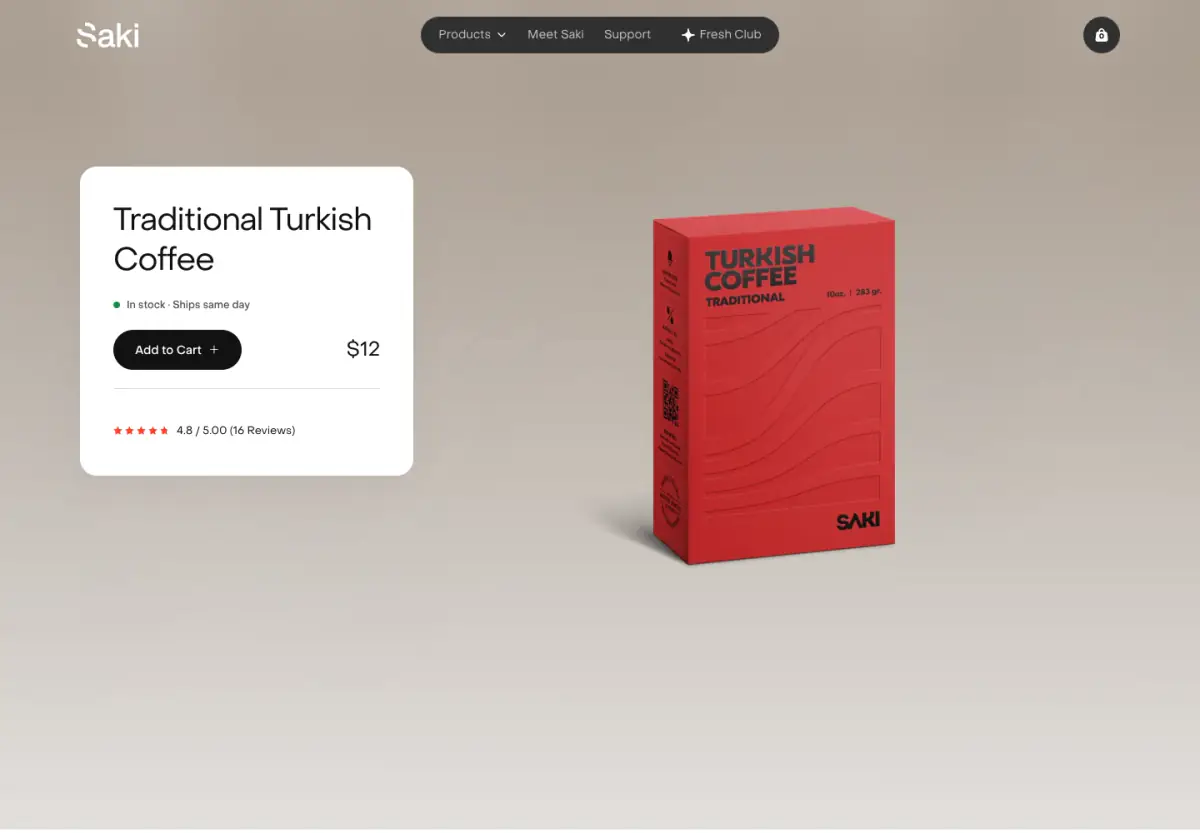
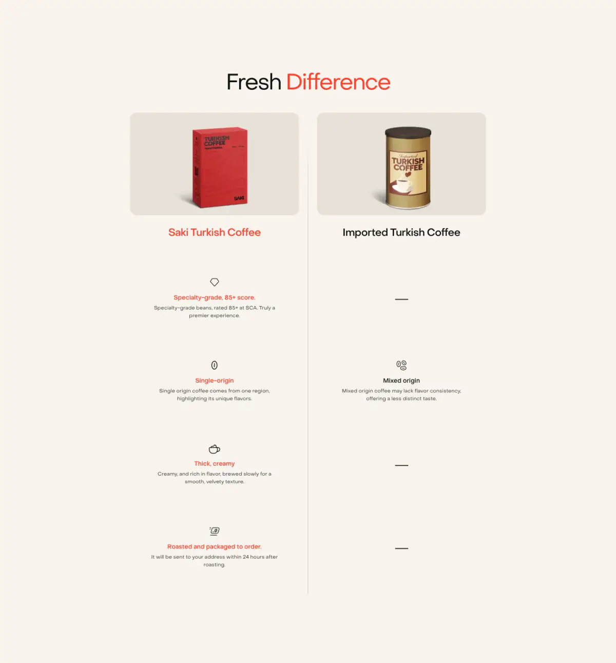
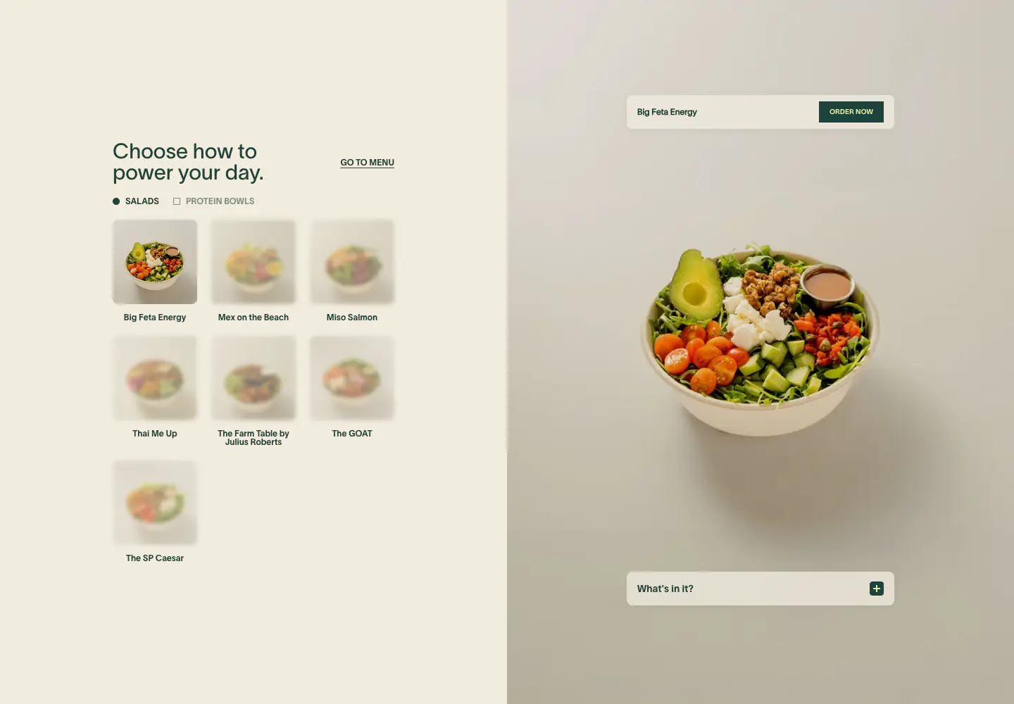
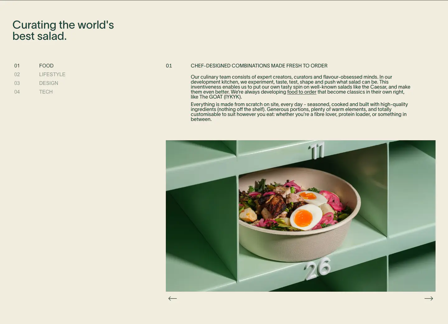
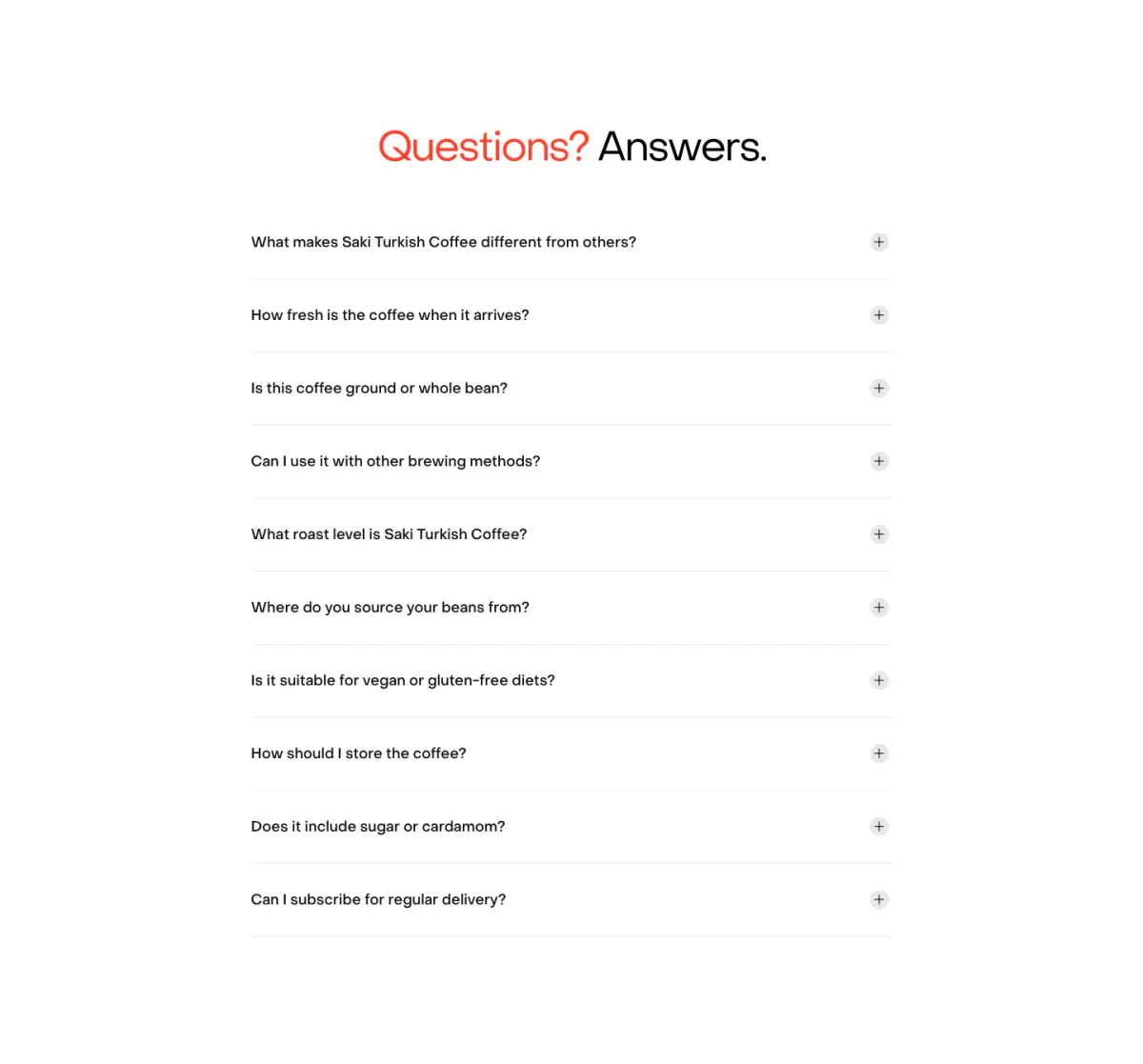
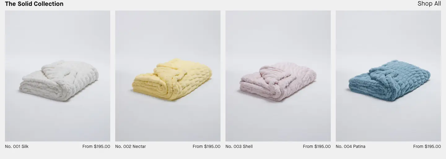
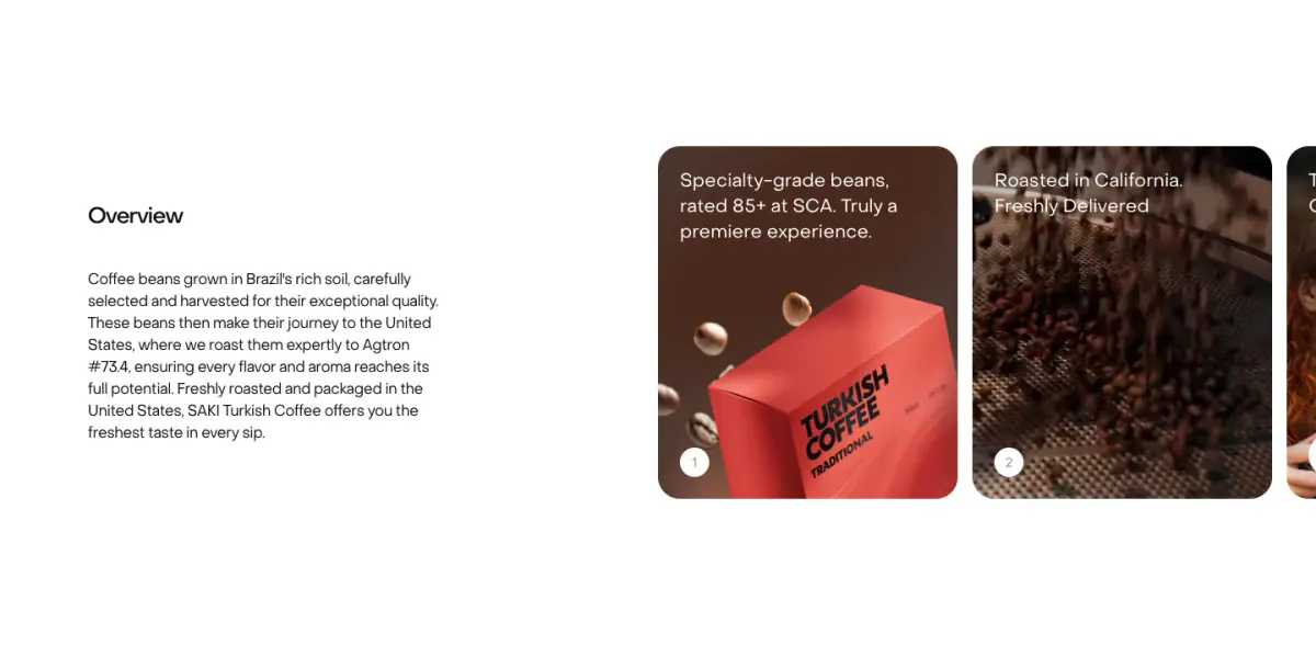
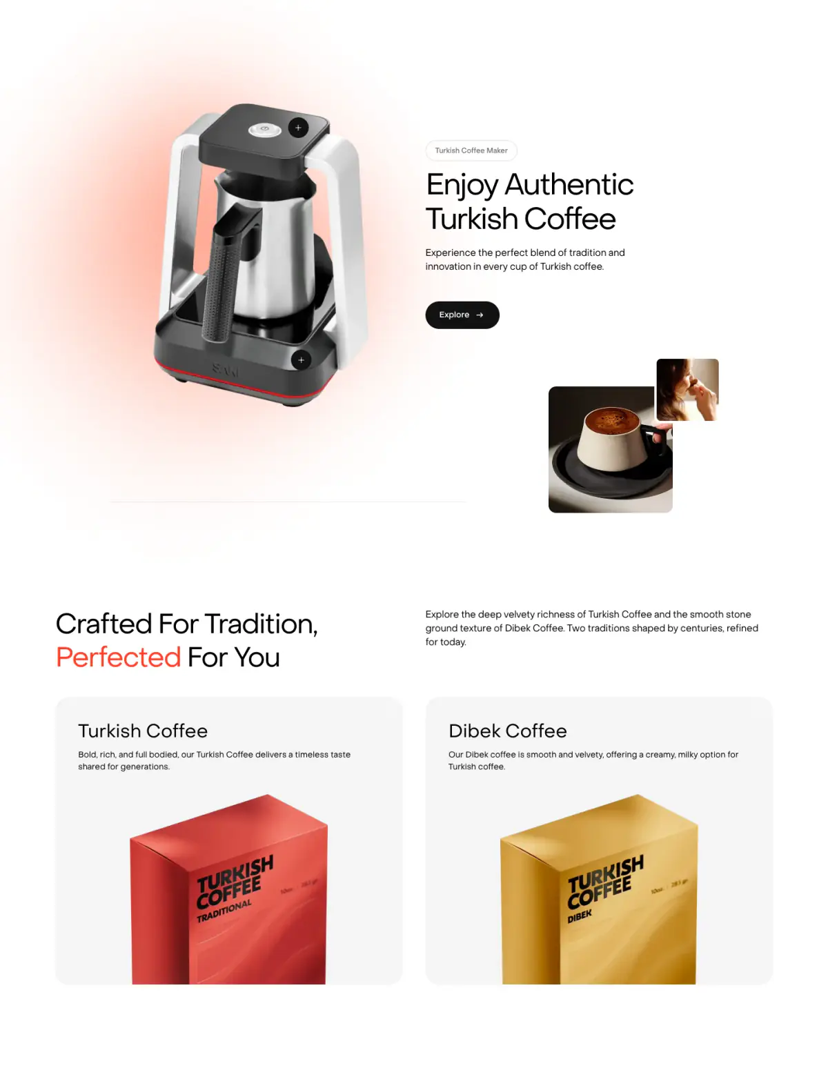
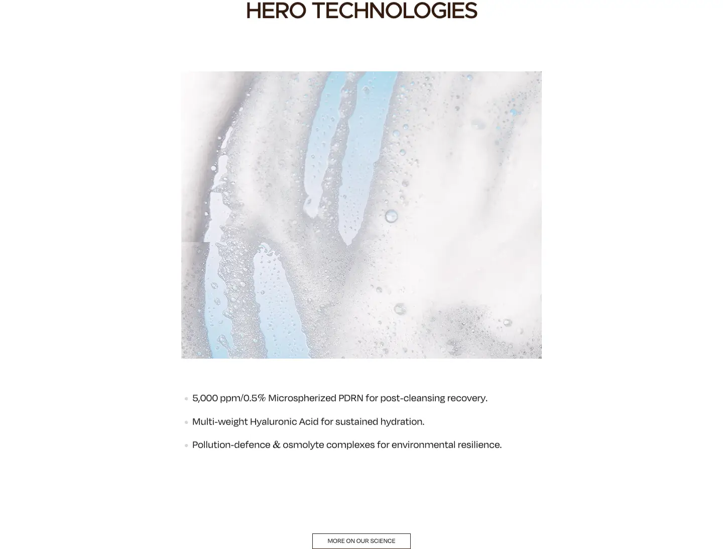
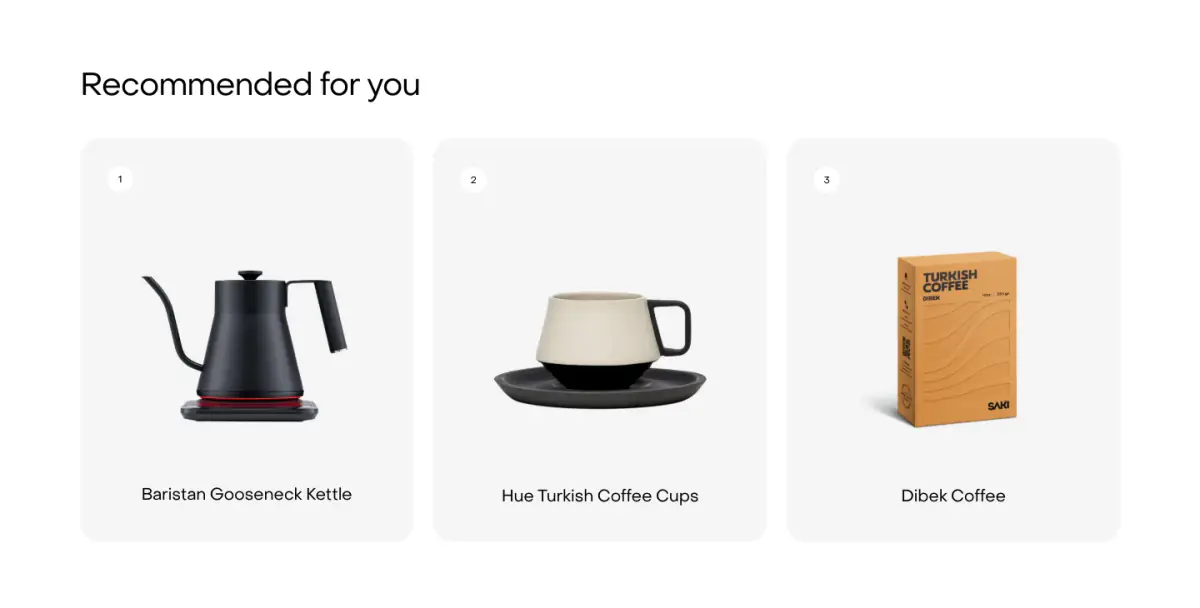
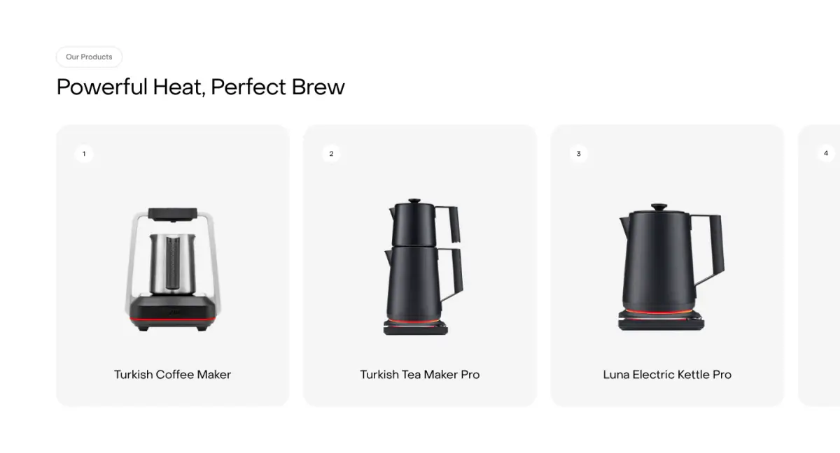
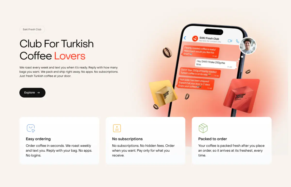
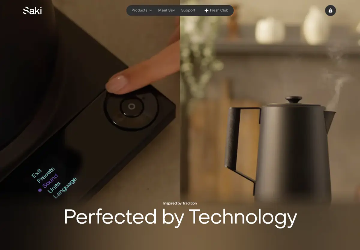
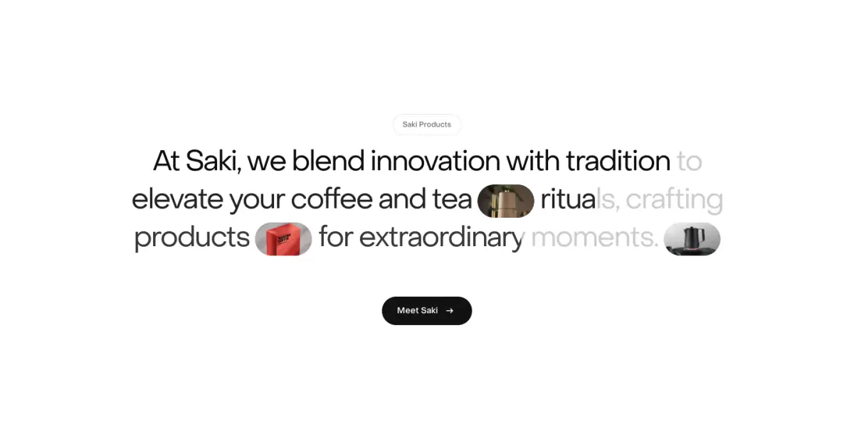
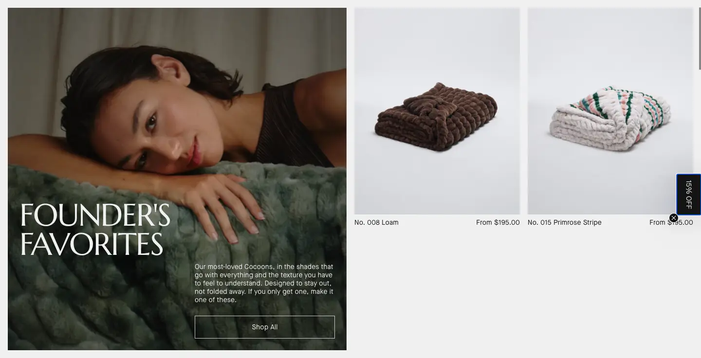
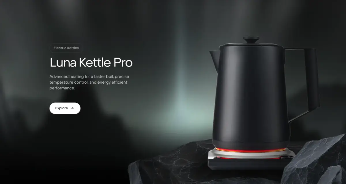
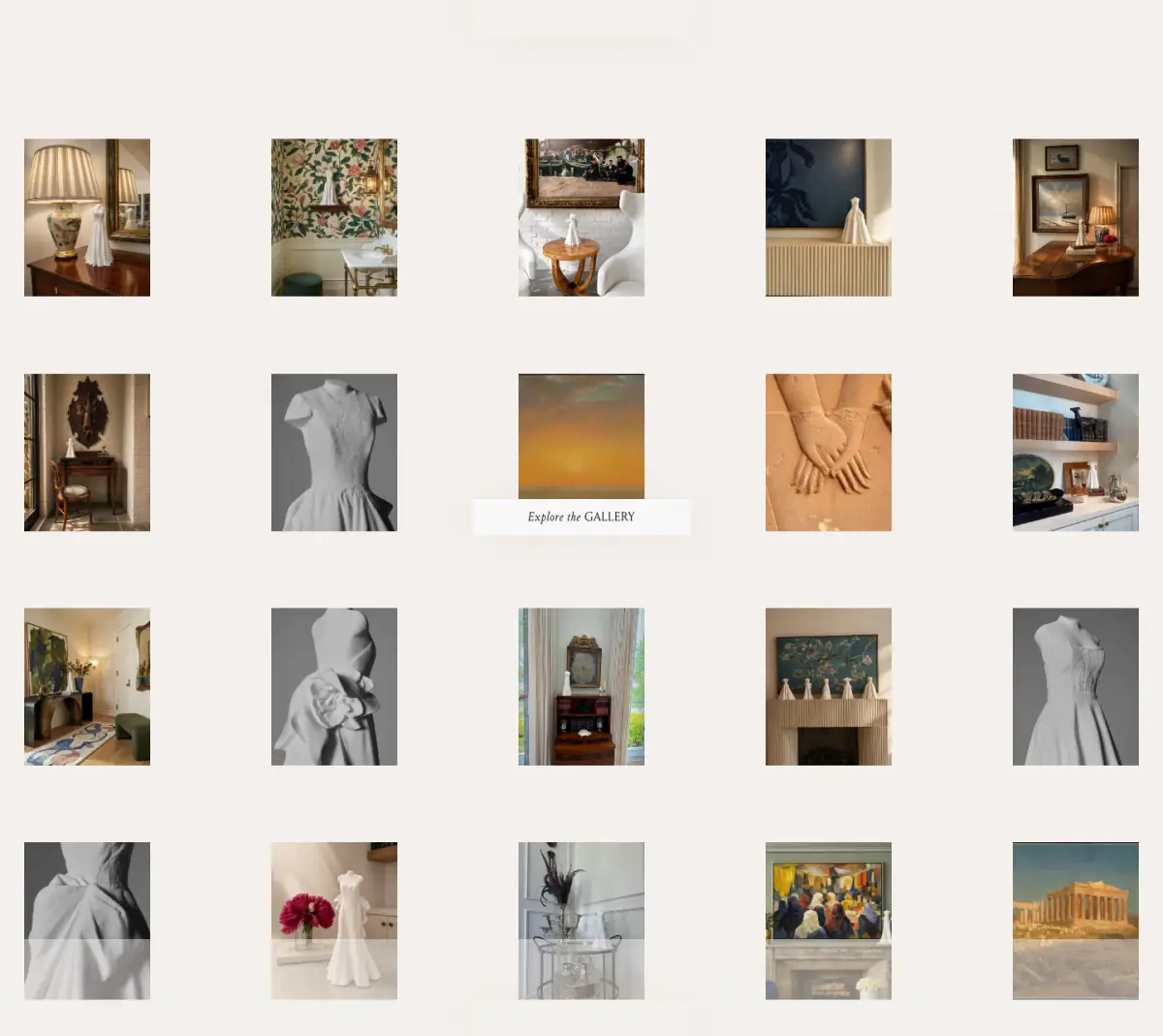
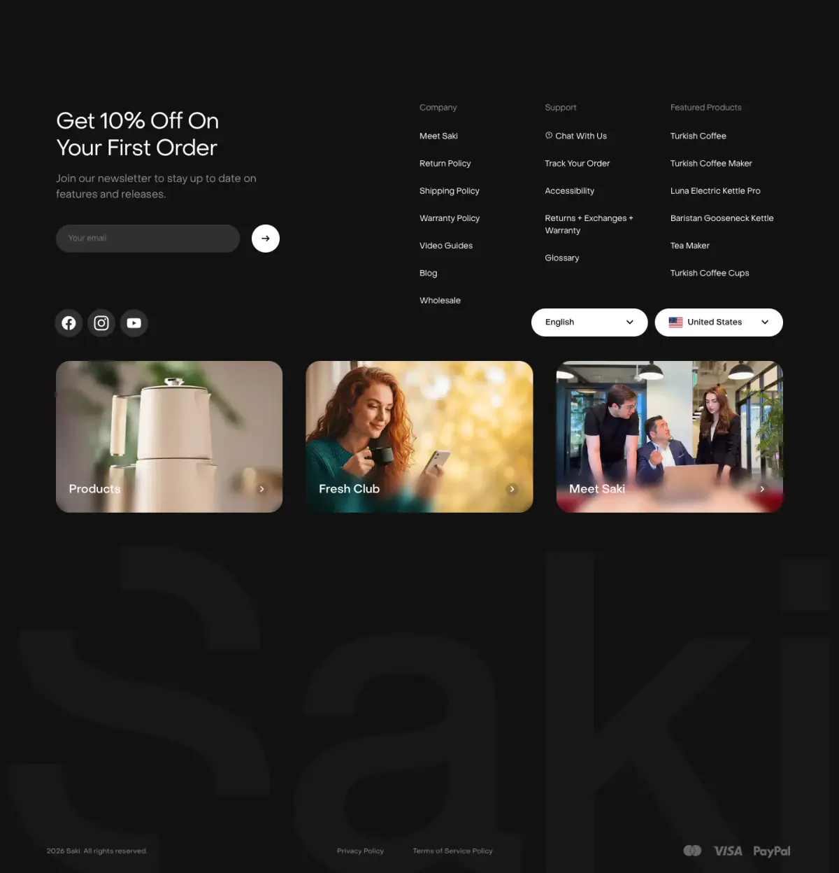
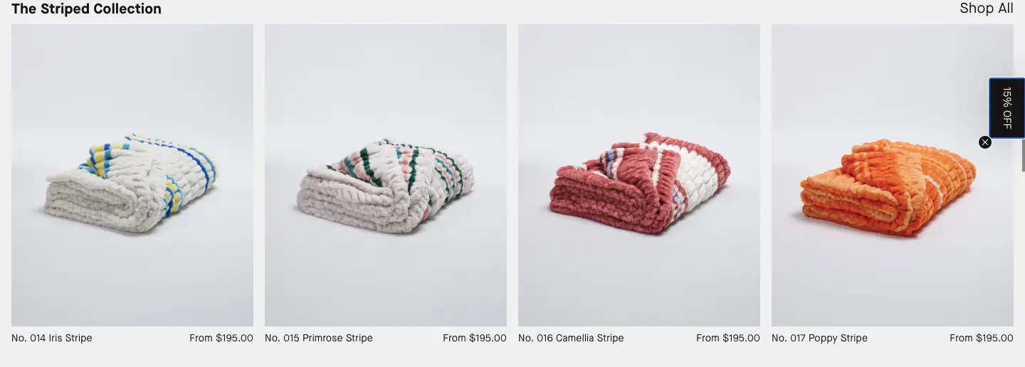
The Saki Products website presents a highly polished, premium brand aesthetic tailored to an e-commerce experience. The design favors a minimal, editorial style that leans heavily on stark contrasts—specifically between dark (#121212, #000000) and light (#F4F4F4, #FFFFFF) canvas areas—allowing high-quality product photography to take center stage. Typography is consistently handled by the PPObjectSans family, with a clear hierarchy established through varying weights and sizes, emphasizing legibility and a modern feel. The user experience is enriched by scroll-linked animations, which guide the user through product features dynamically without relying on traditional navigation clicks. This a
- Spacing
- The layout uses large, deliberate vertical spacing between sections to allow each product feature to breathe, typical of a premium presentation.
- Shape
- The design features heavily rounded corners, almost pill-like, evident on buttons, the navigation bar, and some product card containers. Large border radii are applied to interactive elements and structural cards, softening the overall aesthetic.
- Borders
- Borders are generally avoided in favor of subtle background color shifts or soft shadows, maintaining a clean look.
- Buttons
- Buttons are distinctively pill-shaped, usually solid colors (black or white) with contrasting text, avoiding borders.
- Width
- The design often spans the full width of the viewport for imagery, while text content is constrained to maintain readability.
- Density
- Low density; the design prioritizes whitespace and large imagery over cramming information into small areas.