- Industry
- Creative
- Site type
- Other
- Platform
- Custom code
- Tech
- Not detected yet
- Style
- Bold, Typographic, Colourful, Editorial, Dark Theme, Software Marketing
- Presence
- Online
- Components
- Navigation Bar, Hero, Logo Strip, Feature Collection, Testimonial Card, Video Frame, Primary Button, Footer, Interactive UI Demo Card, Typographic Pull Quote
- Score
- 58/100 · 100% evidence · Review pending
- Typography
- Display — Affinity Serif Variable; Heading — Affinity Serif Variable; Body — Canva Sans
- Palette
- OG image
Design analysis
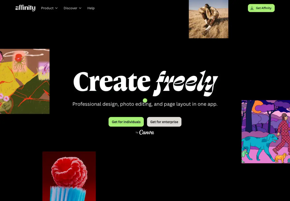
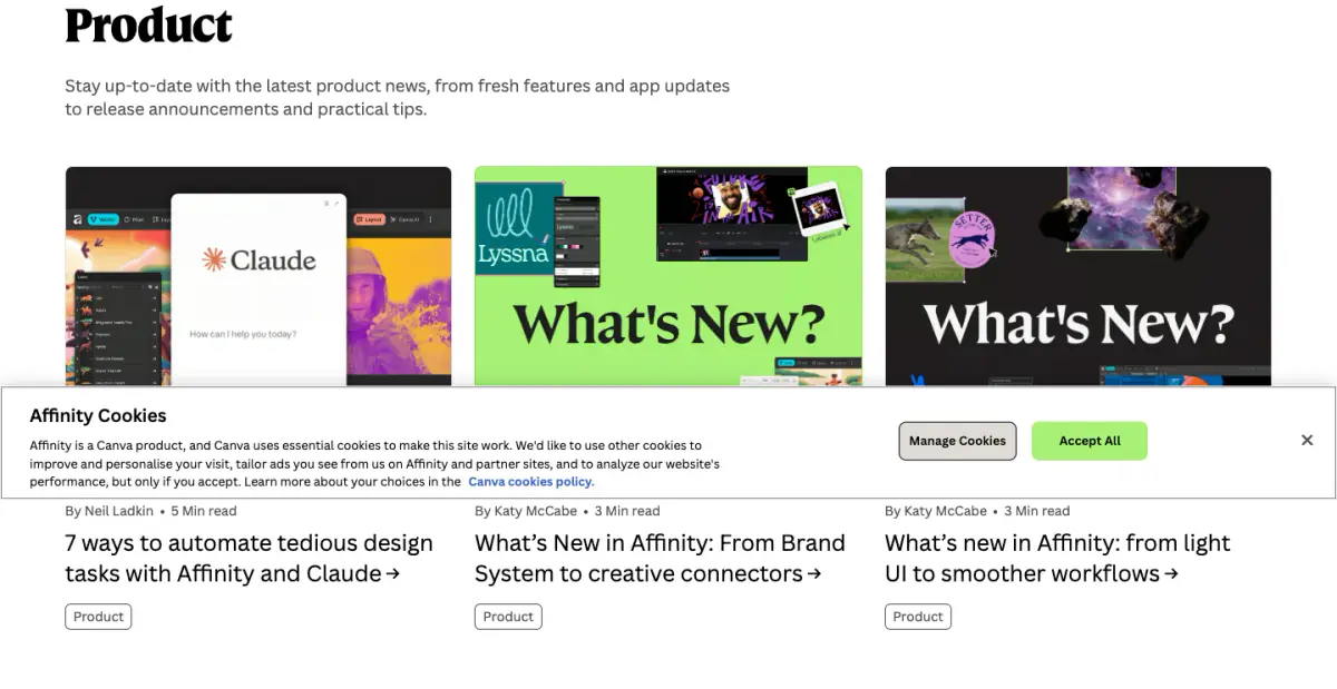
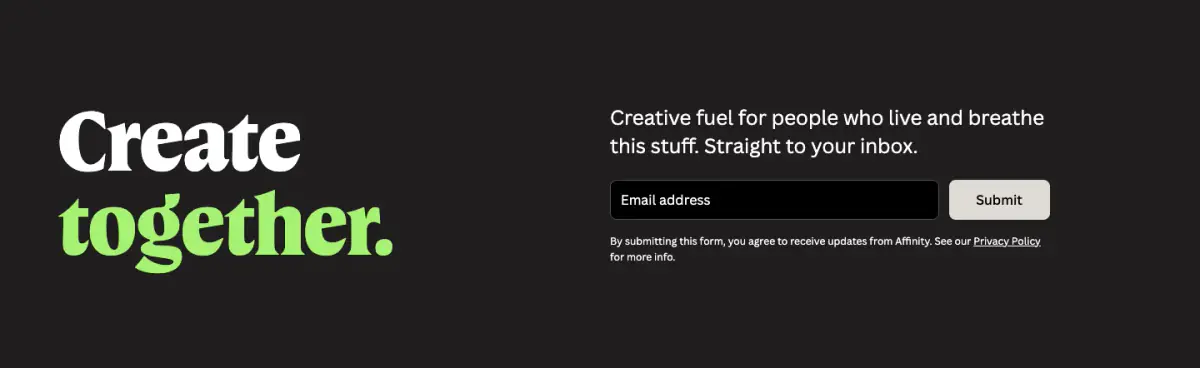
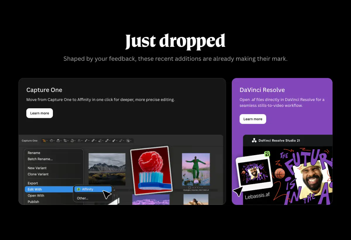
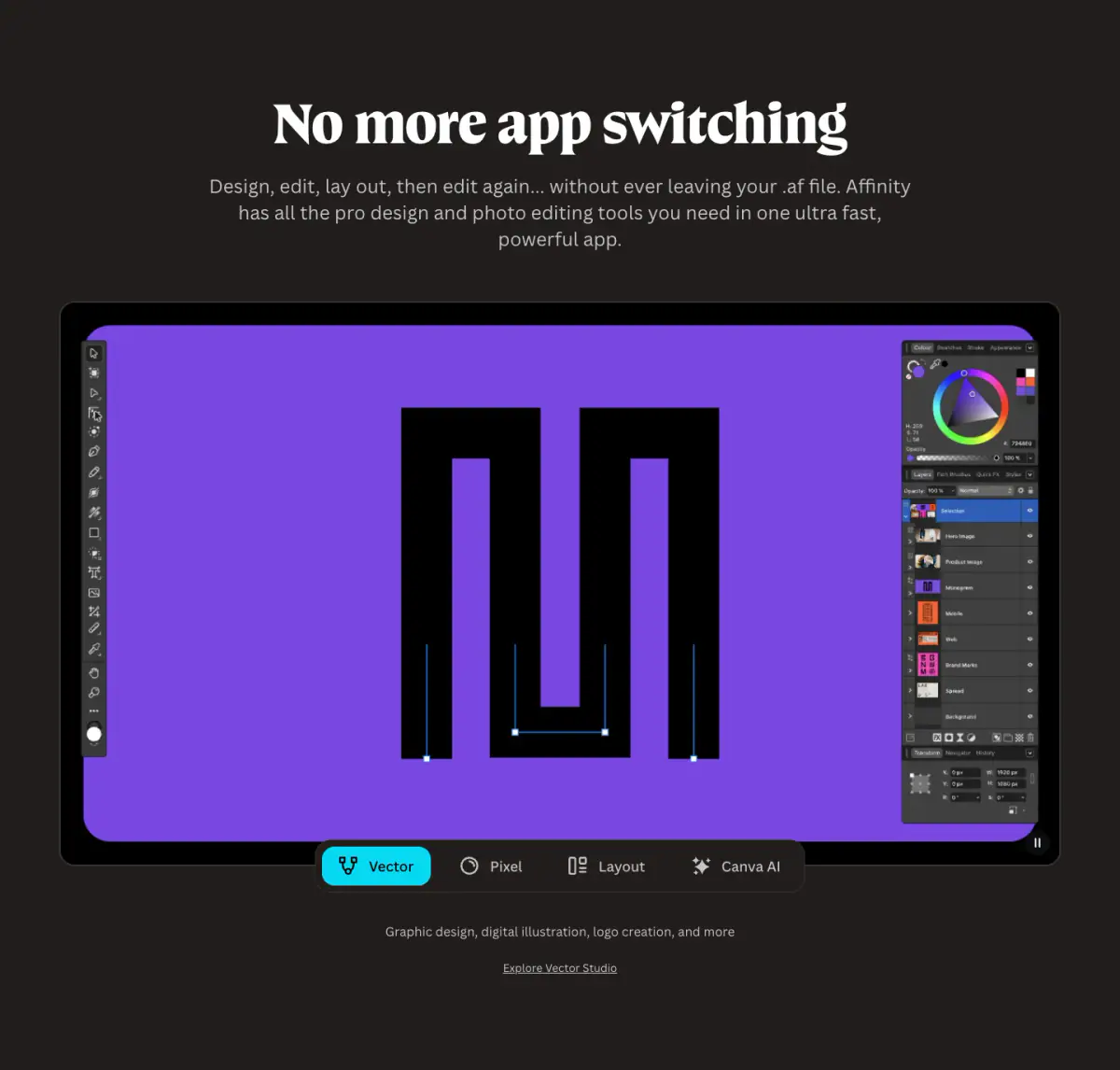
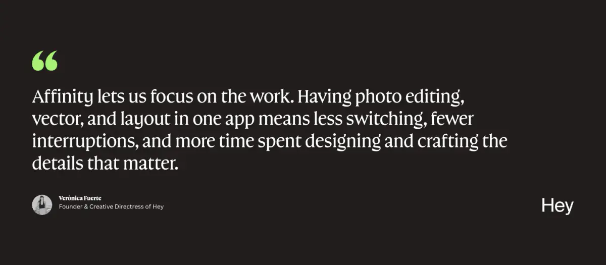
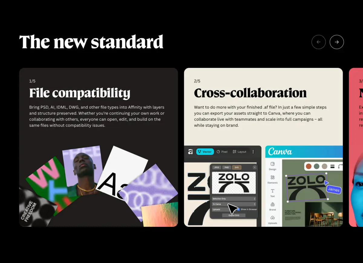
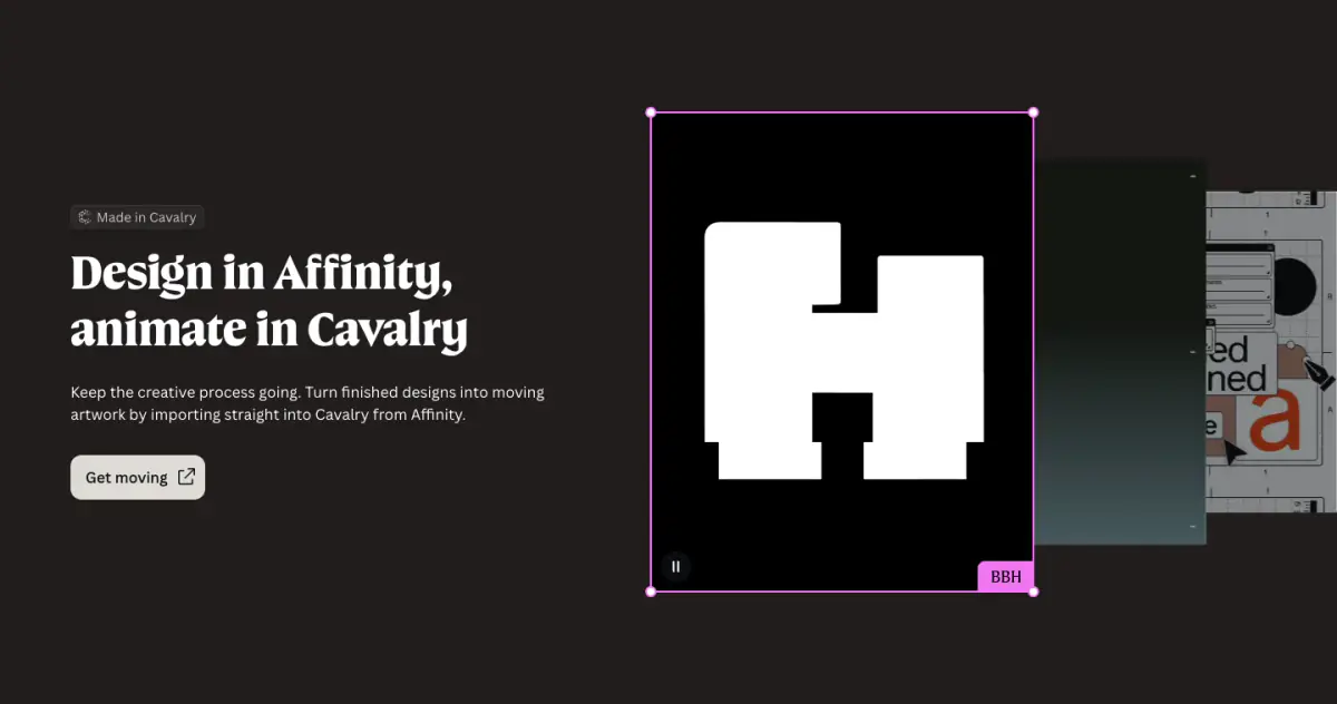
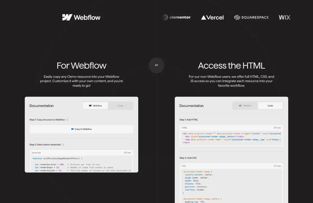
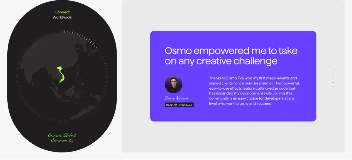
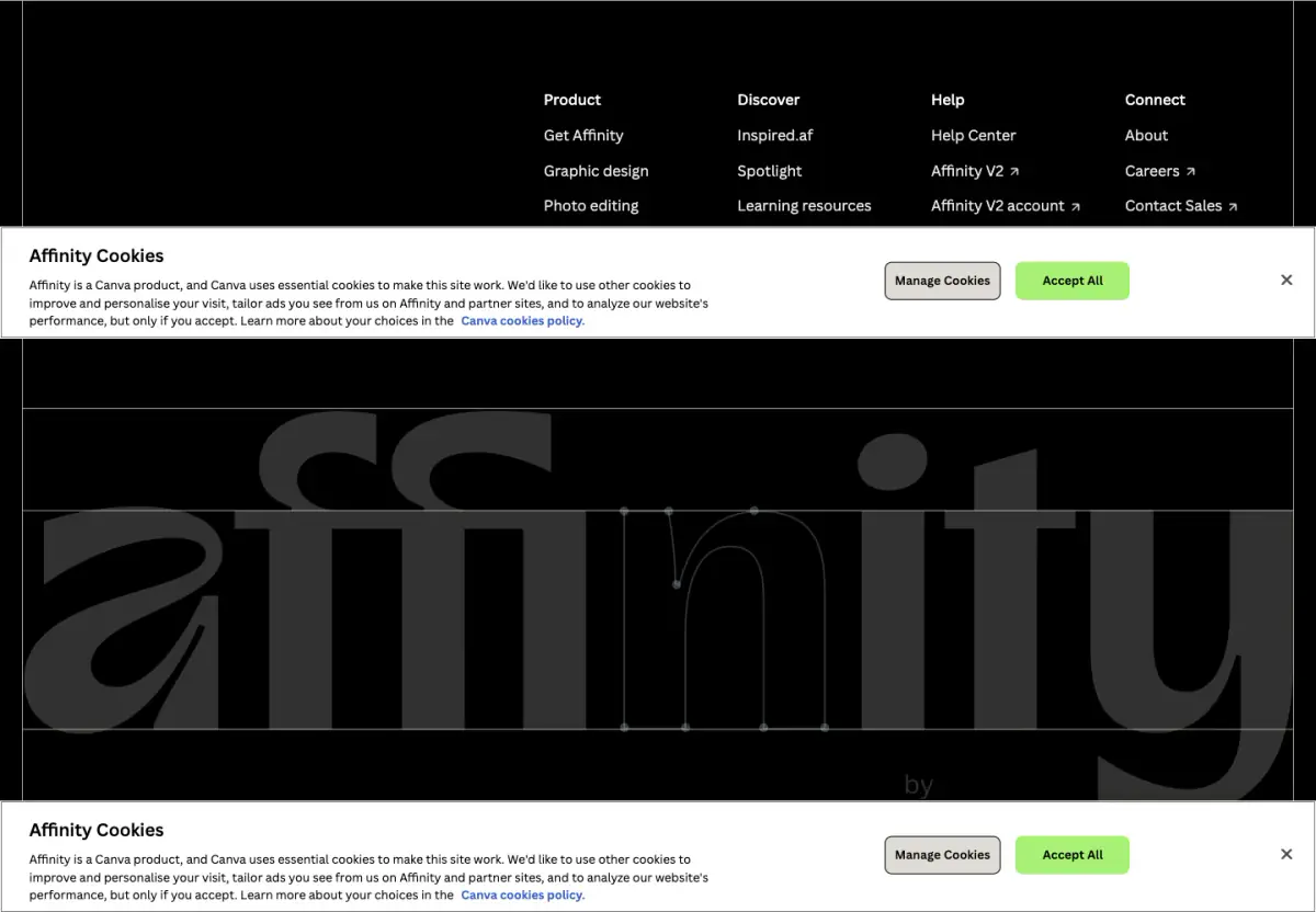
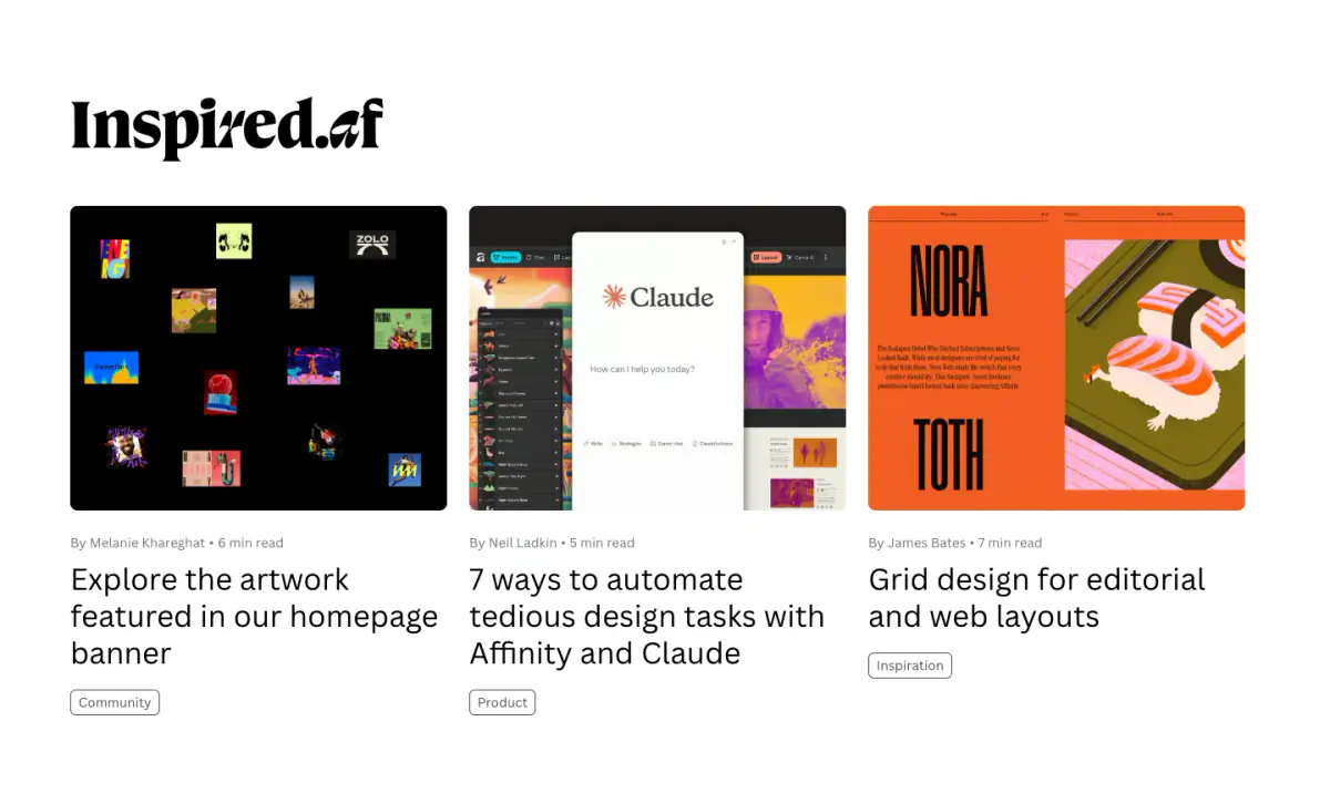
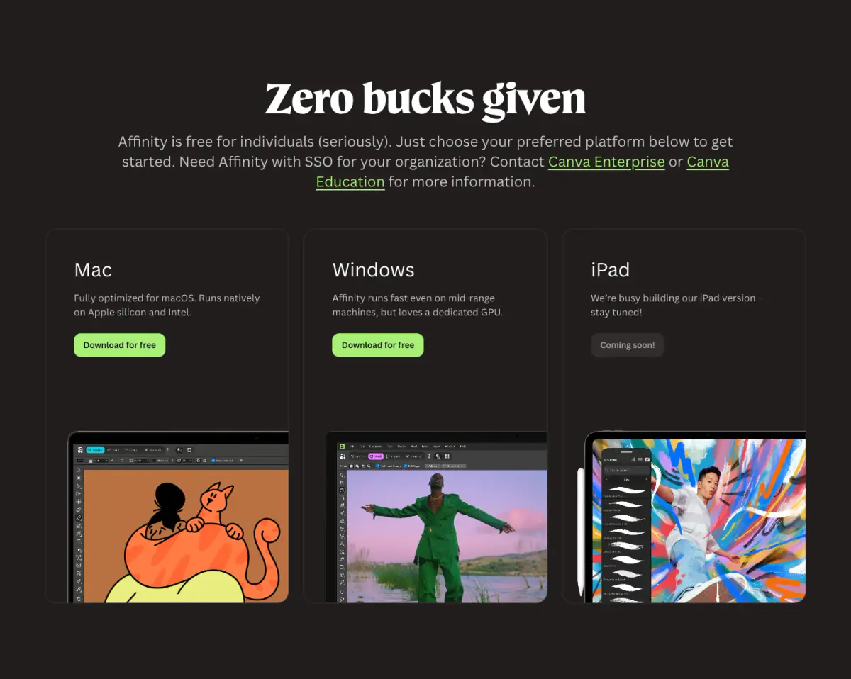
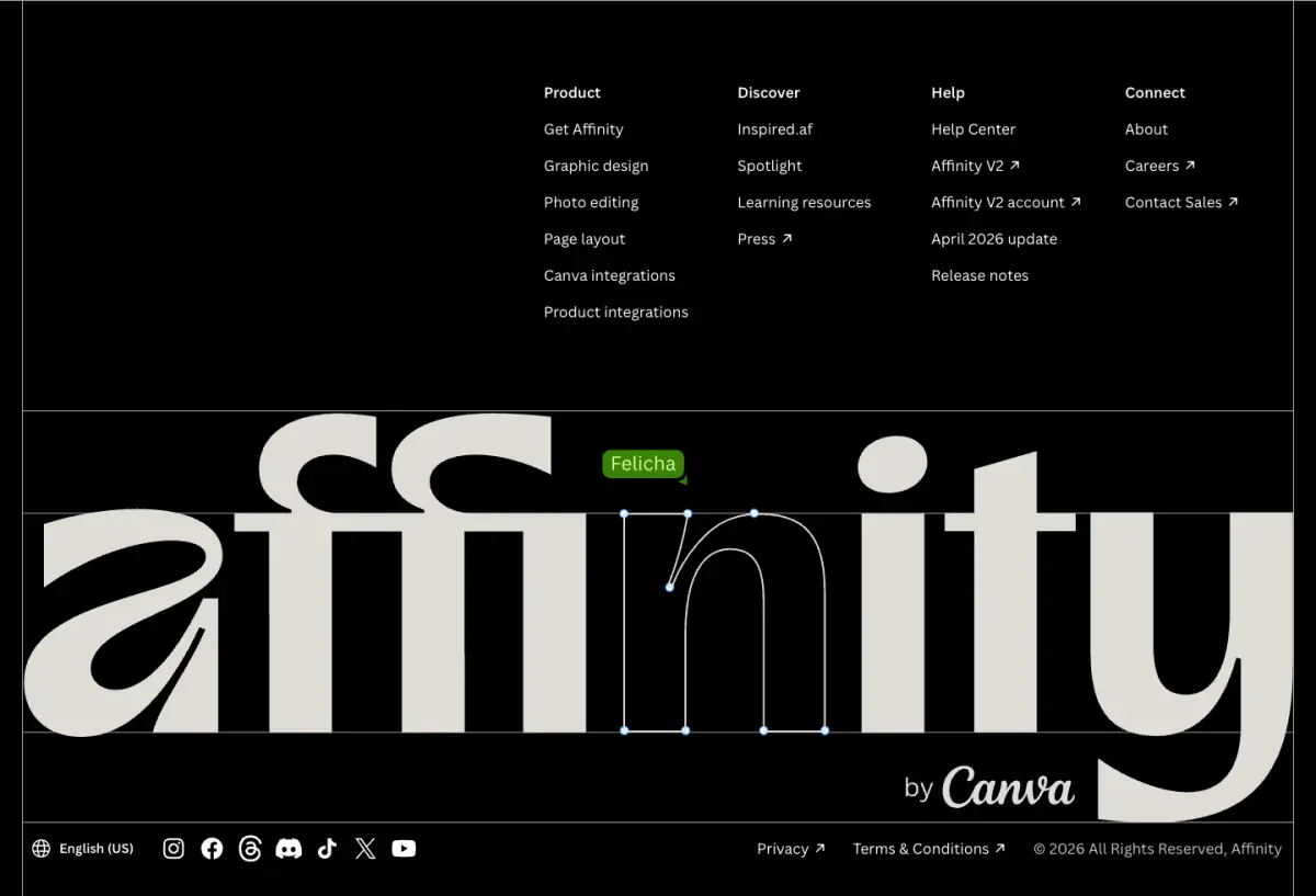
The Affinity homepage employs a bold, dark-themed design characterized by high contrast and expressive typography. Set against deep black (#000000) and off-black (#0F1015) canvases, the layout uses stark white text and vibrant neon accents like lime green (#A7F175), bright pink (#F075F1), and cyan (#2EC7FF). A custom variable serif font dominates headings with large-scale, sometimes italicized flourishes, while a clean sans-serif ensures readability in body copy. Content is housed within softly rounded cards, featuring UI demonstrations, autoplaying videos, and bold blockquotes, creating a dynamic, modern software marketing aesthetic.
- Spacing
- Generous vertical spacing (macro rhythm) separates distinct feature sections, allowing the large typography and media to breathe. Micro rhythm within cards is tighter to group related text and UI elements.
- Shape
- Distinctively soft and rounded, applied consistently across cards, imagery, and interactive elements. Feature cards and media containers use moderately large border radii (approx. 16px-24px). Buttons and tags utilize fully rounded pill shapes.
- Borders
- Mostly borderless design relying on background color contrasts. When borders are used (e.g., dark cards, footer separators), they are thin (1px) and subtle.
- Buttons
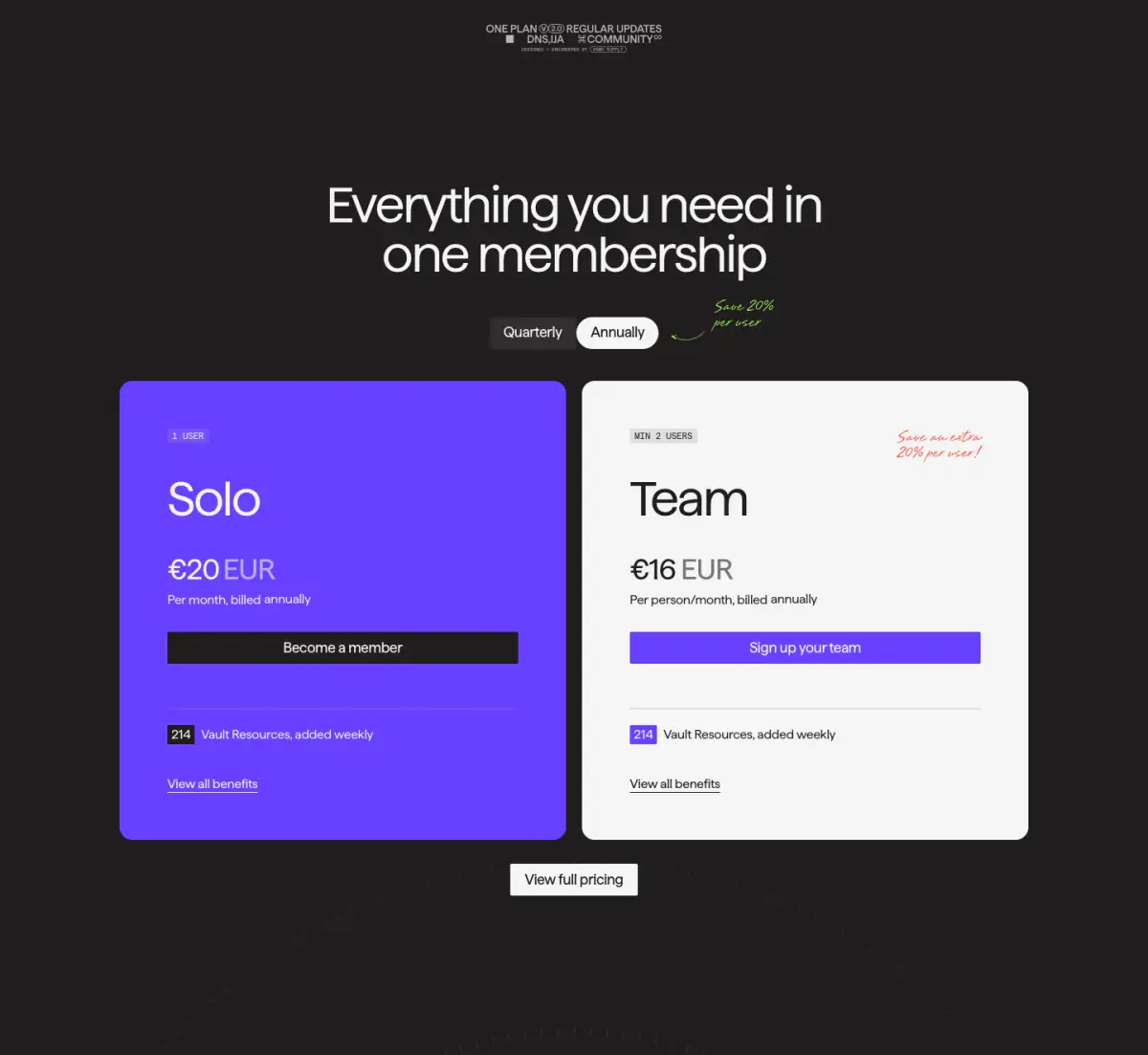
- Solid fill primary buttons with fully rounded corners, contrasting sharply with the dark background. Secondary buttons use muted or semi-transparent fills.
- Width
- Text content is typically constrained to readable column widths (approx. 600-800px), while media cards and marquees often break the grid, extending much wider or full-bleed.
- Density
- Low visual density; the layout embraces negative space to emphasize high-impact visuals and oversized text.