- Industry
- Creative
- Site type
- Portfolio
- Platform
- Webflow
- Tech
- GSAP
- Style
- Bold, Typographic, Editorial, Corporate, Dark Theme
- Business model
- Agency
- Presence
- Online
- Components
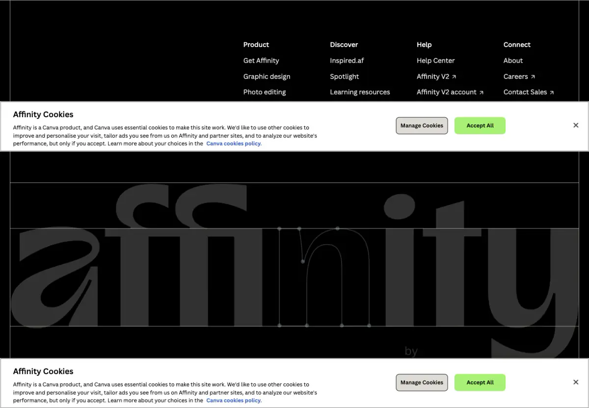
- Navigation Bar, Hero, Feature Card, Primary Button, Video Frame, Footer, Stacking Scroll Cards, Script Typography Accents
- Score
- 56.95/100 · 100% evidence · Review pending
- Typography
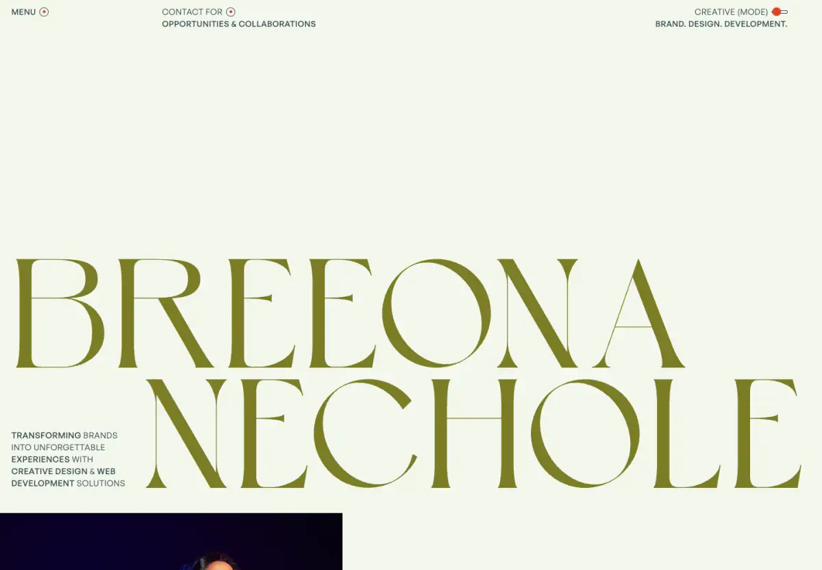
- Display — Scribo; Heading — Owners Wide; Body — Manrope
- Palette
- OG image
Design analysis
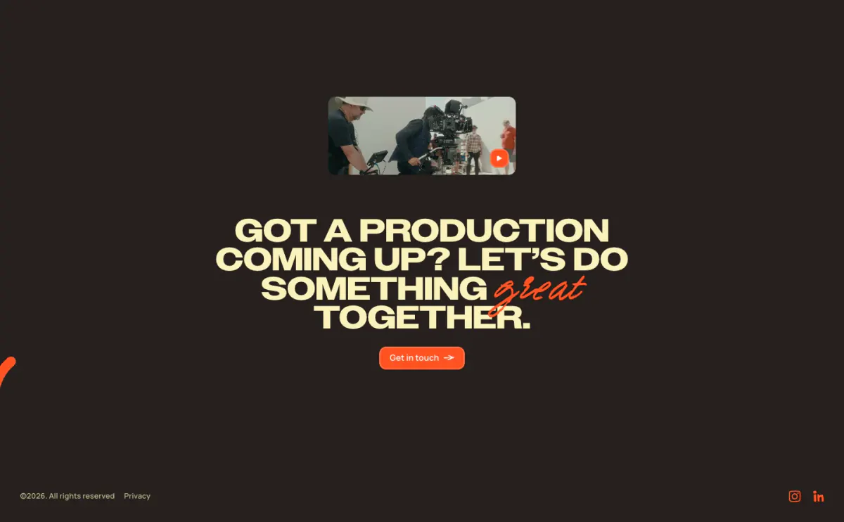
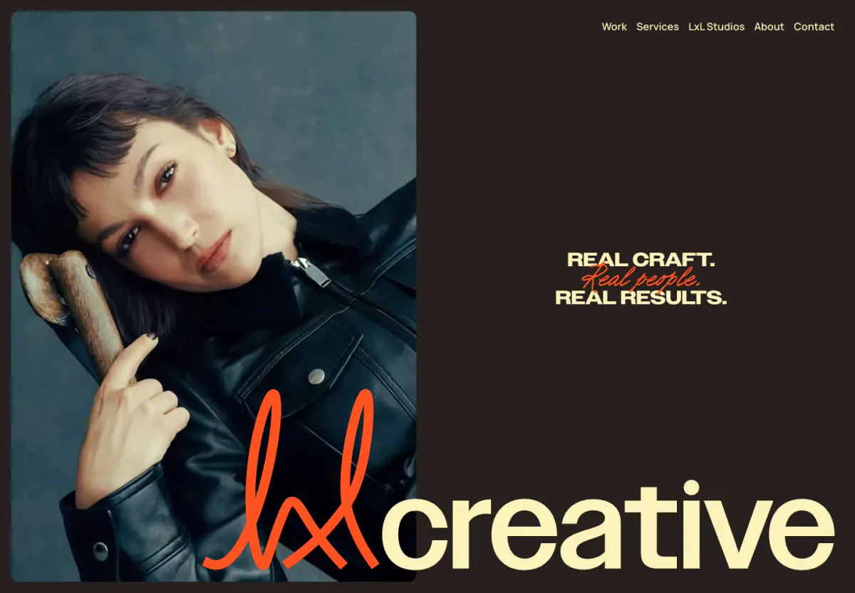
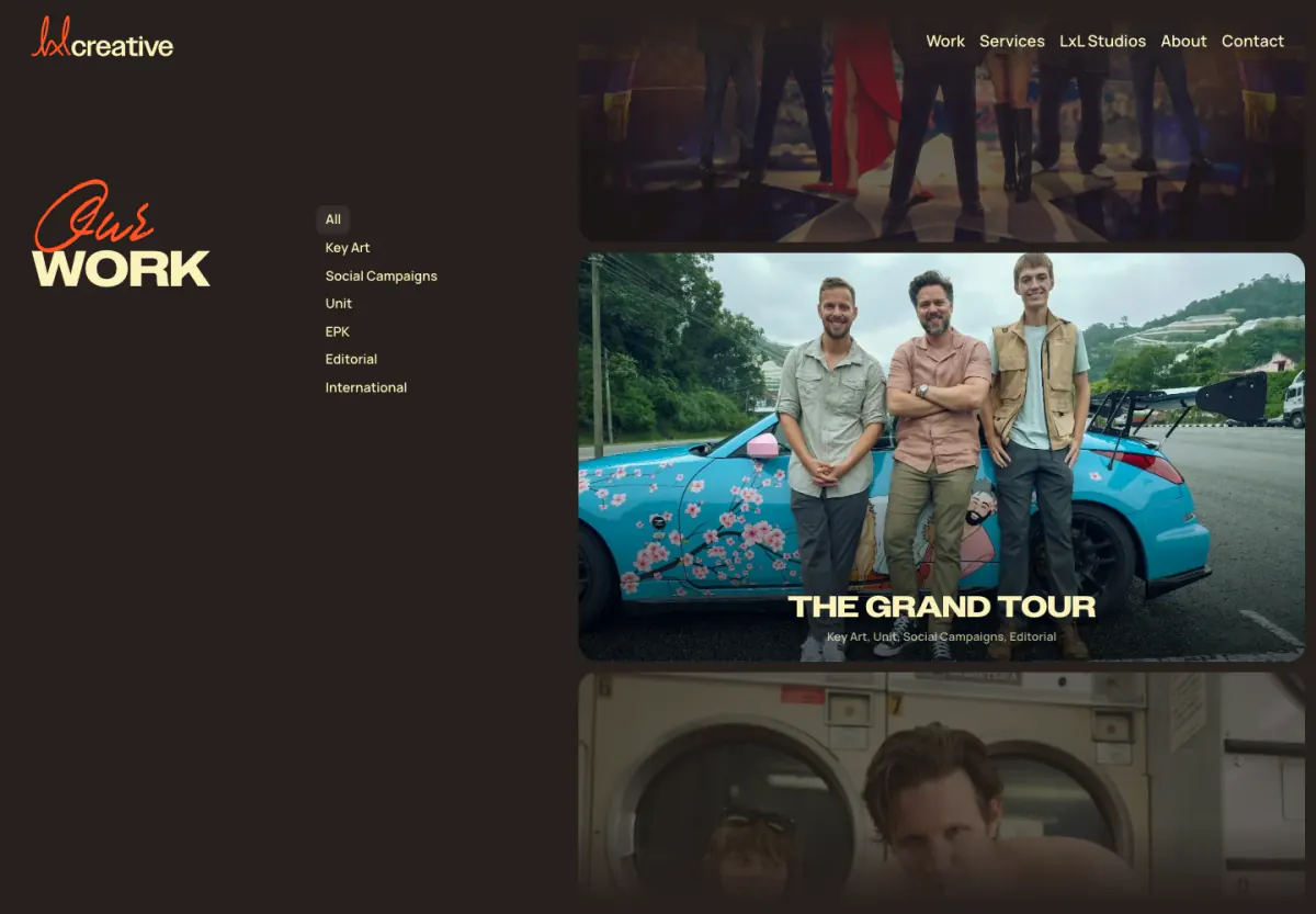
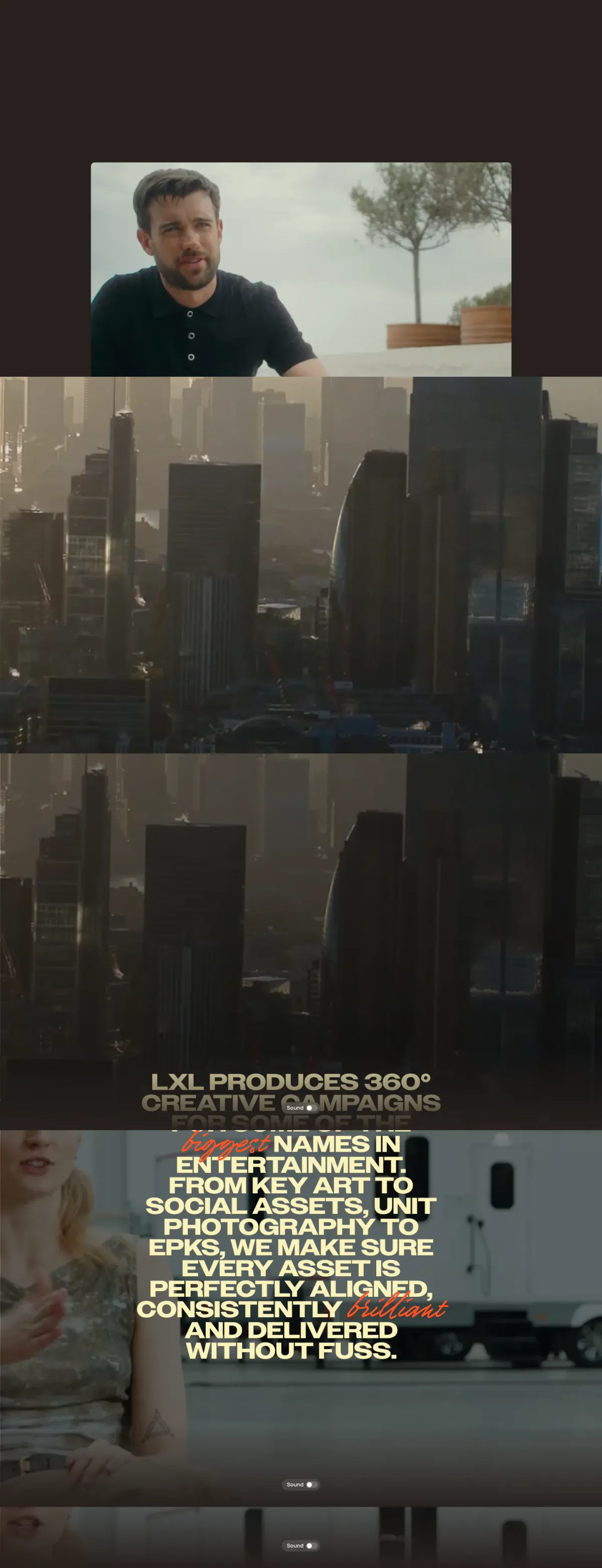
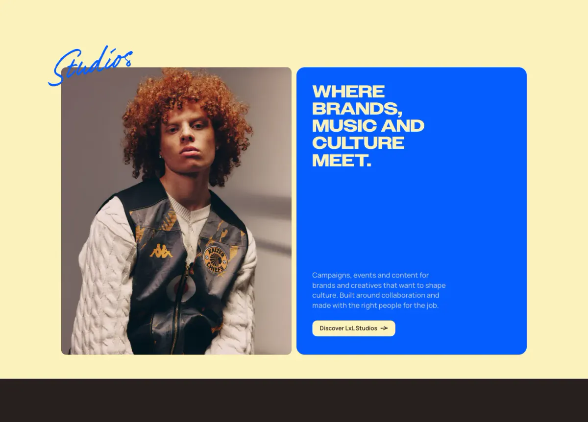
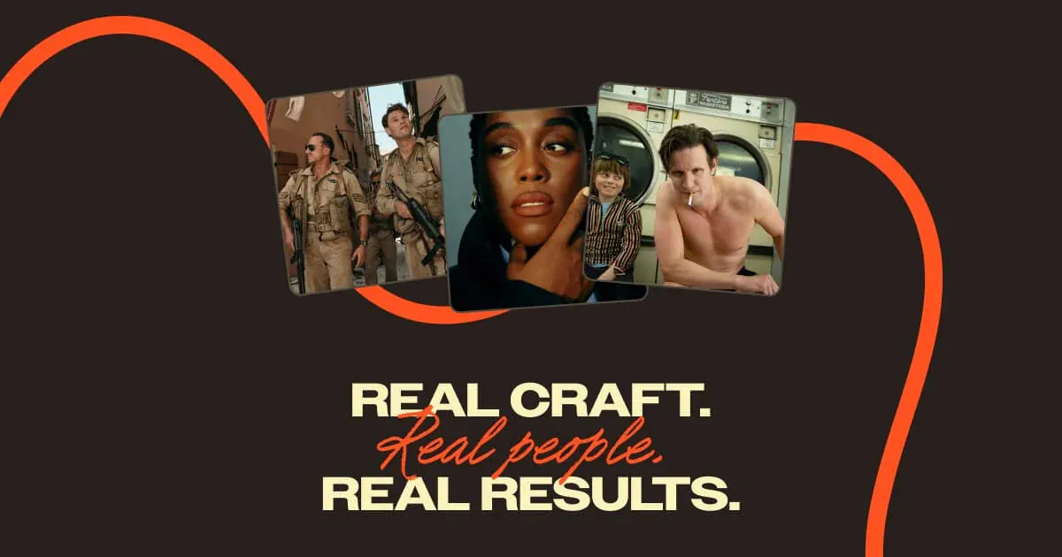
The website features a dark-themed, highly typographic design with a stark contrast between the deep brown/charcoal canvas and vibrant orange accents. It heavily utilizes large, bold, uppercase sans-serif headings paired with expressive, script-like display fonts for emphasis. The layout incorporates generous spacing, rounded corners on media elements and buttons, and scroll-driven interactions such as stacking service cards. The visual language feels modern, editorial, and confident.
- Spacing
- Generous vertical spacing between distinct sections, creating a breathable layout despite the heavy typography.
- Shape
- Consistent use of rounded corners on most contained elements. Medium to large border radii applied to image cards, video frames, and pill-shaped buttons.
- Borders
- Largely borderless design; separation is achieved through background colors and spacing. Subtle translucent borders are used occasionally.
- Buttons
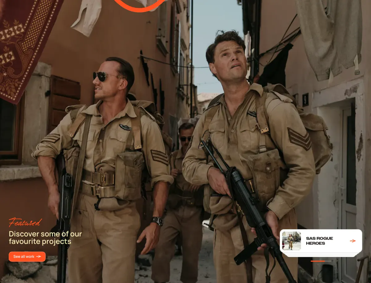
- Pill-shaped, solid brightly colored background (orange) with light text, often including a subtle arrow icon.
- Width
- Content is generally centered or split into dynamic asymmetrical columns, maintaining a contained maximum width on desktop.
- Density
- Low to medium density; the design relies on large focal points (images and big text) rather than densely packed information.