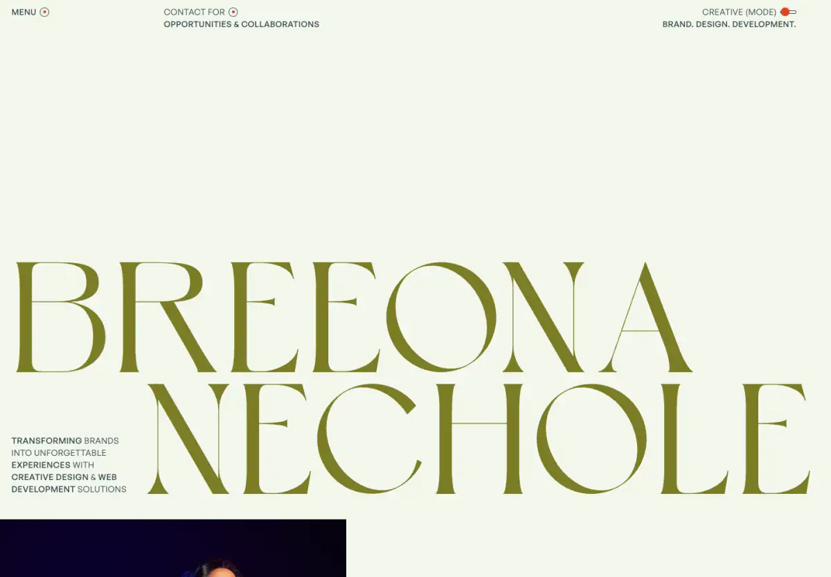
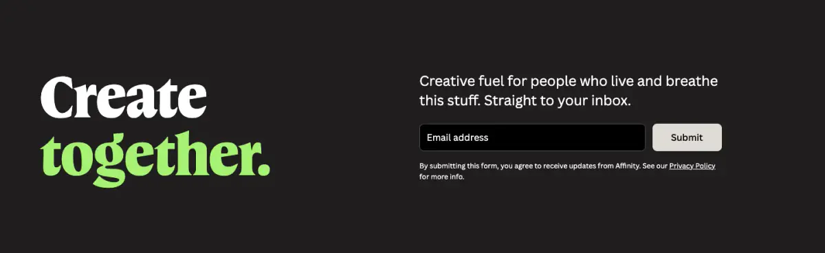
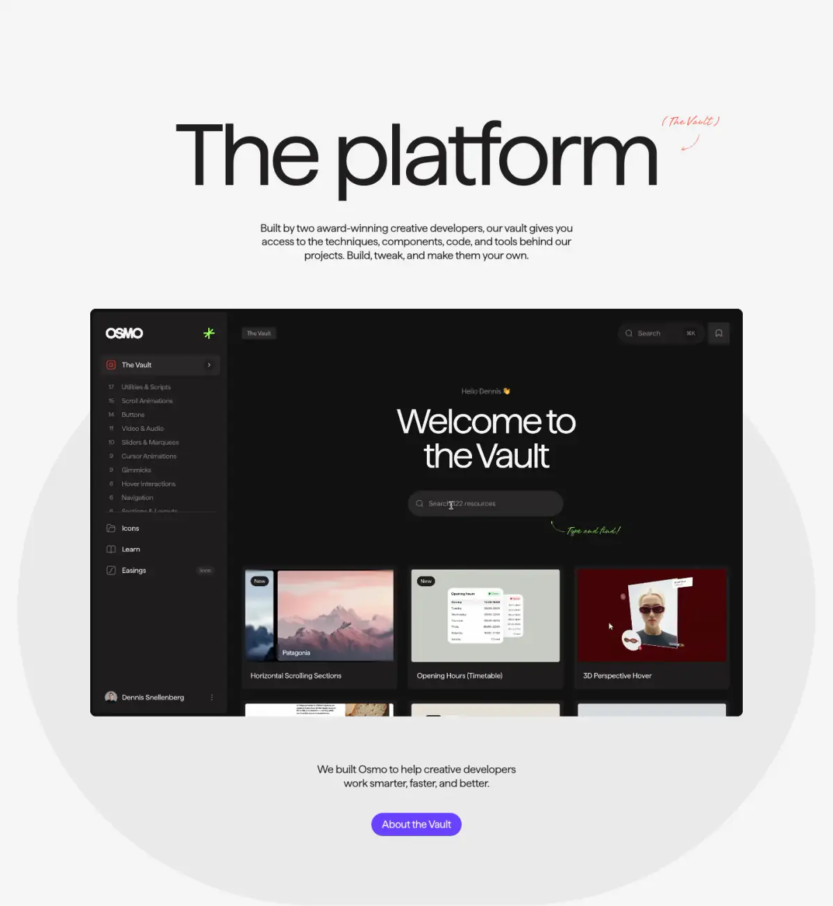
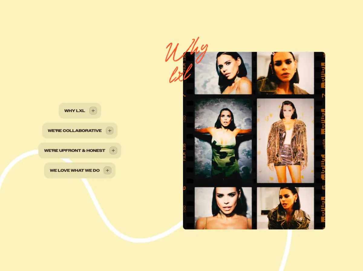
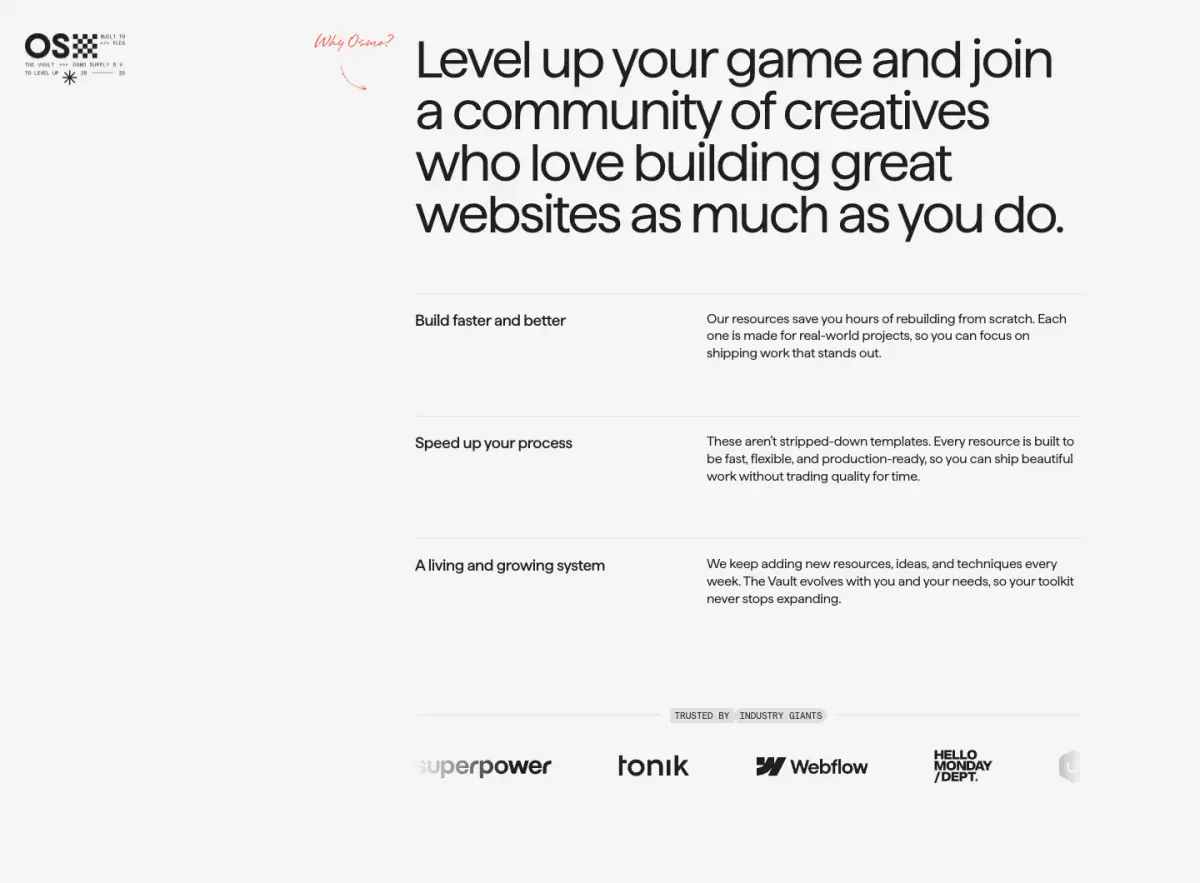
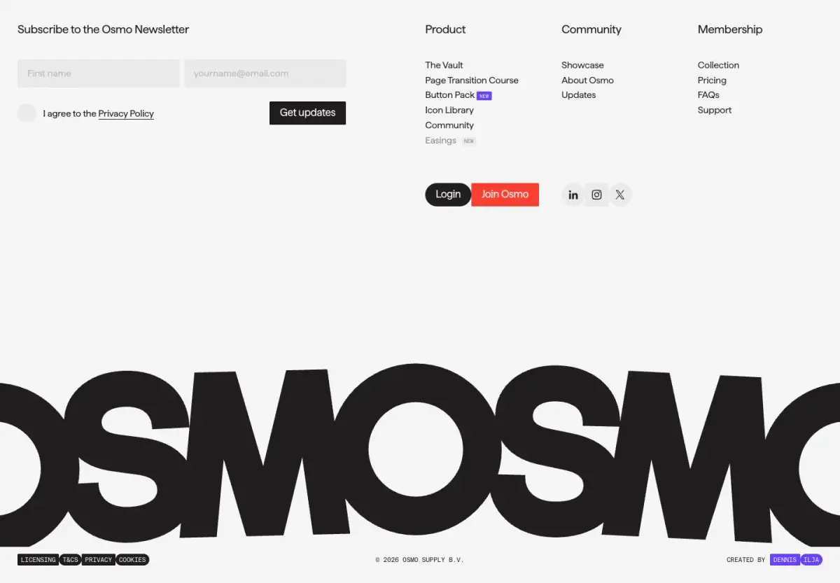
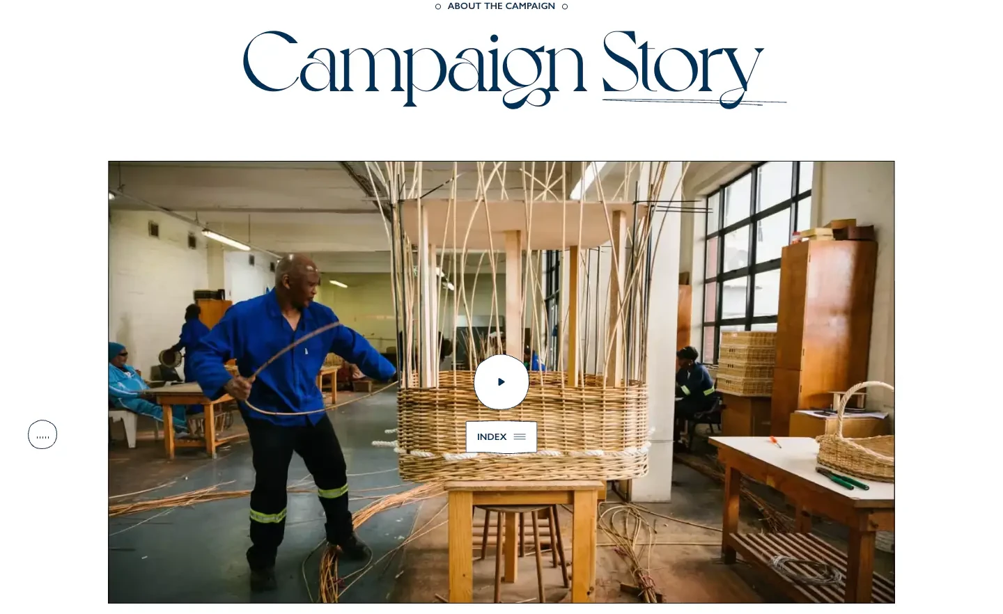
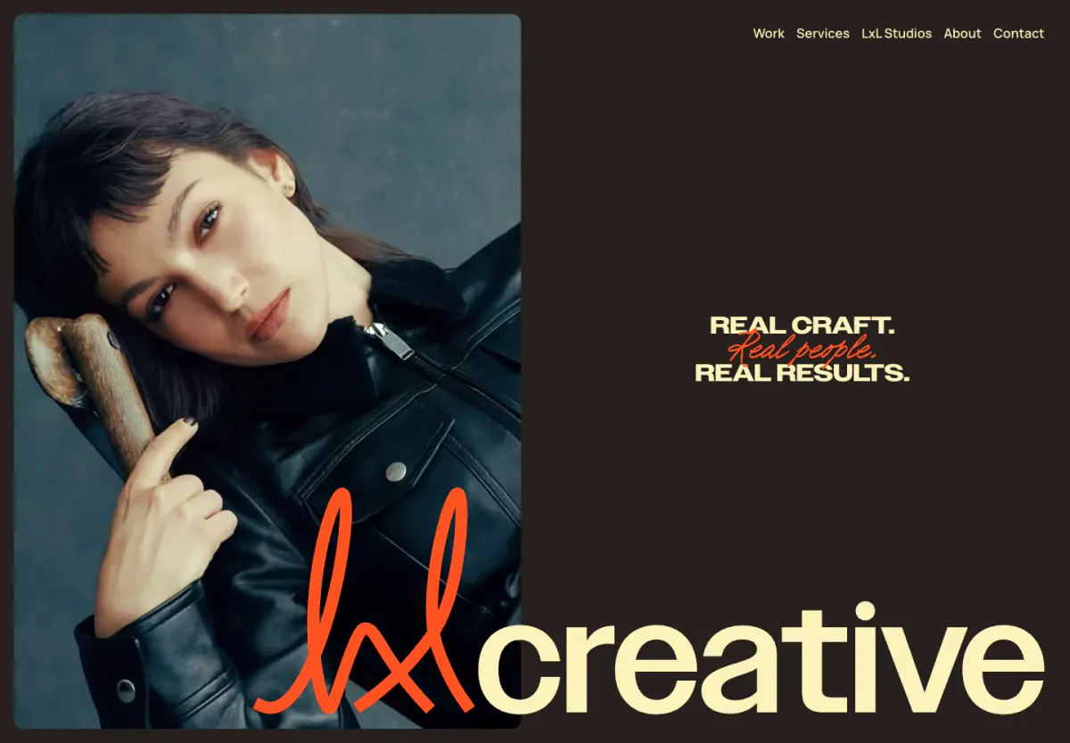
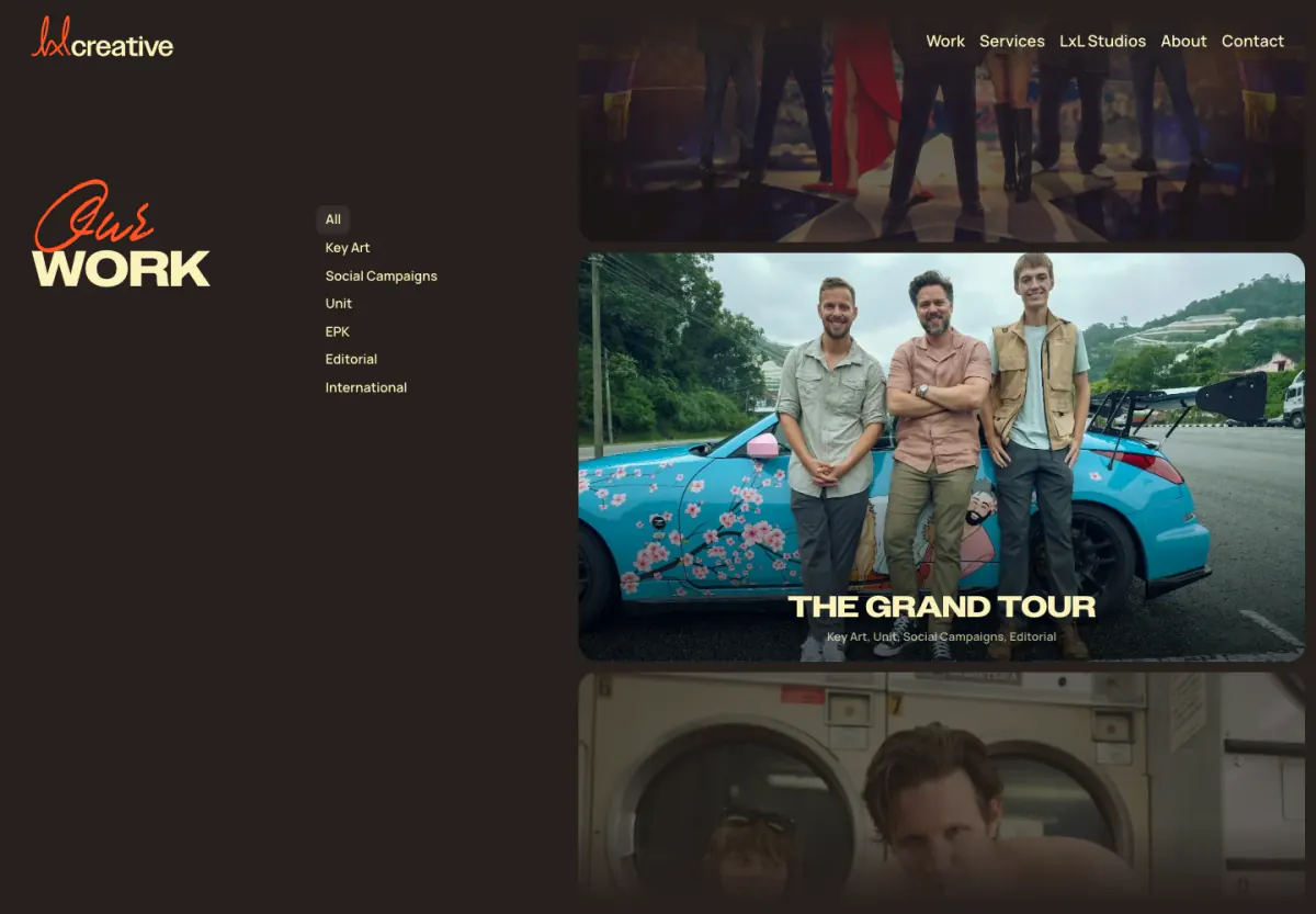
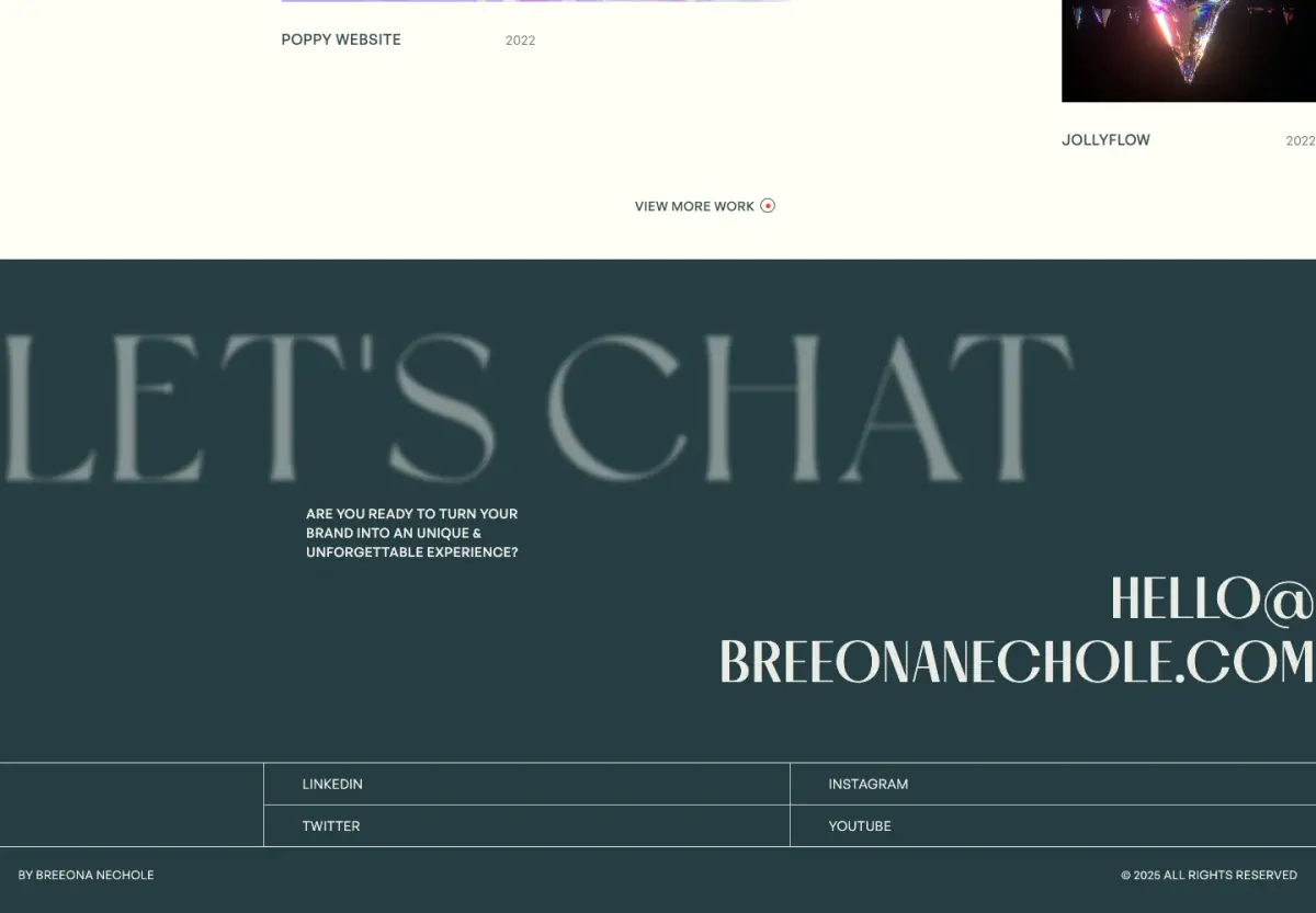
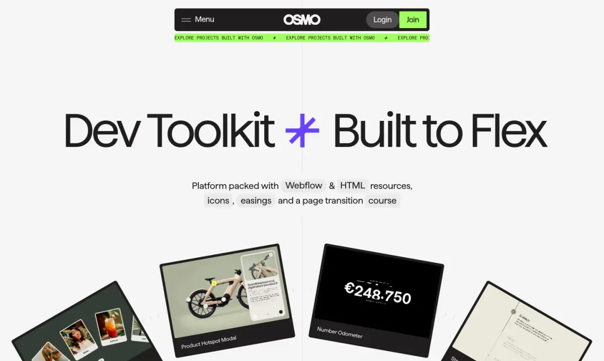
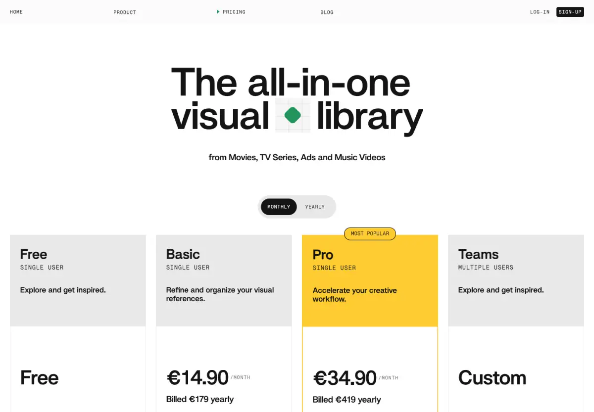
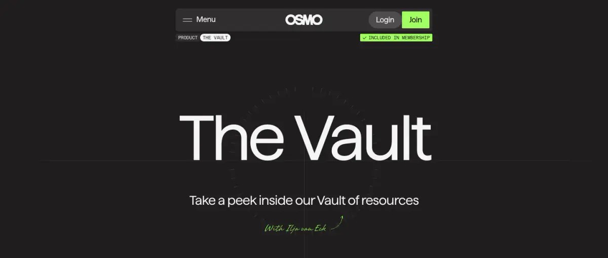
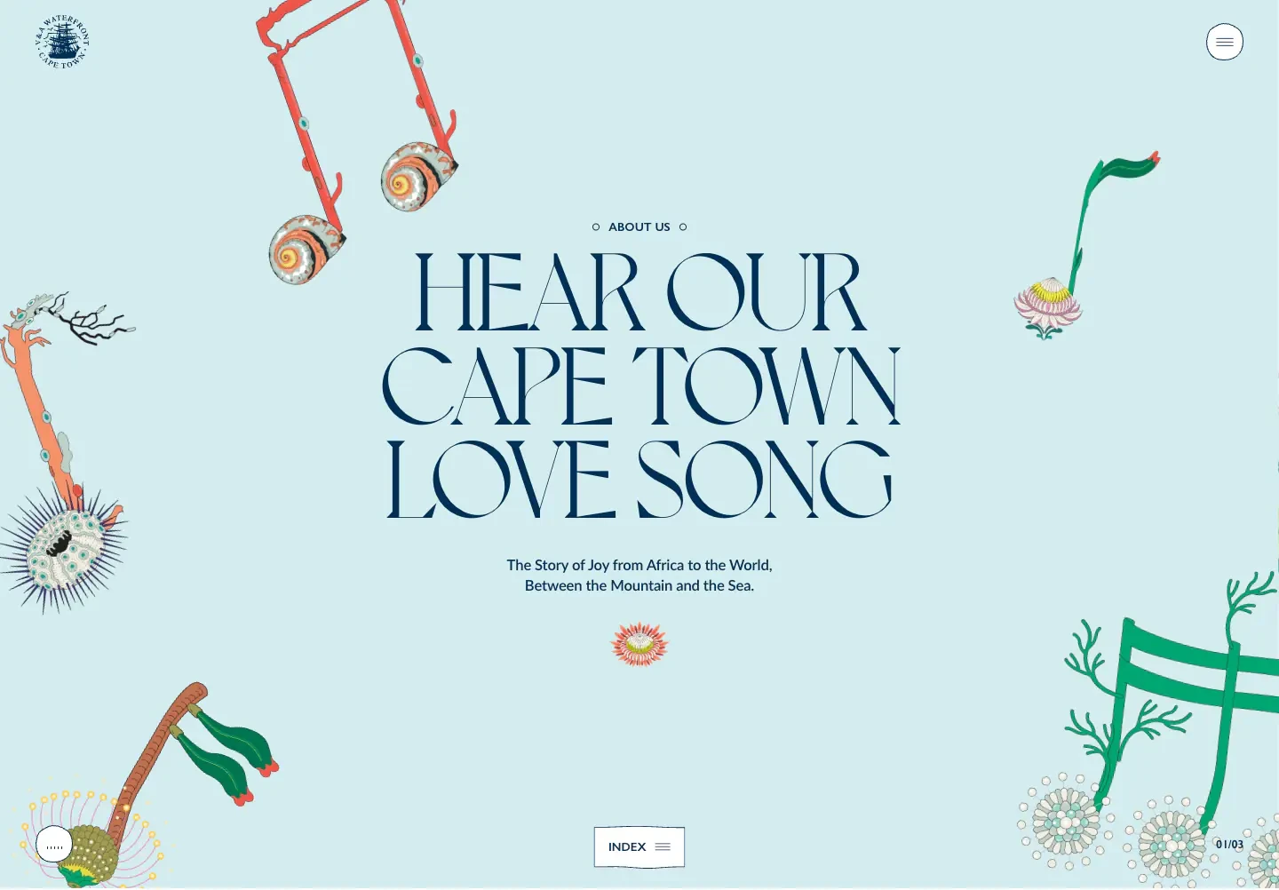
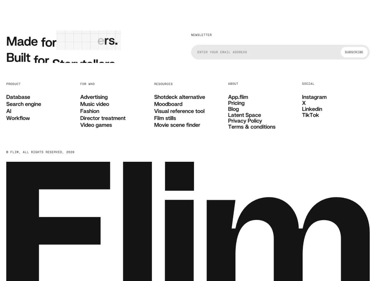
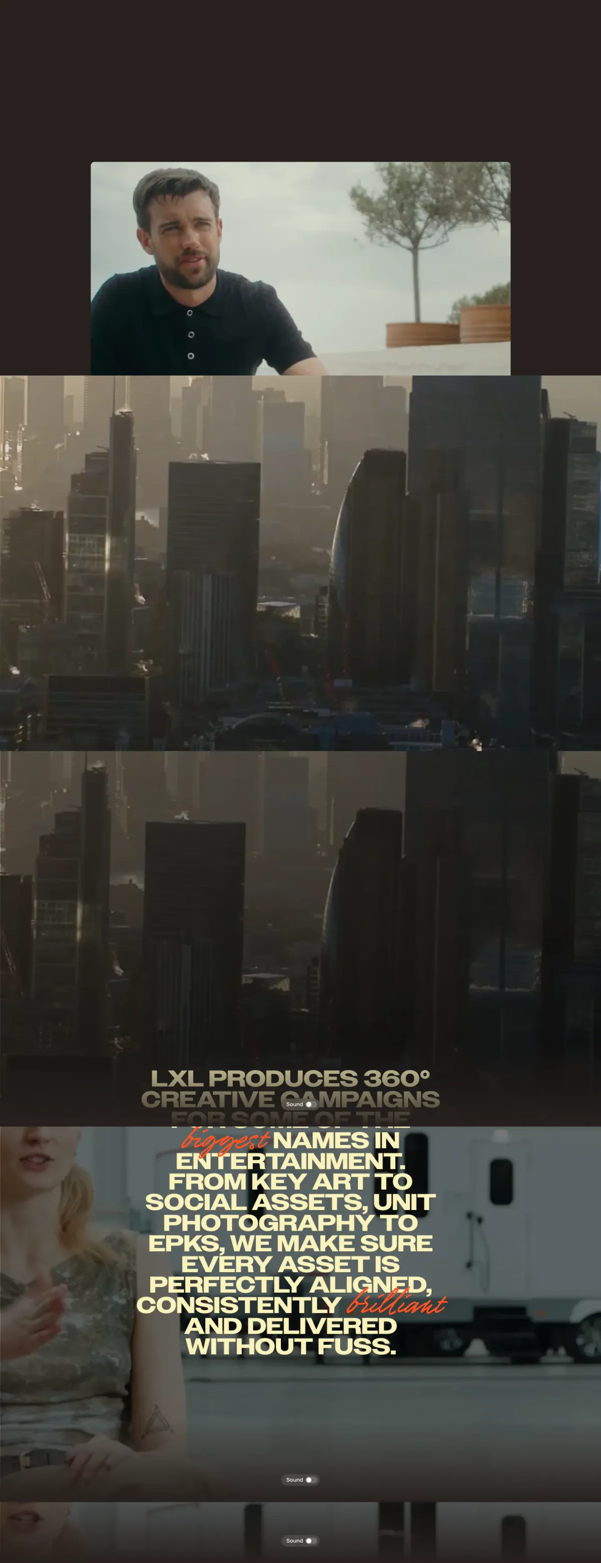
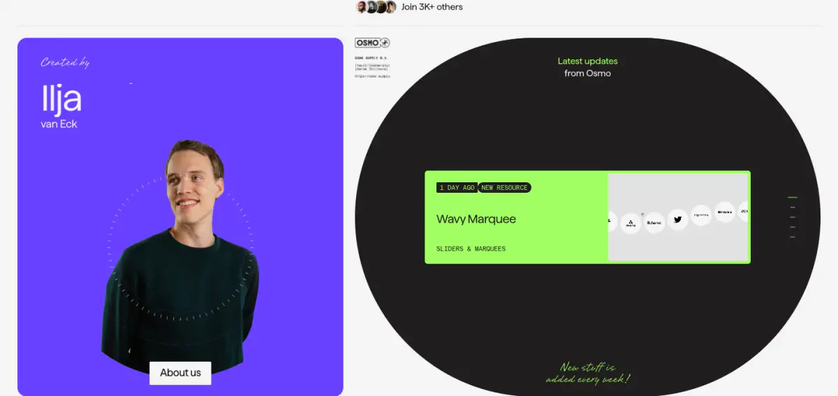
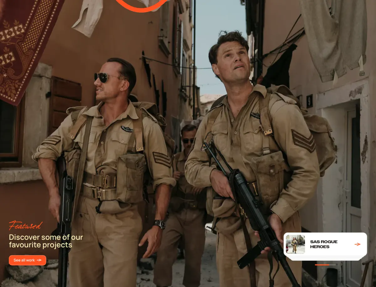
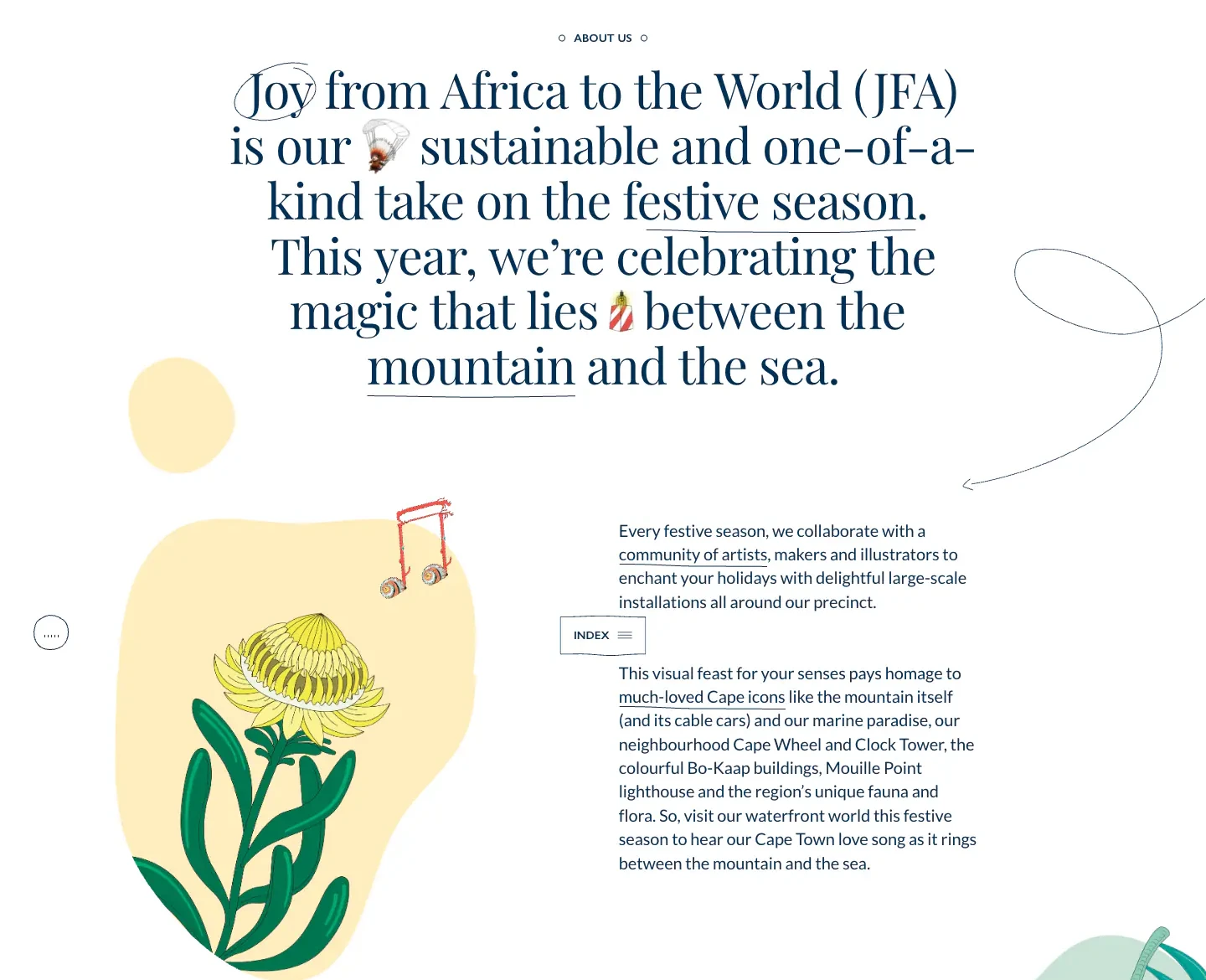
The website for Breeona Nechole showcases an elegant, editorial design heavily reliant on striking typography and a sophisticated, muted colour palette. Very large, display serif text (Blank space serif) dominates the initial view, establishing a strong brand identity. The layout is mostly clean, with ample whitespace offset by blocks of olive green and deep slate. Repeated components include editorial lists ('Dossiers') and text-heavy feature blocks ('Tactics'). A custom cursor and fixed navigation header contribute to the modern feel.
- Spacing
- The site employs very generous padding and margins, creating significant empty space that emphasizes the large typography.
- Shape
- Sharp corners are standard across most elements, aligning with the crisp editorial aesthetic. Radii are not prominent; images and layout blocks generally have sharp, 0px corners.
- Borders
- Thin solid borders are used occasionally, such as in the 'Dossiers' list (color-1 or similar).
- Buttons
- Buttons are typically minimal, often just text links or small circular icons rather than large filled shapes.
- Width
- Content varies from edge-to-edge full width to narrower, centered columns depending on the section.
- Density
- Overall low density. The use of massive typography contrasts with large areas of empty space, creating an airy feel.