- Industry
- Finance
- Site type
- Waitlist, Store
- Platform
- Webflow
- Tech
- GSAP, Three.js
- Style
- Minimal, Bold, Editorial, Photographic, Typographic, Cinematic, Luxury, Dark Mode
- Business model
- Shopping, Software
- Presence
- Online
- Components
- Navigation Bar, Hero, Primary Button, Feature Collection, FAQ Accordion, Footer, 3D Product Showcase, Cinematic Image Masking, Floating Text Cloud
- Score
- 55.4/100 · 100% evidence · Review pending
- Typography
- Display — Neuemontreal; Heading — Neuemontreal; Body — Neuemontreal
- Palette
- OG image
Design analysis
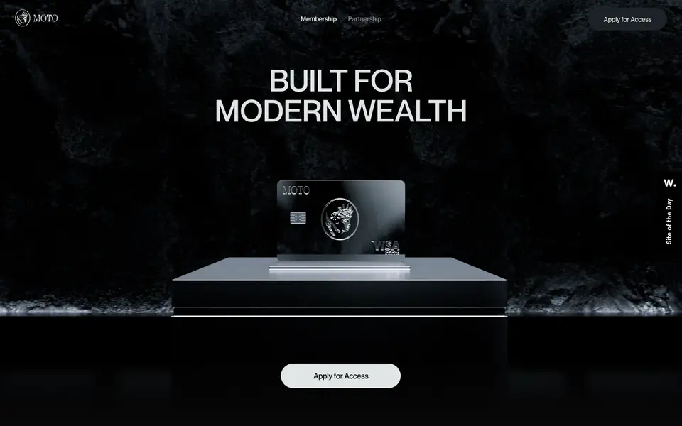
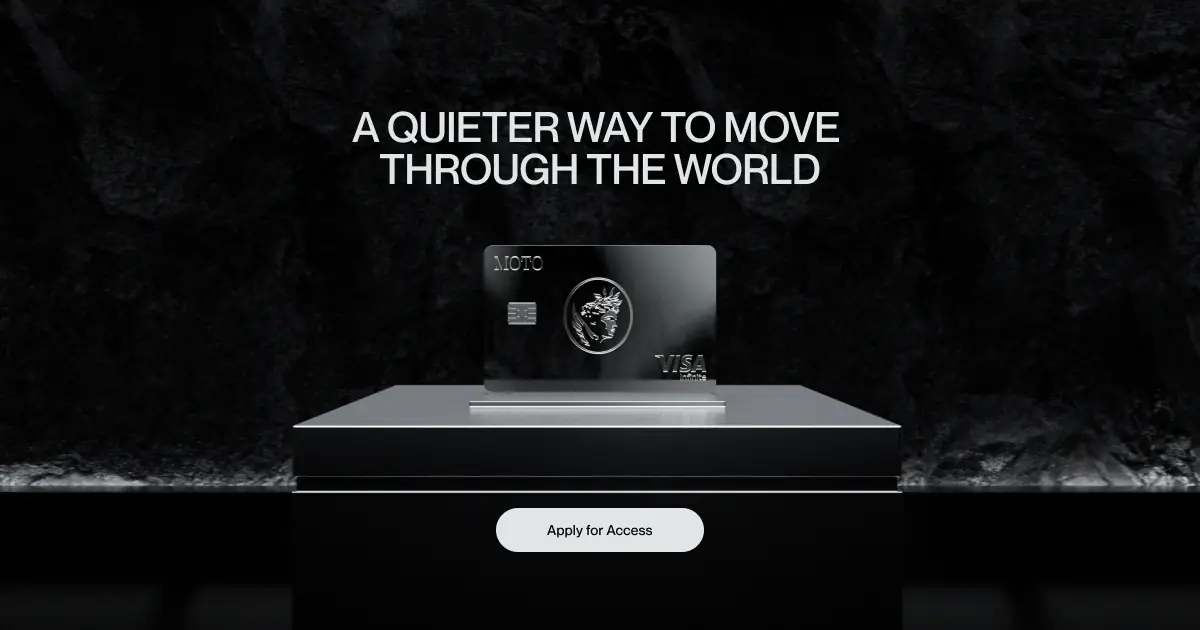
Moto Finance utilizes a dark, cinematic aesthetic to convey modern luxury and exclusivity. The design is heavily reliant on striking, high-contrast typography set against a deep black canvas. Large, uppercase sans-serif headings dominate the viewport, creating a bold, editorial feel. Imagery is sophisticated and moody, often featuring dramatic lighting, integrated seamlessly into the flow via scroll-triggered transitions and 3D elements like a rotating credit card and globe. The UI is highly minimal, with ample negative space, using simple pill-shaped buttons for the primary call to action. The color palette is almost entirely monochromatic, relying on stark whites and various shades of grey
- Spacing
- Highly spacious vertical rhythm. Sections are separated by massive vertical gaps (often entire viewports of scroll space), creating a slow, deliberate pacing.
- Shape
- Stark contrast between perfectly sharp 90-degree corners for images and structural lines, and fully rounded pill shapes for interactive elements. Buttons feature a fully rounded, pill-like border radius, contrasting with the otherwise sharp geometric layout.
- Borders
- Borders are largely absent in favor of high-contrast color blocking, though subtle 1px light grey lines are used to separate items in the features and FAQ lists.
- Buttons
- Solid fill with strong contrast to the background (e.g., off-white on black), entirely borderless, utilizing a pill shape with medium-weight text centered within.
- Width
- Content is generally centered. Typography and form elements adhere to a restrained, readable central column, while background imagery or 3D elements bleed to the viewport edges.
- Density
- Extremely low density. The interface relies on vast amounts of empty canvas to draw focus to a few key lines of text or a single focal image at a time.