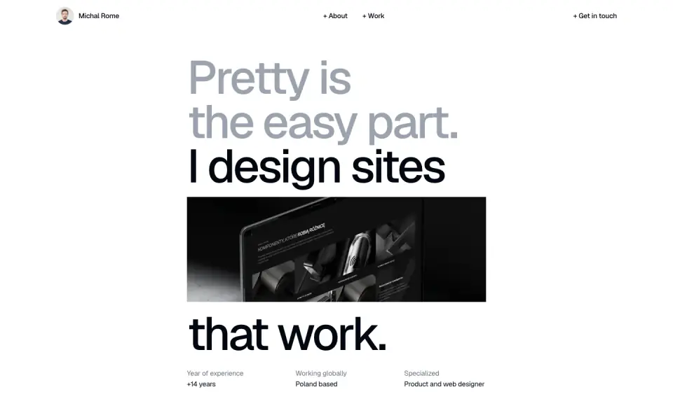
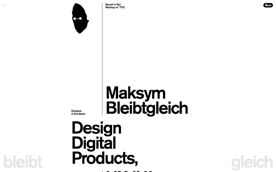
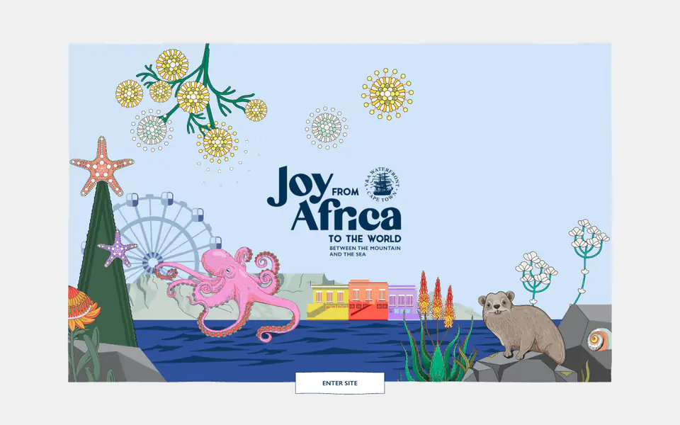
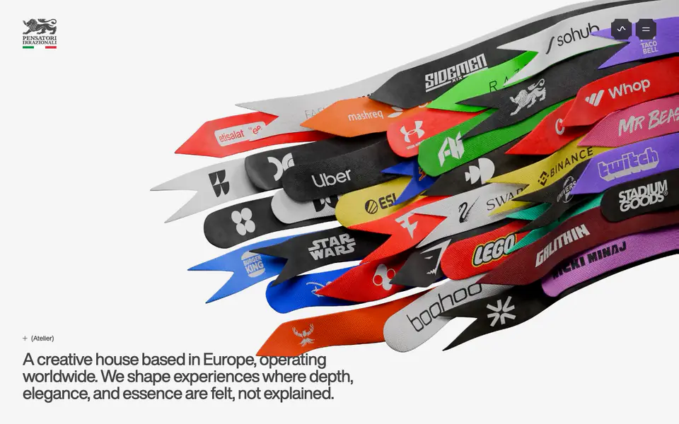
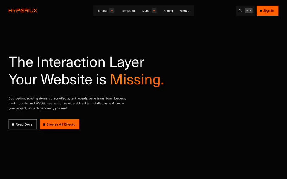
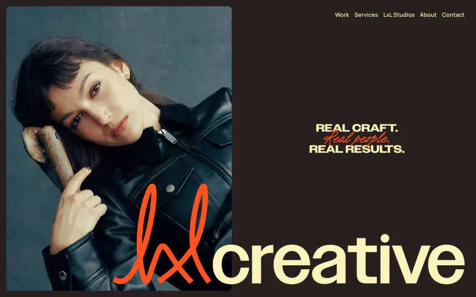
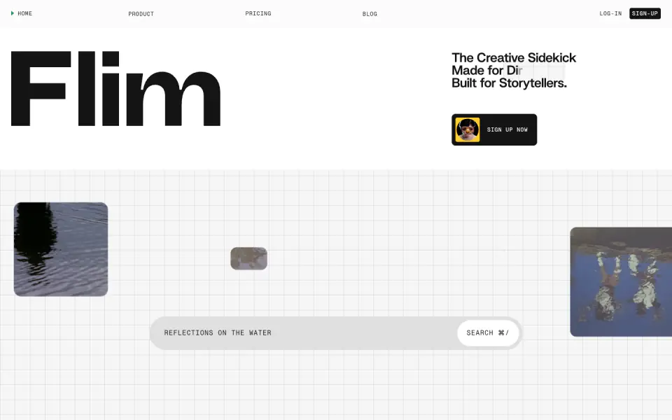
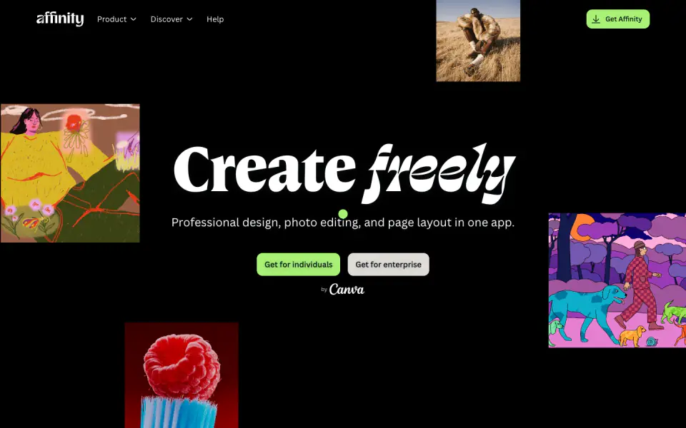
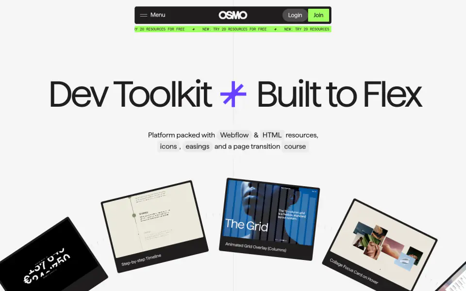
This portfolio website exhibits a clean, minimal, and typographic design language. It uses stark black and white contrasts with a functional grotesque typeface (Geist). The layout relies heavily on whitespace, large typography for key messaging, and a structured grid to present case studies. The overall aesthetic is professional, straightforward, and focuses intently on the content and portfolio pieces.
- Spacing
- Generous use of vertical whitespace between major sections (e.g., between hero and logo strip, and between individual case studies) to create a relaxed reading pace.
- Shape
- Sharp corners on images and layout blocks, contributing to a clean, structural feel. No visible rounded corners on primary elements.
- Borders
- Thin, solid, light grey borders used sparingly as horizontal dividers in lists.
- Buttons
- Minimalist button style relying on text links (e.g., '+ About') or simple outlined text badges ('Coming soon').
- Width
- Wide content area, but text blocks are constrained to maintain readability within a grid system.
- Density
- Low density. Elements are given ample room to breathe, emphasizing individual components rather than packing information tightly.