- Industry
- Technology
- Site type
- Portfolio
- Platform
- Custom code
- Tech
- Not detected yet
- Style
- Editorial, Minimal, Typographic, Sophisticated Utility
- Business model
- AI, Software, Portfolio
- Presence
- Online
- Components
- Navigation Bar, Hero, Editorial Card, FAQ Accordion, Pricing Table, CTA, Footer, Layered Typographic Hero, Hairline Structural Grids
- Score
- 60.55/100 · 100% evidence · Review pending
- Typography
- Display — CormorantGaramond; Heading — CormorantGaramond; Body — Arial
- Palette
- OG image

Design analysis
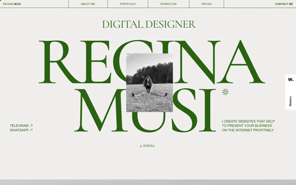
The website for Regina Musi, a digital designer, features an elegant, editorial-inspired design. The visual language relies heavily on a high-contrast palette of an off-white canvas (color-1) and a deep, distinctive green (color-2) used for striking, oversized serif typography (font-7, font-21). A delicate sans-serif (font-2) balances the dramatic display serif (font-1, font-5). The layout makes use of ample negative space, hairline borders, and overlapping elements to create depth. Parallax and variable font animations enhance the sophisticated, slightly brutalist approach to the editorial style.
- Spacing
- Generous use of negative space, creating an airy, editorial feel. Sections are clearly delineated by large gaps.
- Shape
- Sharp, 0px border-radius on all visible structural elements and images. None; sharp corners are a defining feature.
- Borders
- Extensive use of hairline (likely 1px) solid borders, often in the primary green color, defining grids and lists.
- Buttons
- Text links or full-width bordered blocks rather than traditional pill or rounded-rect buttons. The main CTA is a large solid rectangular block.
- Width
- Content spans wide, often utilizing a multi-column grid that fills the viewport with balanced margins.
- Density
- Low density; elements are spread out to emphasize scale and typography.