Inside the Parallel website design
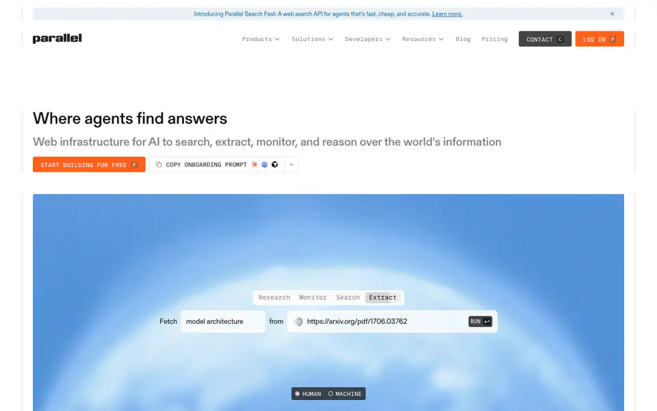
Parallel is an AI website built with custom code and Next.js. Its pages are built from footer, features, navbar, hero, logo cloud, feature card, pricing, FAQ, comparison, feature grid, and CTA sections, shown here in full-page captures and a scroll recording. Palette: #FFE0E0, #FF8040, #608080.
Web infrastructure for AI to search, extract, monitor, and reason over the world's information. Its visual style is minimal, typographic, and corporate, with navigation bar, hero with background imagery, and logo strip among its components.
Why we picked it
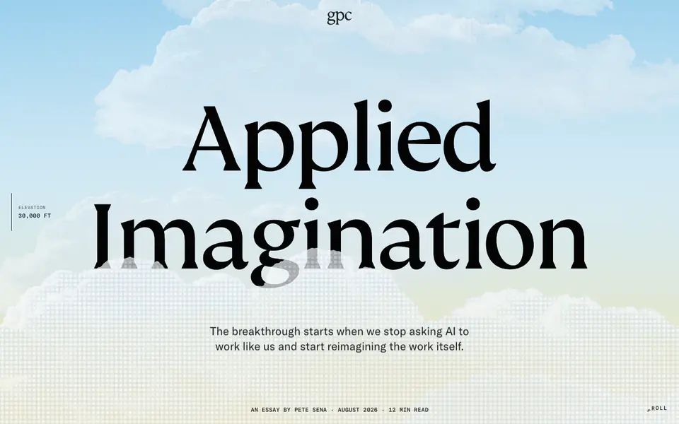
A soft blue cloud render under a plain dark headline gives the API a calm, trustworthy face, while a mono-style query card floating on top shows the product doing real work instead of describing it. Down the page, logo rows, orange accent buttons and alternating light and tinted panels pace long technical content into easy, scannable chunks.
What to look for
- Footer: grouped navigation with clear column headings
- Features: benefits framed around what the user gets, not internal capability names
- Hero: a specific headline instead of a generic slogan
- Feature Card: one idea per card
Questions designers ask
What is the Parallel website built with?
The Parallel website is built with custom code and Next.js, detected when the page was captured.
What colours does the Parallel website use?
The captured palette includes #FFE0E0, #FF8040, and #608080.
What sections does the Parallel website have?
The Parallel website includes footer, features, navbar, hero, logo cloud, feature card, pricing, FAQ, comparison, feature grid, and CTA sections. Each one opens on its own page, so you can compare it with the same section on other websites.
Can I use Parallel's design for my own project?
Use it as a reference for structure, hierarchy, and style rather than something to copy. The DESIGN.md download summarises Parallel's typography, colours, and components for your team or an AI tool.