- Industry
- Technology
- Site type
- Landing, Blog
- Platform
- Custom code
- Tech
- Next.js
- Style
- Bold, Editorial, Minimal, Photographic, Dark Mode Primary, Tech Forward
- Business model
- E-commerce, AI, Agency
- Presence
- Online
- Components
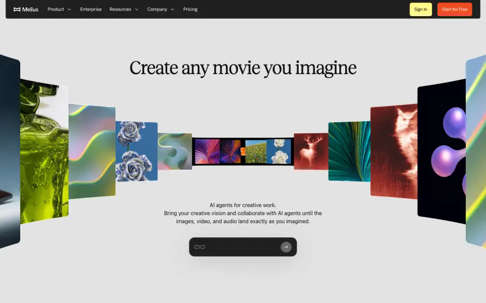
- Navigation Bar, Hero With Background Imagery, Carousel, Tabs, Feature Collection, Pricing Table, FAQ Accordion, Newsletter Form, Footer, Primary Button, Product UI, Node Based Visualizer, Interactive Command Prompt
- Score
- 53.2/100 · 100% evidence · Review pending
- Typography
- Display — recklessStandard; Heading — recklessStandard; Mono — easeStandard
- Palette
- OG image
Design analysis
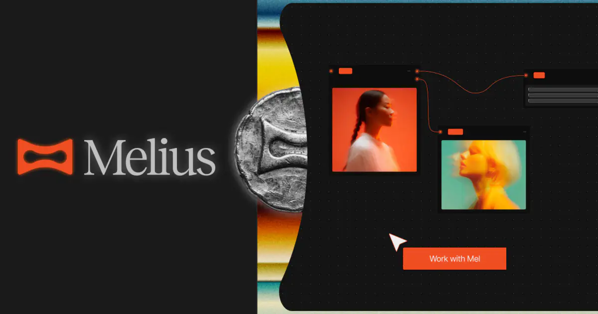
Melius employs a highly visual, modern, and slightly brutalist design language, characterized by a dark theme, strong contrasts, and a focus on high-fidelity imagery and interactive components. The typography mixes a clean sans-serif for UI elements with a distinctive, slightly condensed serif for headings, creating an editorial feel. The color palette relies heavily on off-blacks, dark grays, and a vibrant burnt orange as the primary accent, alongside neon yellow for secondary highlights. Key UI patterns include complex node-based visualizers, 3D carousel elements, and segmented controls used as interactive tabs.
- Spacing
- Generous spacing between major sections, with tighter, grouped spacing within functional components like the node visualizers and pricing cards.
- Shape
- Rounded corners are prevalent on buttons, input fields, pricing cards, and image containers, softening the overall dark aesthetic. Varies from small (approx. 4-8px) on tabs and tags, to medium (approx. 12-16px) on product UI panels, to large on pricing cards.
- Borders
- Subtle borders are used to define containers against dark backgrounds, often in low-opacity gray (color-18) or solid dark gray (color-8).
- Buttons
- Solid fill for primary actions (orange or yellow) with rounded corners, often without borders. Ghost or subtle background styles for secondary actions/tabs.
- Width
- Content is generally constrained to a central max-width, while background elements and the hero carousel break out to full bleed.
- Density
- Balanced density. High visual density in the node-based UI mockups and carousels, contrasted with low density, whitespace-heavy typography sections.