Inside the Biotic website design
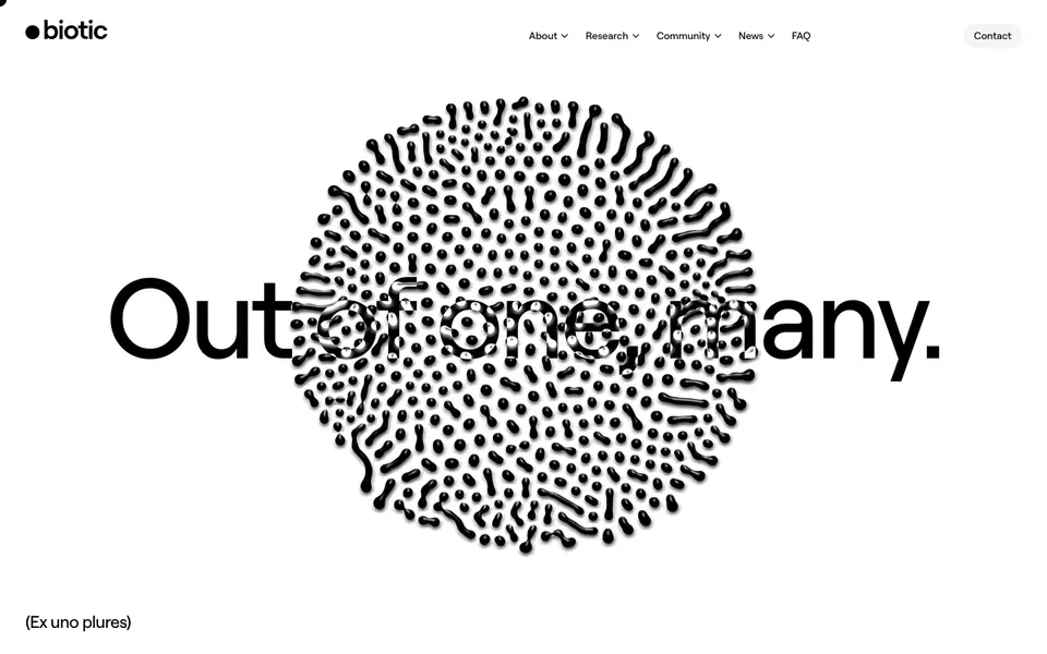
Biotic is a technology website built with WordPress. Its pages are built from features sections, shown here in full-page captures and a scroll recording. Typography: Roobert Medium. Palette: #E0E0FF, #A0A0C0, #606080.
The future of science starts now Its visual style is minimal, typographic, and corporate, with navigation bar, hero, and feature collection among its components.
Why we picked it
A dense cellular dot pattern sits behind the giant headline, echoing the biology theme without a single photo, while a black band with circular countdown rings gives the abstract mission a ticking deadline. Lime green accents and generous white space keep the dense scientific text easy to scan and lend the nonprofit a credible, lab-like mood.
What to look for
- Features: benefits framed around what the user gets, not internal capability names
Questions designers ask
What fonts does Biotic use?
Biotic uses Roobert Medium, read from the fonts loaded on the captured page.
What is the Biotic website built with?
The Biotic website is built with WordPress, detected when the page was captured.
What colours does the Biotic website use?
The captured palette includes #E0E0FF, #A0A0C0, and #606080.
What sections does the Biotic website have?
The Biotic website includes features sections. Each one opens on its own page, so you can compare it with the same section on other websites.
Can I use Biotic's design for my own project?
Use it as a reference for structure, hierarchy, and style rather than something to copy. The DESIGN.md download summarises Biotic's typography, colours, and components for your team or an AI tool.