- Industry
- Technology
- Site type
- Landing, Store
- Platform
- Shopify
- Tech
- React
- Style
- Minimal, Bold, Playful, App Showcase, Scrollytelling
- Business model
- AI, Agency, Shopping
- Presence
- Online
- Components
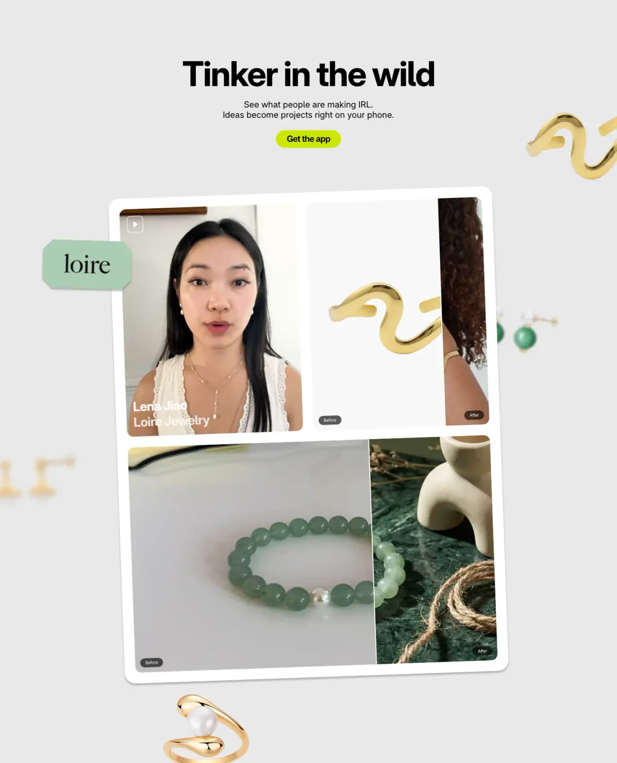
- Navigation Bar, Hero, Primary Button, Product UI, Feature Collection, FAQ Accordion, Footer, App Store Badges, Before/after Labels, Scroll Expanding Wordmark
- Score
- 56.9/100 · 100% evidence · Review pending
- Typography
- Display — Shopify-Inter; Heading — Shopify-Inter; Body — Shopify-Inter
- Palette
- OG image

Design analysis
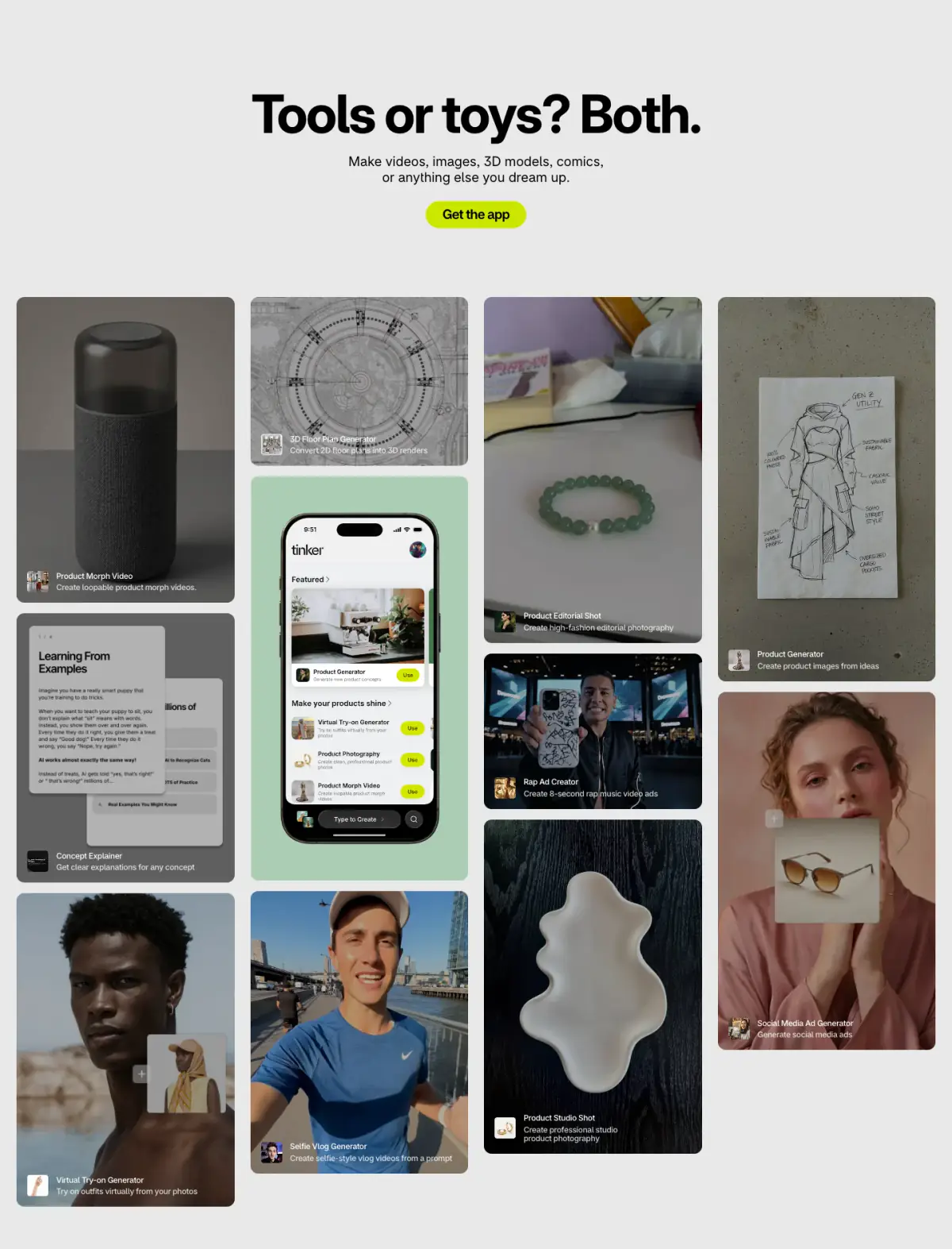
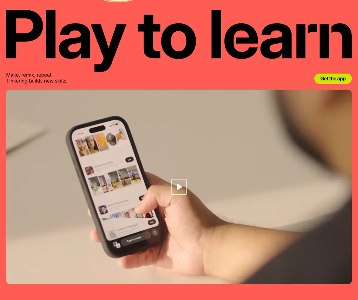
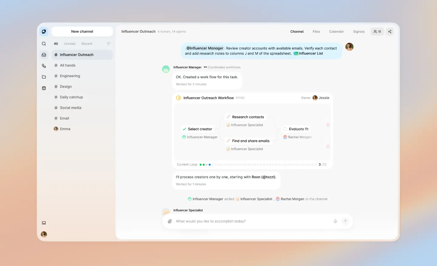
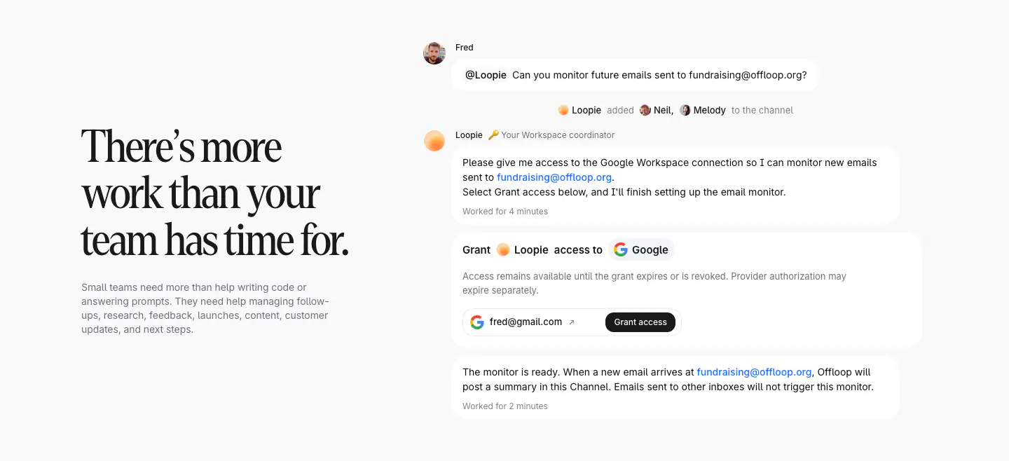
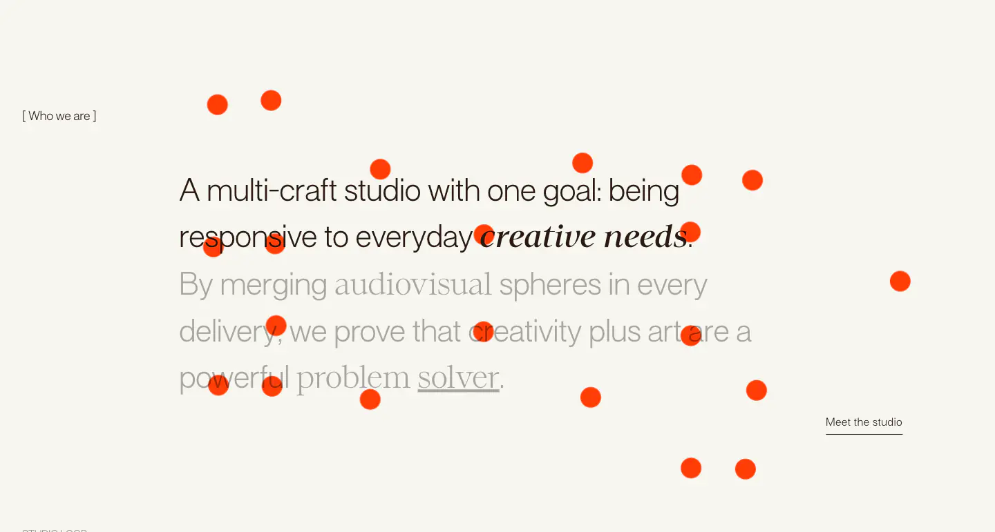
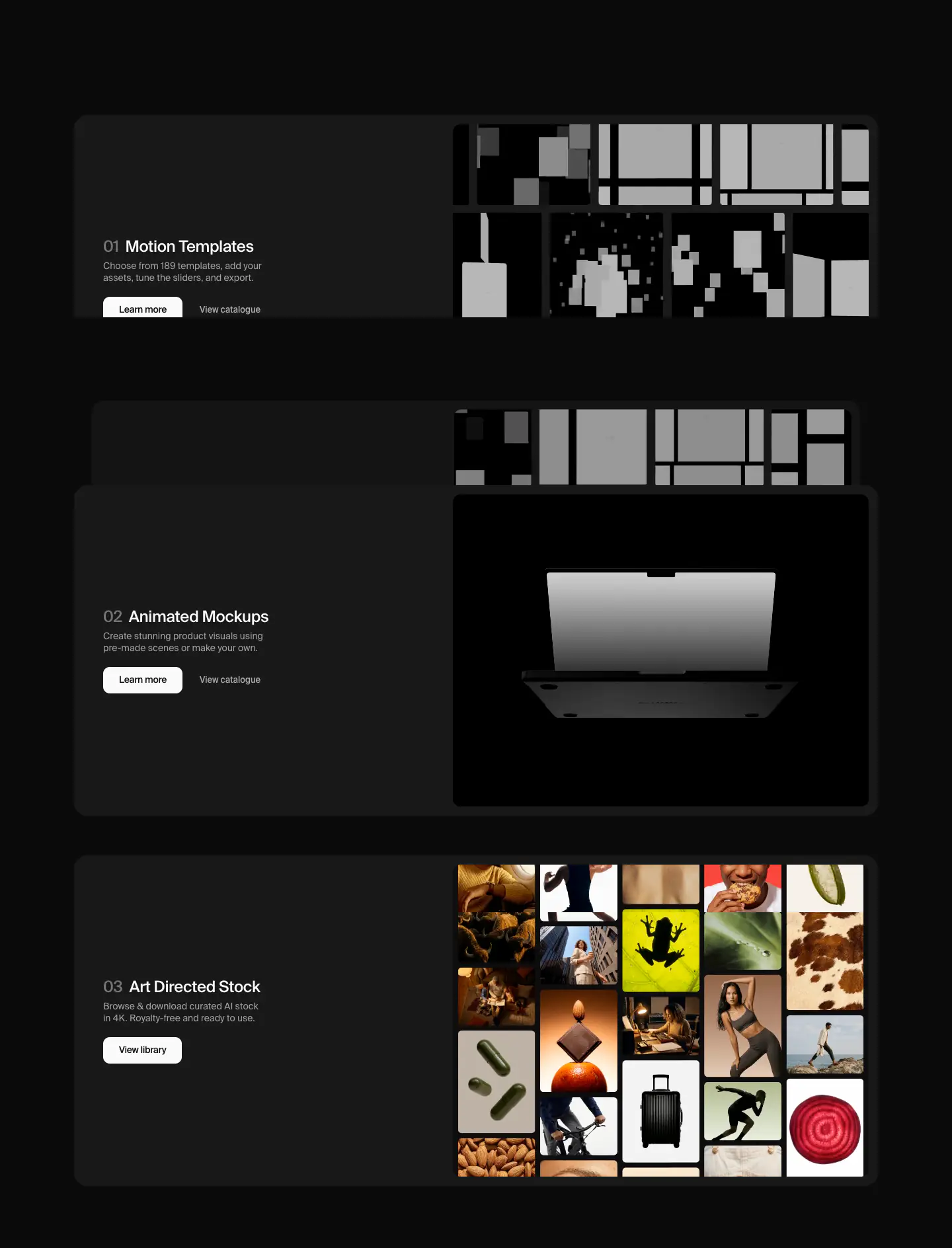
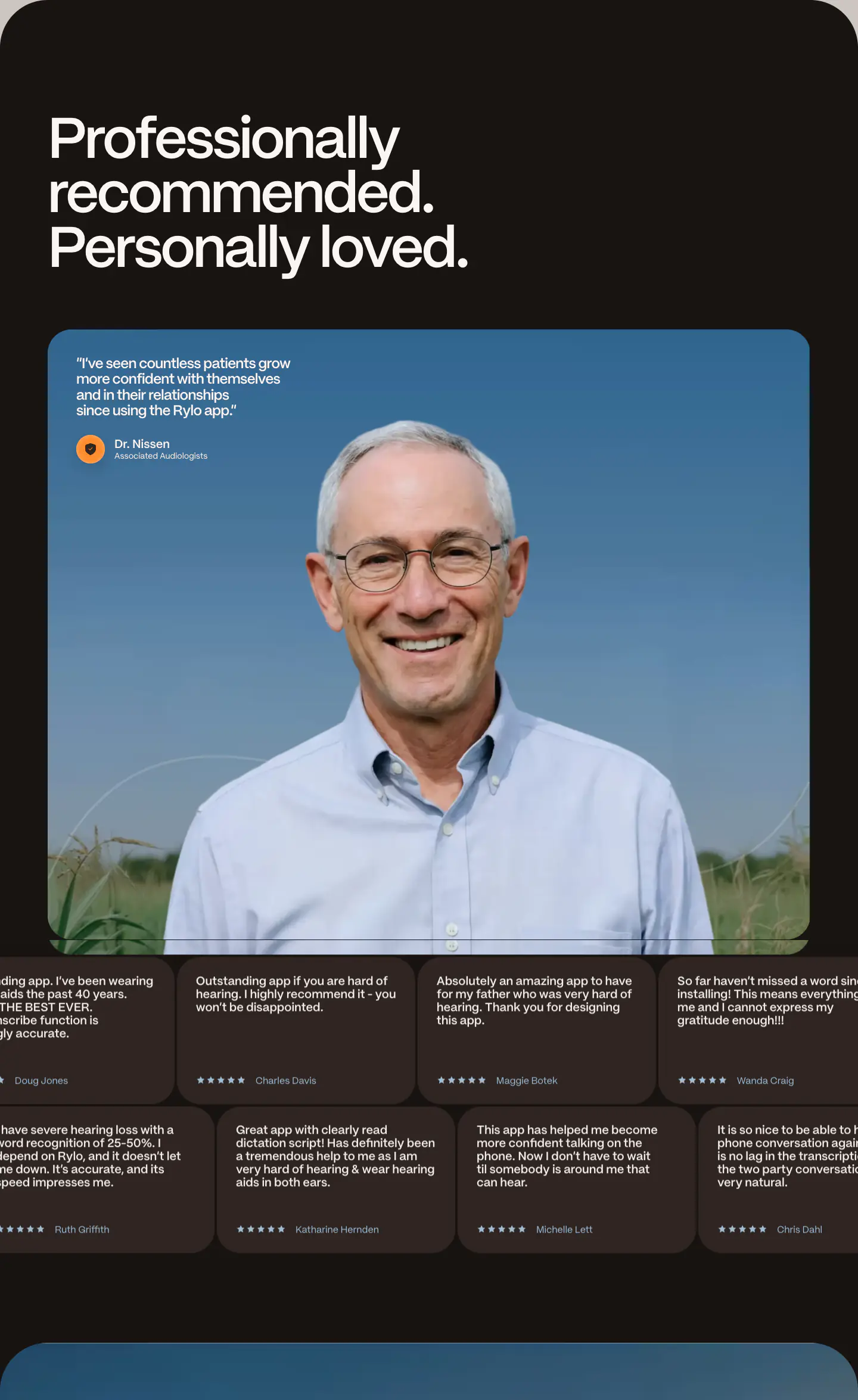
The website presents a clean, visually striking interface focused on a mobile application. It relies on a minimalist canvas with a high-contrast palette featuring black, white, and a signature lime green accent. The layout is driven by large, tightly tracked typography and generous whitespace. Visual interest is heavily dependent on a masonry grid of product features, mockups of the mobile app interface, and bold section background colors like coral and light gray. Elements consistently feature soft, rounded corners, from image frames to pill-shaped buttons, contributing to an approachable, modern aesthetic.
- Spacing
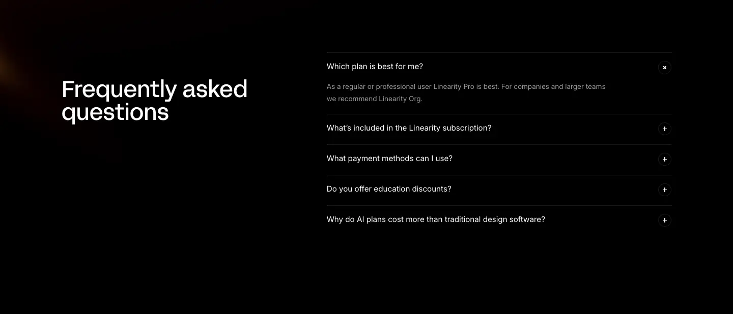
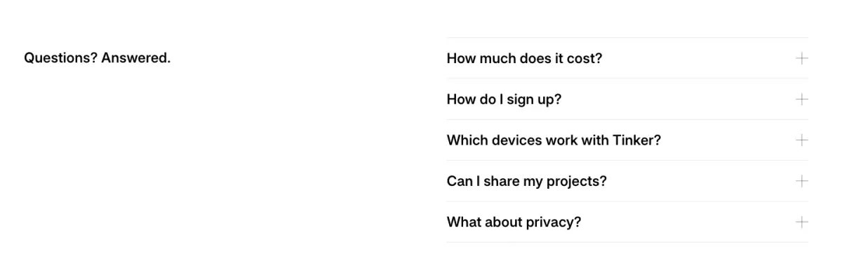
- Generous vertical padding distinguishes major sections, creating a breathable layout. Tighter spacing is used within clusters like the FAQ list or inside the app UI mockups.
- Shape
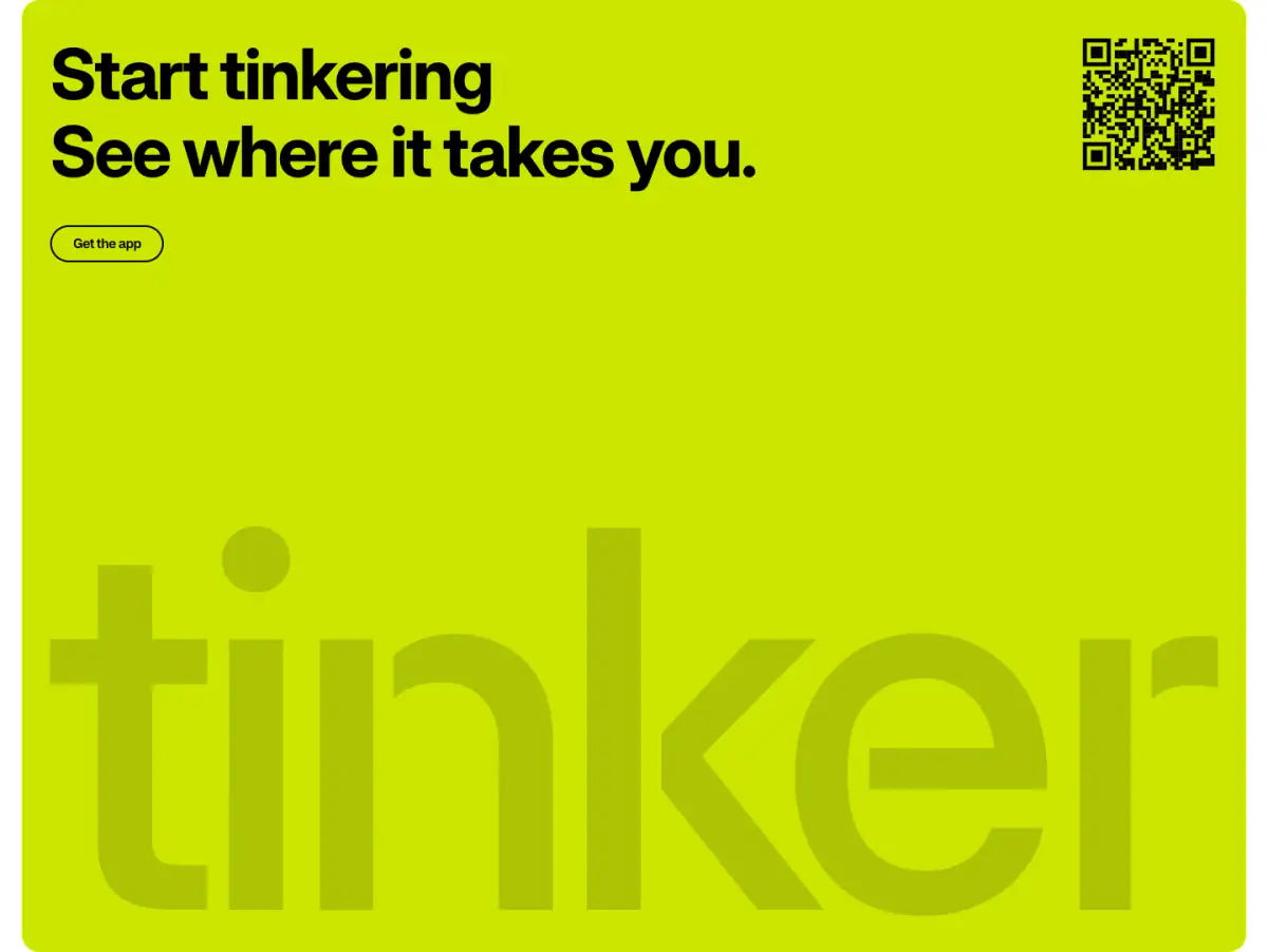
- Consistent use of soft, rounded corners across all interactive and framed elements to create a friendly and modern aesthetic. Fully rounded (pill) radii for primary buttons and app store badges. Large rounded corners (approx 16-24px) for image containers, videos, and app UI mockups.
- Borders
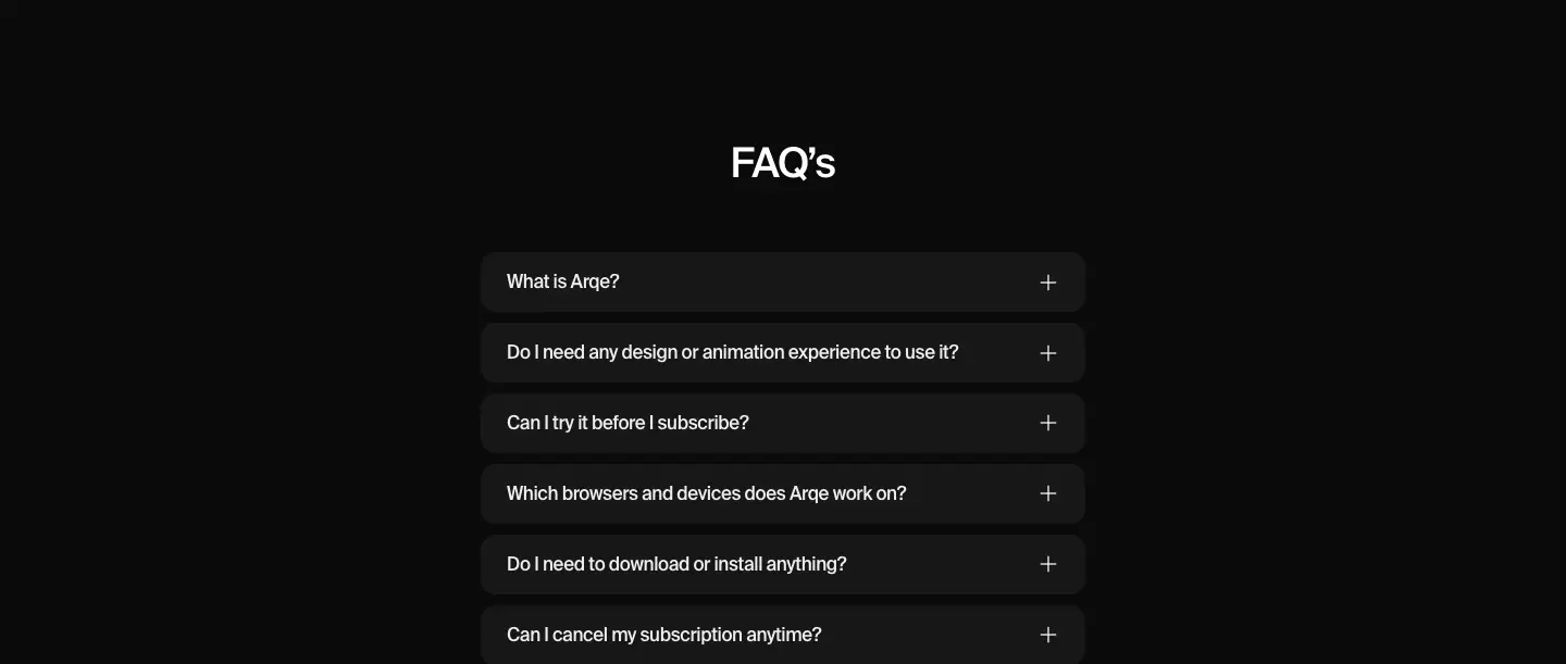
- Mostly borderless design, relying on background color contrasts to define areas. Subtle 1px solid borders are used to separate items in the FAQ accordion.
- Buttons
- Solid-fill, pill-shaped buttons with contrasting text. The primary call-to-action uses the bright lime green brand color with dark text.
- Width
- Text content is frequently centered and constrained to a readable medium width, while background colors and masonry image grids extend fully or near-fully across the viewport.
- Density
- Low overall density. The design leverages large typography and expansive empty space to draw attention to the colorful visual assets and core messages.