- Industry
- Technology
- Site type
- Waitlist, Landing
- Platform
- Custom code
- Tech
- Next.js
- Style
- Minimal, Typographic, Corporate, Saas Showcase, High Contrast Accent
- Business model
- AI, Software, Agency
- Presence
- Online
- Components
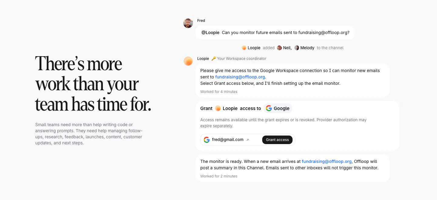
- Announcement Bar, Navigation Bar, Hero, Feature Card, Feature Collection, Primary Button, Footer, Offset Feature Layout, App UI Mockup Container
- Score
- 41.6/100 · 100% evidence · Review pending
- Typography
- Display — graphik; Heading — graphik; Body — Inter
- Palette
Design analysis
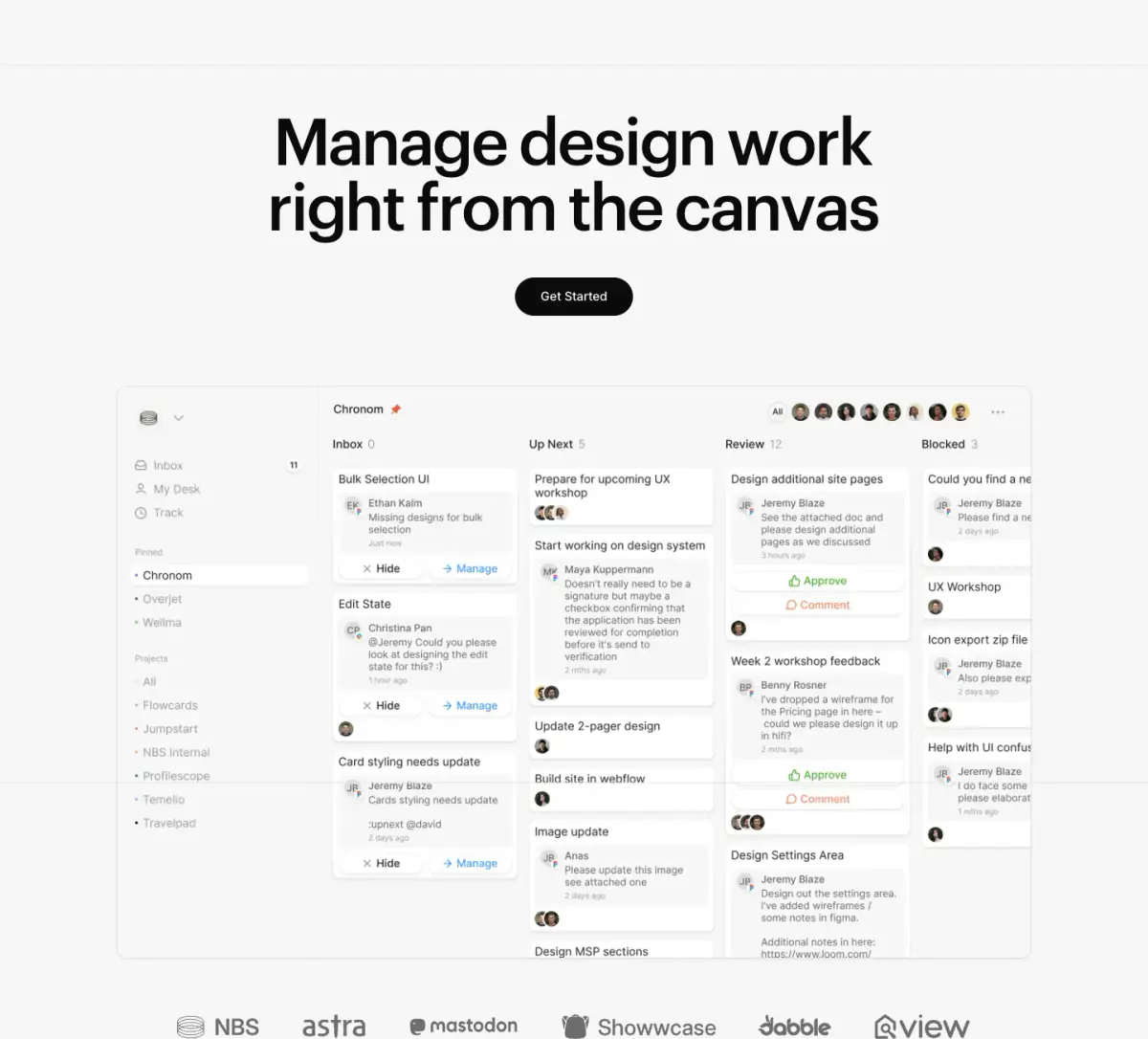
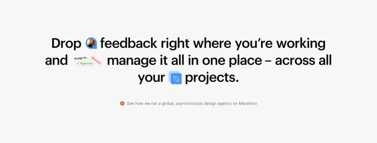
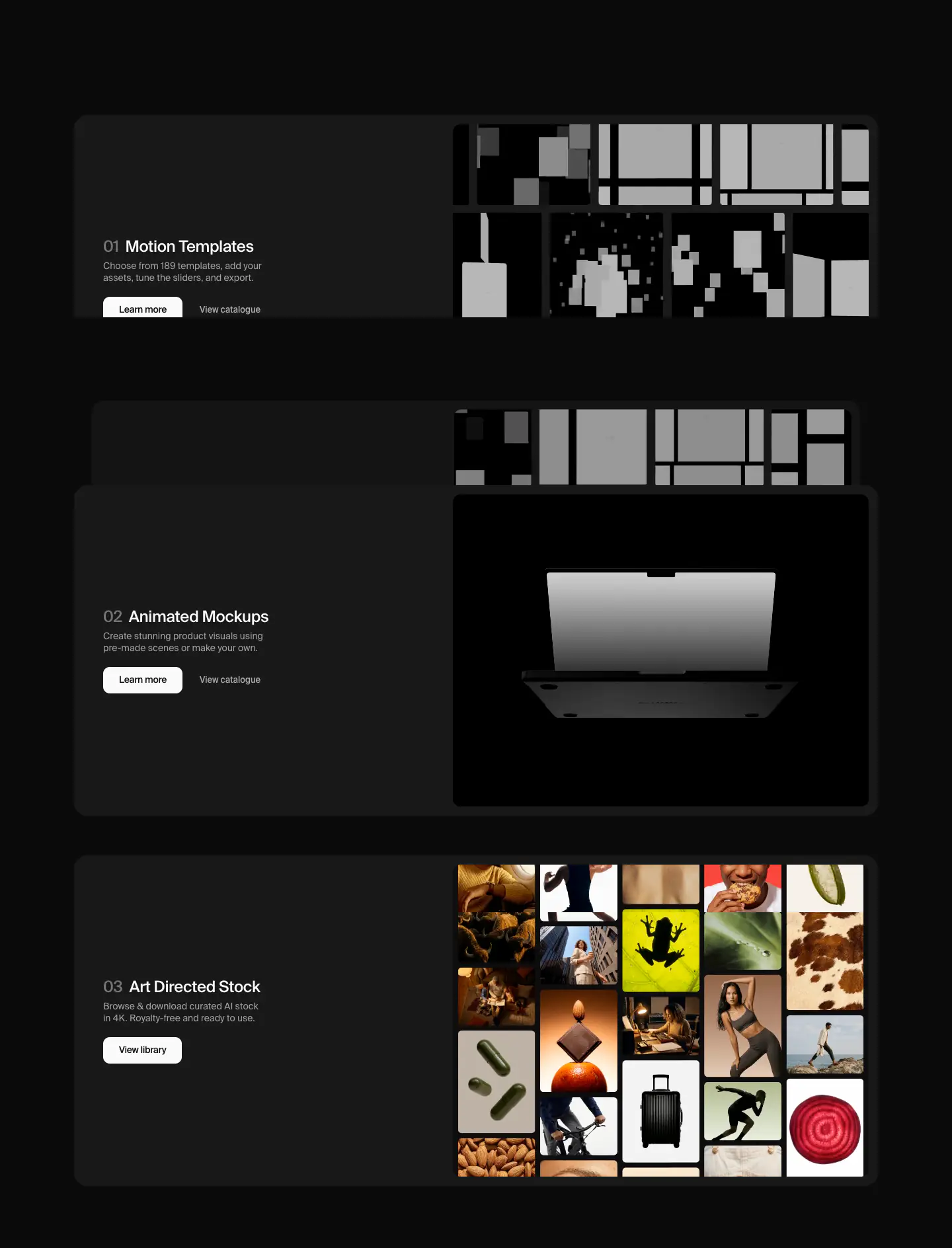
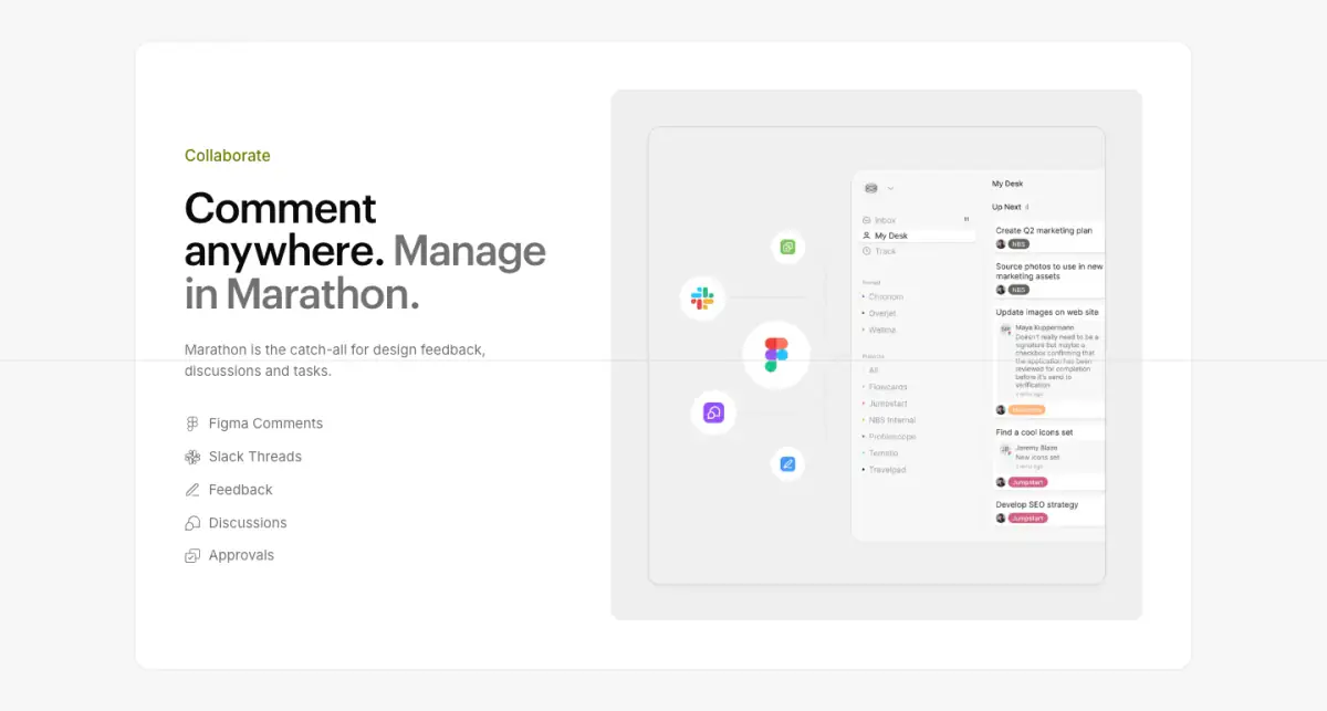
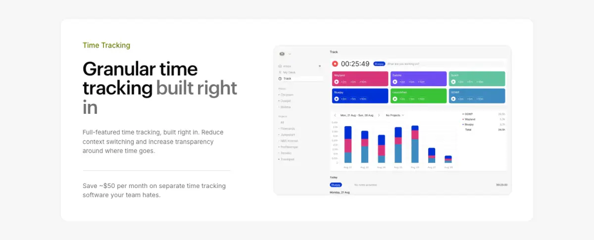
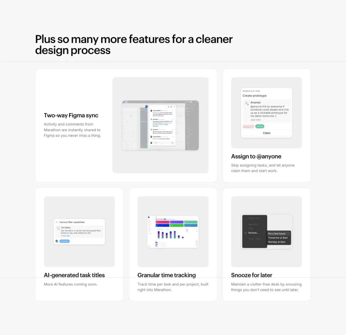
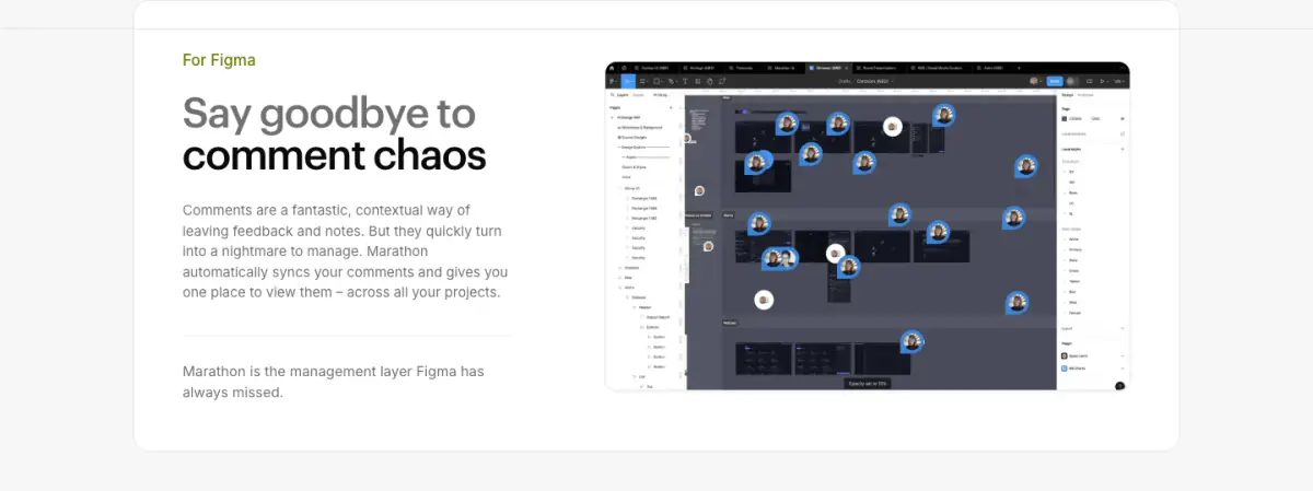
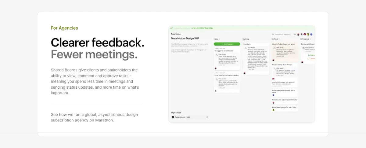
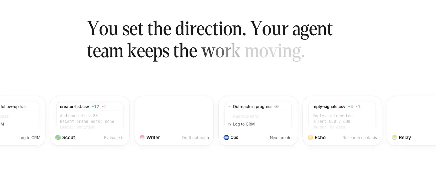
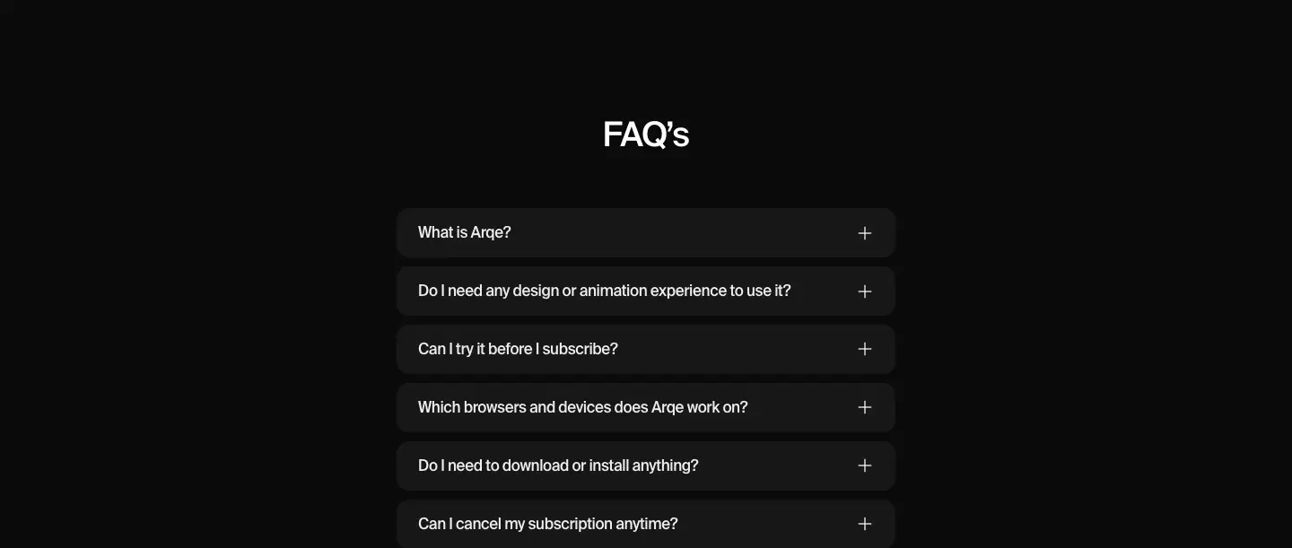
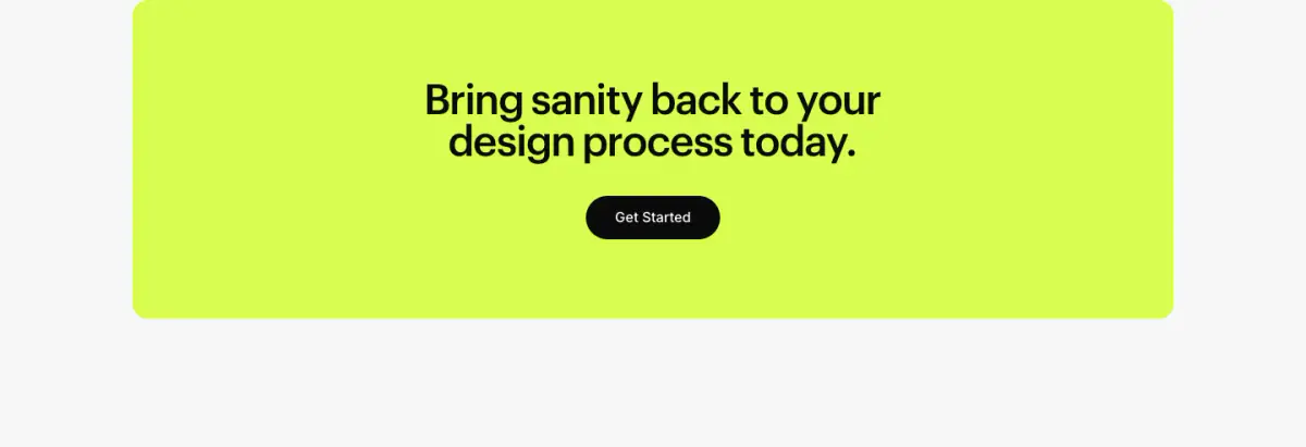
The Marathon website exhibits a clean, modern, and minimal aesthetic tailored for a B2B SaaS product. It uses a light grayscale palette with a striking neon green accent color for the persistent announcement bar and lower CTA section. Typography is heavily emphasized, utilizing the sans-serif typefaces Graphik for bold, highly legible headings and Inter for body copy. The layout is spacious with low density, relying on ample white space to separate content blocks rather than rigid bounding boxes, though feature showcases are presented within softly rounded, white surface cards against an off-white canvas. Interactive elements like primary buttons adopt a solid black, fully rounded pill shape
- Spacing
- Generous vertical spacing between major sections and components, emphasizing a relaxed and uncluttered layout.
- Shape
- Mixed but consistent: fully rounded for interactive elements, gently rounded for layout containers. Buttons appear as fully rounded pills; feature cards and image containers have a moderate corner radius, likely around 12px to 16px.
- Borders
- Mostly borderless design with depth achieved via subtle background color contrasts; very faint 10% black borders appear as dividers (e.g., under the nav bar).
- Buttons
- Solid fill with highly contrasting text, heavily rounded (pill shape), without visible borders or prominent drop shadows.
- Width
- Content is constrained to a central column, leaving wide margins on standard desktop viewports.
- Density
- Low density. The layout breathes with significant negative space surrounding text blocks and UI mockups.