- Industry
- Technology
- Site type
- Landing, Blog
- Platform
- Custom code
- Tech
- Next.js
- Style
- Corporate, Typographic, Minimal, Cyberpunk Tech, Developer Centric
- Business model
- AI, Software
- Presence
- Online
- Components
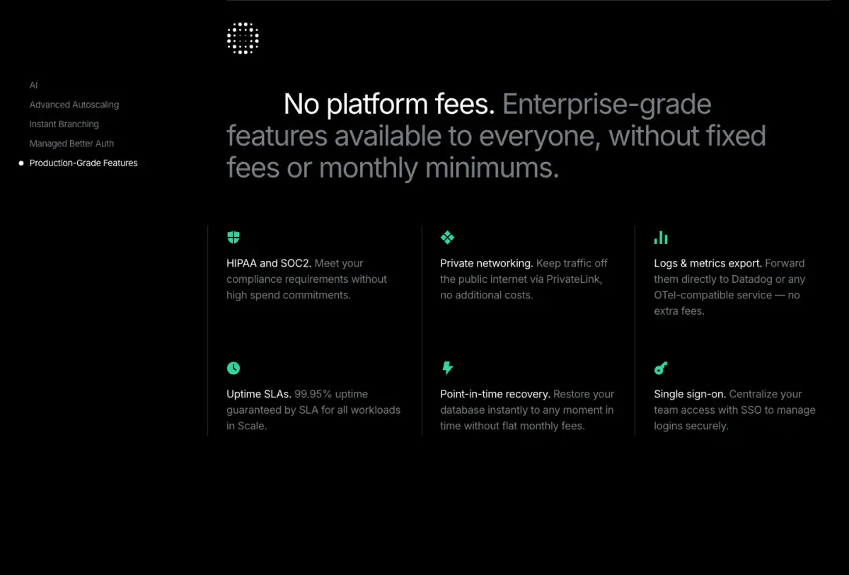
- Navigation Bar, Hero, Feature Card, Feature Collection, Testimonial Card, Logo Strip, Primary Button, Outline Button, Footer, Tabs, Product UI, Interactive Diagram, Code Snippet Block, Sticky Sidebar Navigation
- Score
- 60.7/100 · 100% evidence · Review pending
- Typography
- Display — Inter; Heading — Inter; Body — Inter; Mono — GeistMono
- Palette
- OG image

Design analysis
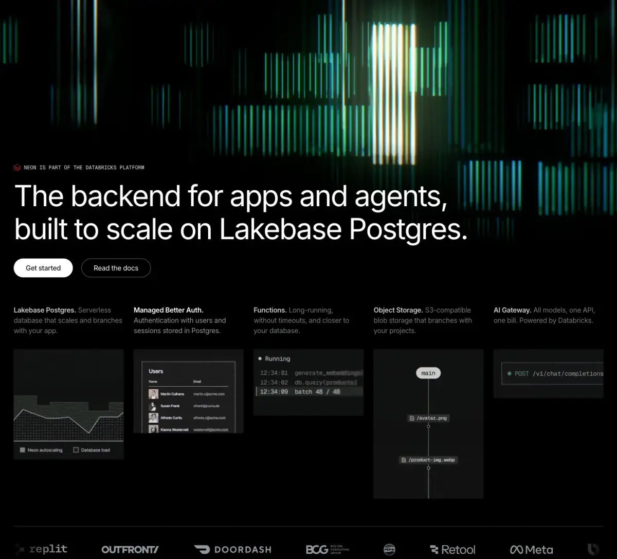
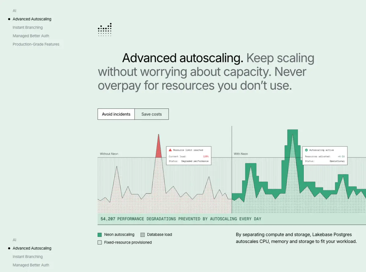
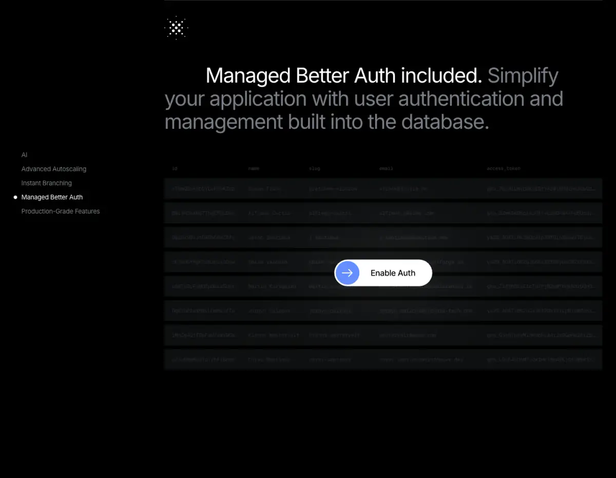
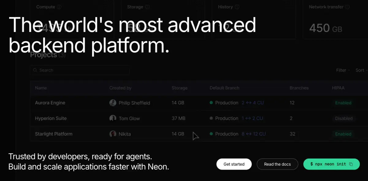
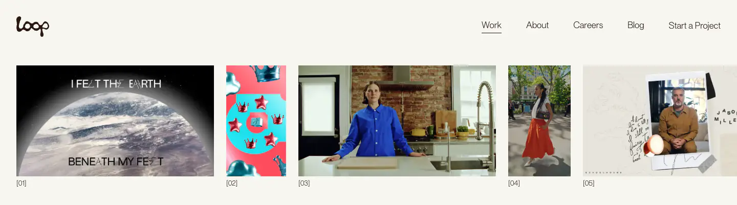
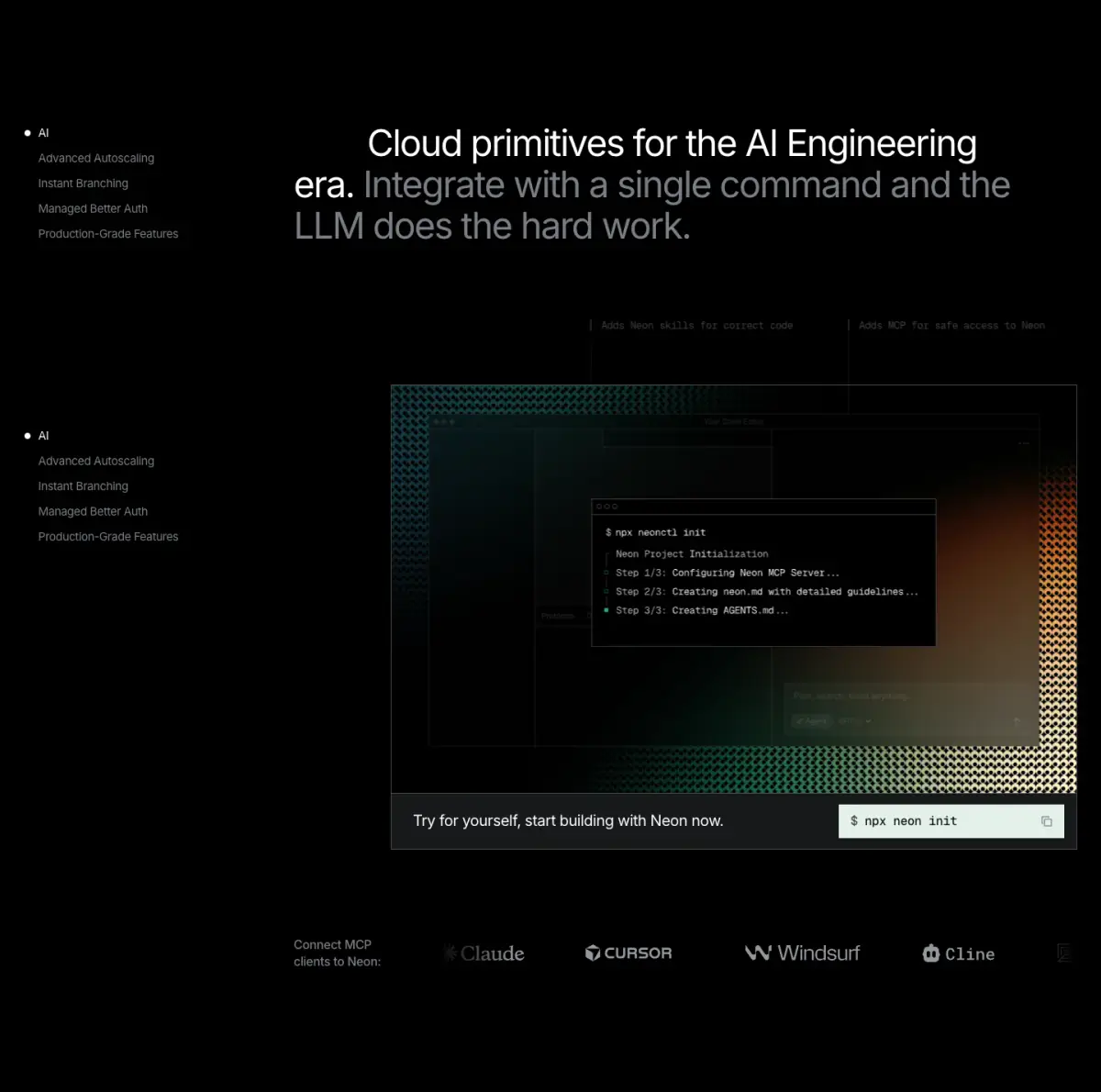
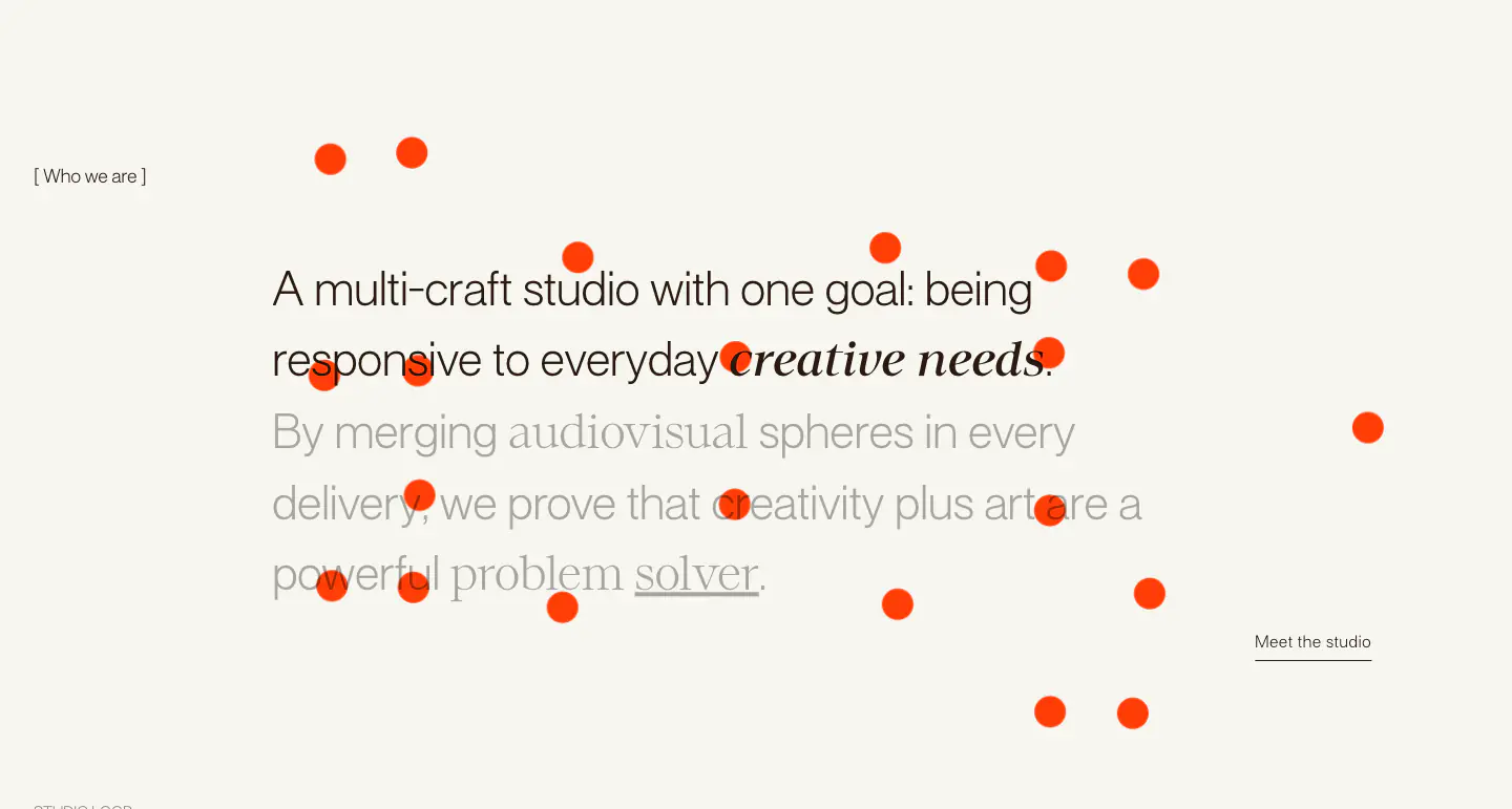
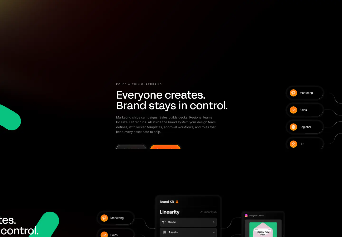
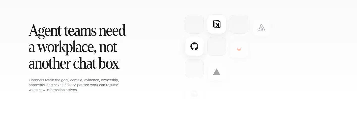
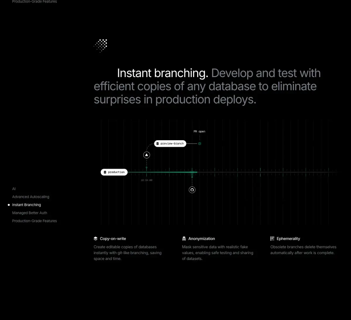
The Neon website utilizes a distinctly tech-forward, 'cyberpunk' aesthetic, characterized by a predominantly dark canvas (rgb(0, 0, 0)) contrasted with vibrant, glowing green accents (rgb(0, 229, 153), rgb(52, 213, 154)) and stark white text. The layout is structured yet dynamic, featuring intricate grid patterns, animated diagrams, and code snippets that reinforce its developer-centric focus. Typography relies on Inter for clean readability and GeistMono to evoke a terminal/coding environment. The design heavily leverages scroll-triggered animations to reveal complex diagrams, such as autoscaling charts and branching timelines, adding a layer of interactivity and technical depth. A sudden v
- Spacing
- Generous vertical spacing between major sections, allowing complex diagrams and animations room to breathe.
- Shape
- Mix of sharp corners on diagrams/code blocks and slightly rounded corners on UI elements like buttons (pill shape) and feature cards. Buttons appear pill-shaped (fully rounded), while cards and code blocks have smaller, subtle border radii (e.g., 4px-8px).
- Borders
- Subtle, dark grey borders (e.g., color-12) used to define cards and UI panels against the black background without overwhelming the visual.
- Buttons
- Solid white primary buttons for general actions, vibrant green solid buttons for technical actions ('npx neon init'), and pill-shaped outline buttons for secondary actions.
- Width
- Content is generally centered with a max-width, while background animations and some large graphics extend full width.
- Density
- Variable density: Minimal in transition areas and hero sections, but highly dense in areas containing technical diagrams, charts, and code snippets.