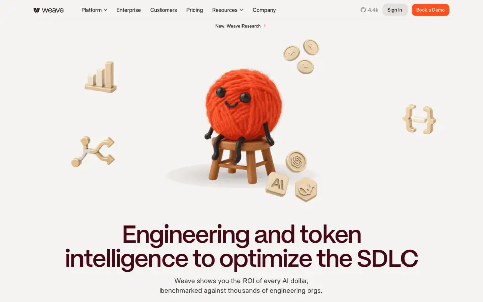
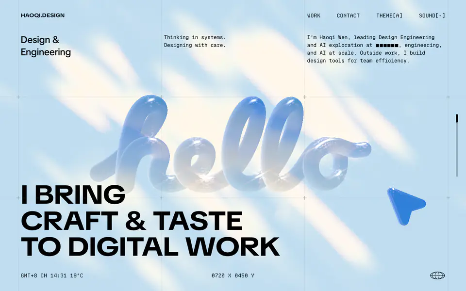
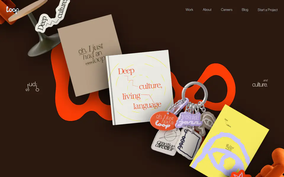
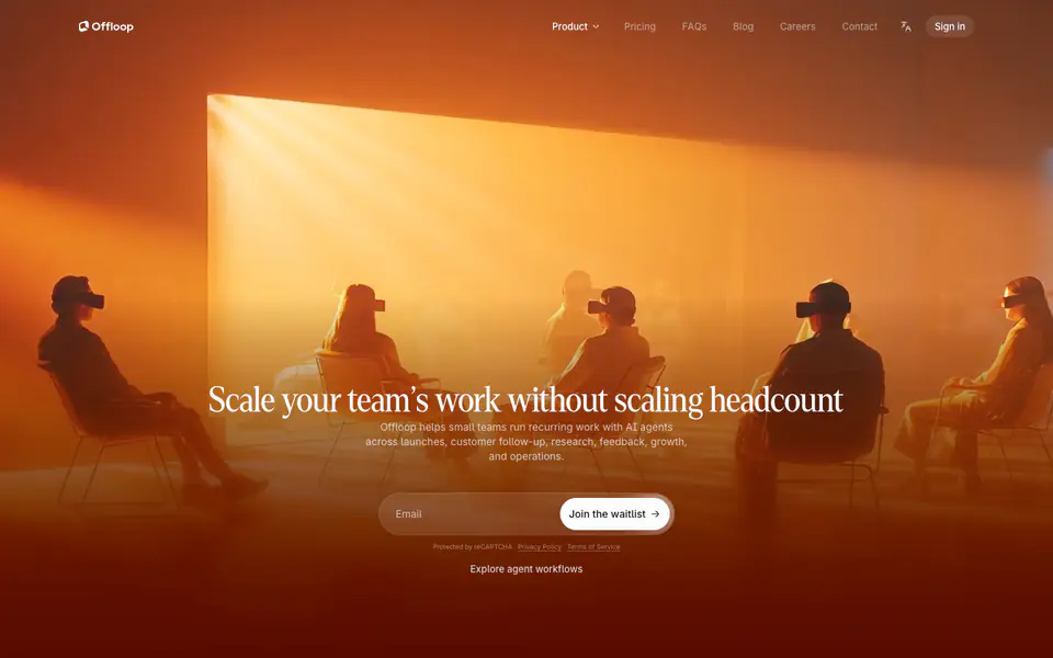
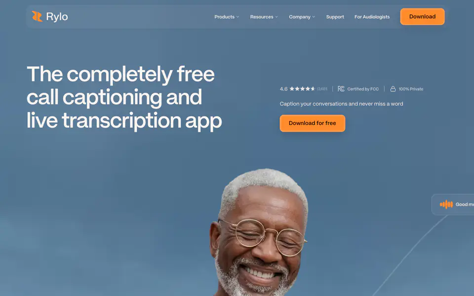
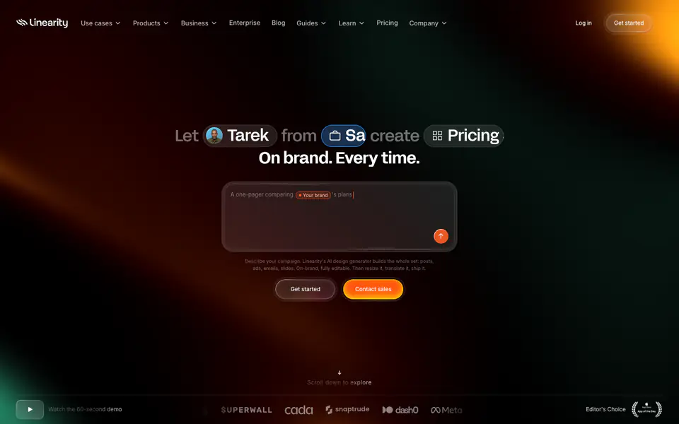
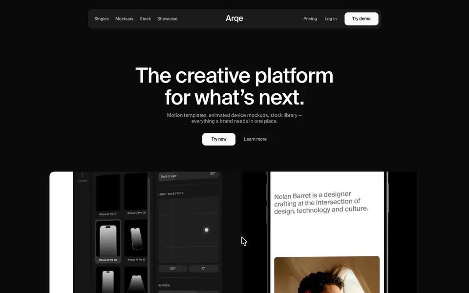
The design exhibits a minimal, soft, and slightly playful aesthetic. A warm, light grey canvas sets the stage for deep burgundy serif headings and dark grey sans-serif body text, creating an editorial feel. 3D illustrations of a yarn character add playfulness. Components like feature cards and buttons feature soft, rounded corners and generous internal spacing. Bright orange serves as the primary action color, providing a strong contrast against the muted background.
- Spacing
- Large, deliberate vertical spacing between sections (macro-rhythm), with tighter, consistent padding within cards and text blocks (micro-rhythm).
- Shape
- Consistently soft and rounded. UI elements avoid sharp corners. Pill-shaped (fully rounded) buttons and tags; large border radii on main content containers and feature cards.
- Borders
- Mostly borderless design relying on background color contrast (surface vs canvas). Where borders exist, they are solid, 1px, and low-contrast light grey.
- Buttons
- Primary buttons are brightly colored (orange) and pill-shaped. Secondary buttons often feature a very light grey background.
- Width
- Content is generally centered with a max-width constraining readability, while some background elements stretch wider.
- Density
- Low density. The design embraces significant whitespace, allowing elements room to breathe.