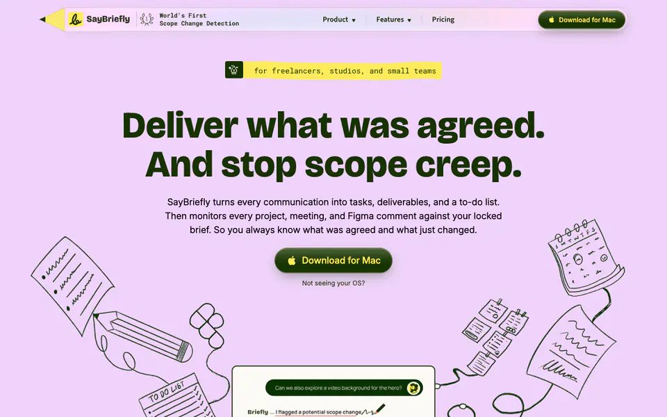
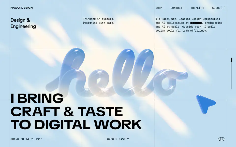
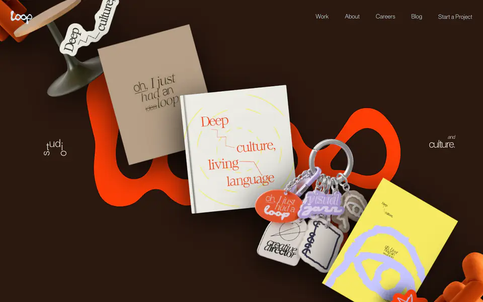
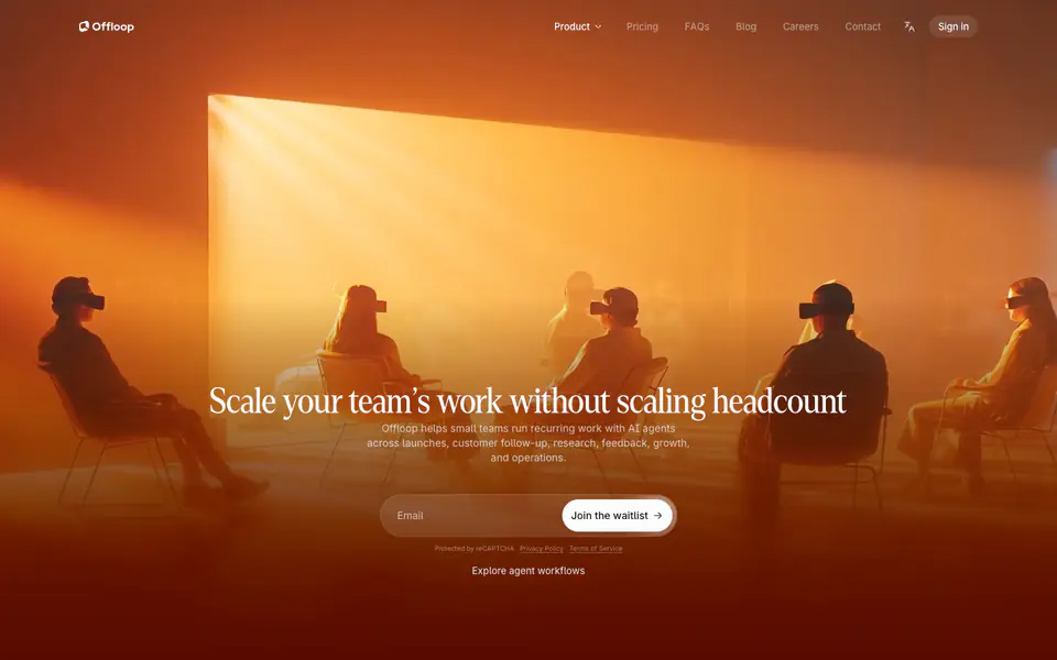
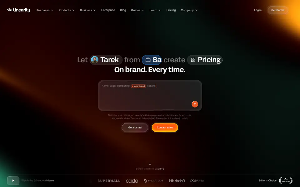
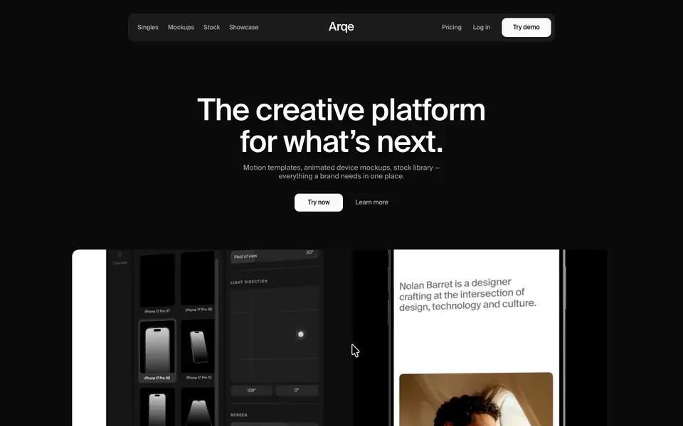
The design features a playful, illustrative aesthetic anchored by a warm off-white canvas and dark green text. Hand-drawn doodle-style graphics are heavily utilized alongside bold Grotesque typography for headings. Bright yellow and muted orange accents provide contrast and highlight key elements, such as tags and call-to-actions. The layout uses generous spacing and dotted horizontal rules to separate sections.
- Spacing
- Generous vertical rhythm with large gaps between distinct content blocks, allowing illustrations to act as visual breaks.
- Shape
- Mix of sharply rounded pills (buttons, tags) and slightly rounded rectangles (UI mockups). Primary buttons use a small but distinct border radius, while tags are fully rounded pill shapes.
- Borders
- Thin, solid dark green borders are used to outline illustrations and UI cards. Dotted rules are used as structural dividers.
- Buttons
- Solid fill (dark green) with contrasting accent text (yellow) and an icon, featuring soft rounded corners.
- Width
- Content is centrally constrained, maintaining significant whitespace on the left and right margins on desktop.
- Density
- Low density overall. The layout feels airy, relying on the off-white canvas and illustration space to prevent crowding.