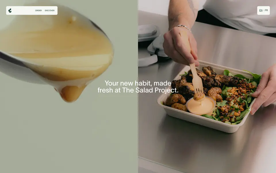
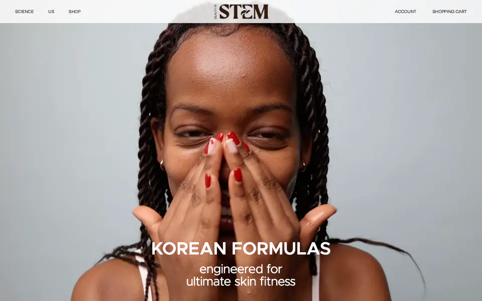
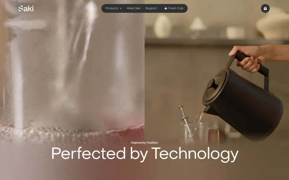
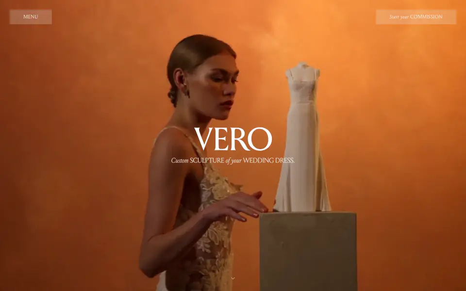
The website employs a visually striking, photography-led design with a distinct organic and fresh aesthetic. It relies on a carefully curated palette of light cream backgrounds and deep forest green typography, accented by vibrant light green elements. The layout makes heavy use of asymmetric split-screen scrolling, full-bleed imagery, and clean, geometric sans-serif typography. Navigation and interactive elements frequently utilize prominent pill-shaped containers.
- Spacing
- Generous vertical spacing between major sections. Structured, even gaps in product grids.
- Shape
- Fully rounded (pill shape) for navigation elements and buttons. Product images are generally circular or softly rounded. Maximum border-radius used extensively on UI controls to create pill shapes.
- Borders
- Borders are largely absent on primary layout elements, relying instead on color contrast. Subtle, thin borders are used for structure (e.g., lines above footer).
- Buttons
- Solid fill pill shapes, occasionally using uppercase text, contrasting sharply with the background.
- Width
- Fluid full-width for media backgrounds, with text and grid content constrained to a wide, centered column layout.
- Density
- Spacious and open. The design breathes well, emphasizing imagery and clear typography over dense information packing.