- Industry
- Health
- Site type
- Landing
- Platform
- Custom code
- Tech
- GSAP
- Style
- Minimal, Typographic, Corporate, Kinetic Overlay
- Business model
- Agency
- Presence
- Online
- Components
- Navigation Bar, Hero, Outline Button, Icon Button, Tag, Footer, Edge Aligned Framing
- Score
- 54.19/100 · 80% evidence · Review pending
- Typography
- Display — Google Sans; Heading — Google Sans; Body — Google Sans; Mono — Monument Extended
- Palette
- OG image

Design analysis
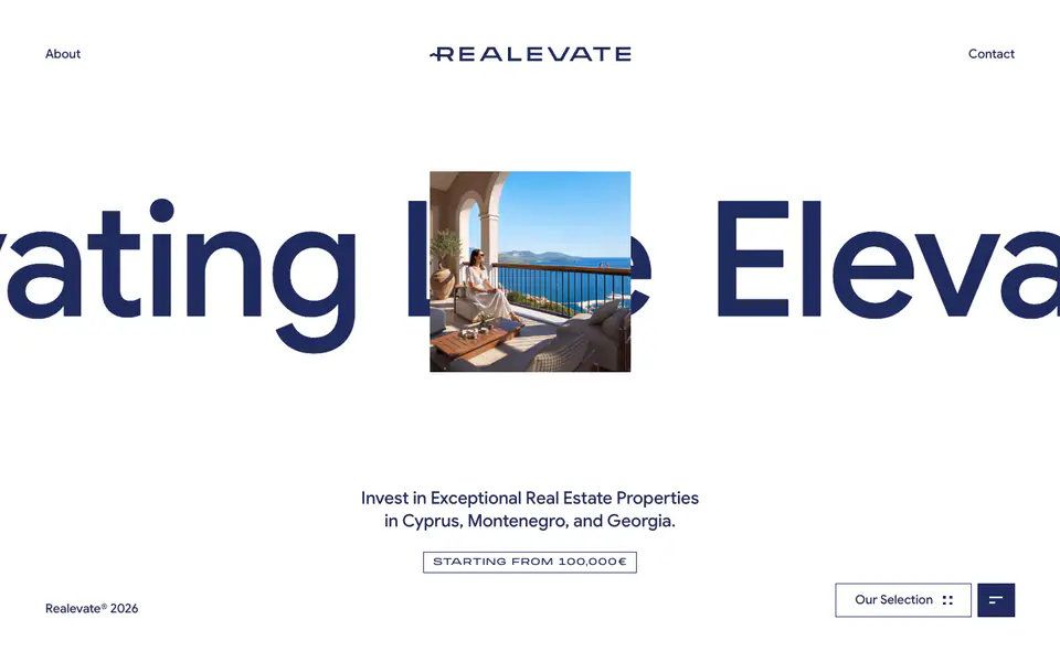
The page presents a highly minimal, typographic hero layout dominated by a stark two-color palette of white and navy blue. A central, square-cropped image serves as a focal point, layered over a large, horizontally scrolling text marquee. Structural elements like the navigation, footer, and calls to action are pushed to the extreme edges of the viewport, creating a wide, open canvas that emphasizes the central content and the kinetic background text.
- Spacing
- Content is deeply centralized with interactive and utility elements pushed to the far perimeter of the viewport.
- Shape
- Strictly sharp, 0px border radii on all visible UI elements, including buttons and tags. No rounded corners are present; everything utilizes perfect right angles.
- Borders
- Thin, solid 1px borders in the primary navy color (#1F2B5E) used to enclose tags and outline buttons.
- Buttons
- A paired approach: one bordered, white-filled button next to a solid, navy-filled icon button, both with sharp corners.
- Width
- Central content is constrained to the middle third of the screen, contrasting with full-bleed background elements.
- Density
- Very sparse and airy; large negative space surrounds the central focal points.