- Industry
- Technology
- Site type
- Waitlist, Landing
- Platform
- Custom code
- Tech
- Not detected yet
- Style
- Minimal, Editorial, Typographic, Saas Focused
- Business model
- AI
- Presence
- Online
- Components
- Navigation Bar, Hero With Background Imagery, Split Hero, Product UI, FAQ Accordion, Footer, Input Field, Primary Button, Editorial Card, Data Visualization Chart, Floating Action Bar
- Score
- 57.4/100 · 100% evidence · Review pending
- Typography
- Display — Denton; Heading — Denton; Body — Inter; Mono — JetBrains Mono
- Palette
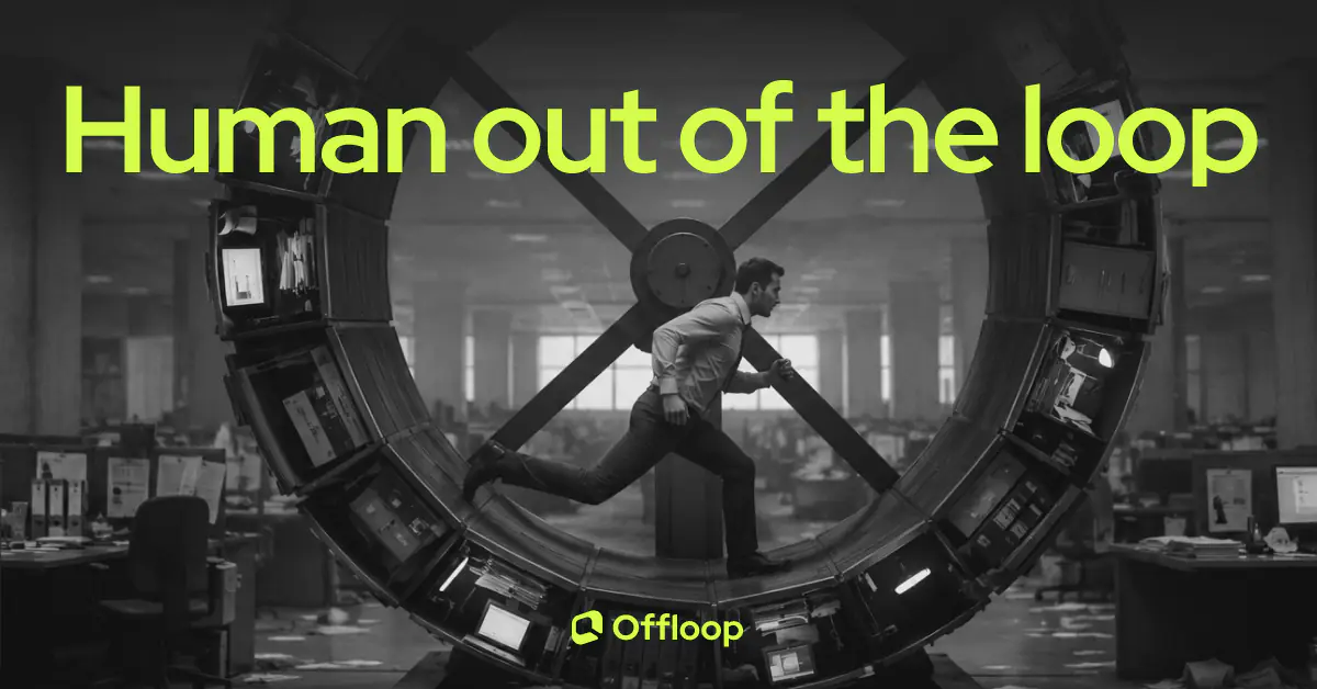
- OG image
Design analysis
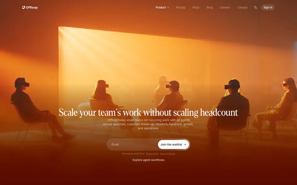
The Offloop landing page employs a minimal, editorial design style, utilizing a generous amount of whitespace, clear typography, and a refined color palette to communicate a sophisticated and modern software tool for AI agents. The layout features distinct sections with large, impactful headings (font-2, font-19) paired with functional, smaller text (font-6, font-8) for detailed explanations. Subtle use of color, primarily monochromatic with strategic accents (color-18, color-40), helps guide attention without overwhelming the user. The UI mockups scattered throughout the page are designed to look like a clean, contemporary application, reinforcing the brand's focus on productivity and clari
- Spacing
- Generous spacing between sections and elements, creating a breathable layout. Padding inside cards and UI elements is consistent.
- Shape
- Rounded corners are prevalent on UI mockups, buttons, and cards, suggesting a modern and approachable feel. Varies; buttons and smaller UI elements have tighter radii, while large UI mockups have softer, more pronounced rounded corners.
- Borders
- Subtle borders are used occasionally to define cards or inputs, but many elements rely on spacing or light backgrounds for separation.
- Buttons
- Buttons are typically solid with rounded corners. The primary call-to-action in the hero is prominent, while secondary actions are more subdued.
- Width
- Content is generally centered and constrained to a readable width, though UI mockups may break out wider for emphasis.
- Density
- Low density; the design favors whitespace and clear hierarchy over packing information tightly.