- Industry
- Technology
- Site type
- Waitlist, Landing
- Platform
- WordPress
- Tech
- Next.js
- Style
- Minimal, Corporate, Typographic, Photographic, SaaS
- Business model
- E-commerce, AI, Software
- Presence
- Online
- Components
- Navigation Bar, Hero, Product UI, Feature Card, Primary Button, Ghost Button, FAQ Accordion, Footer, Stat Block, Product Mockup Feature Showcase, Input Style CTA
- Score
- 55/100 · 100% evidence · Review pending
- Typography
- Display — abcDiatype; Heading — abcDiatype; Body — abcDiatype
- Palette
- OG image
Design analysis
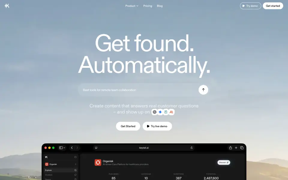
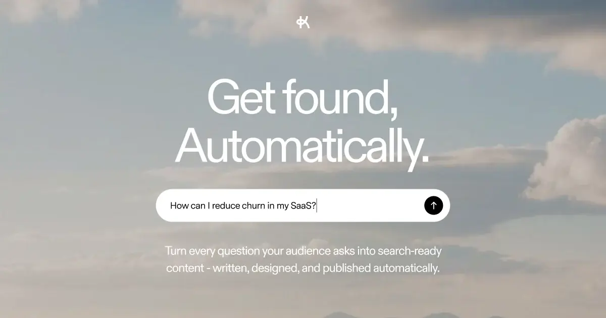
Keytail employs a clean, modern, and minimal design aesthetic with corporate undertones. The layout relies heavily on ample whitespace and a simple monochromatic palette (black, white, and grays) to allow product UI screenshots and large, expressive typography to stand out. A single sans-serif typeface, 'abcDiatype', is used consistently across all weights and sizes, contributing to a cohesive and professional feel. The visual hierarchy is established primarily through scale and weight contrasts in typography, as well as distinct spatial grouping. Subtle photographic elements (cloudscapes and landscapes) add depth without overwhelming the core message.
- Spacing
- Generous vertical rhythm with significant padding between major sections. Elements within sections have tighter, logical grouping.
- Shape
- Predominantly rounded corners. Buttons and cards use significant border radii (pill shapes for smaller buttons, softer rounded rectangles for larger containers). Mixed. Pill-shaped buttons use fully rounded radii. Feature cards and product mockups use moderate rounding (likely 12px-24px range).
- Borders
- Subtle and minimal. Borders are generally thin (1px) and use light grays to define edges without adding visual weight.
- Buttons
- Solid fill (black or white) for primary/secondary actions, often pill-shaped. Ghost/toggle variants use transparent or very light backgrounds with text changes.
- Width
- Content is generally centered and constrained to a readable max-width, though background imagery and some full-width sections break this constraint.
- Density
- Low density. The design prioritizes whitespace and large typography over packing in information.