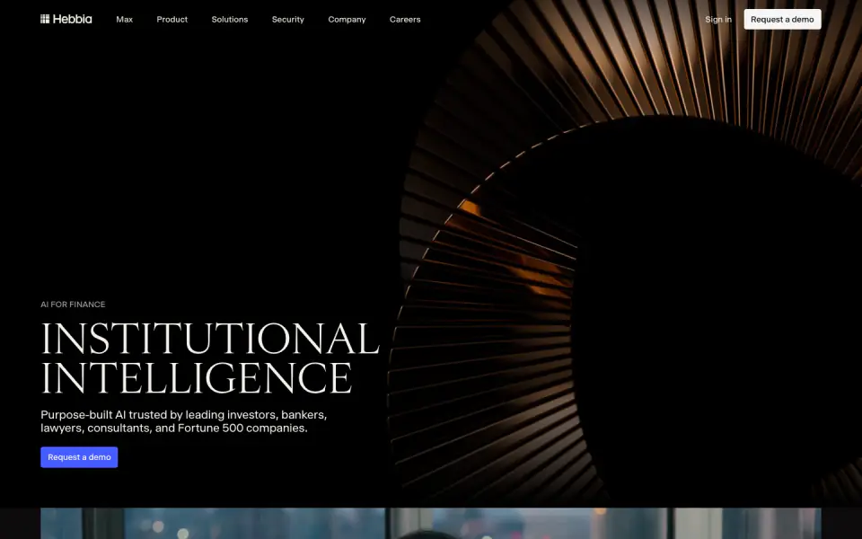
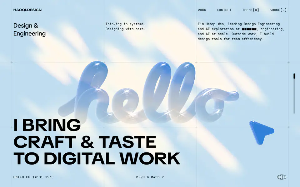
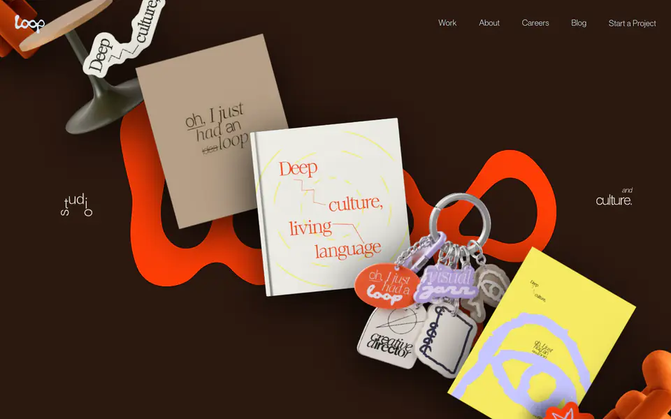
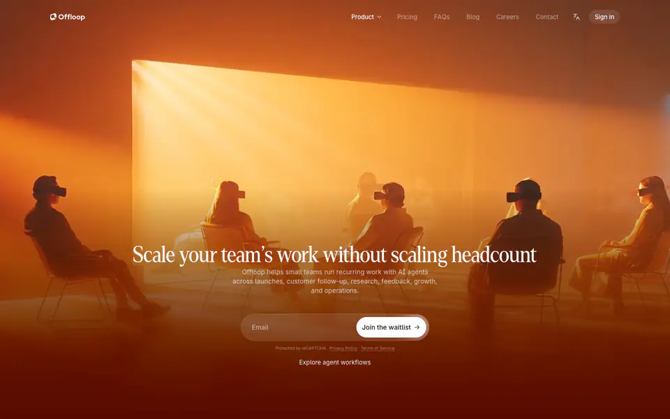
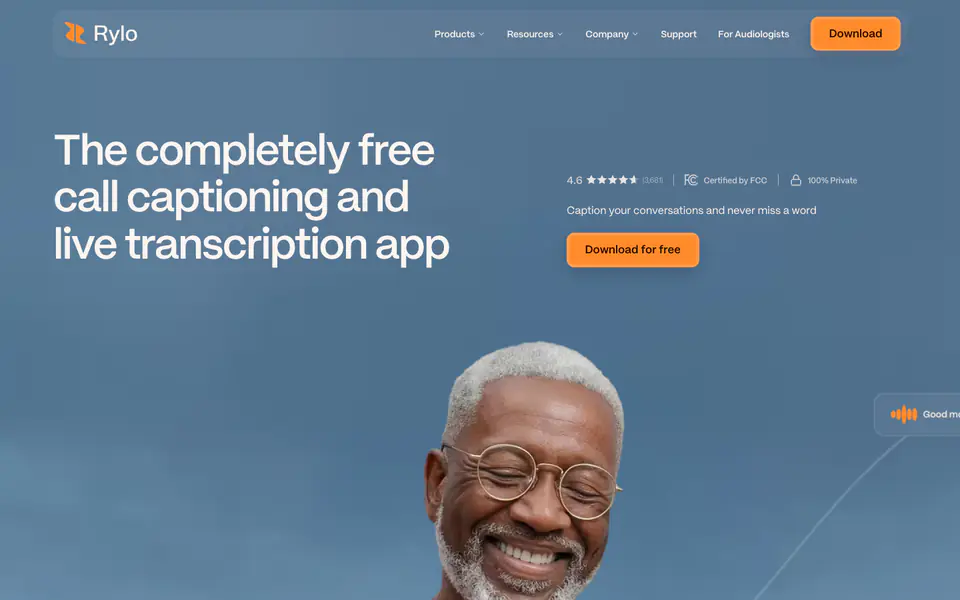
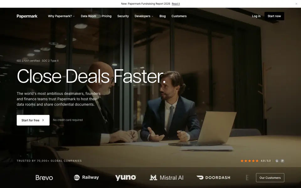
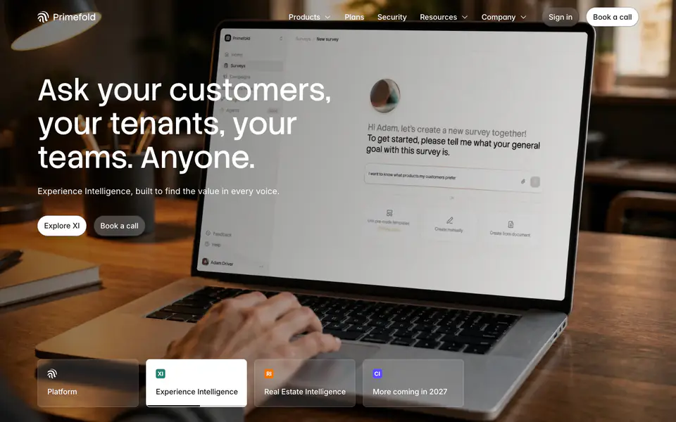
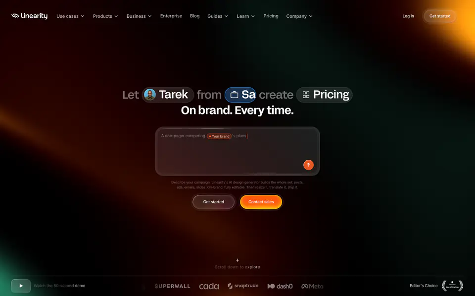
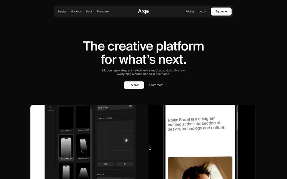
The website presents a highly polished, editorial-style corporate design with a predominantly dark theme. It utilizes a sophisticated contrast between an elegant serif font for headings and a clean sans-serif for UI elements and body copy. High-quality, moody photography and 3D renders are used alongside detailed, dense product UI mockups. The layout is structured yet spacious, giving an institutional and premium feel.
- Spacing
- Generous vertical spacing between major sections, contrasting with tighter, denser spacing within UI mockups and data tables.
- Shape
- Subtly rounded corners applied consistently to buttons, UI mockups, and image containers, softening the strict geometric layout. Small to medium border radii (likely 4px-8px for small elements, 12px-16px for larger cards).
- Borders
- Thin (1px), solid borders used extensively within the product interface illustrations to delineate table rows and structural bounds.
- Buttons
- Solid color fills (white or vibrant blue) with rounded corners and distinct padding.
- Width
- Centered content container for main text blocks, while UI mockups and images often stretch wider or utilize multi-column grids.
- Density
- Varies significantly; highly spacious in editorial marketing sections, but high density within the specialized product UI 'Matrix' sections.