- Industry
- Technology
- Site type
- Store
- Platform
- Webflow
- Tech
- GSAP
- Style
- Minimal, Bold, Corporate, Tech Utility
- Business model
- E-commerce, Shopping, AI
- Presence
- Online, Offline
- Components
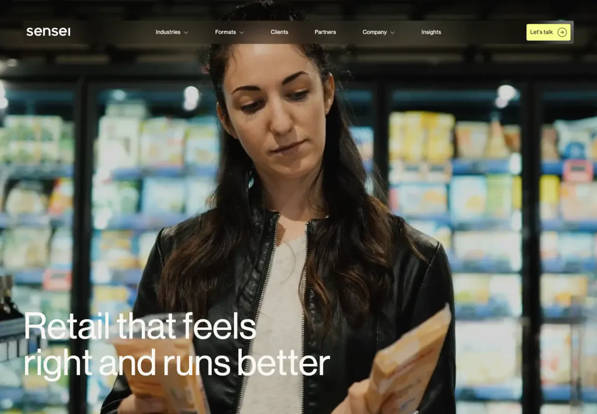
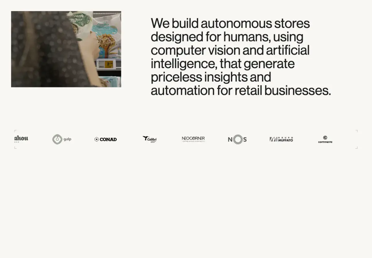
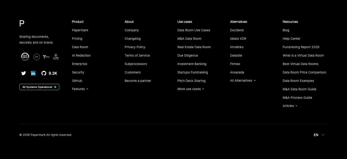
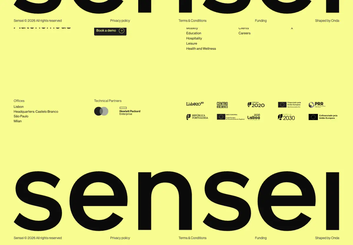
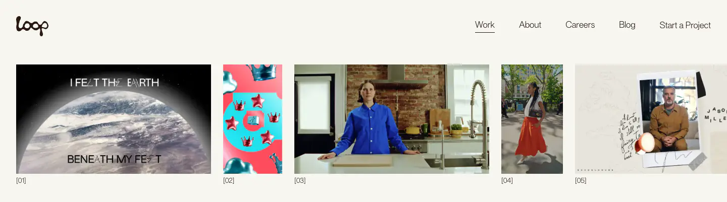
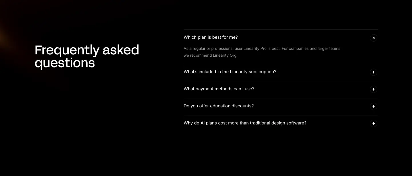
- Navigation Bar, Hero With Background Imagery, Logo Strip, Primary Button, Tabs, Footer, Interactive Media Grid, Massive Typographic Footer
- Score
- 57.05/100 · 100% evidence · Review pending
- Typography
- Display — neue-haas-grotesk-display; Heading — neue-haas-grotesk-display; Body — neue-haas-grotesk-display
- Palette
- OG image
Design analysis
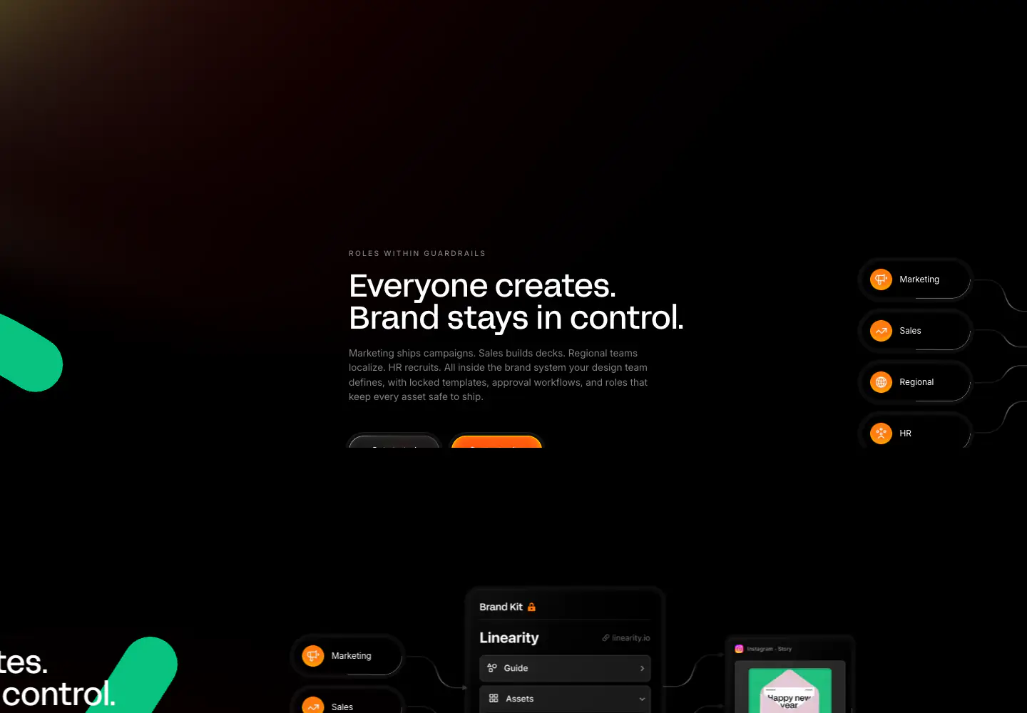
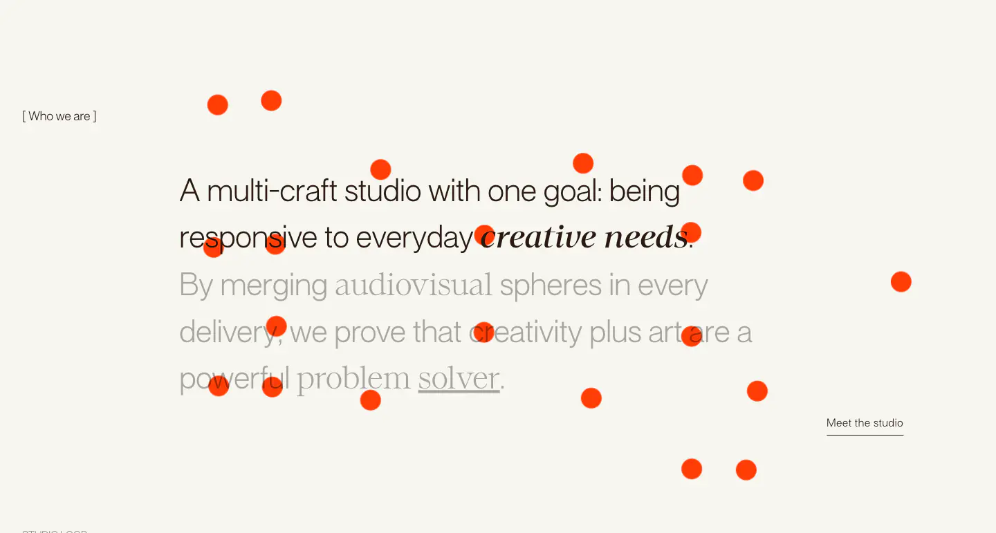
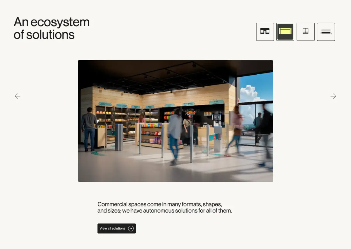
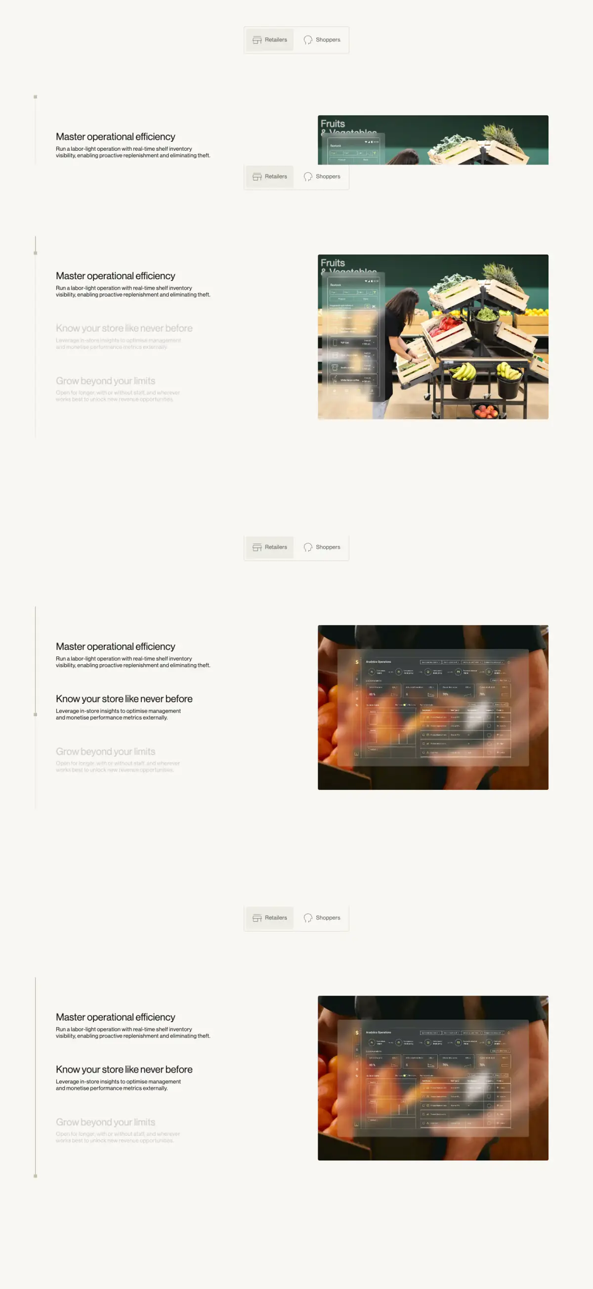
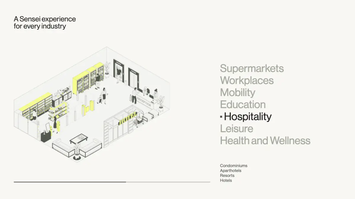
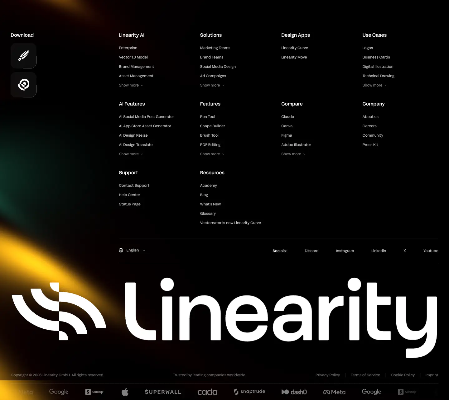
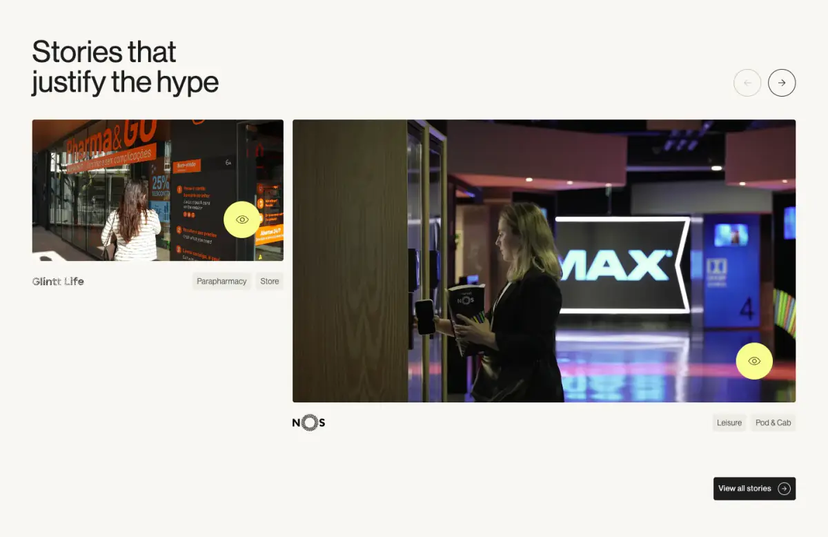
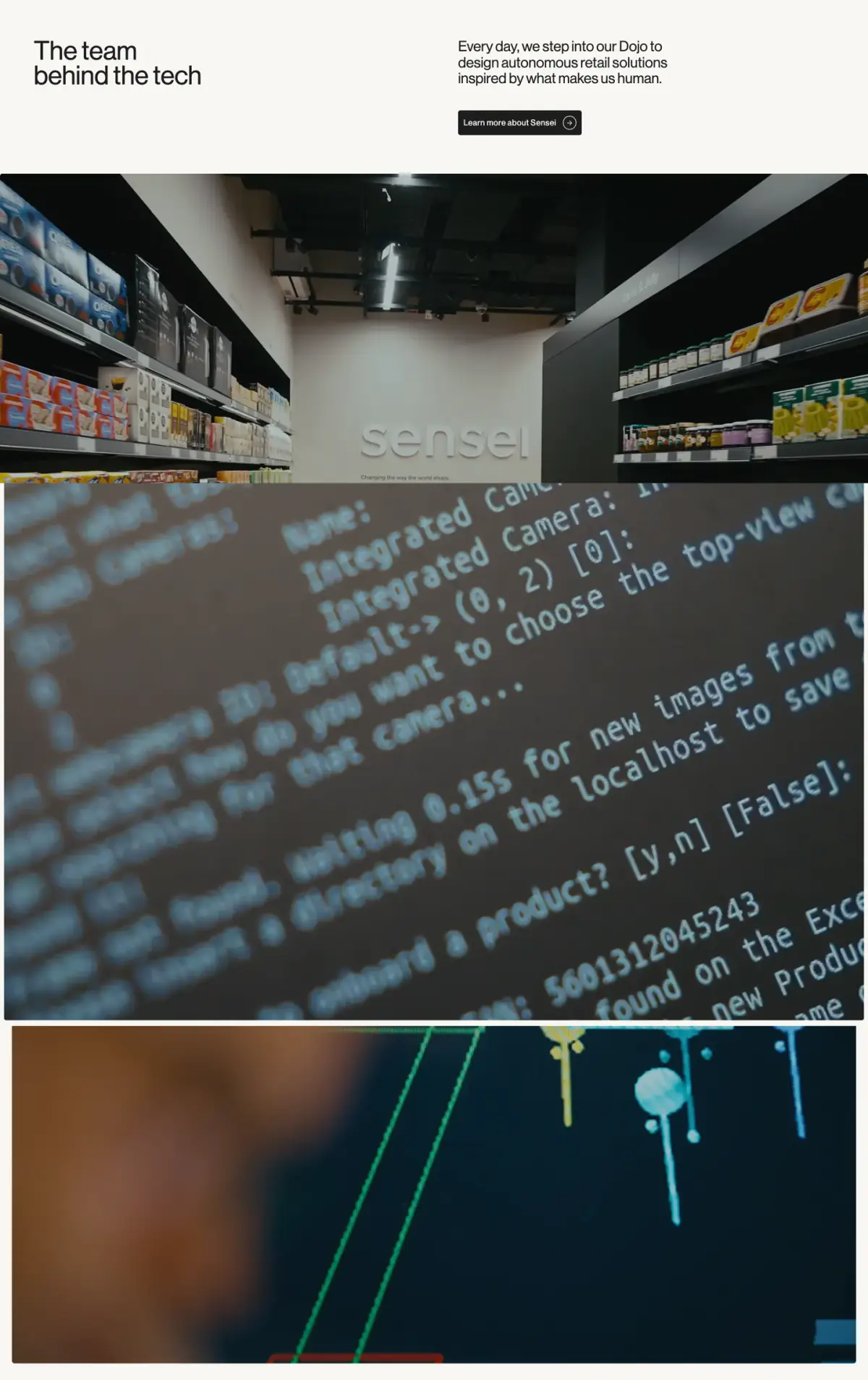
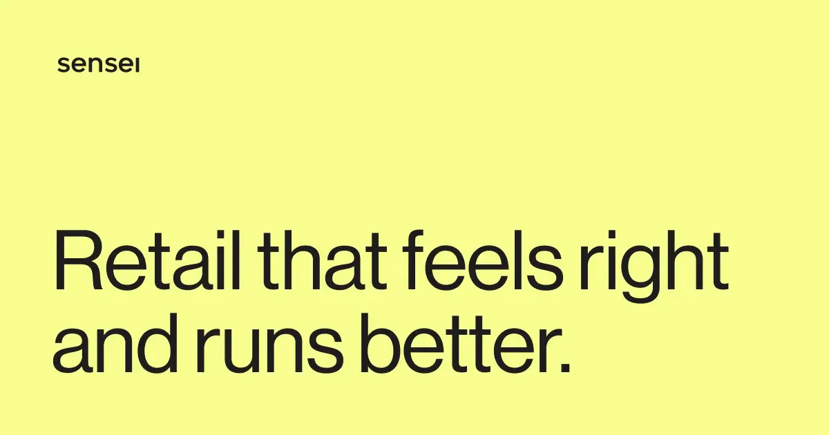
The Sensei website employs a modern, minimal, and bold design language focused on B2B retail technology. It uses a pale off-white canvas with stark dark text and striking acid-yellow accents for primary actions and key sections. The typography relies exclusively on Neue Haas Grotesk, ranging from precise body copy to massive, screen-filling display text in the footer. The layout is spacious with low density, utilizing a strong vertical rhythm and asymmetrical grid alignments for feature blocks and media clusters.
- Spacing
- Generous vertical spacing between sections, using wide margins to separate typography from media.
- Shape
- Mixed approach: fully rounded (pill) for interactive UI elements, while media blocks maintain sharp or barely rounded corners. Pill-shape (likely max radius) for buttons and tab toggles.
- Borders
- Thin, solid 1px borders used sparingly to frame tabs or separate subtle footer rows.
- Buttons
- Pill-shaped, solid background with contrasting text and often accompanied by an arrow icon inside a circular container.
- Width
- Wide maximum width with structured padding, giving a cinematic but organized feel.
- Density
- Low overall density, prioritizing focus on large media and bold typography over dense information.