- Industry
- Other
- Site type
- Landing, Store
- Platform
- Webflow
- Tech
- GSAP
- Style
- Minimal, Typographic, Editorial, Corporate, Technical, Industrial
- Business model
- Shopping, Software, Agency
- Presence
- Online
- Components
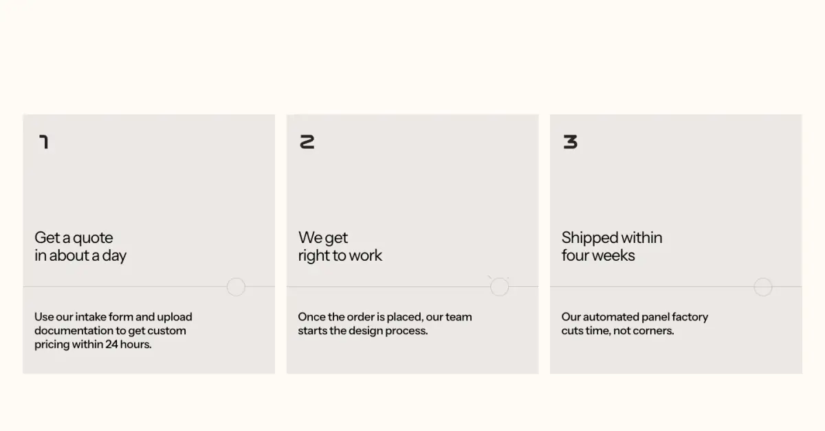
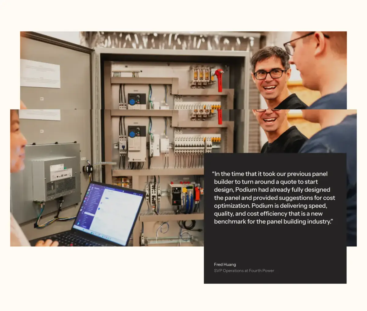
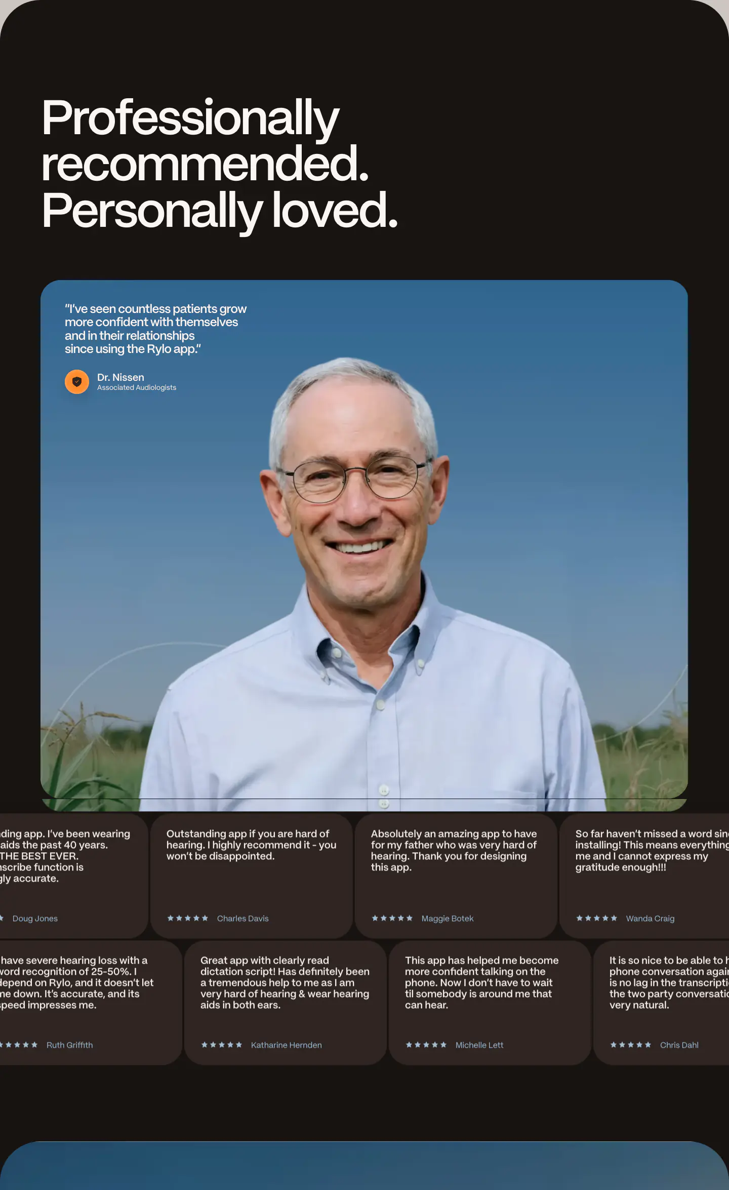
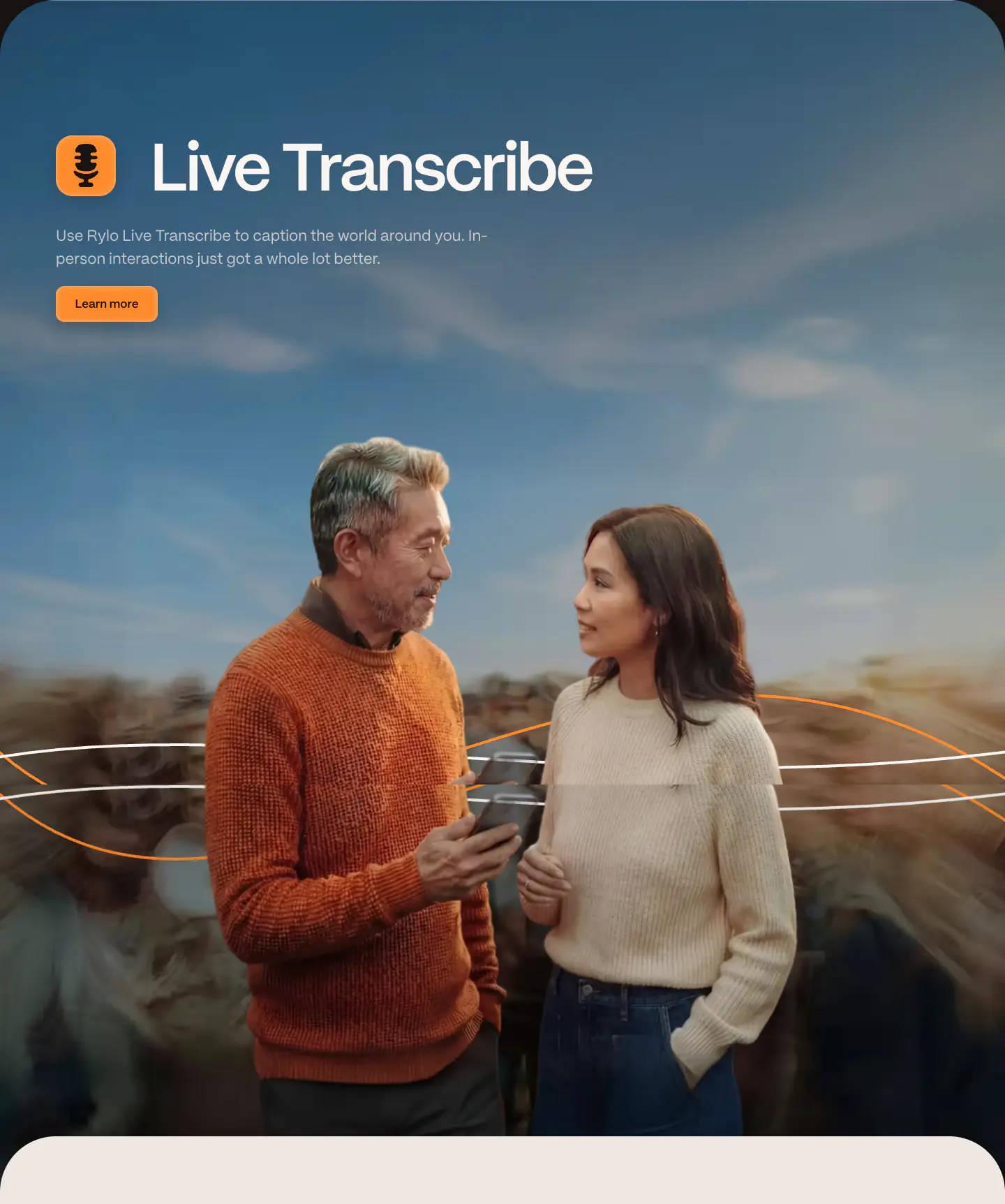
- Navigation Bar, Hero, Primary Button, Ghost Button, Text Link, Logo Strip, Feature Card, Testimonial Card, Editorial Card, FAQ Accordion, Footer, Interactive Diagram, Sticky Section Header, Process List
- Score
- 56.3/100 · 100% evidence · Review pending
- Typography
- Display — Instrument Sans; Heading — Instrument Sans; Body — Instrument Sans
- Palette
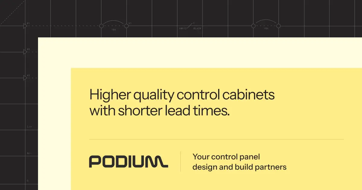
- OG image
Design analysis
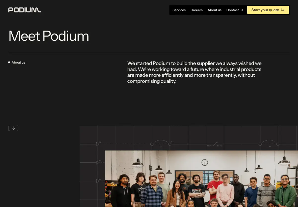
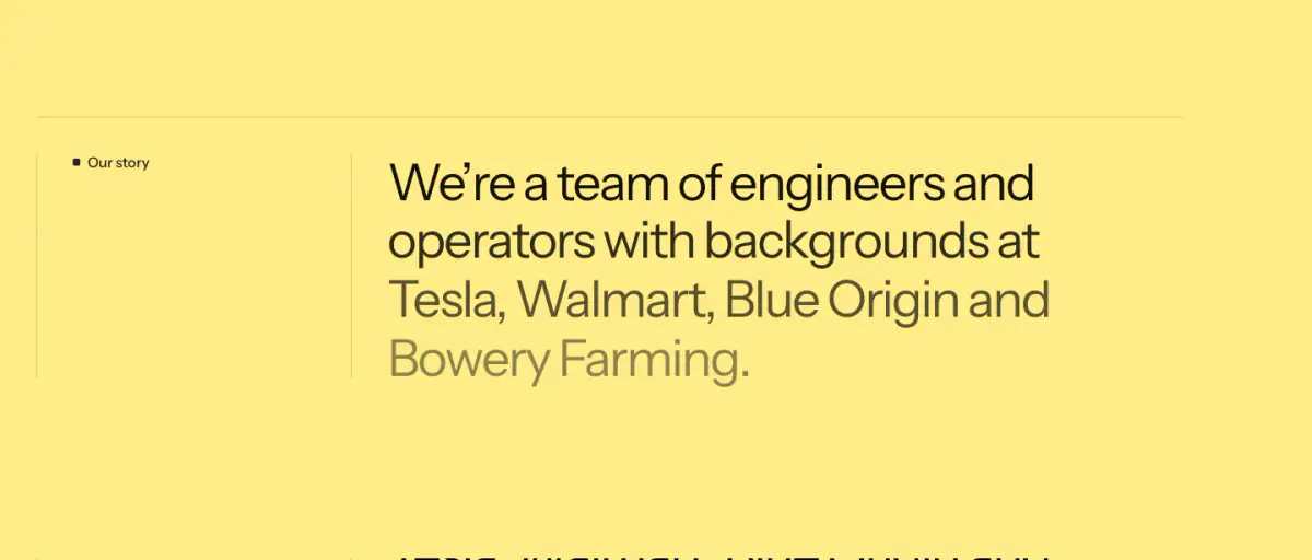
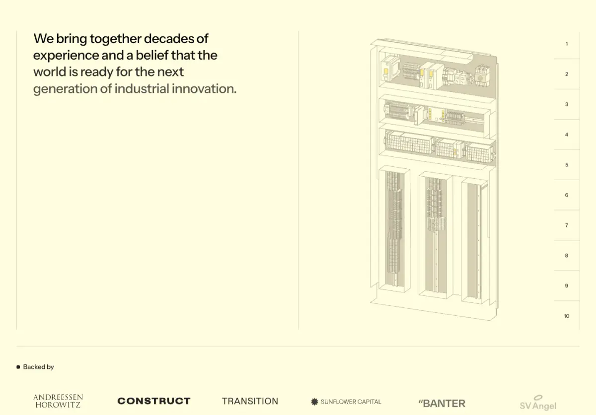
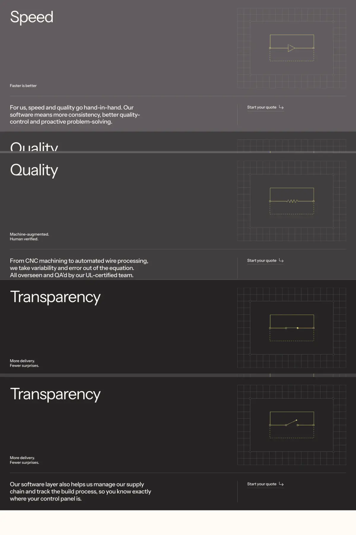
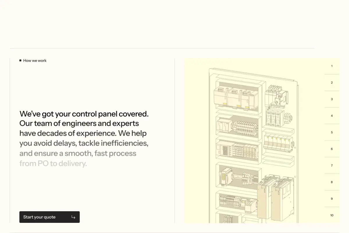
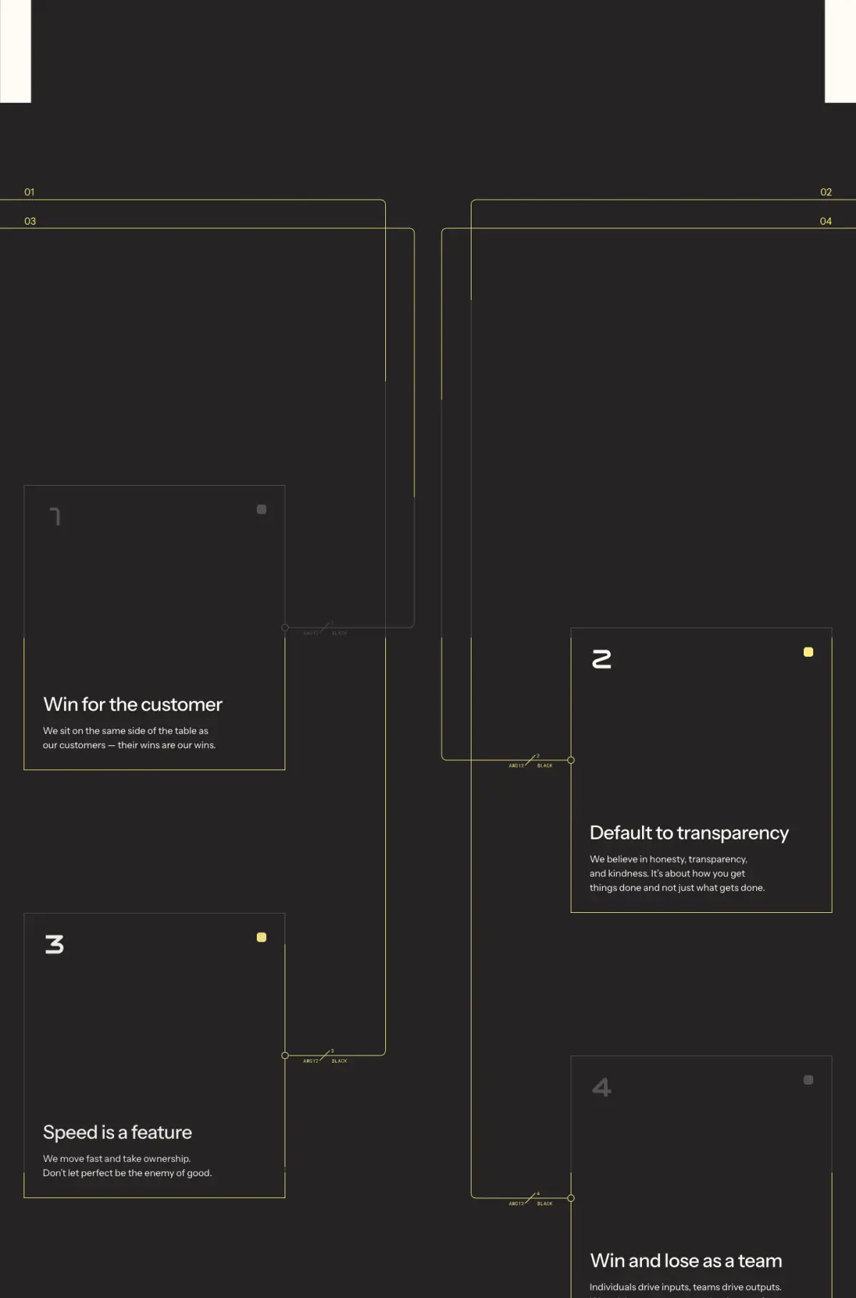
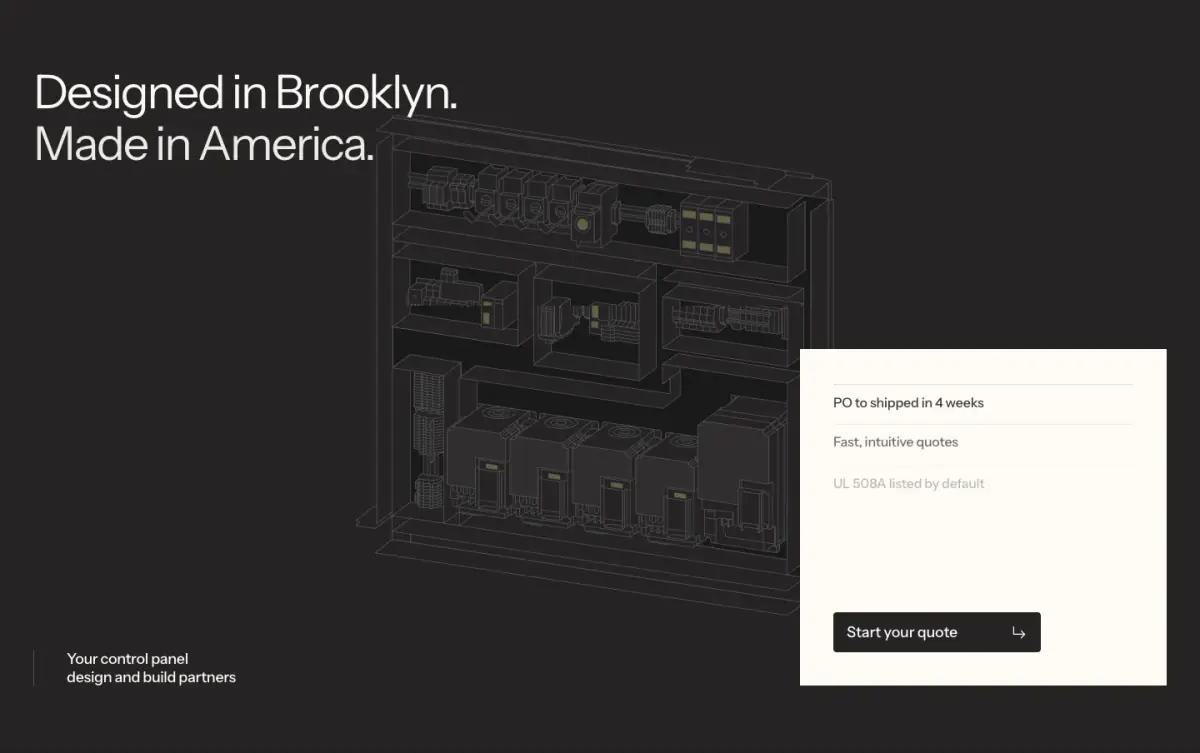
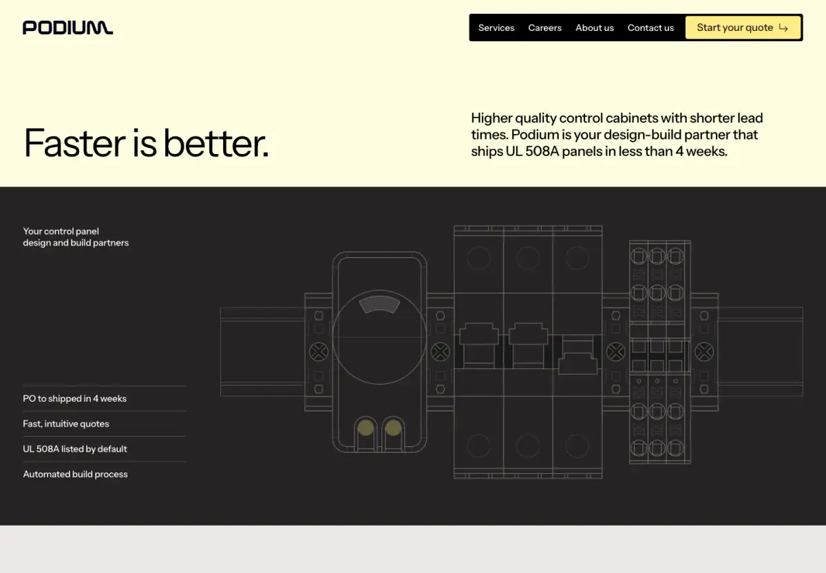
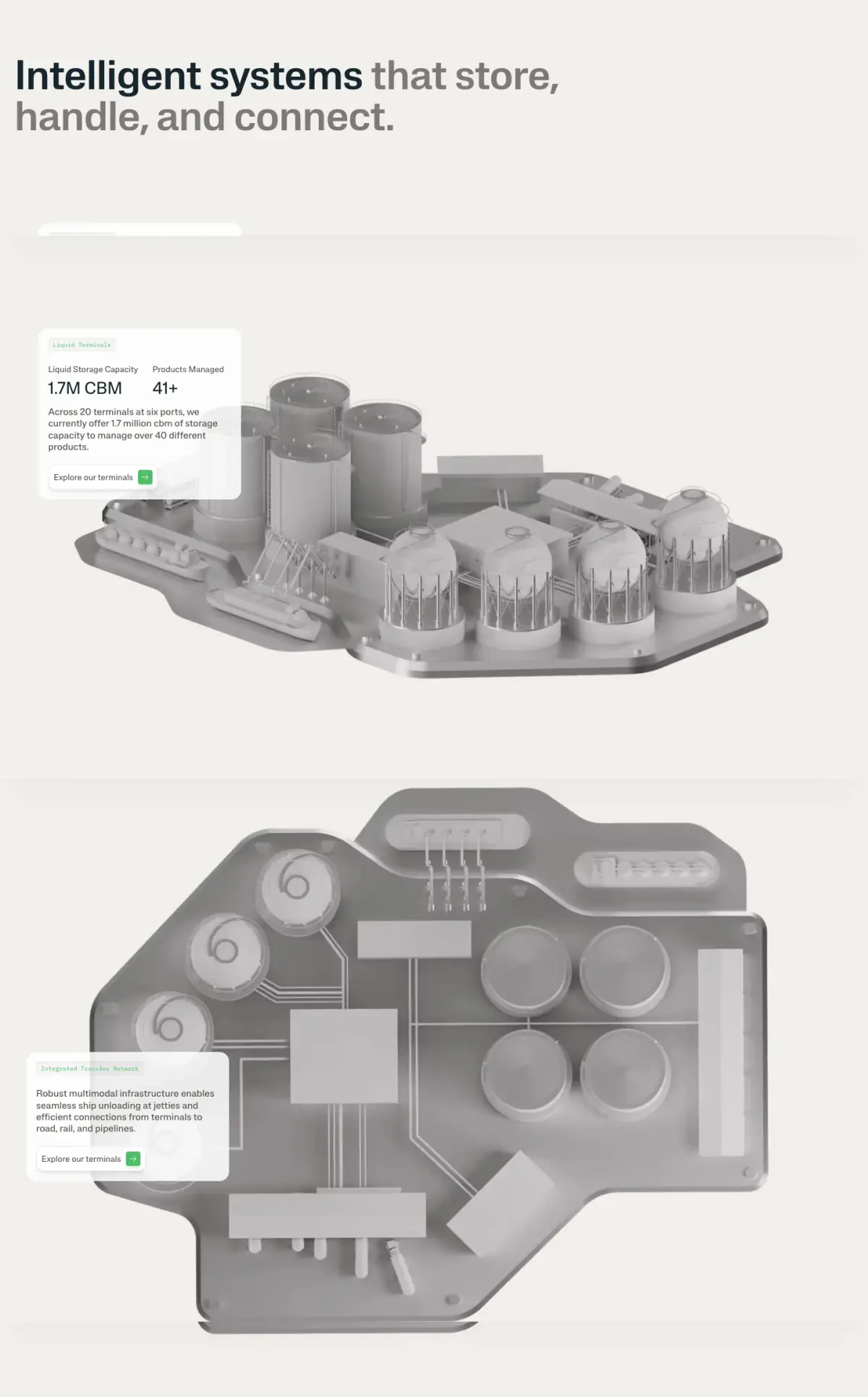
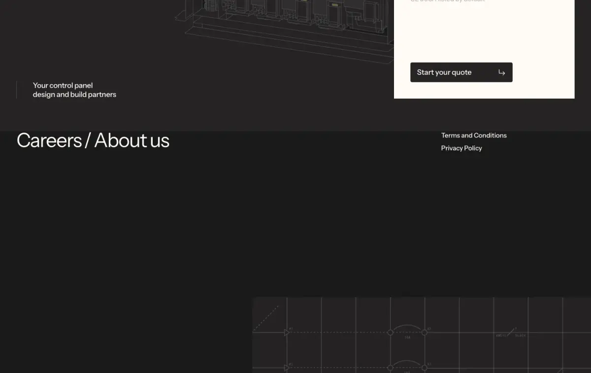
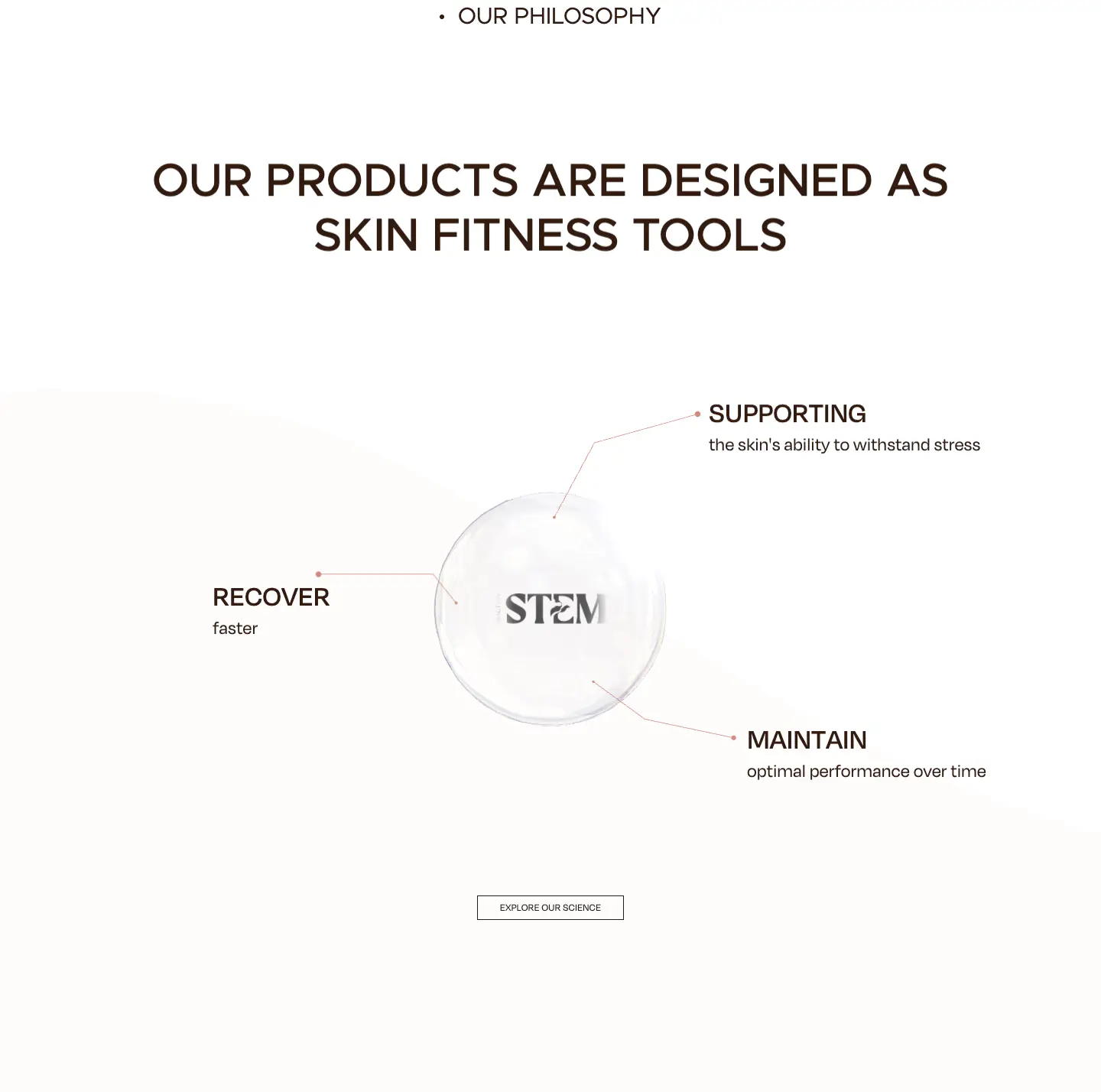
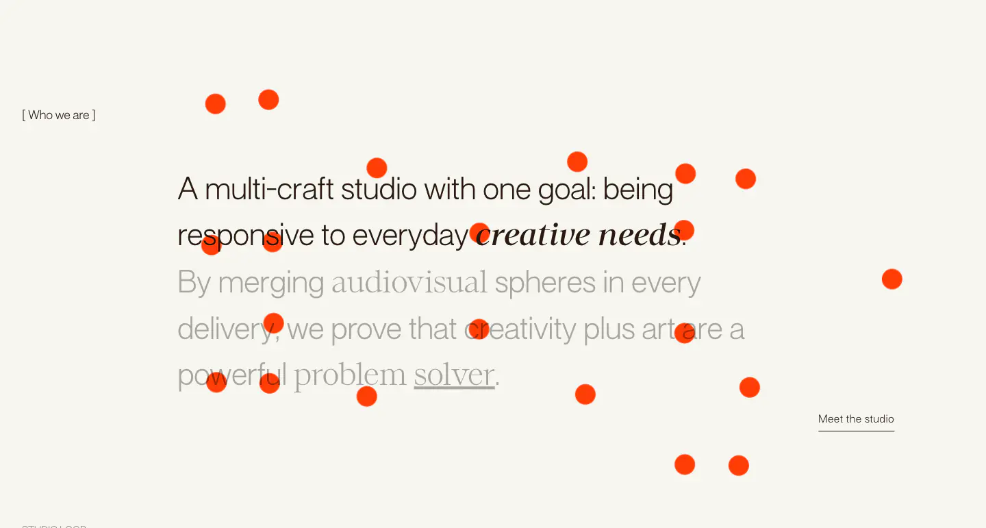
The website employs a minimal and highly technical design language, characterised by extensive use of technical diagrams, a tight monochromatic palette accented by muted yellows, and a strong reliance on a clean, geometric sans-serif typeface (Instrument Sans). The layout features a consistent rhythm of large, airy sections, utilizing sticky positioning and scrolling animations to reveal content dynamically. Structural components like process blocks and case study grids are clearly defined by subtle borders or shifts in background color, contributing to a structured, editorial feel with a brutalist edge.
- Spacing
- Generous use of vertical and horizontal whitespace, creating distinct, airy sections. Padding is substantial within structural blocks.
- Shape
- Sharp, square corners are used consistently across cards, buttons, and diagram borders. No visible border radius is employed; elements are strictly rectilinear.
- Borders
- Thin, solid, light grey or dark grey lines are used to separate sections, define grids, and outline components.
- Buttons
- Solid fill (black or yellow) with sharp corners and contrasting text, often featuring a small arrow icon.
- Width
- Content is generally centered and constrained to a max-width, with some background elements extending full-bleed.
- Density
- Low density, prioritizing whitespace and large typography over dense information packing.