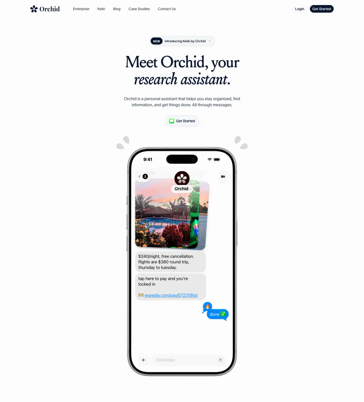
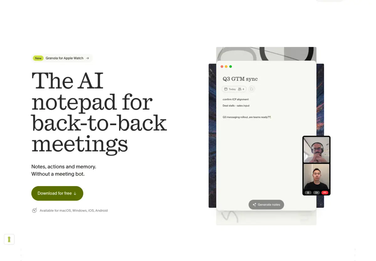
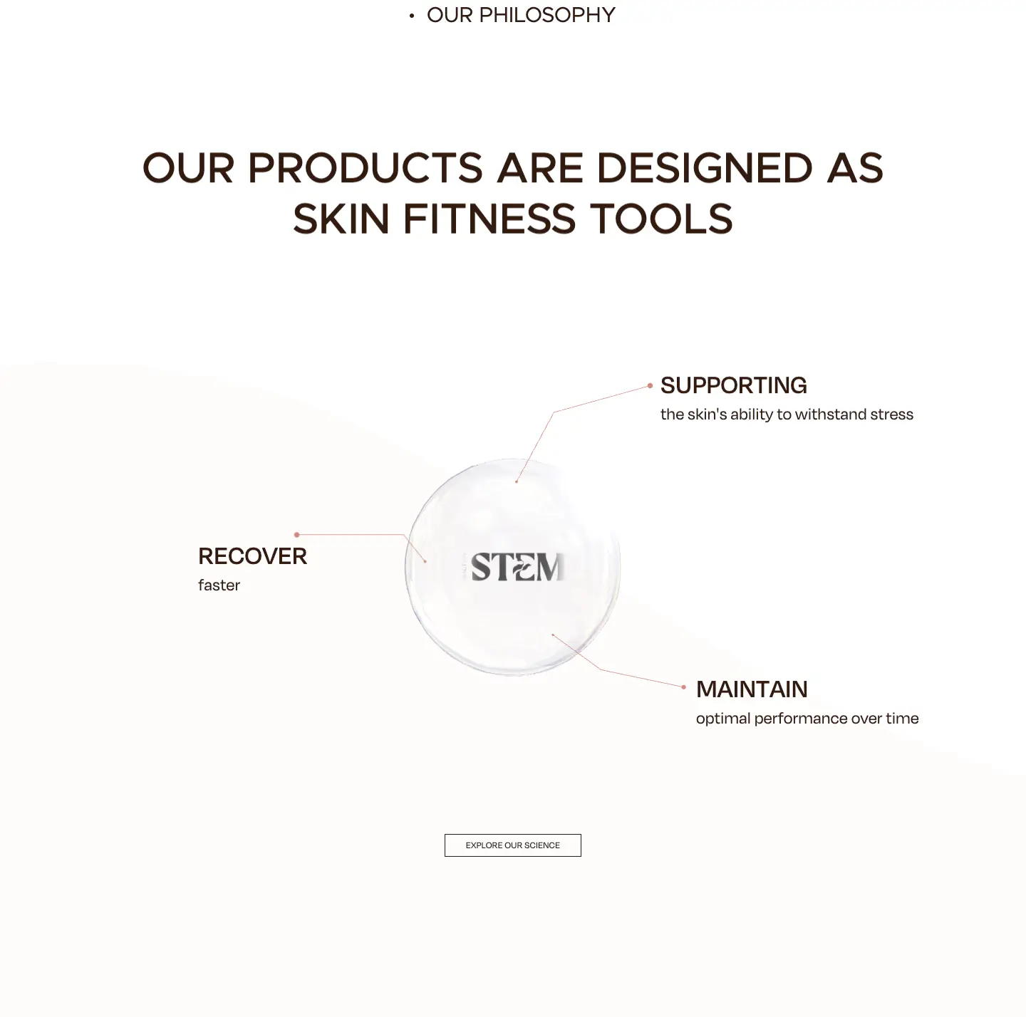
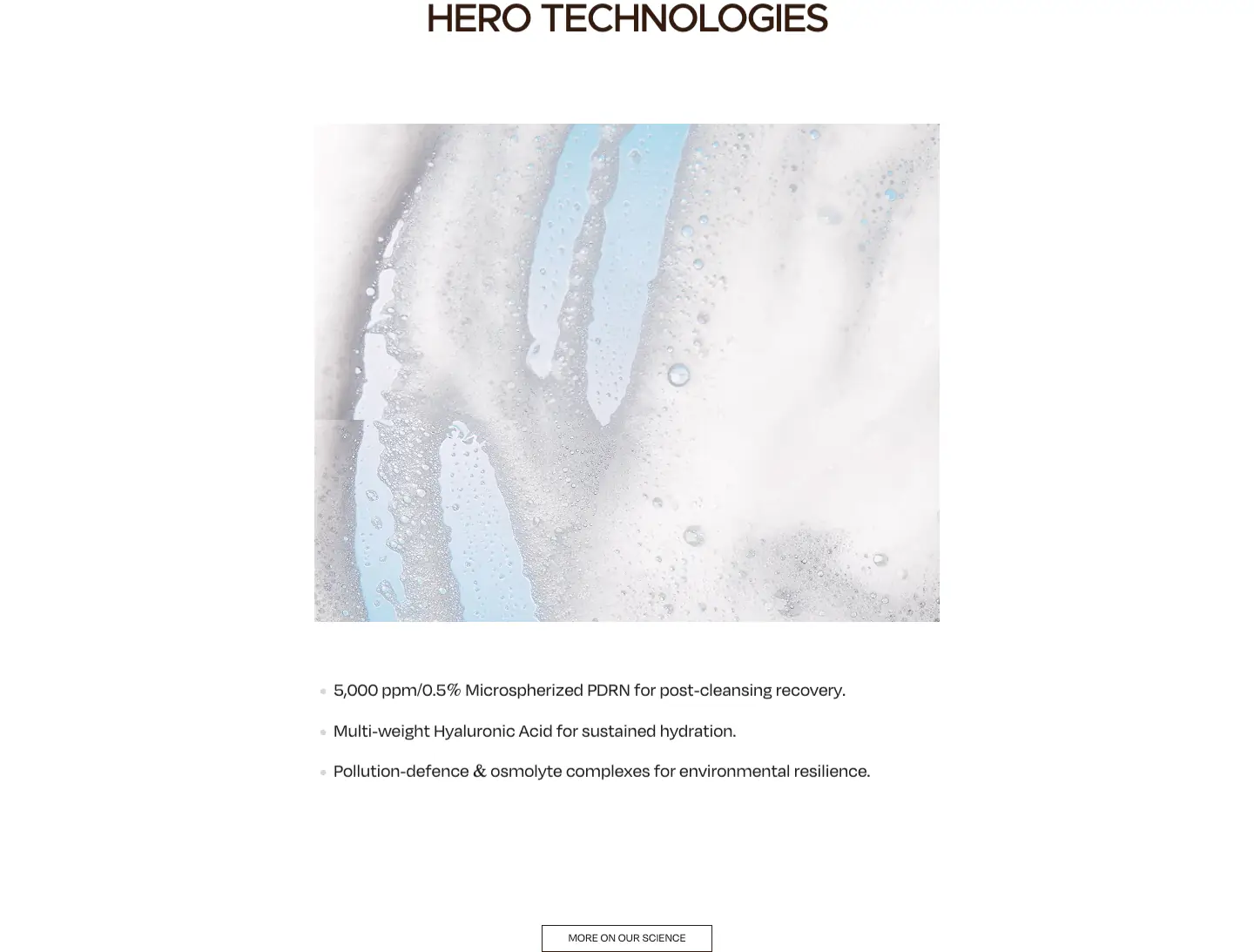
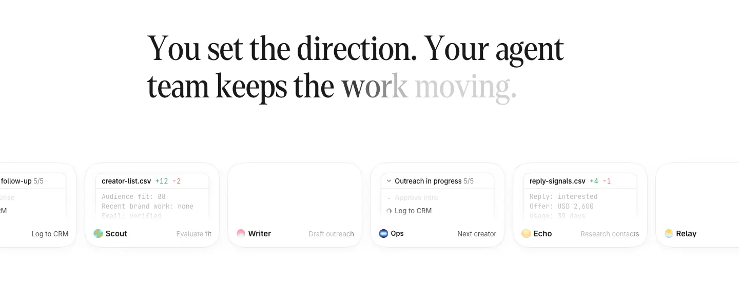
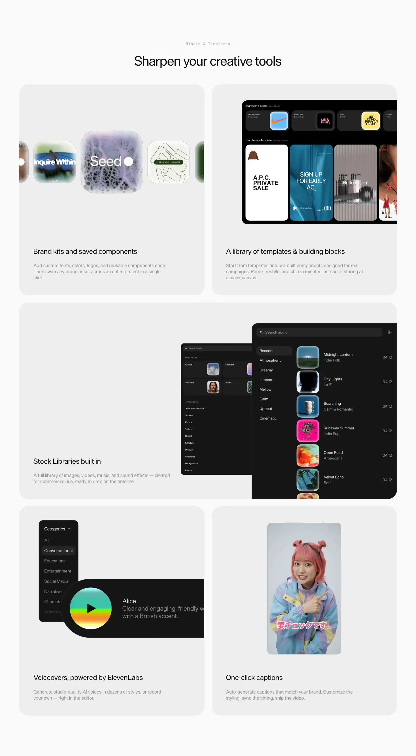
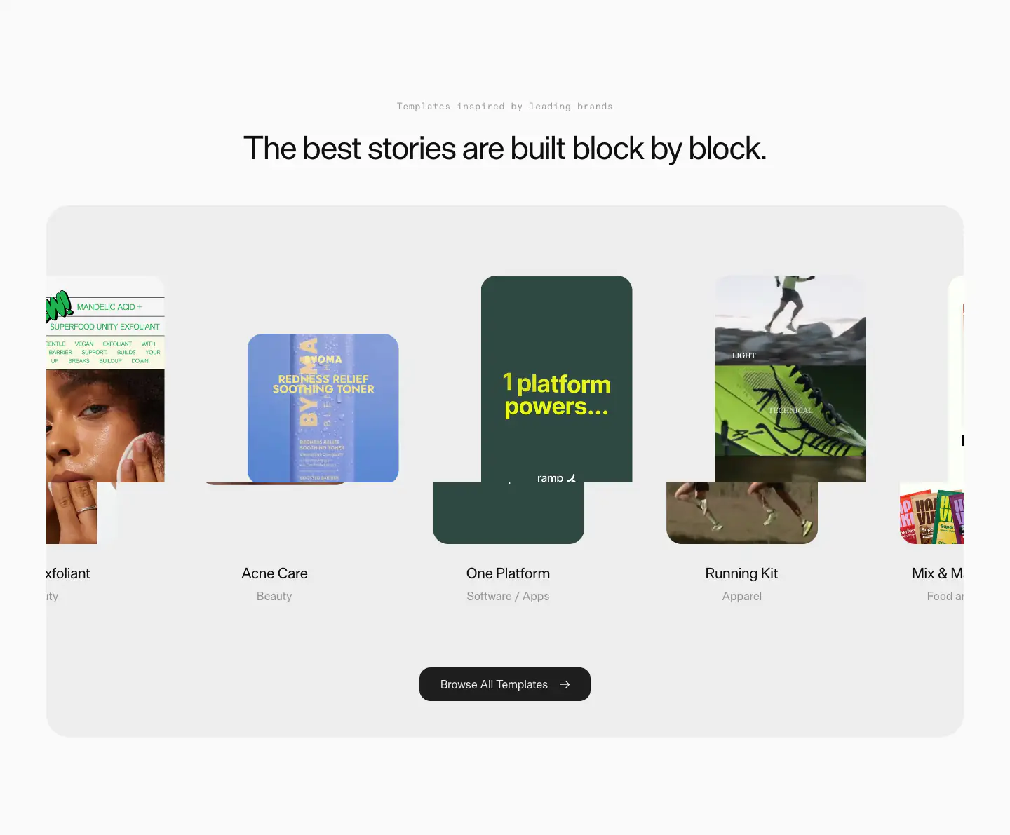
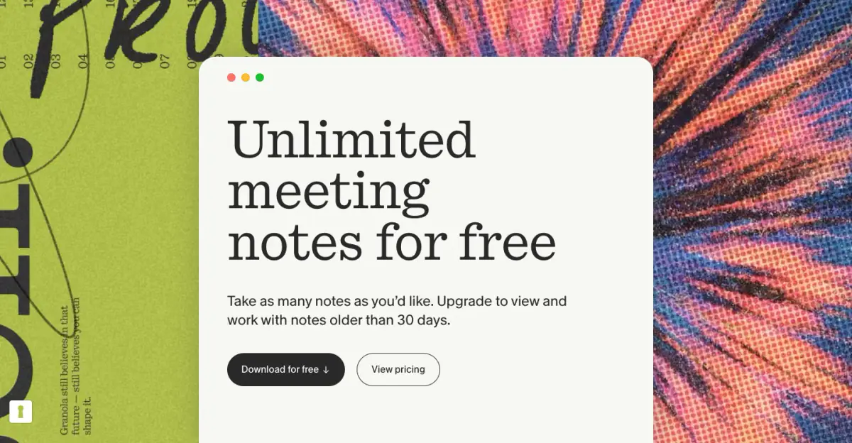
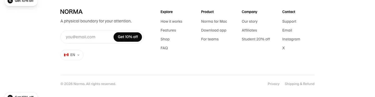
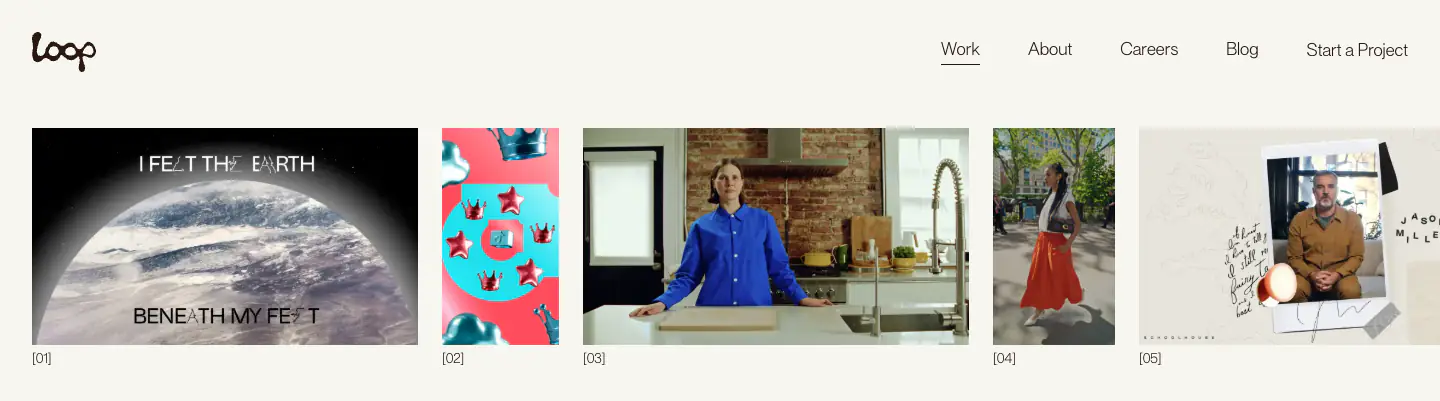
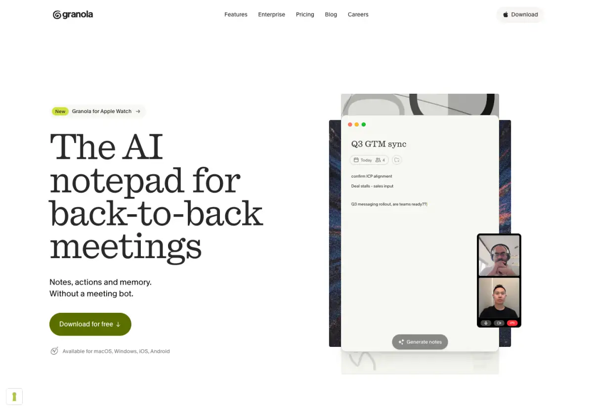
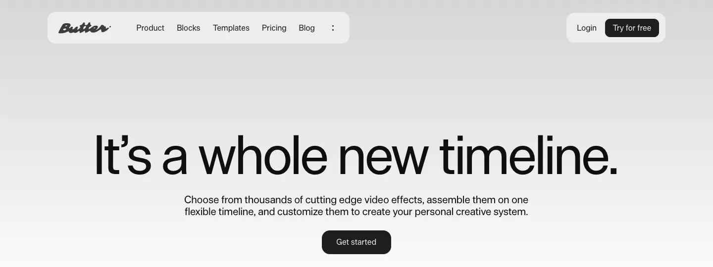
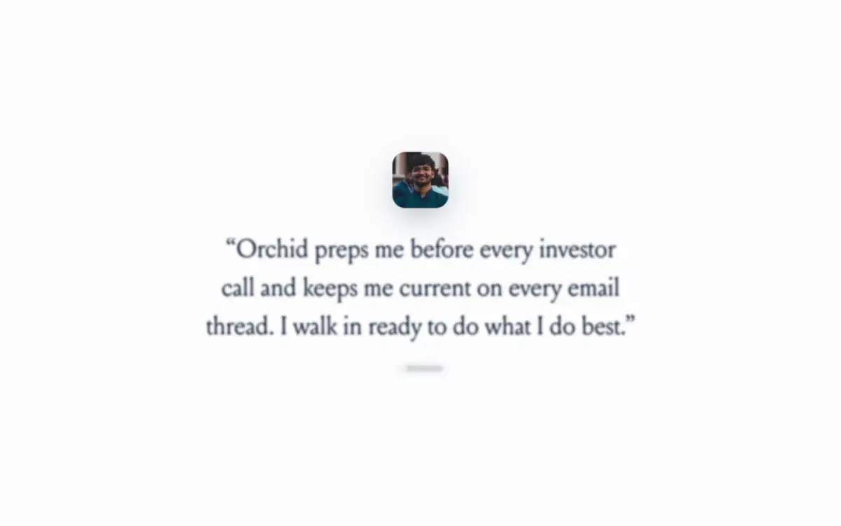
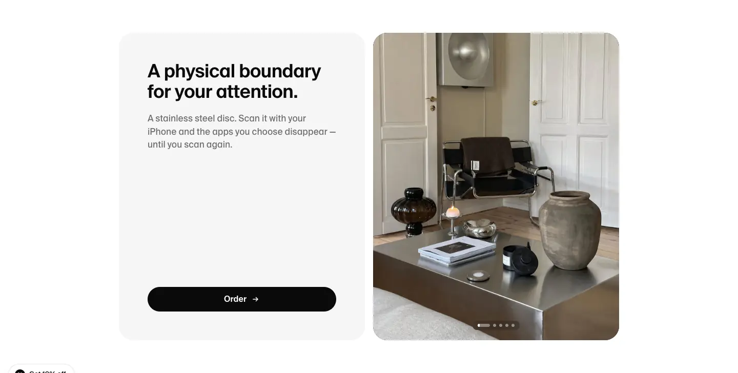
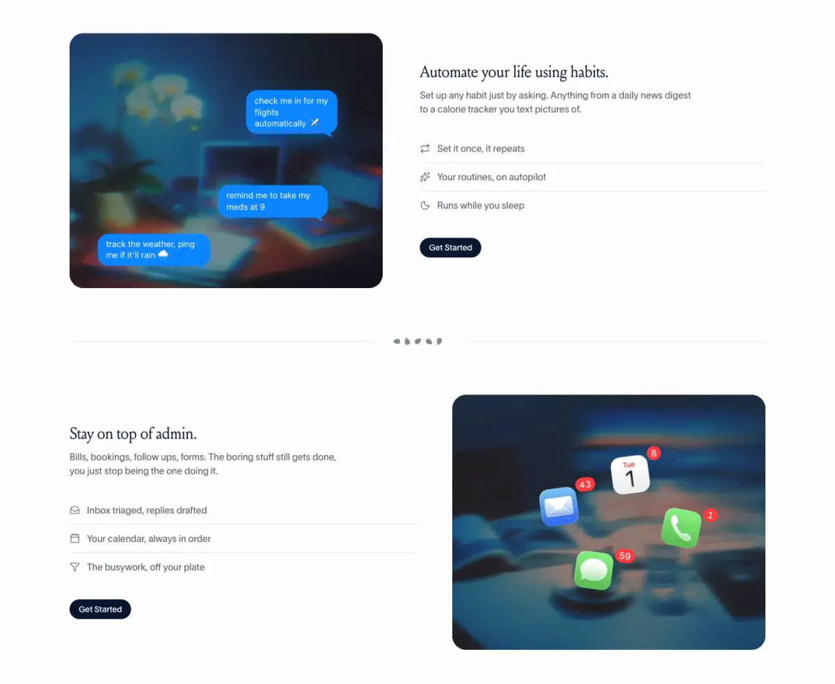
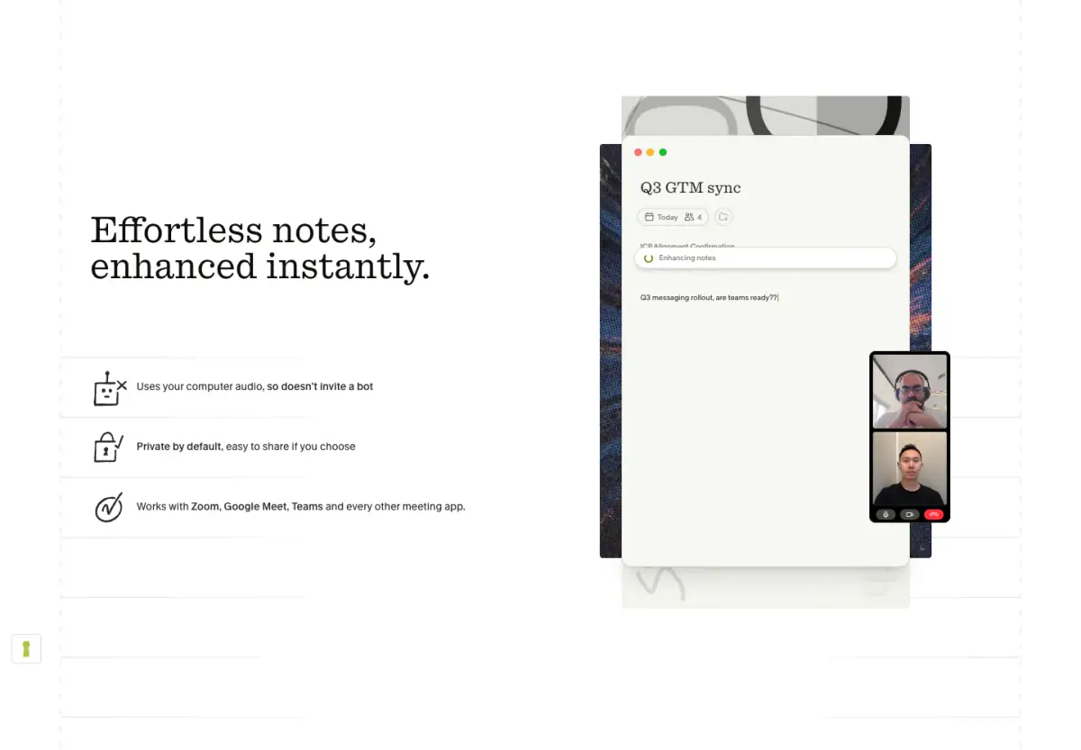
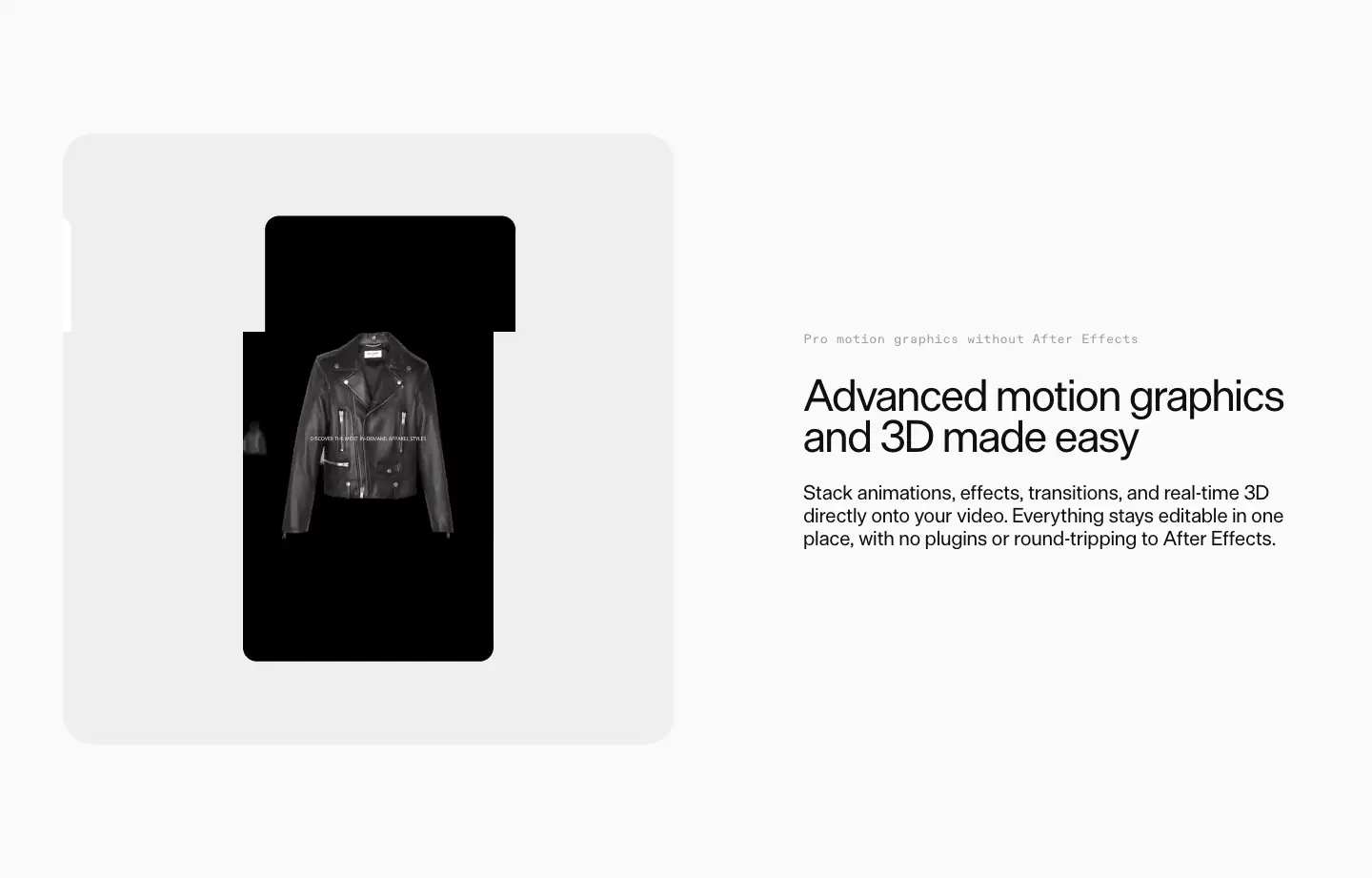
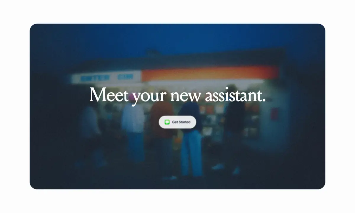
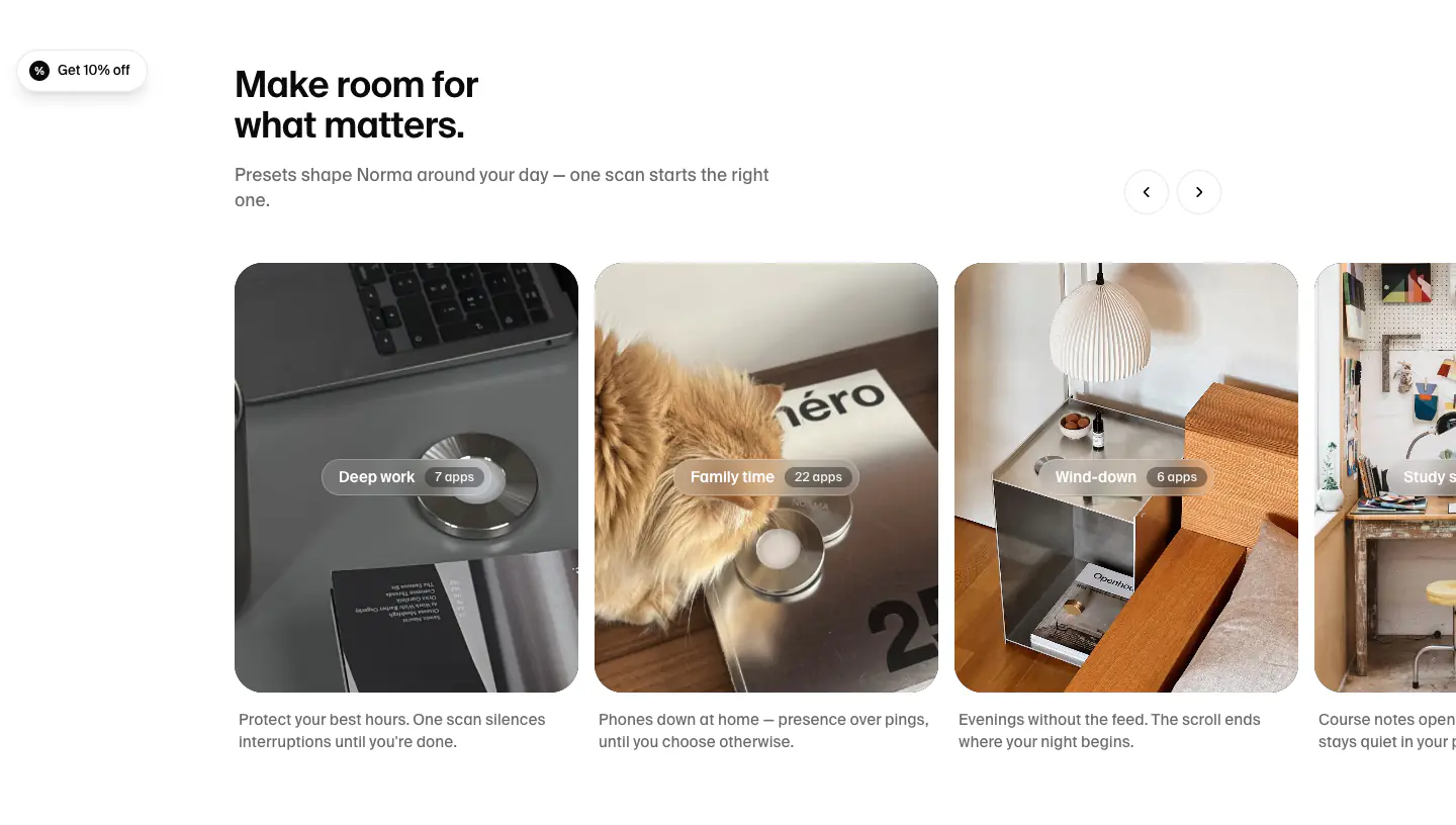
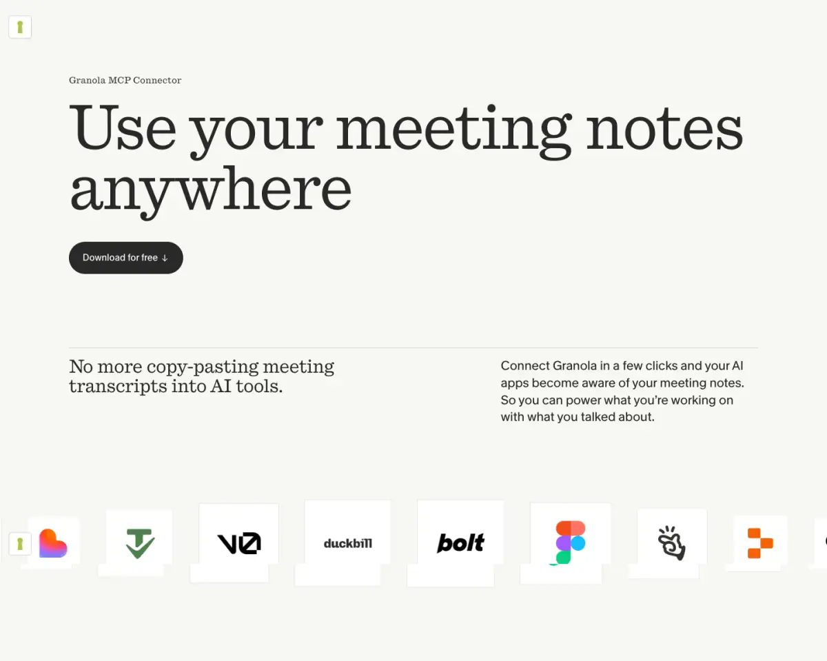
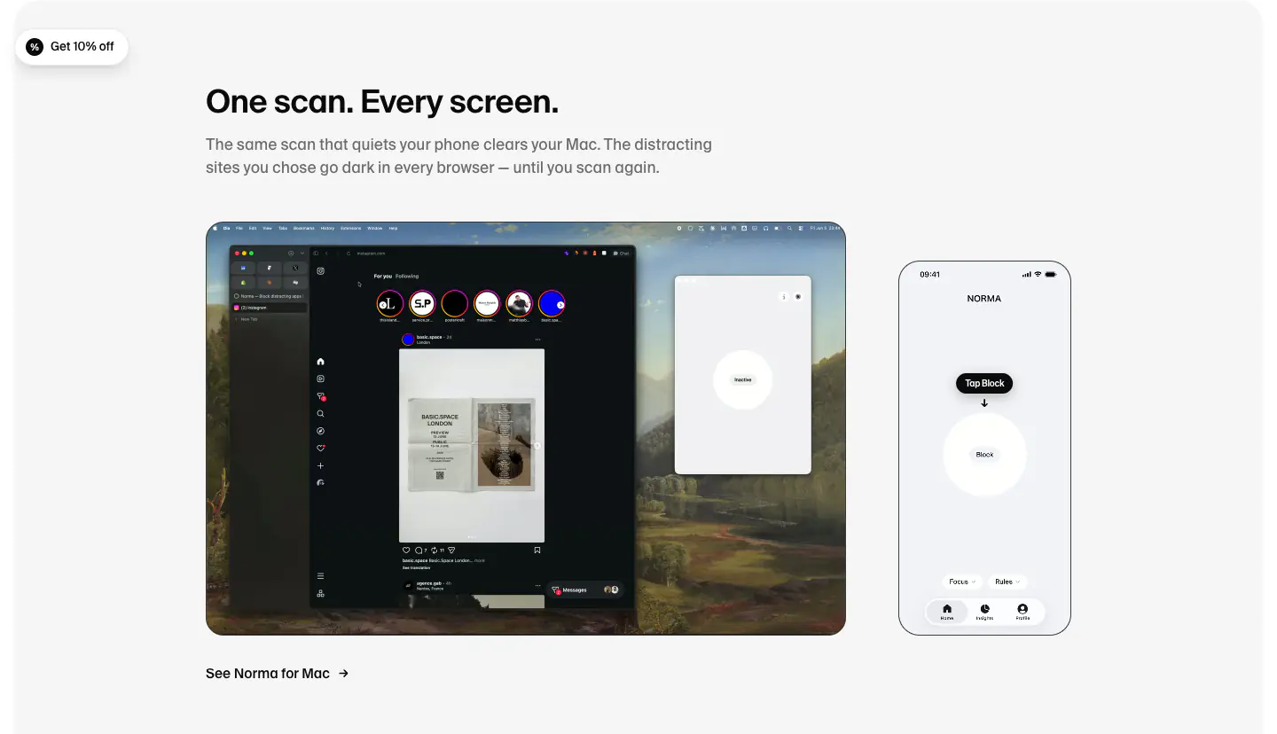
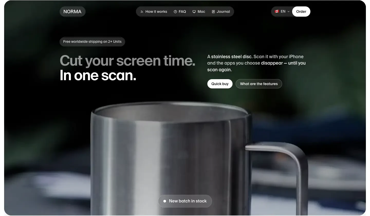
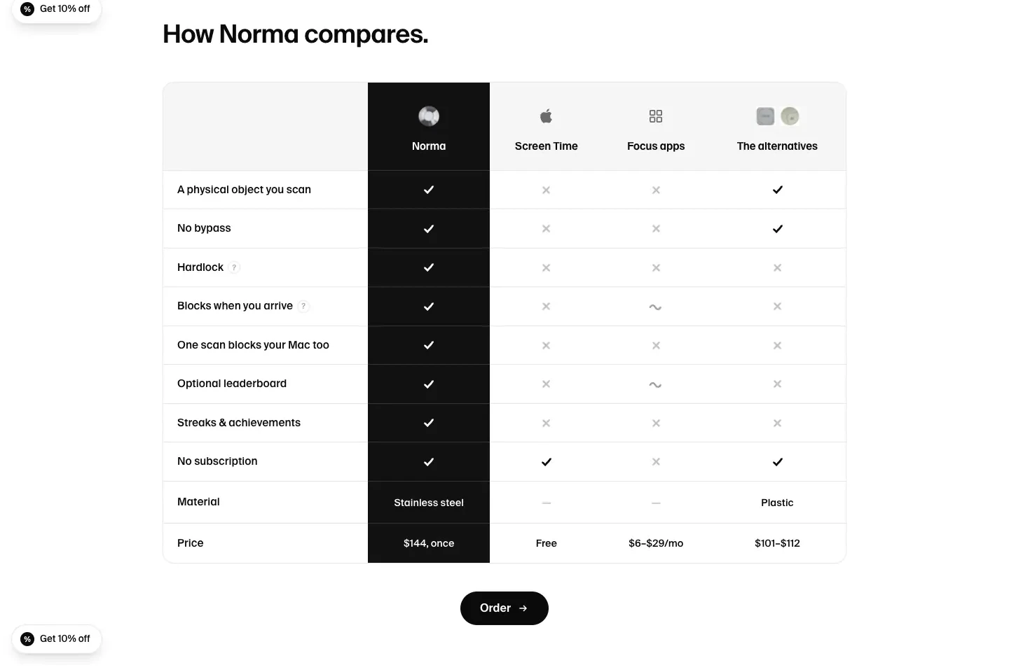
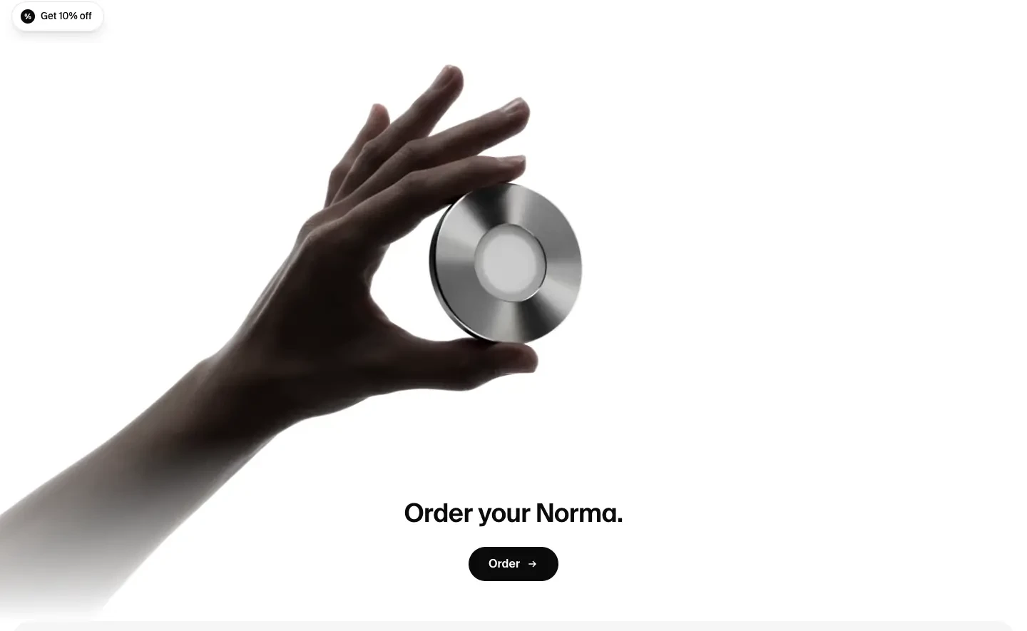
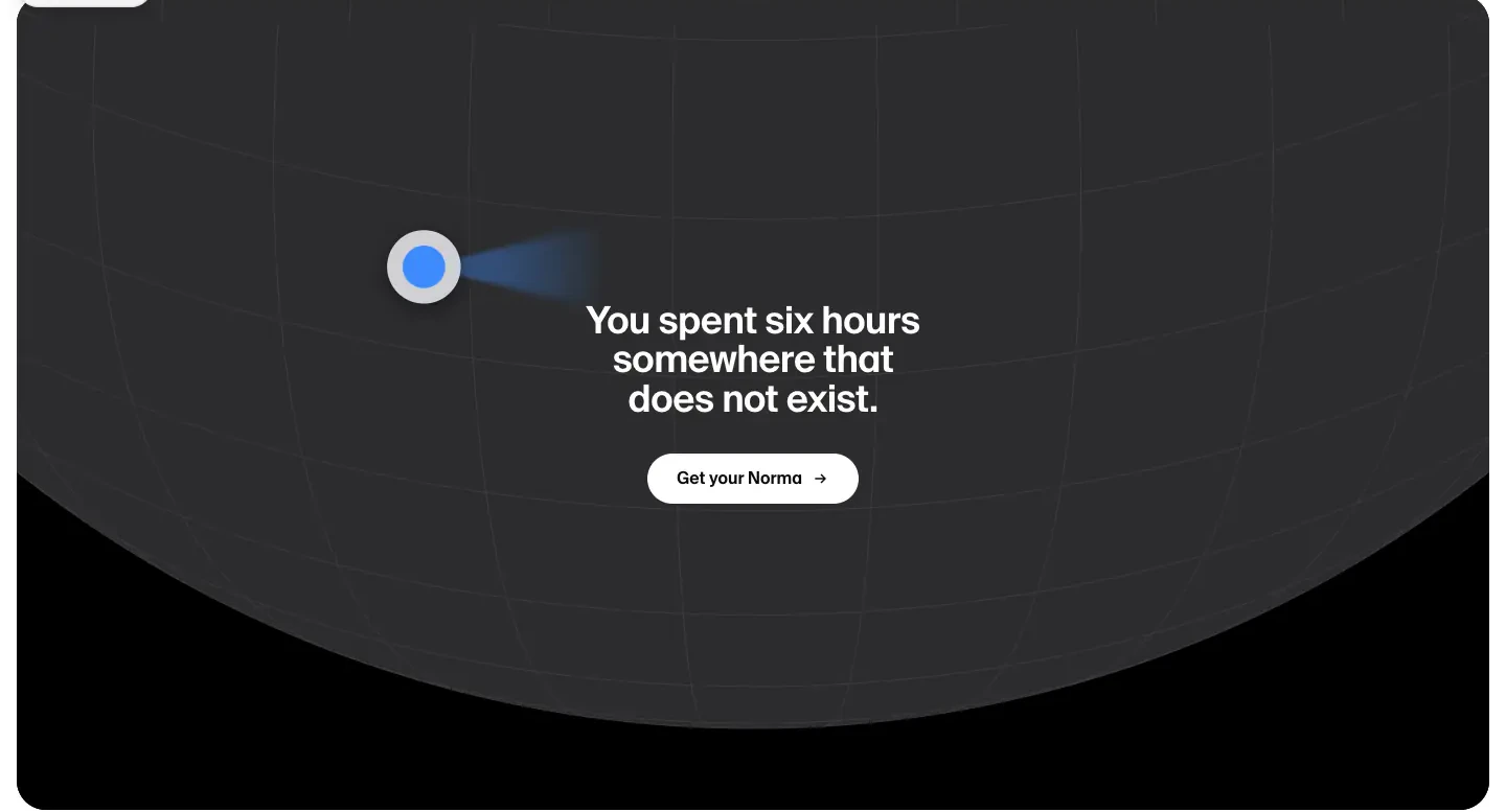
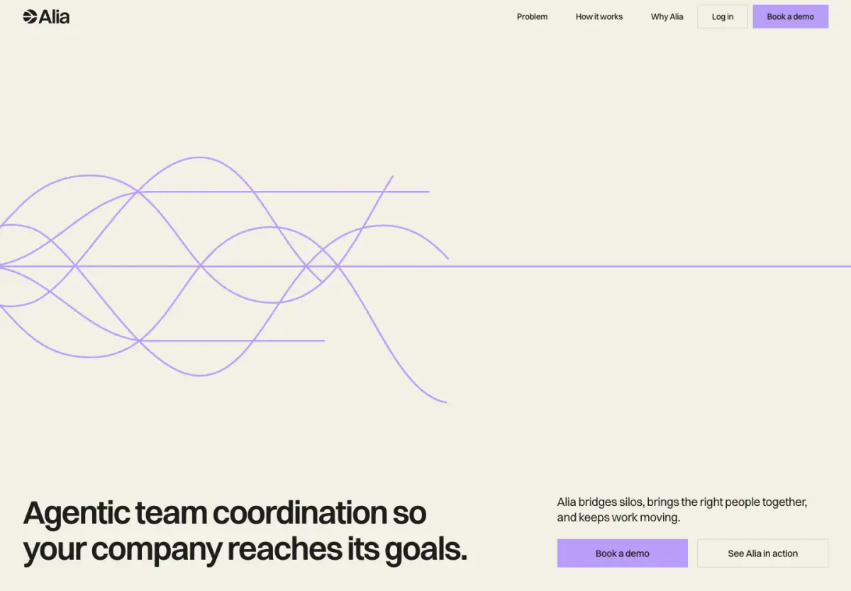
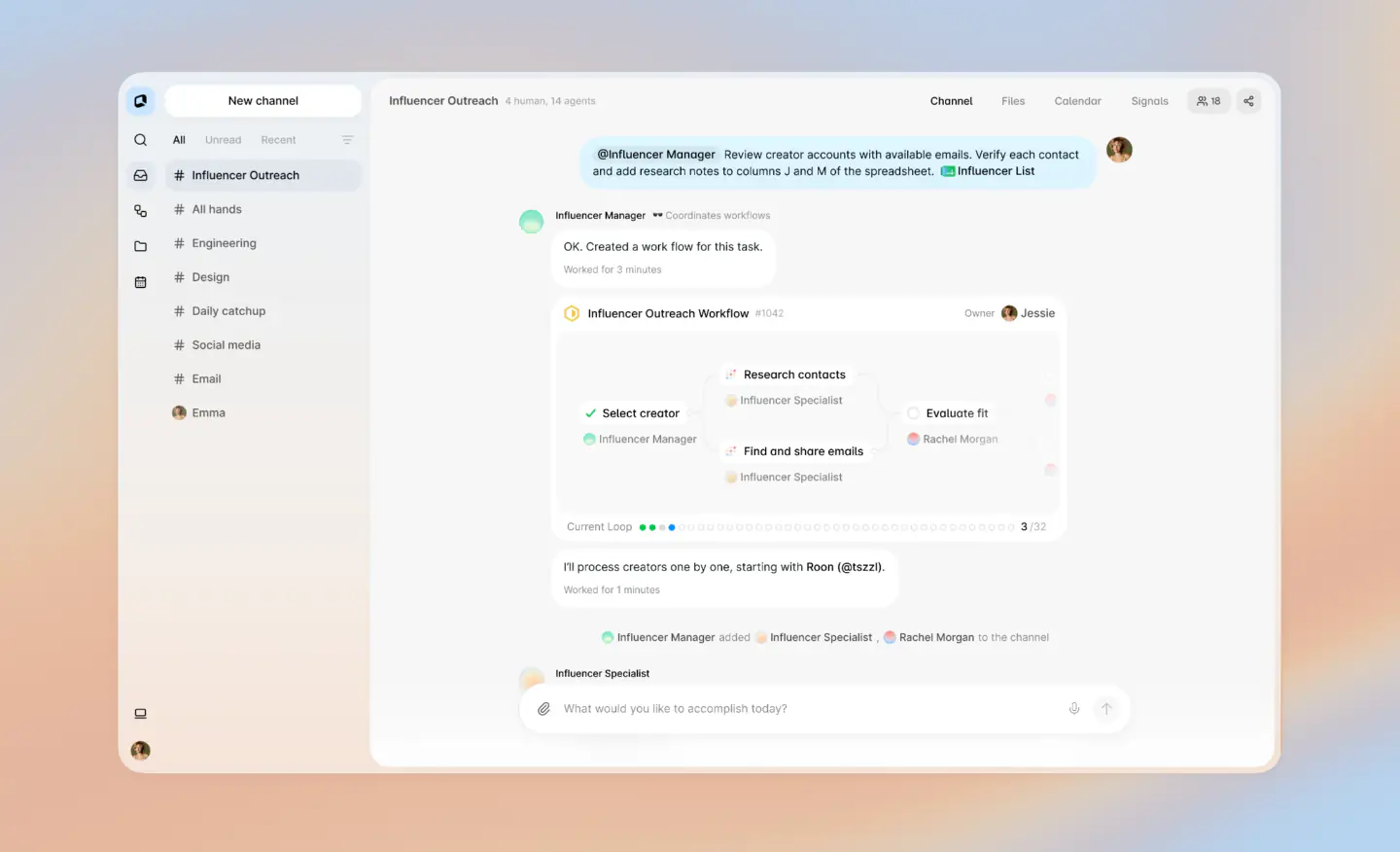
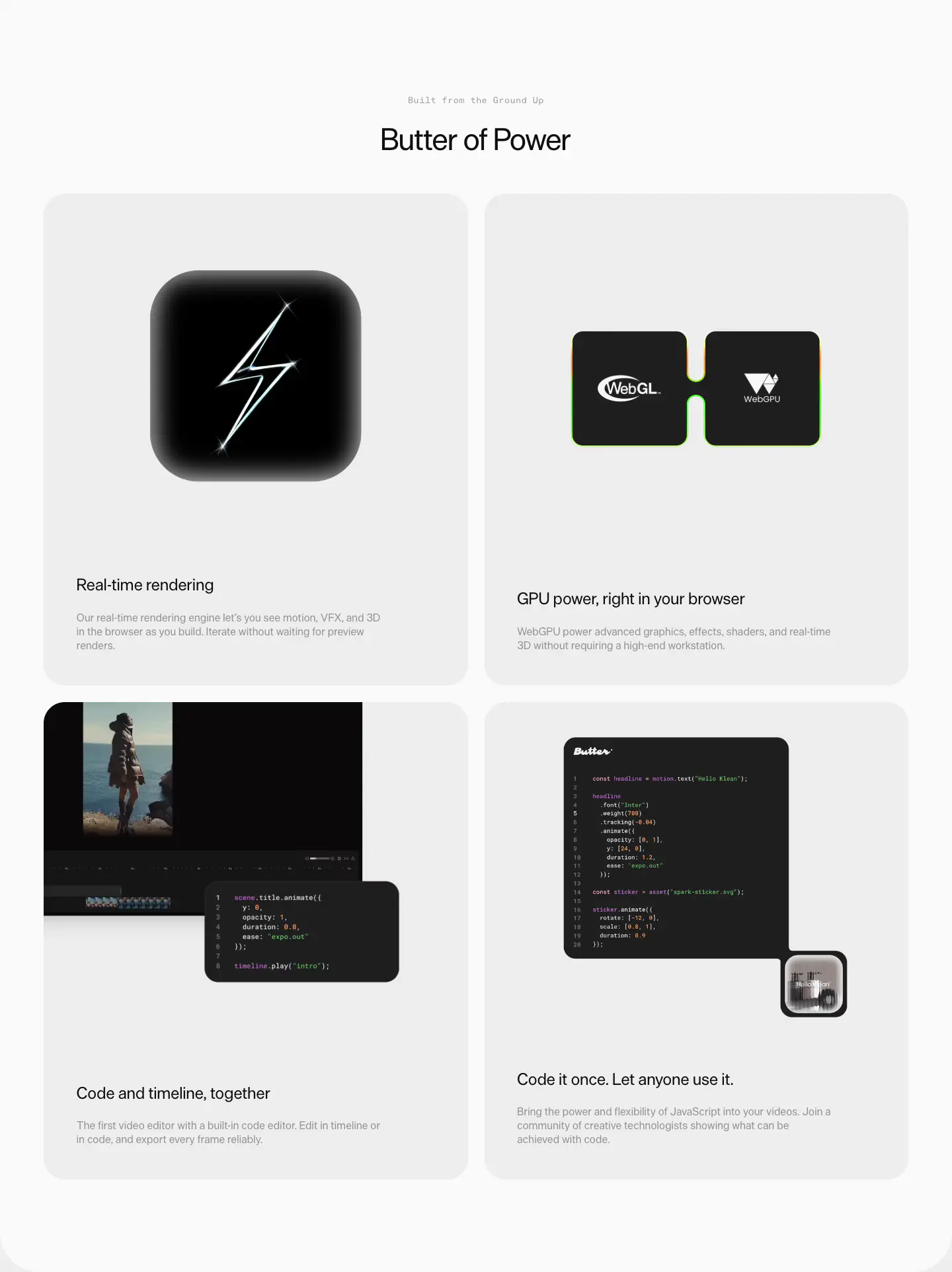
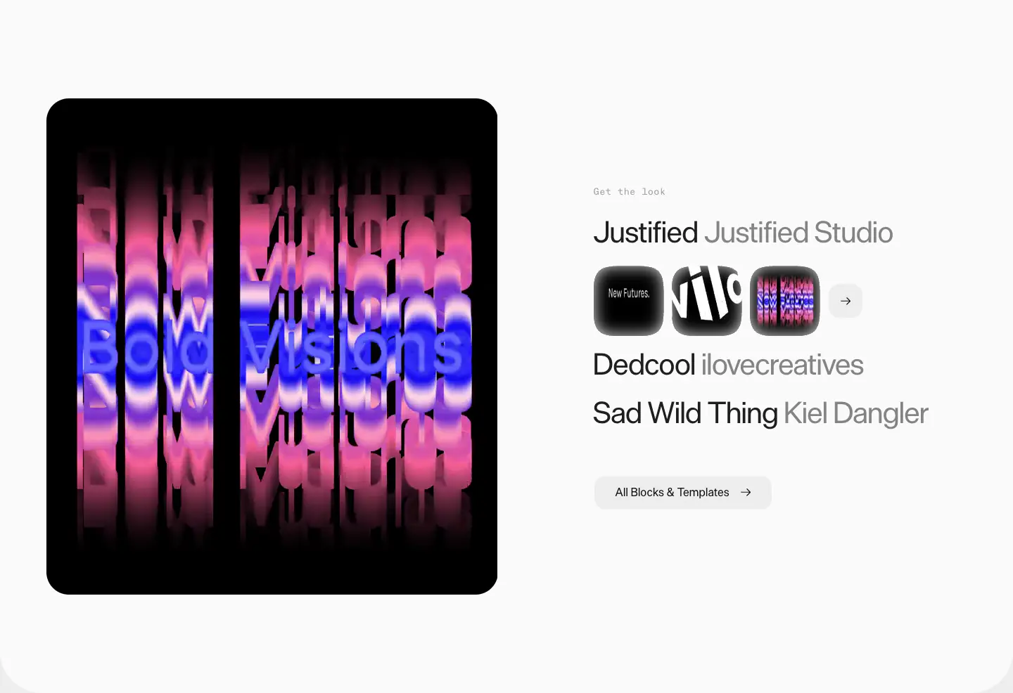
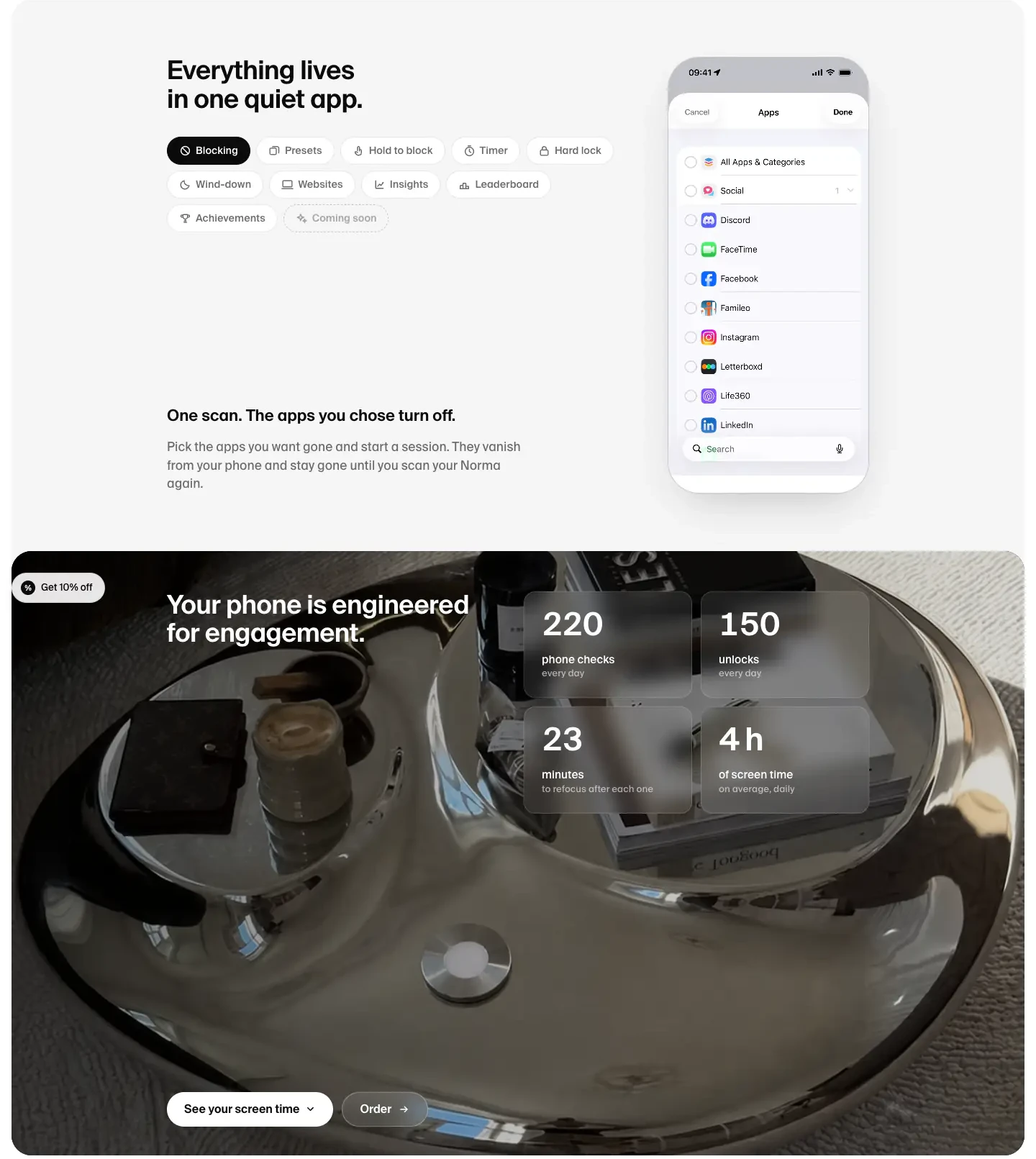
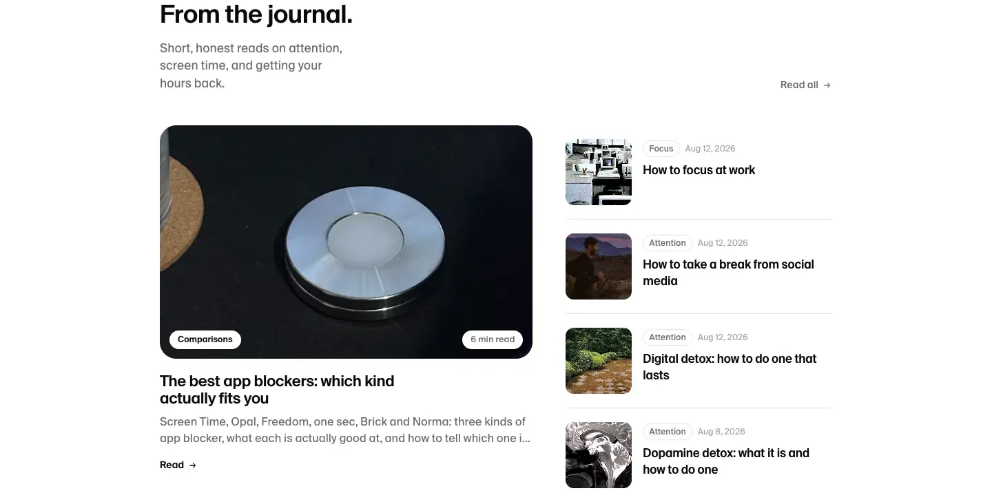
The website presents a highly polished, minimalist aesthetic that heavily relies on high-quality product photography and stark black-and-white contrast. The layout utilizes ample white space, heavily rounded corners on cards and interactive elements, and a clean, grotesque sans-serif typeface to convey a modern, premium feel. Subtle use of translucency is observed in the floating navigation and select UI overlays.
- Spacing
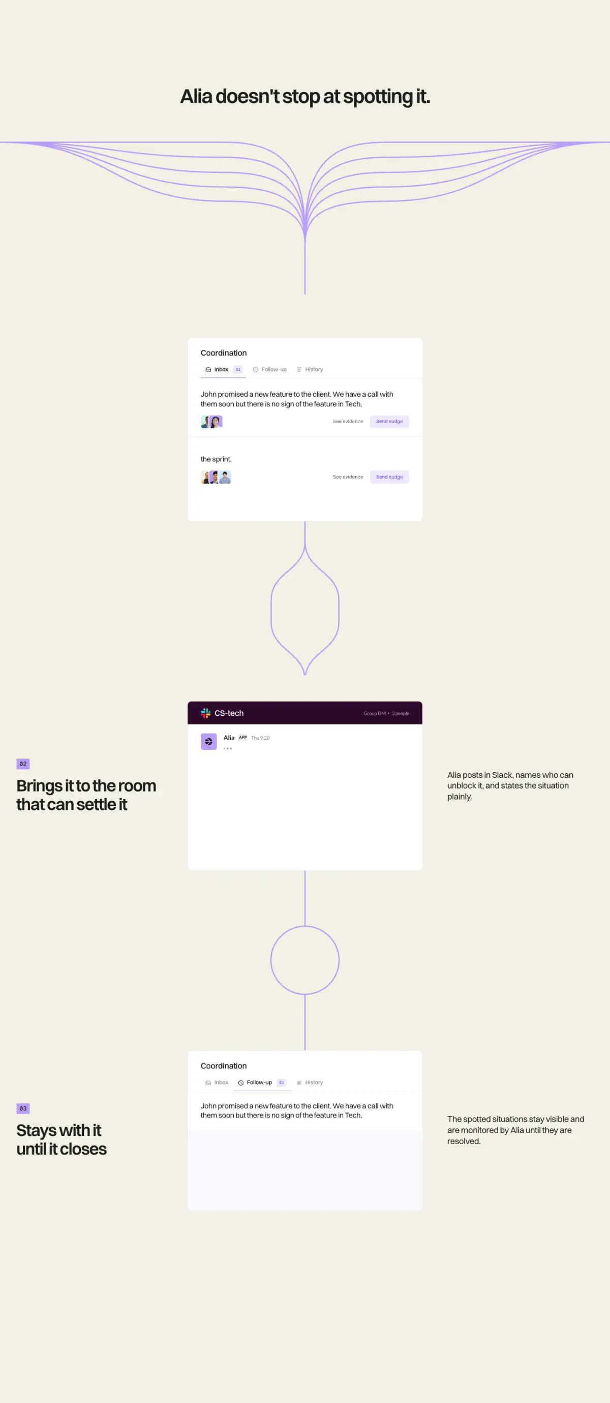
- Large, deliberate macro-spacing between distinct sections, with tighter, consistent padding within localized components like cards and tables.
- Shape
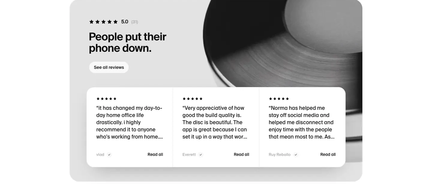
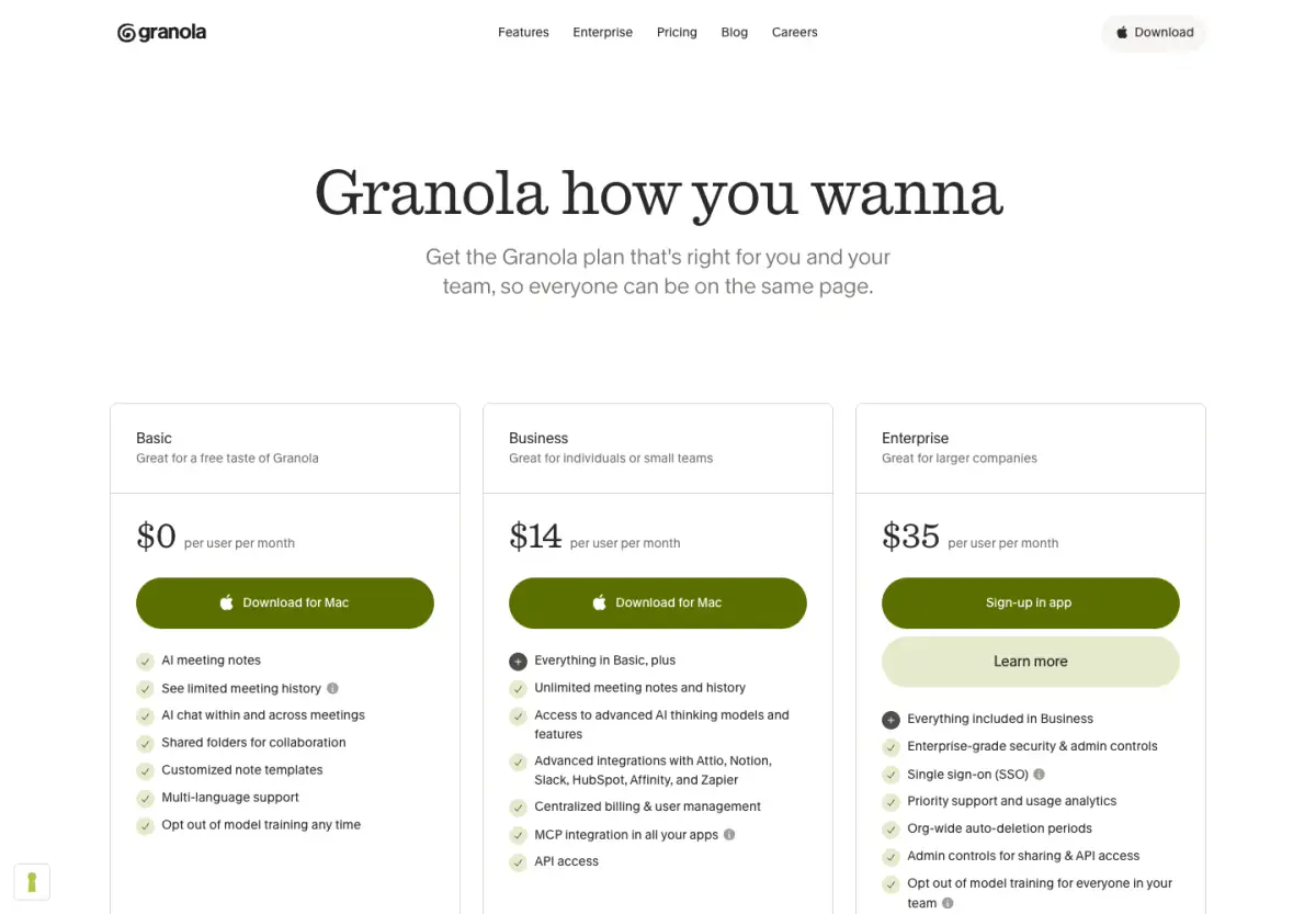
- Prominent use of large border radii, applying fully rounded (pill) shapes to buttons/nav and softly rounded corners to larger structural cards. Mixed: fully rounded pills for interactive elements, approx 16px-24px soft rounds for content blocks and images.
- Borders
- Generally borderless, relying on contrasting surface colors, though thin, translucent structural borders exist on elements like the navigation.
- Buttons
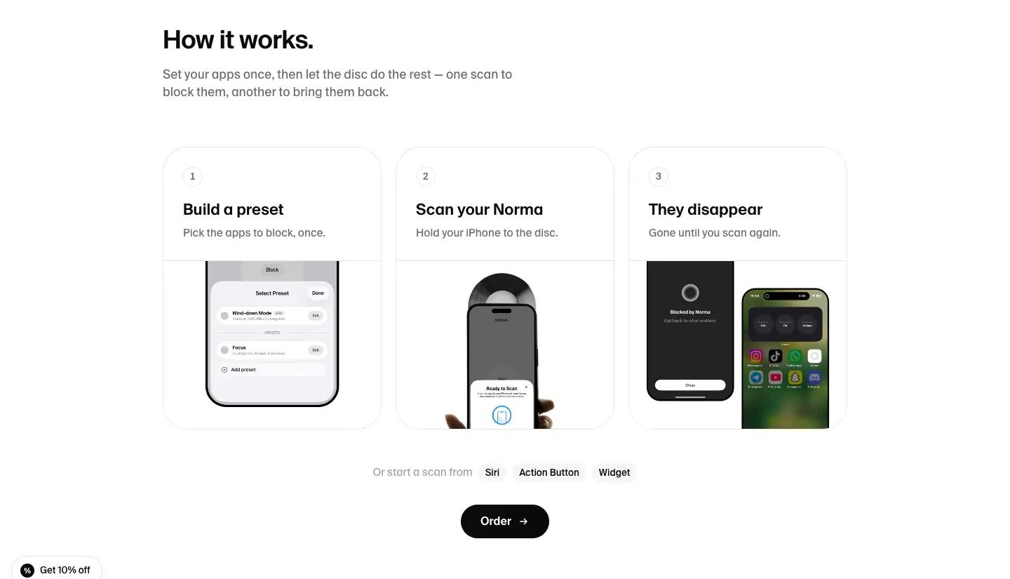
- Solid-fill pill shapes, predominantly relying on strict black/white inversion for normal versus active/hover states.
- Width
- Centered layout with a well-defined maximum width, keeping line lengths readable while maximizing outer margins.
- Density
- Low density; the design heavily leverages negative space to focus attention on typography and product imagery.