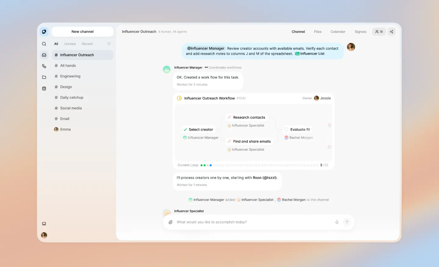
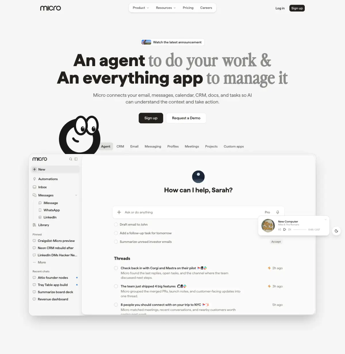
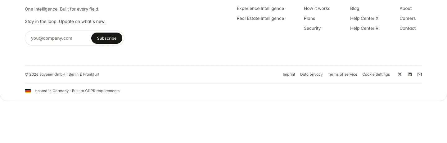
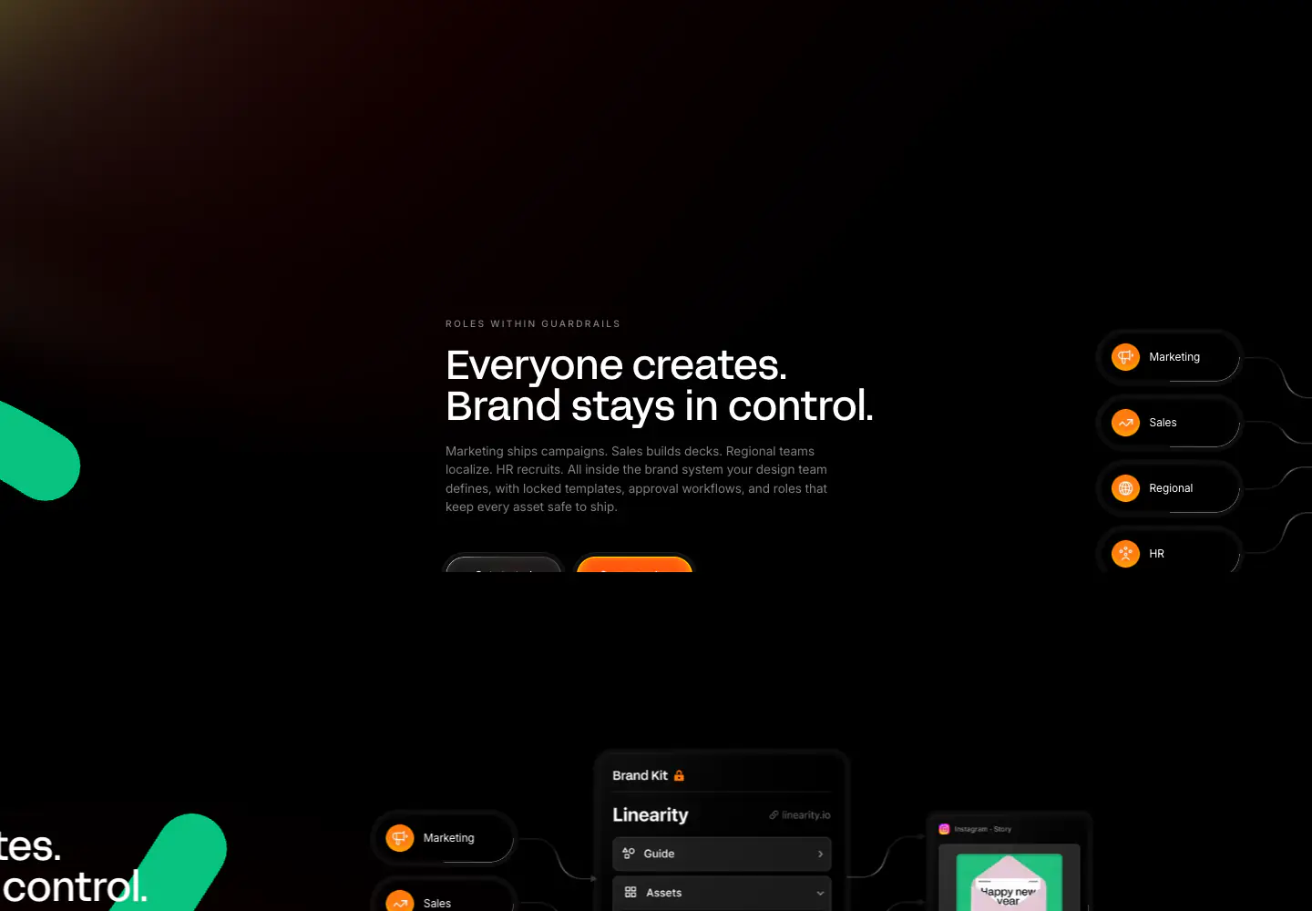
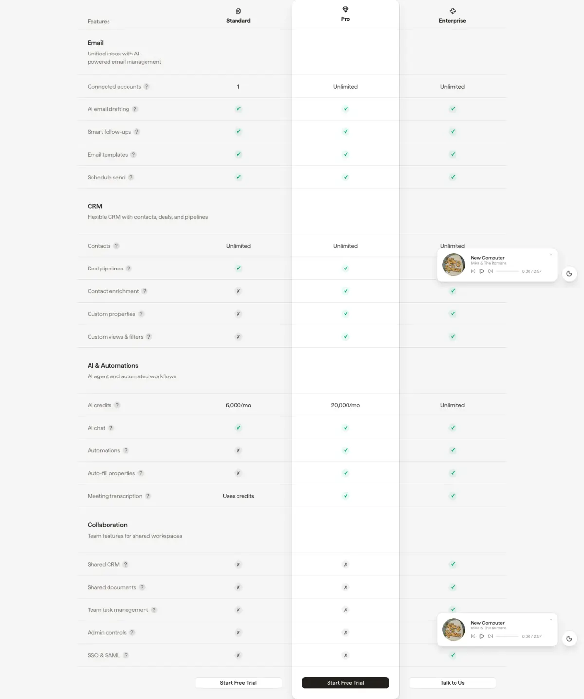
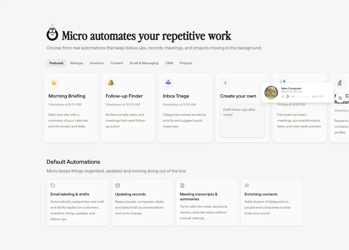
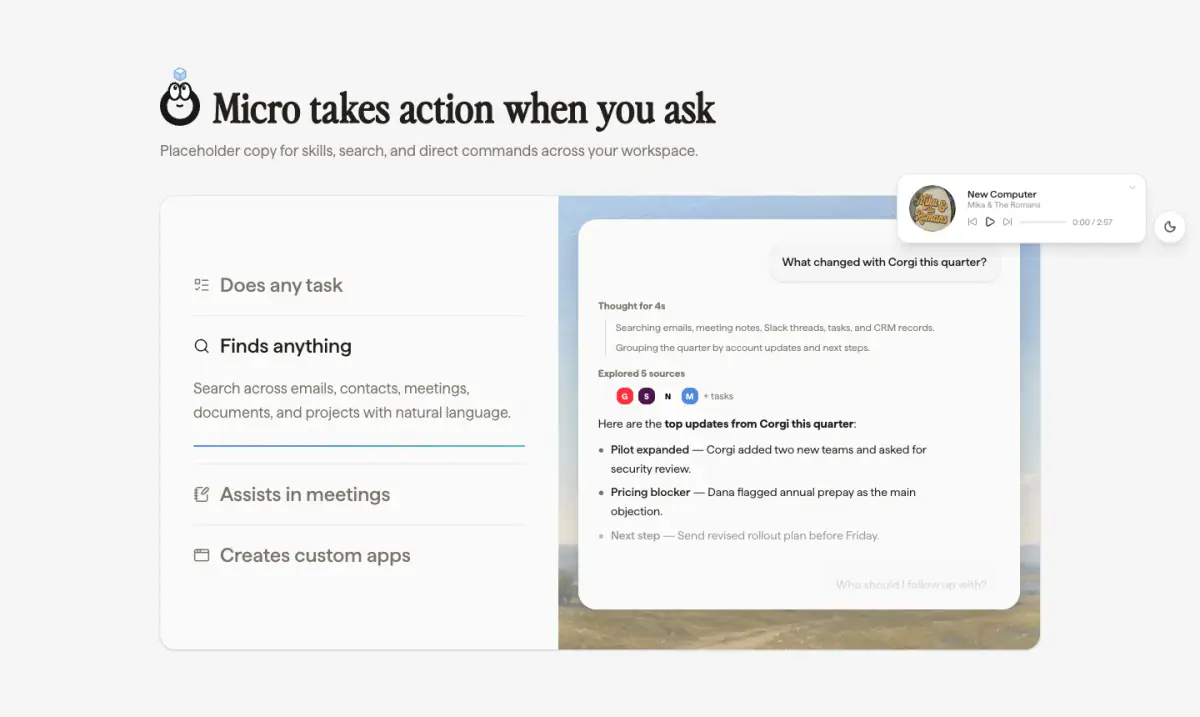
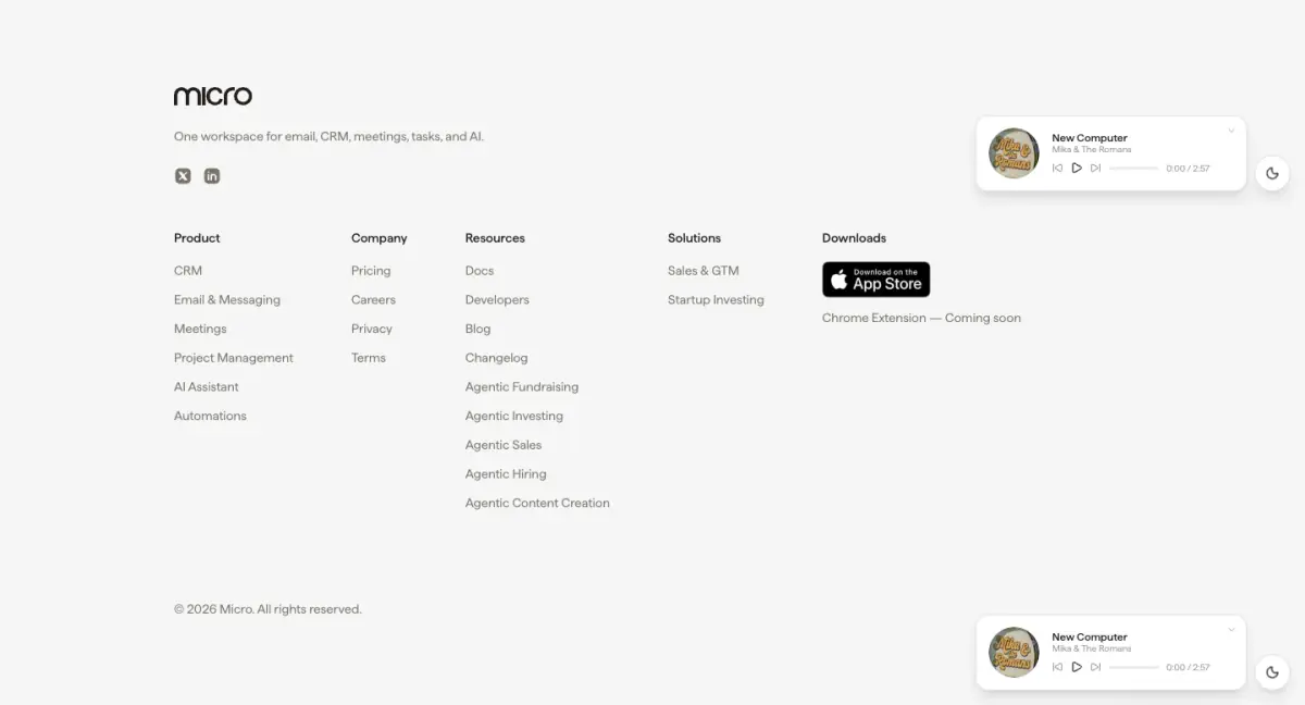
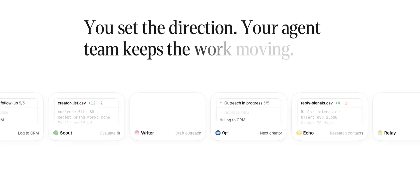
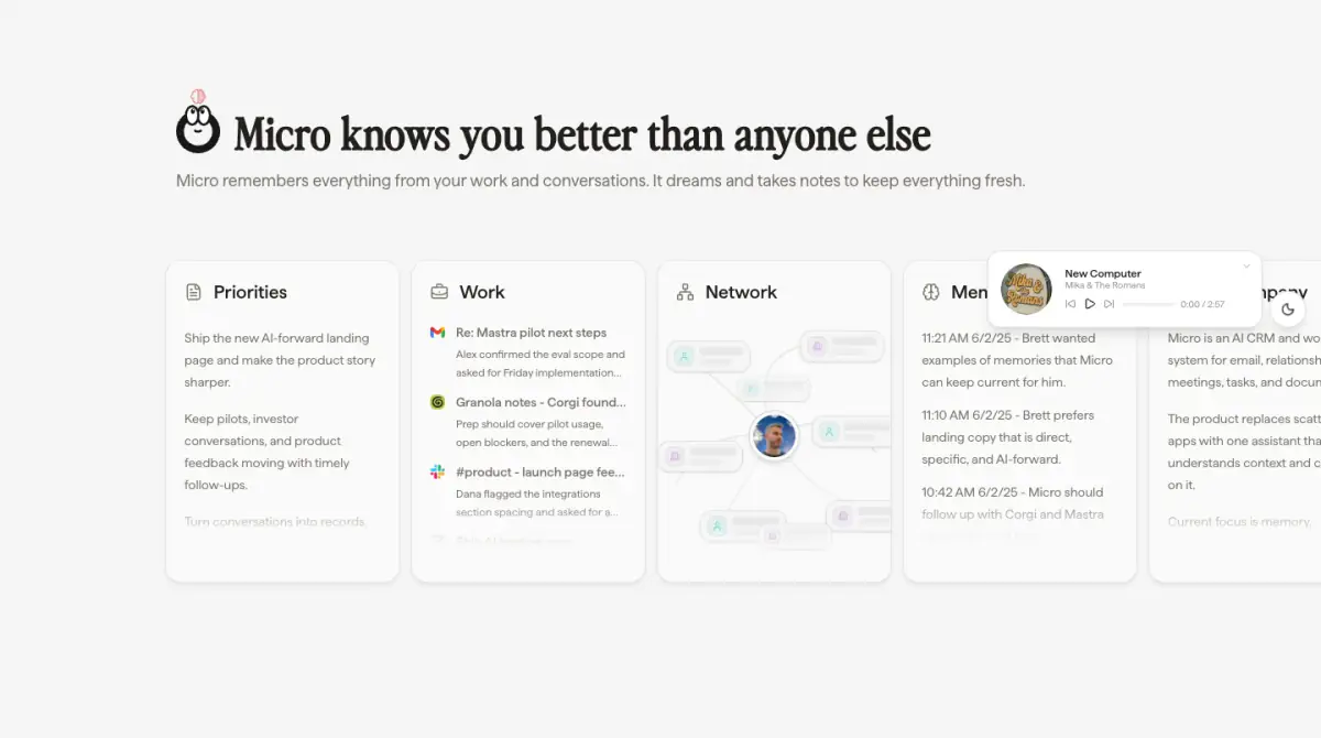
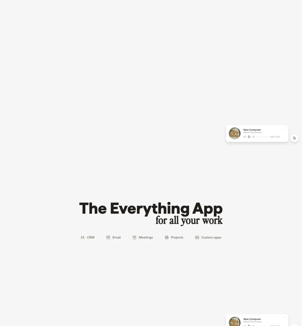
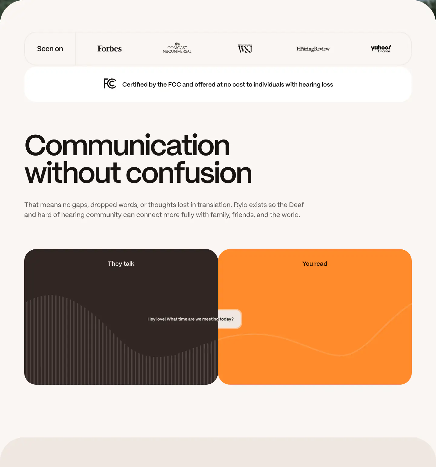
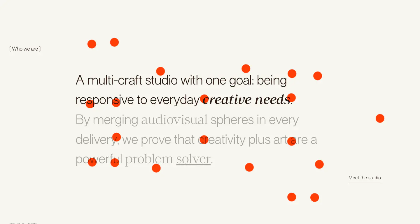
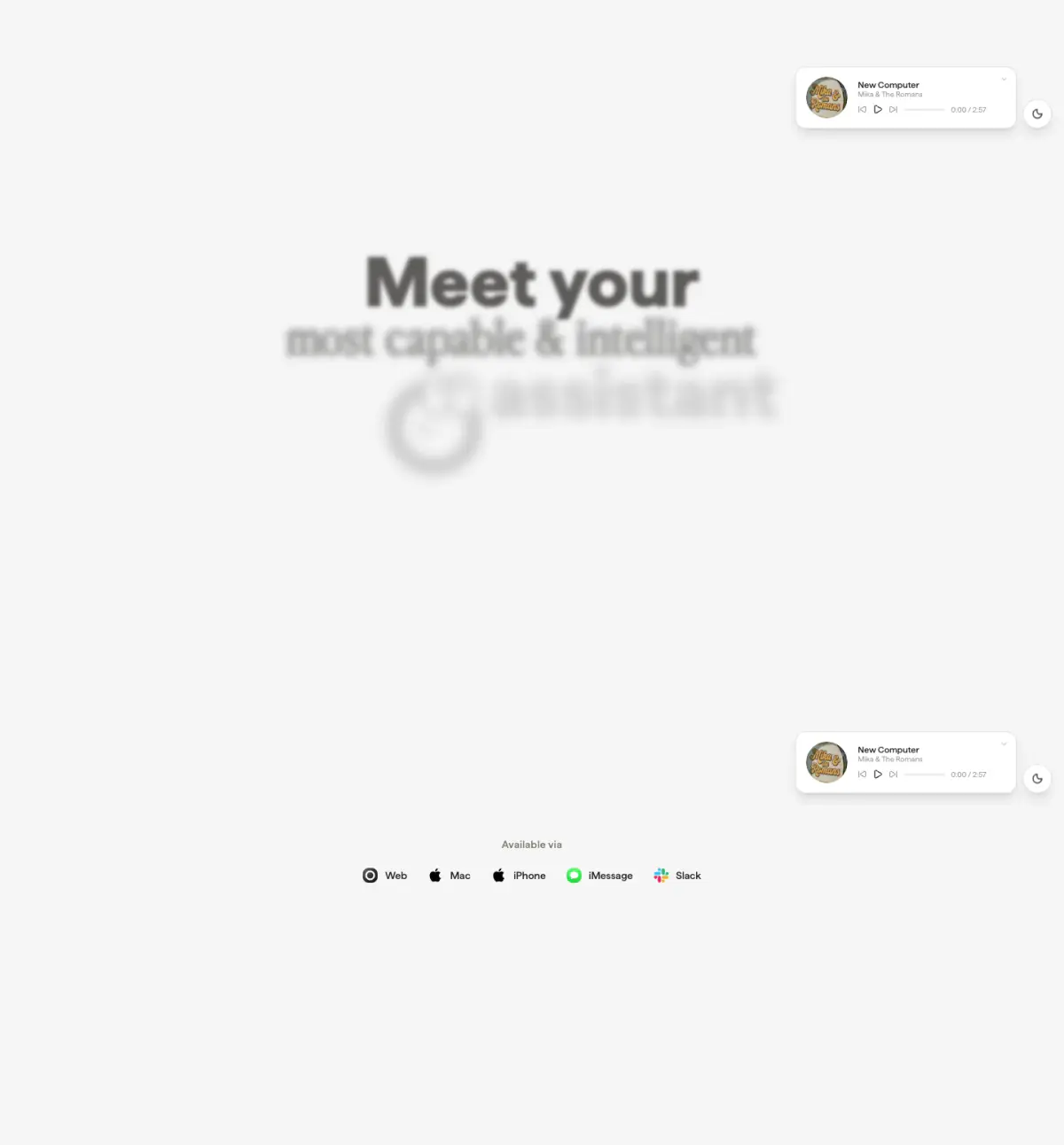
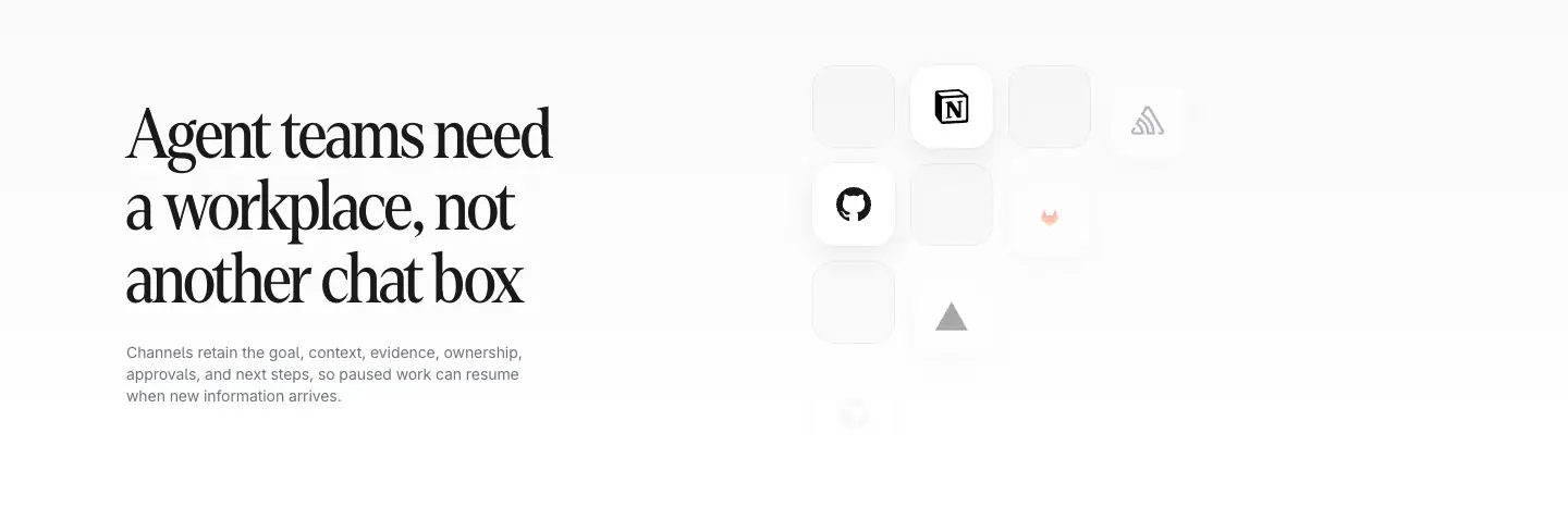
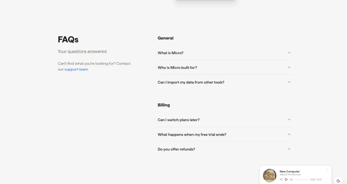
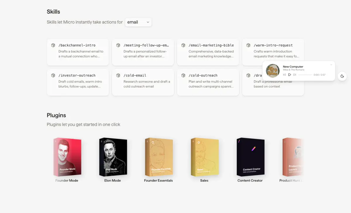
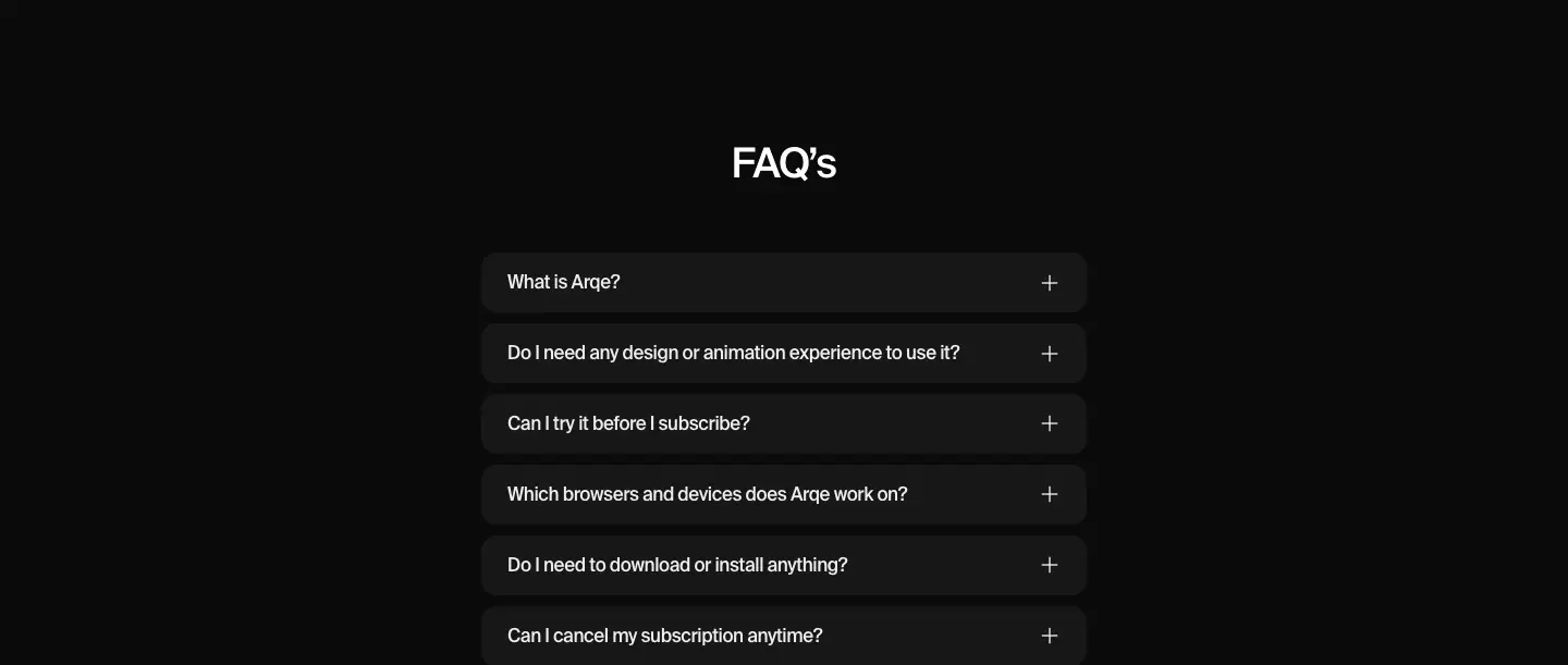
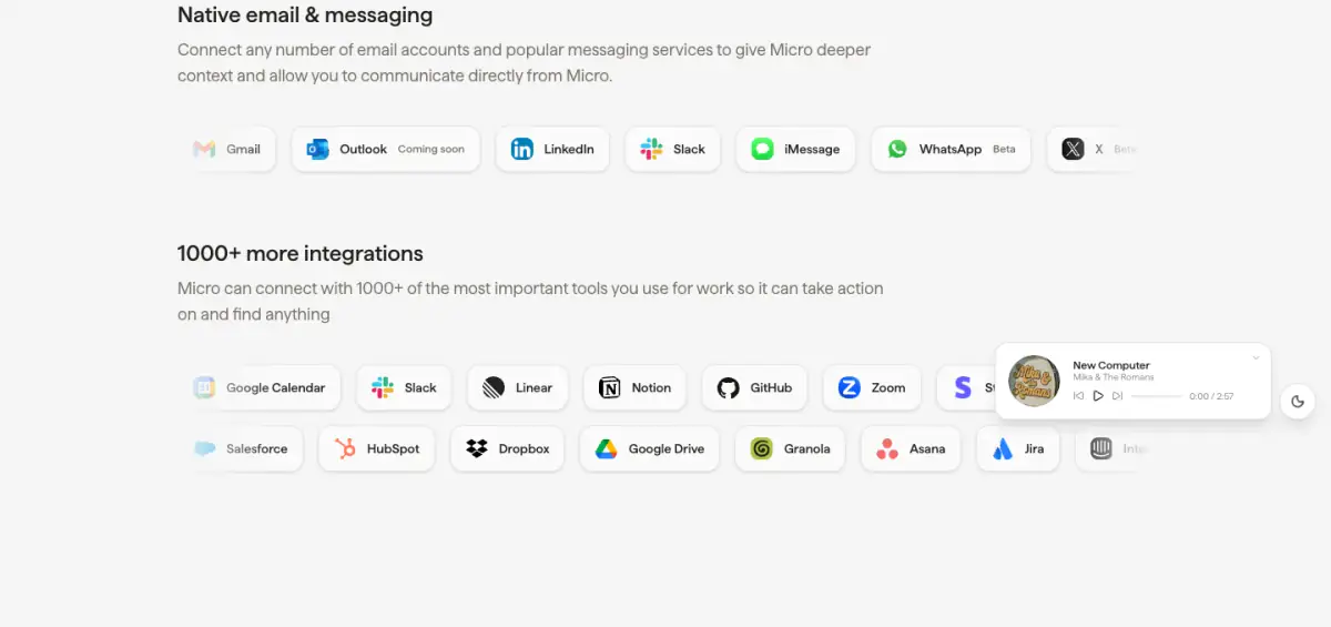
Micro's website features a minimal and slightly playful design tailored for a modern SaaS product. It uses a light grey canvas with crisp white surfaces for UI components, heavily relying on high-fidelity, interactive product mockups to demonstrate value. The typography pairs a characterful serif for major headings with a clean sans-serif for UI and body copy, giving it an editorial yet approachable feel. A recurring illustrated mascot adds a playful touch, while subtle shadows, translucent borders, and pill-shaped elements soften the overall aesthetic. The layout is spacious, guiding the user through various feature blocks and interactive demonstrations.
- Spacing
- Generous vertical spacing between major sections, with tighter, structured padding inside product mockups and feature cards.
- Shape
- Highly rounded, utilizing pill shapes for buttons, tags, and floating navs, with softer, moderate rounding on larger containers. Small (4-8px) for internal UI elements, medium (12-16px) for feature cards, large (24px+) for prominent product mockups and modal-like containers.
- Borders
- Subtle, semi-transparent 1px borders (e.g., rgba 0,0,0,0.08) used extensively to define cards and UI panels against the light gray canvas without adding visual weight.
- Buttons
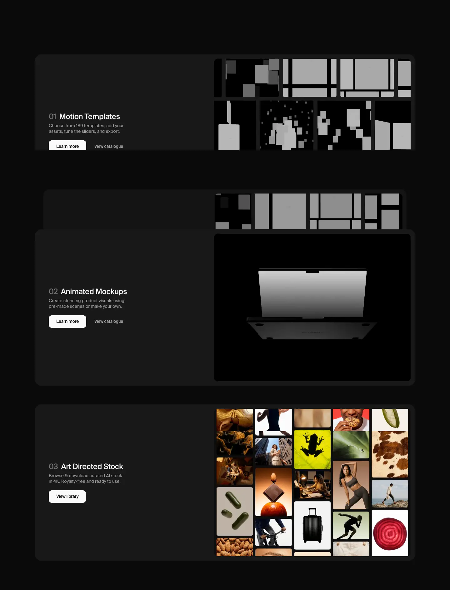
- Predominantly pill-shaped. Primary buttons are solid dark (#000000 or #221F1C) with light text, while secondary buttons and tags often use light backgrounds with dark text or transparent ghost styles.
- Width
- Centered max-width constraints for text content, allowing product mockups to stretch wider or bleed off-center for visual interest.
- Density
- Comfortable and airy. The design prioritizes legibility and clear visual hierarchy over packing dense information.