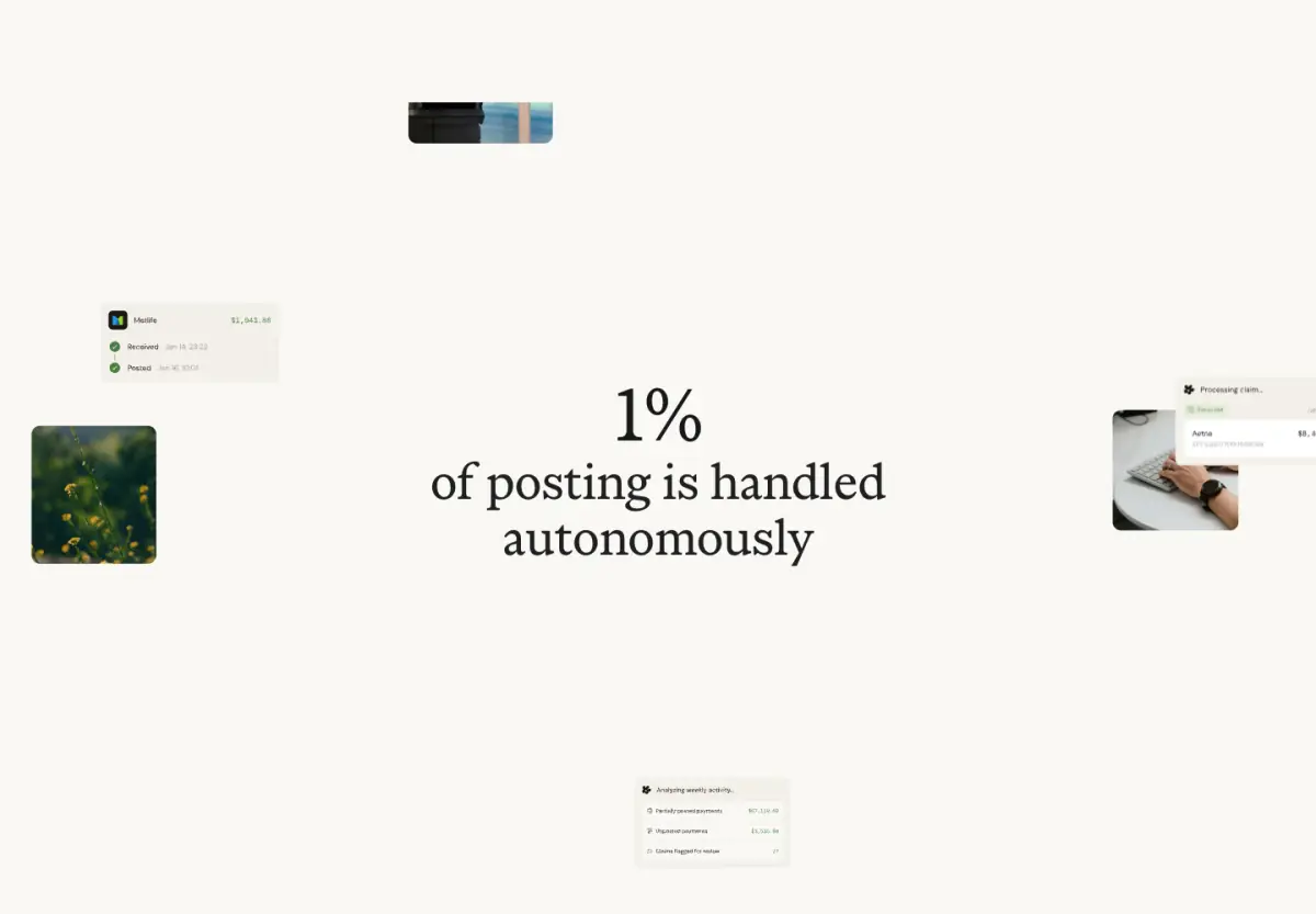
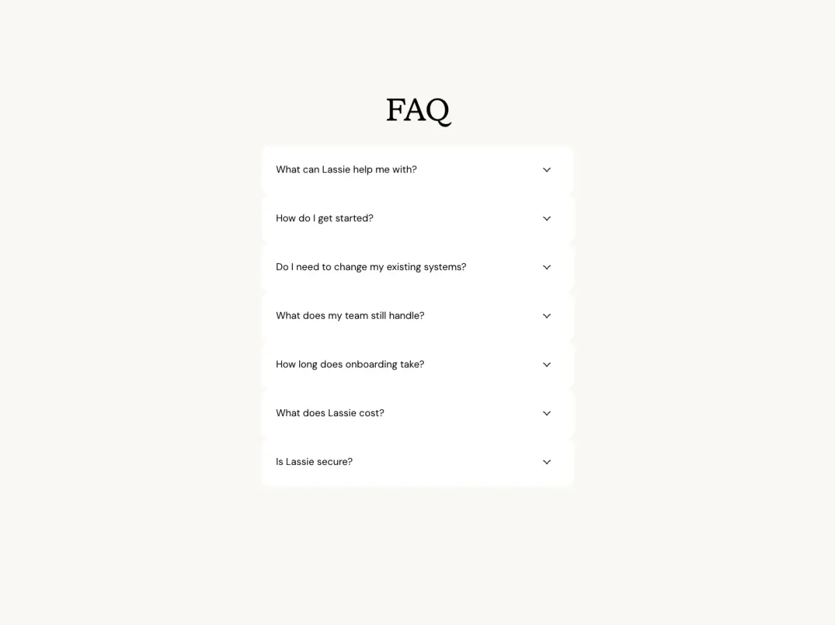
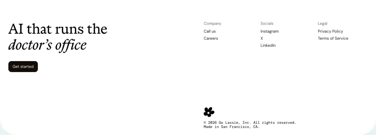
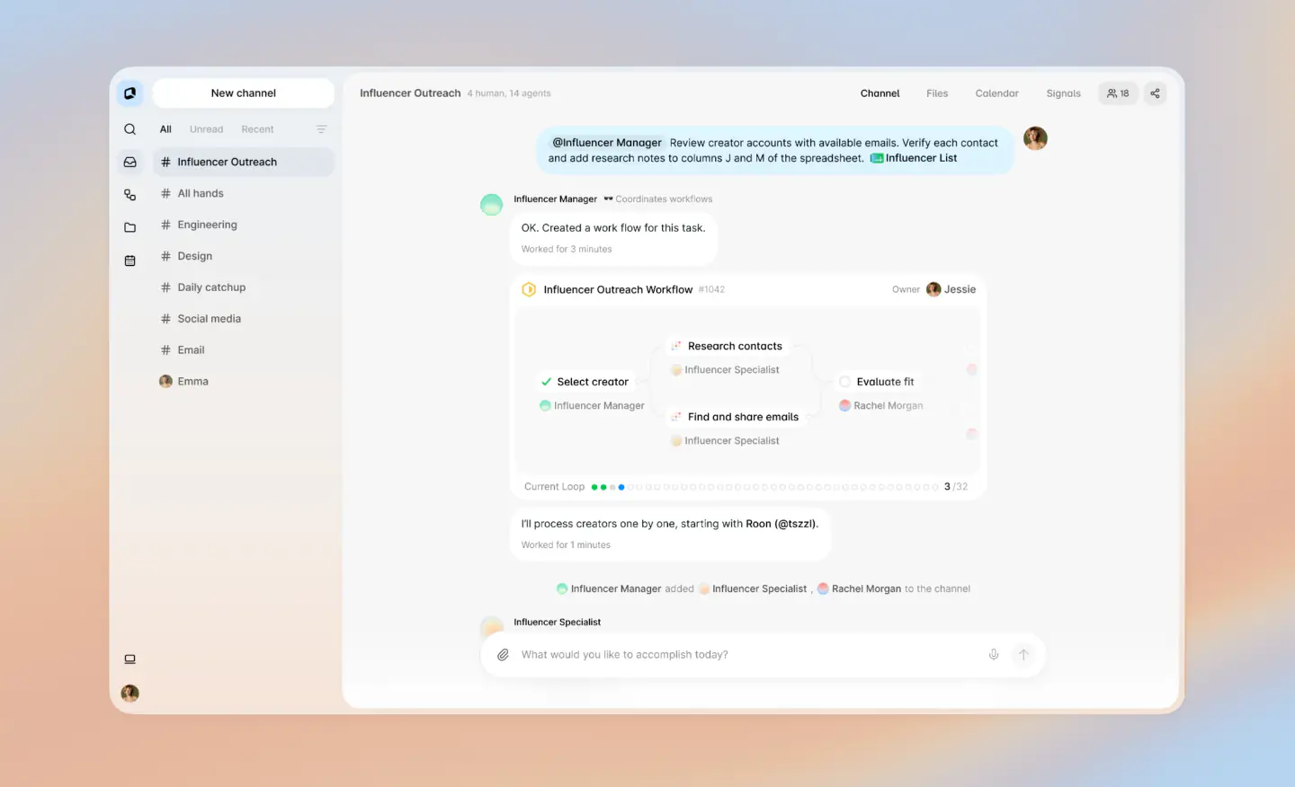
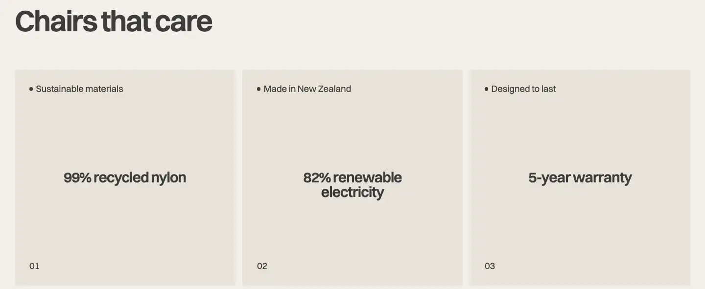
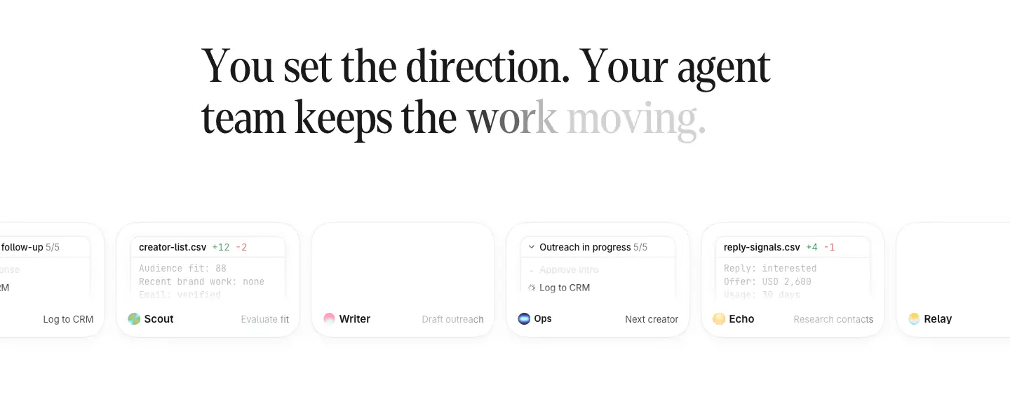
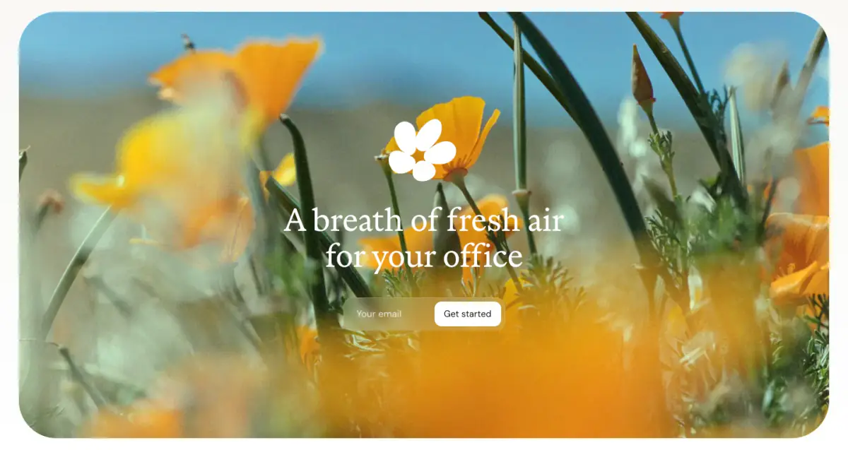
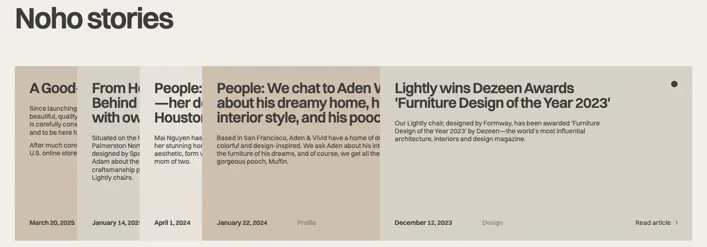
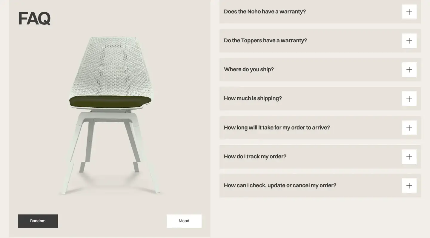
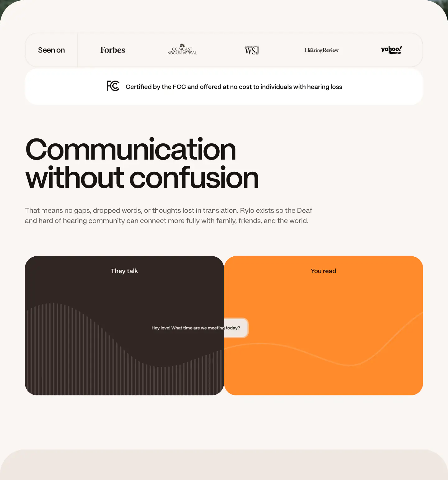
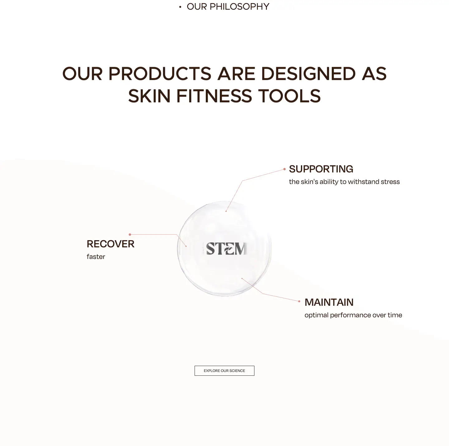
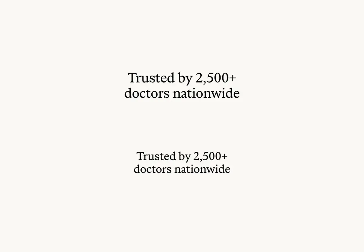
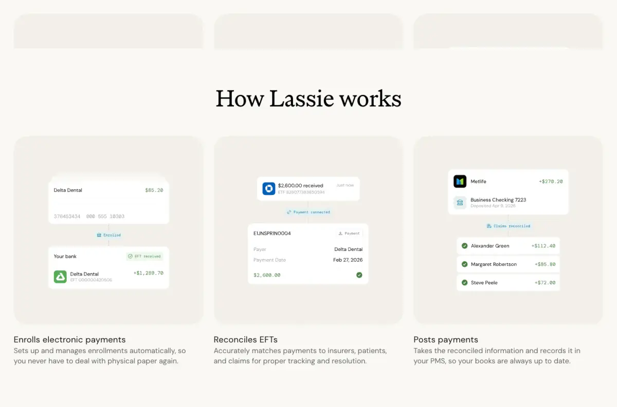
Lassie relies on a clean, minimal, and typographic design language that contrasts large, highly legible serif headings against generous off-white negative space. The layout leverages soft container boundaries, utilizing generous corner radii and subtle borders, to frame content and establish hierarchy. Scroll-triggered animations, as observed separately, dynamically reveal and position elements such as product UI snippets and an interactive map, playing a significant role in content delivery and user engagement.
- Spacing
- Generous vertical spacing between major sections, allowing the scroll-triggered animations to breathe and command attention.
- Shape
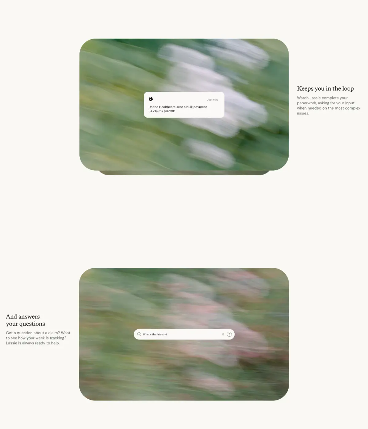
- Distinctly rounded corners are a key motif, applied to the navigation bar, feature cards, and the input field container. Large border radii are consistently used to create soft, pill-like shapes for buttons and floating UI elements.
- Borders
- Borders are generally subtle or non-existent, relying more on background color contrast to define shapes, except for thin, translucent borders on some input elements.
- Buttons
- Buttons are predominantly pill-shaped, utilizing solid white or dark backgrounds with contrasting text.
- Width
- Content is generally centered and constrained to a readable maximum width, though background images and the scroll map break out to utilize the full viewport width.
- Density
- The design is loose and airy, heavily relying on negative space to highlight typographic elements and scroll-driven interactions.