- Industry
- Technology
- Site type
- Blog, Landing
- Platform
- Custom code
- Tech
- Next.js
- Style
- Minimal, Corporate, Geometric, Developer Focused, Technical Blueprint
- Business model
- AI, Software
- Presence
- Online
- Components
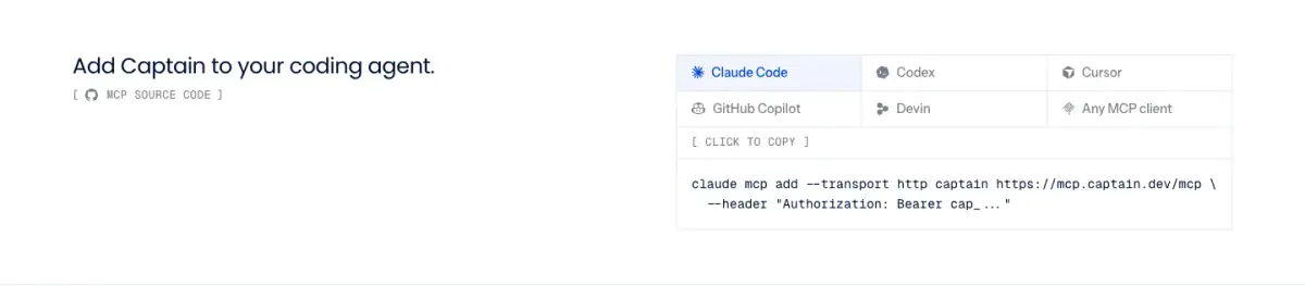
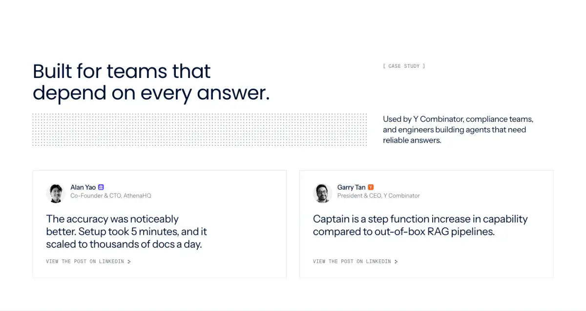
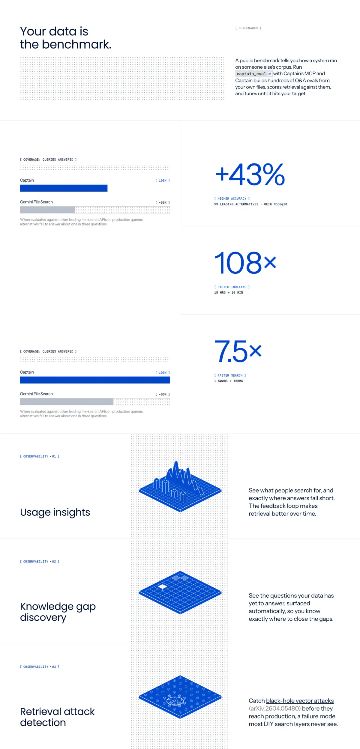
- Announcement Bar, Navigation Bar, Hero, Logo Strip, Testimonial Card, Stat Block, Footer, Code Snippet Block, Isometric Feature Stack
- Score
- 58.25/100 · 80% evidence · Review pending
- Typography
- Display — Poppins; Heading — Poppins; Body — instrumentSans; Mono — geistMono
- Palette
- OG image
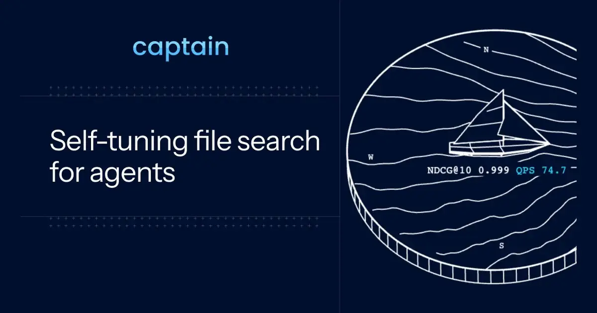
Design analysis
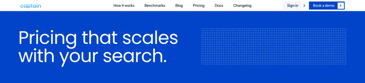
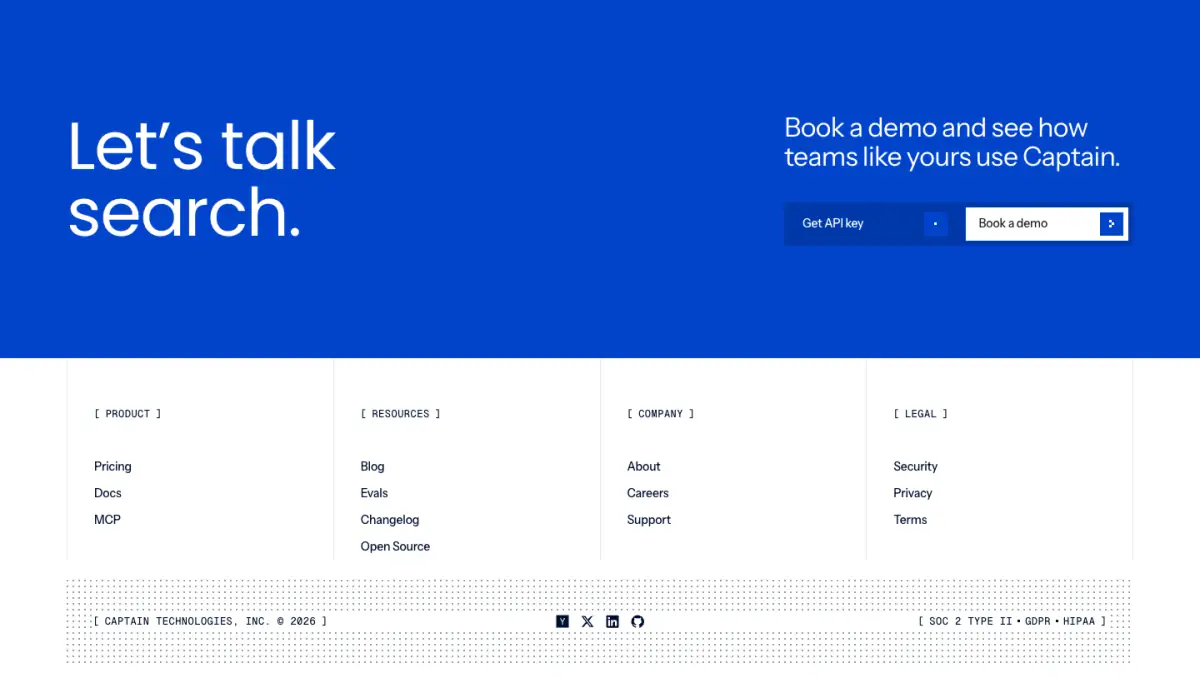
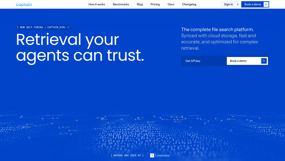
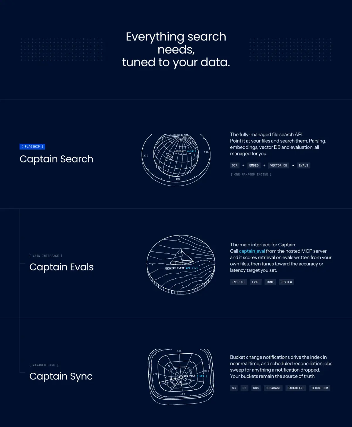
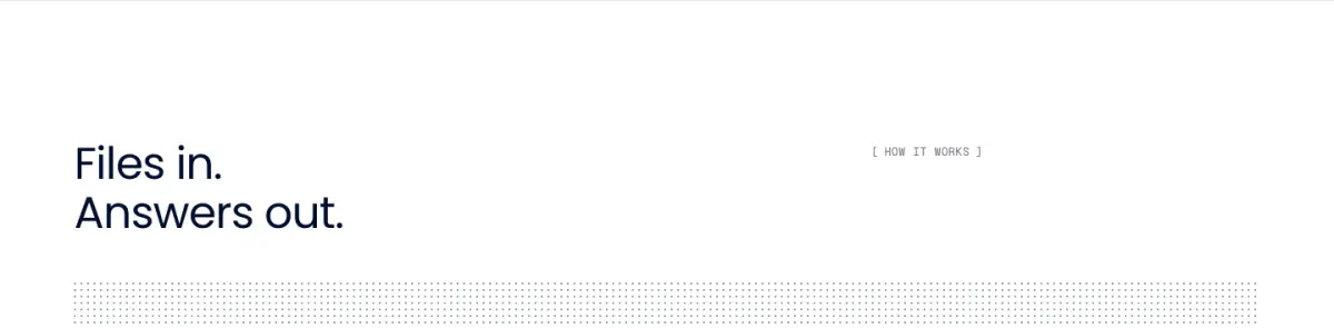
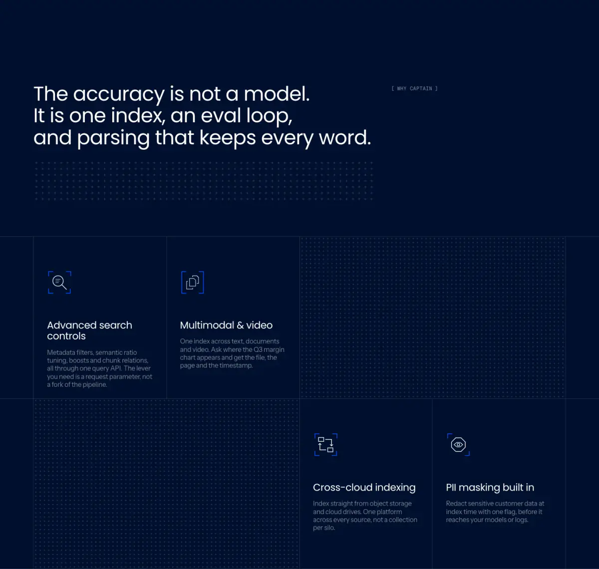
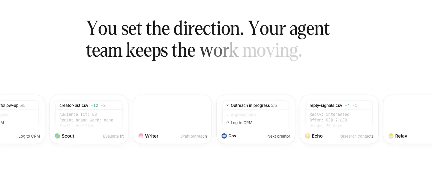
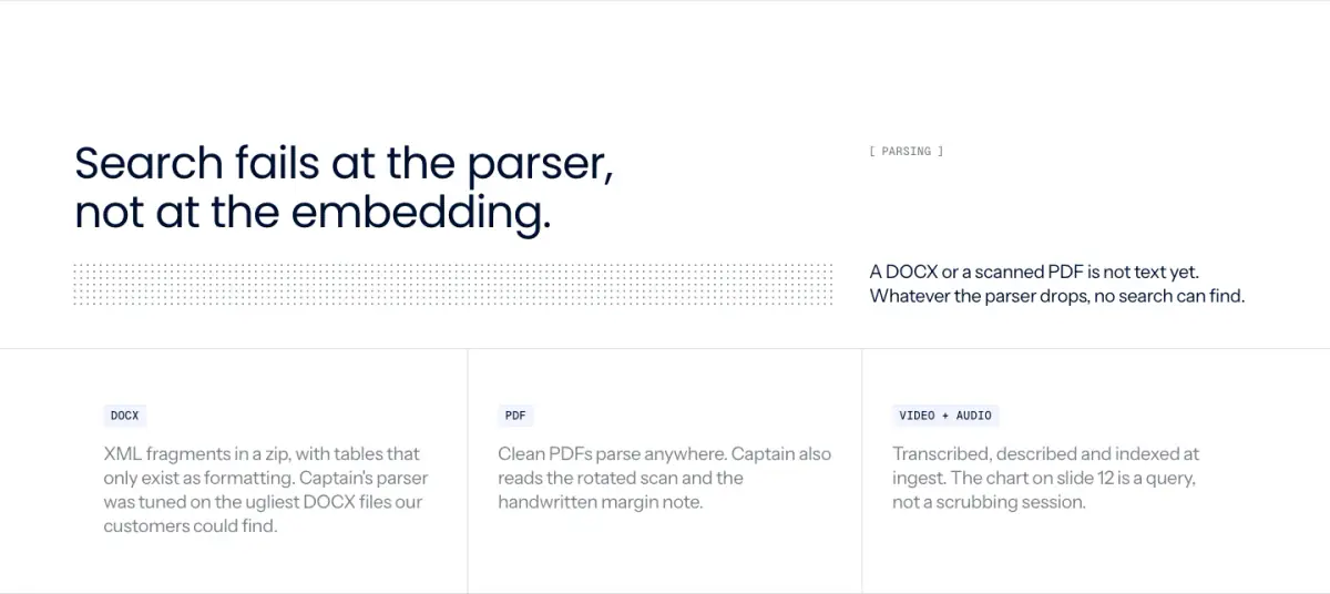
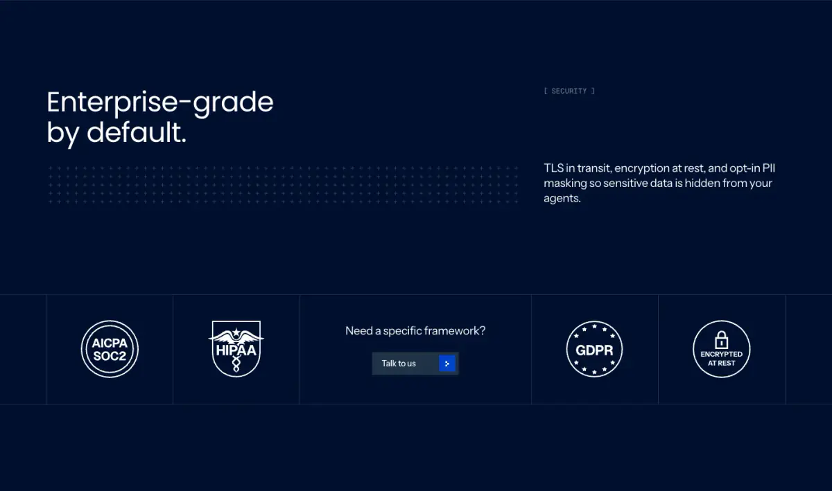
The website for 'Captain' employs a highly technical, minimalistic, and modern corporate style, heavily geared toward developers and enterprise users. It uses a striking combination of deep blues, white, and subtle grays to create high contrast. The typography effectively mixes a geometric sans-serif (Poppins) for large, punchy headlines with a clean sans-serif (Instrument Sans) for body text, alongside a monospaced font (Geist Mono) for technical labels and code snippets, reinforcing its developer-focused aesthetic. The design relies on generous white space and precise, delicate line work—such as dot matrices and grid patterns—combined with intricate, blueprint-like isometric illustrations
- Spacing
- Generous vertical spacing between major sections, with tight groupings inside technical feature blocks.
- Shape
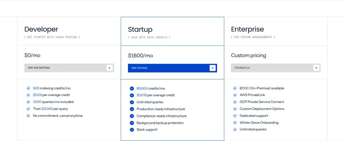
- Sharp 0px border radii on buttons, inputs, and layout containers, reinforcing a precise, technical feel. Buttons and containers appear to have 0px radius based on visual inspection.
- Borders
- Thin 1px solid borders used heavily for structural dividing lines, tabs, and code block containers.
- Buttons
- Solid, sharp-edged rectangles for primary CTAs (blue background, white text) with a distinct trailing arrow icon block.
- Width
- Restricted central content column with wide, full-bleed background bands for section separation.
- Density
- Low overall density with high-density micro-typography (monospaced labels and brackets) clustered in specific areas.