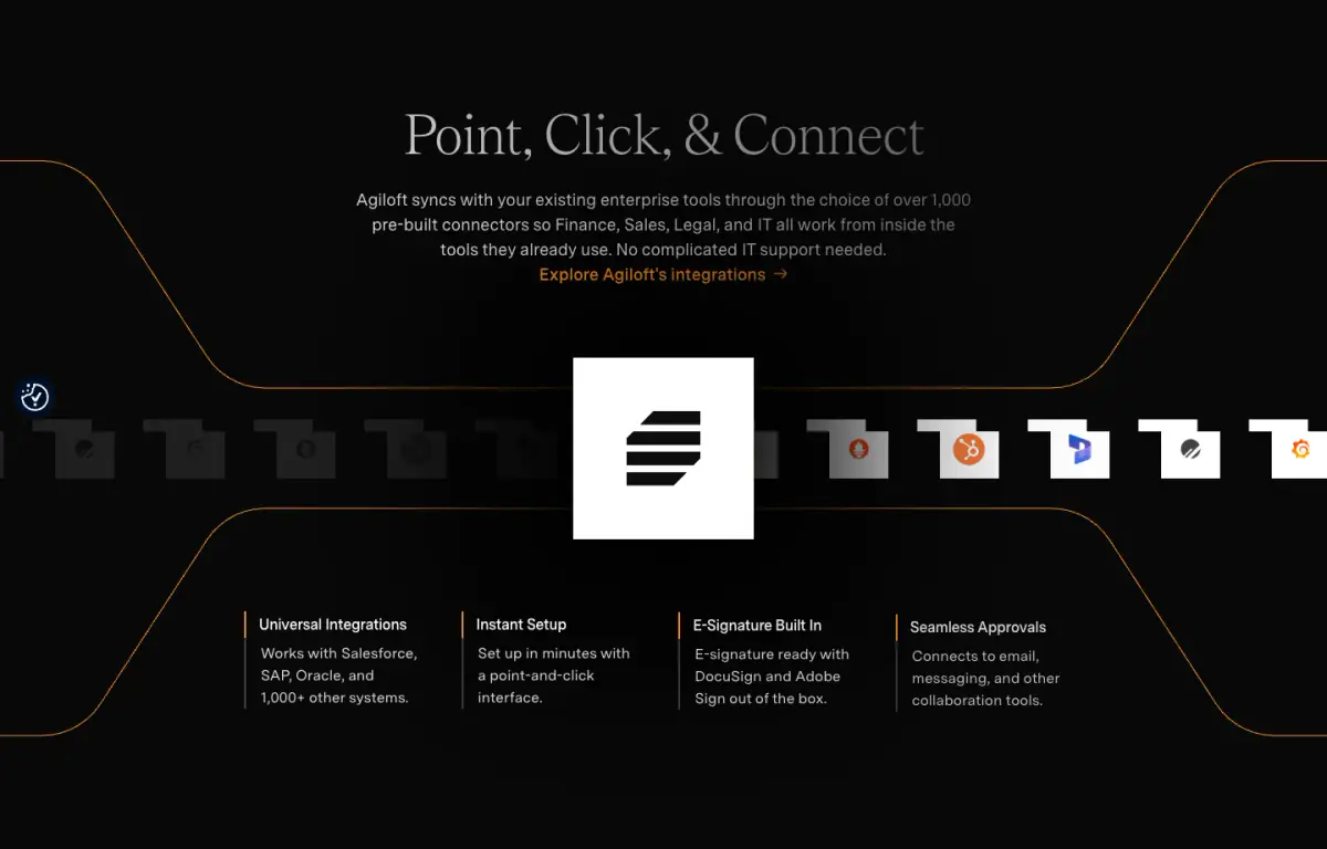
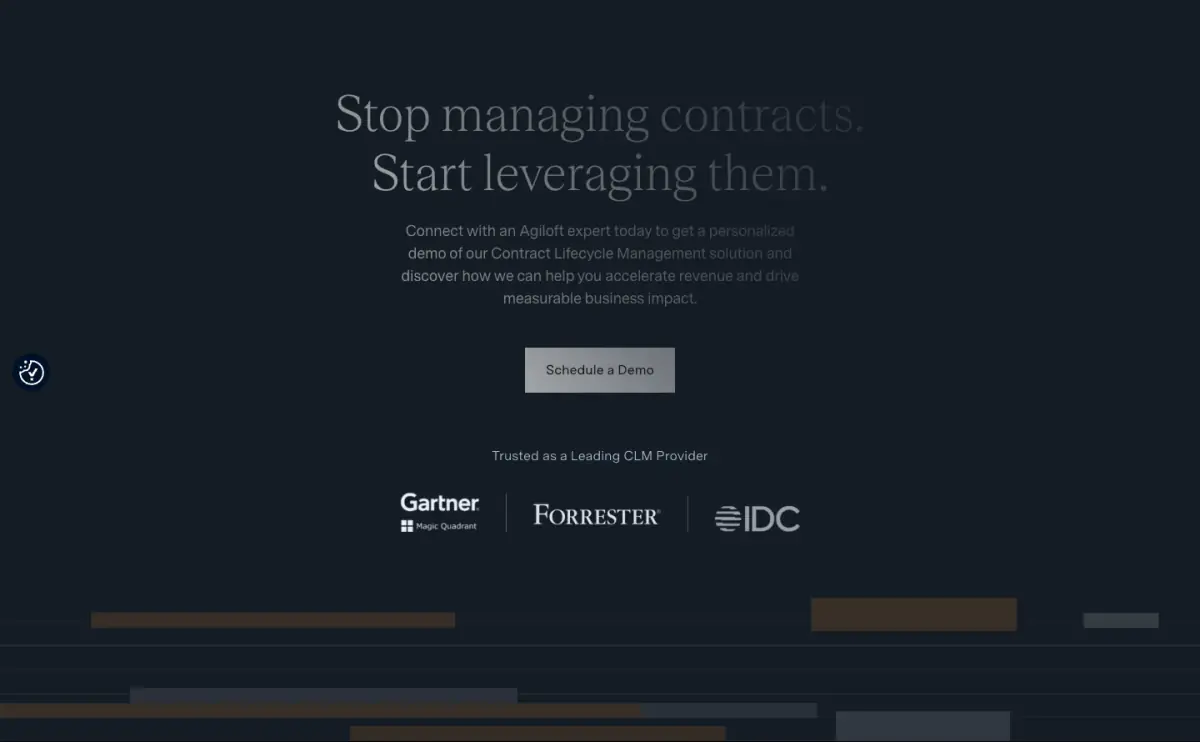
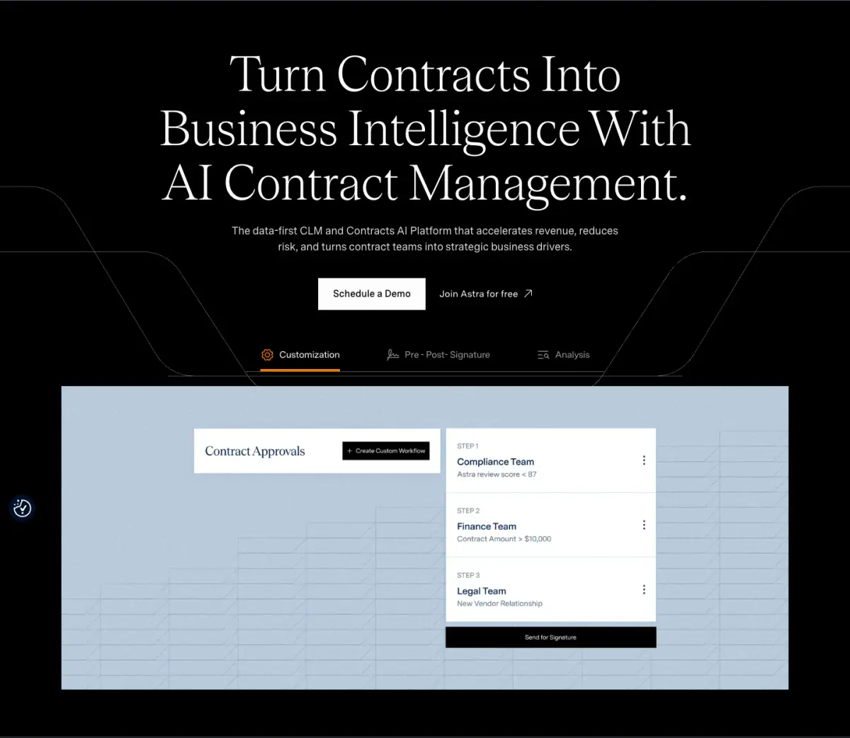
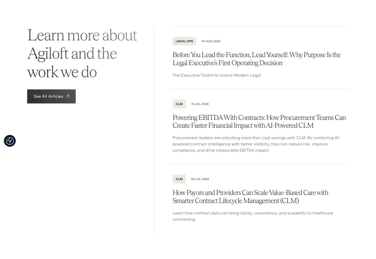
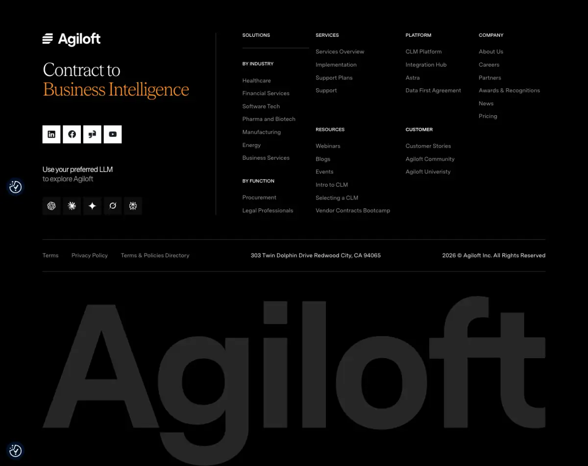
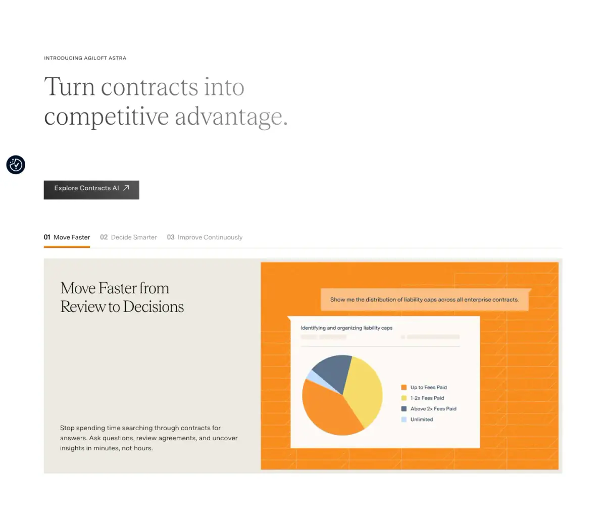
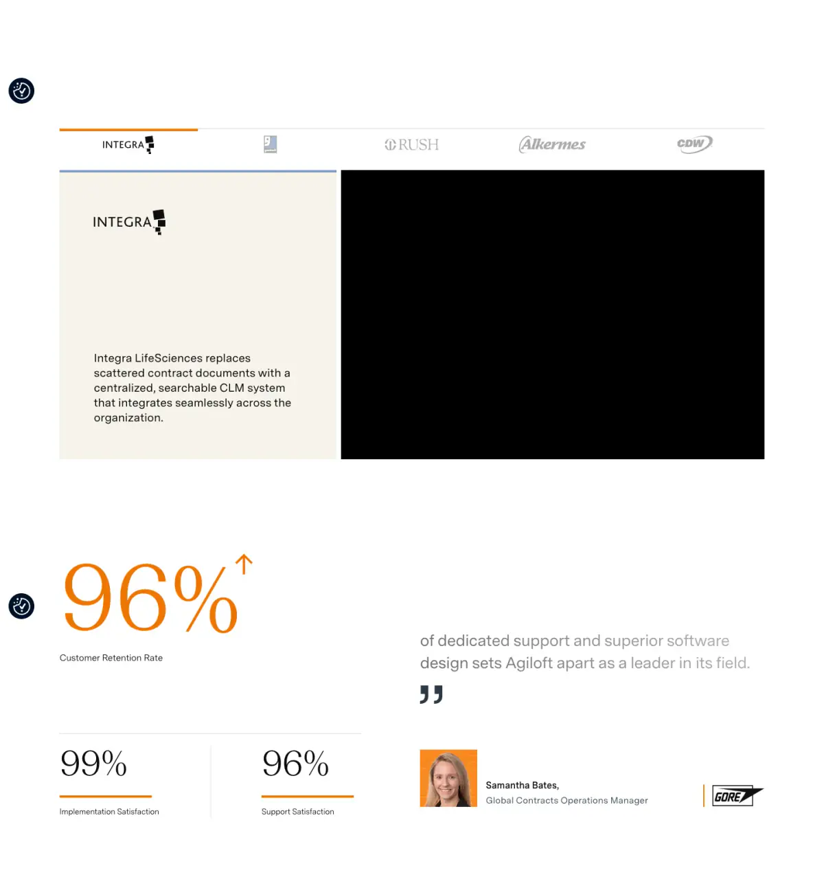
Agiloft features a sophisticated, modern corporate design with an editorial flair. The layout is structured yet dynamic, utilizing high-contrast typography and precise geometric accents. A stark black, white, and light grey canvas is punctuated by vibrant orange highlights that draw attention to key interactive elements and data visualizations. The typography pairs a graceful, fine-weight serif (Teodor) for impactful headings with a clean, highly legible sans-serif (Messinasansweb) for body copy and UI elements. Reusable components include complex feature showcase tabs, detailed statistic blocks, and structured editorial article cards. Fine orange lines and subtle gradients are used extensiv
- Spacing
- Generous and clearly defined. Large vertical padding separates major sections, while tighter, consistent margins are used within components like editorial cards and feature lists.
- Shape
- Strictly sharp, orthogonal corners. Very little to no rounding on buttons, input fields, or container elements, reinforcing a precise, technical aesthetic. 0px or functionally non-existent across prominent UI elements.
- Borders
- Thin, crisp solid lines. Used frequently for structural definition, such as separating list items, outlining UI representations, and dividing footer columns.
- Buttons
- Solid fill rectangles with sharp corners. Typically high contrast (white on black or black on white), relying on typographic clarity rather than borders or shadows.
- Width
- Wide max-width container, likely around 1200px-1440px, allowing for expansive multi-column layouts and large typographic displays while maintaining margins.
- Density
- Comfortable to sparse. High reliance on negative space to create focus around key statements and diagrams. Information is chunked into distinct, easily scannable sections.