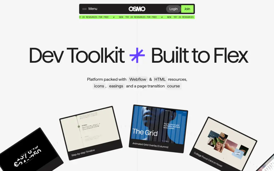
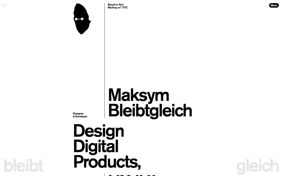
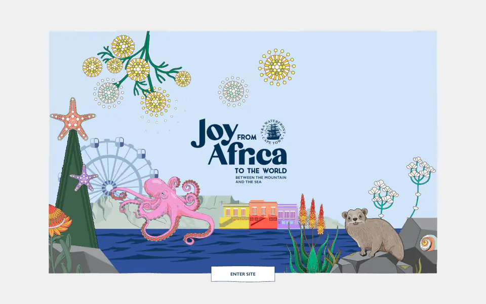
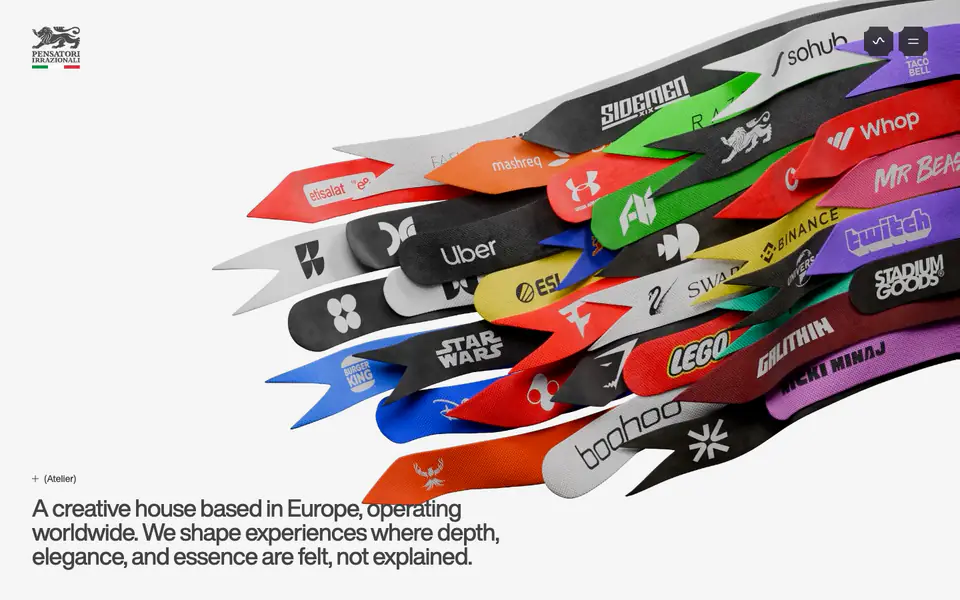
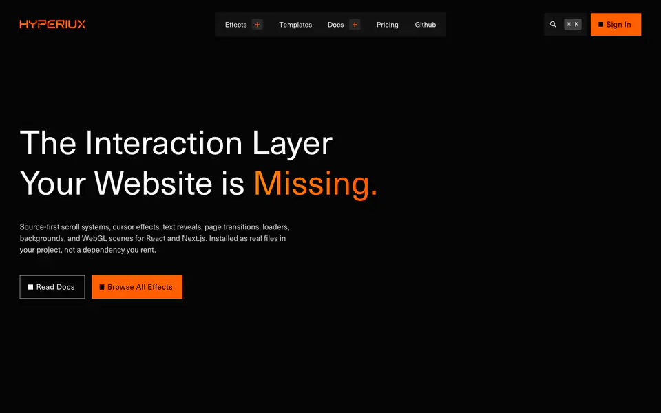
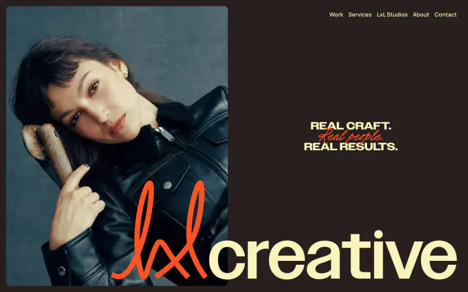
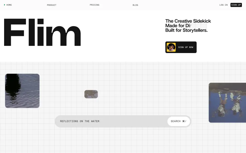
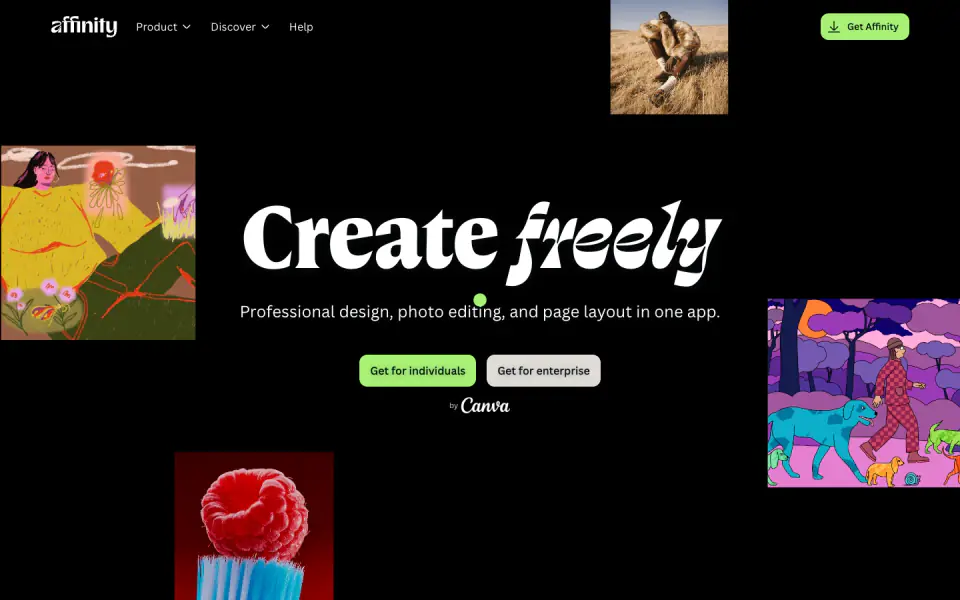
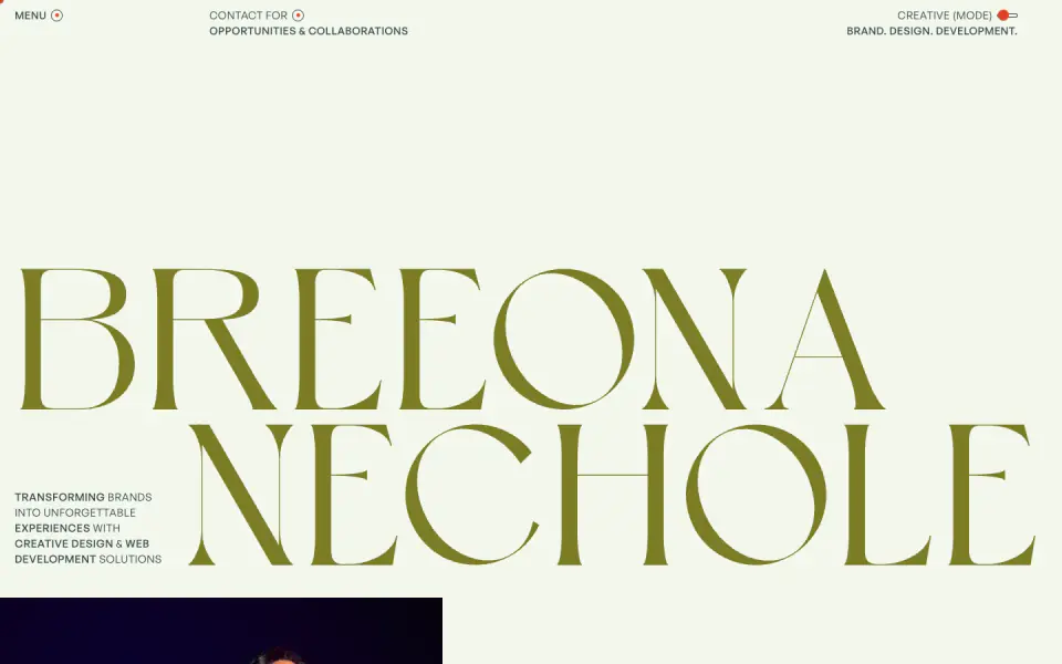
The website employs a highly contrast-driven, modern aesthetic characterized by massive, tightly-tracked typography and vibrant accent colors (neon green and electric purple) set against alternating off-white and dark gray backgrounds. The layout makes extensive use of floating, rounded cards arranged in dynamic, sometimes circular or overlapping compositions. Navigation is handled by a compact, pill-shaped floating bar at the top of the viewport. Sections are spaced generously, allowing the oversized headings and interactive component previews to act as the primary visual anchors.
- Spacing
- Generous vertical spacing between major structural sections, allowing the large typography and graphical arrangements to breathe. Internal card padding is substantial but proportional to the content.
- Shape
- Distinctly rounded. Navigation bars and buttons utilize pill shapes (fully rounded), while feature and pricing cards use large, soft border radii. Visible use of large radii on main content containers (visually estimating 16px to 24px) and 999px/pill-shapes for buttons and floating headers.
- Borders
- Mostly reliant on background color contrasts for containment, though some subtle, thin borders are used for structure (e.g., the thin lines separating pricing tier features).
- Buttons
- Pill-shaped, typically featuring a solid background color that contrasts highly with the text, though some dark mode variants appear to be solid dark gray with white text.
- Width
- Text blocks are often center-aligned and constrained to narrow max-widths for readability, while graphical elements like the hero cards or the footer wordmark bleed across the entire viewport width.
- Density
- Overall low density. The layout prioritizes large, impactful singular elements (huge text, big cards) over packing dense information into tight grids.