- Industry
- Creative
- Site type
- Portfolio
- Platform
- WordPress
- Tech
- Not detected yet
- Style
- Editorial, Minimal, Typographic, High Contrast
- Business model
- Agency
- Presence
- Online
- Components
- Navigation Bar, Hero With Background Imagery, Editorial Card, Footer, Text Link, Typographic Statement Block
- Score
- 52.55/100 · 100% evidence · Review pending
- Typography
- Heading — KleischLLSub-Light; Body — Basel Grotesk
- Palette
Design analysis
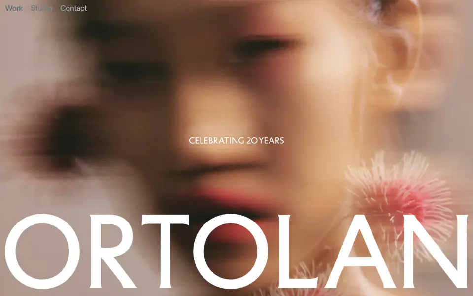
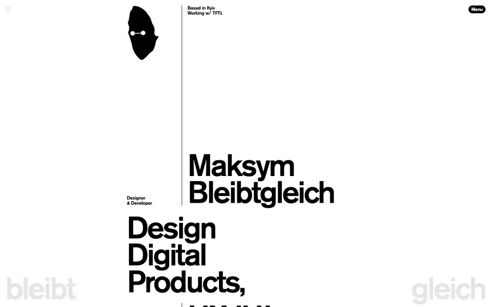
The website presents a clean, editorial design with a focus on large, impactful typography and high-quality photography. The layout uses a predominantly white background with black text, creating a strong contrast and a minimalist aesthetic. Large serif headings are paired with a clean sans-serif for body copy and navigation. The structure relies on a simple grid for displaying projects as large feature cards, and generous white space is used throughout to separate distinct content areas, contributing to a refined, sophisticated feel.
- Spacing
- Generous vertical spacing between distinct sections (e.g., between the hero, the introductory text, and the image grids), creating a relaxed reading pace.
- Shape
- Sharp, square corners are used consistently on all image containers and grid elements. 0px radius applied to image cards.
- Borders
- Minimal visible borders; thin, horizontal hairline separators (likely 1px solid) are used to divide major content sections.
- Buttons
- No prominent contained buttons are visible; interactive elements are primarily simple text links.
- Width
- Content generally spans the full width of the viewport with comfortable side margins, utilizing a fluid grid approach for image cards.
- Density
- Low density; the design heavily leverages negative space to focus attention on typography and imagery.